Forum Replies Created
-
AuthorPosts
-
ZerogarthMemberGreat portrait! Awesome work with her expression : O! …btw, diggin the sci-fi bar, awesome!
ZerogarthMemberYou should try to do brighter backgounds, that way the character’s a visual priority …and maybe give a little transparency to the lighing effects, same reason as before… anyways, nice work, u’re getting the hang of it! Kilgor is specially great, u can tell he just polished his armor and weapons (liked those shining effects) : )
ZerogarthMemberGreat fantasy characters! the Shades are specially awesome! …Patrian is remarkable too, he’s unique in spite of the simple clothes… and by simple I don’t mean basic… its effective enough as it is : )
peace!
ZerogarthMemberChaos is awesome; even though its very Venomlike, it has its own style, I like that! …oh, and nice work on Dirtnap remake too : )
ZerogarthMemberI think the barbarian looks too small to be one (or to be fearsome)… Maybe its just his head… is too big, I think.
And man, the Skull Knight is awesome, and the armor on his horse its great too : D! (nice custom saddle, btw) …just one detail to make it look better, I think his feet are too close to each other… its seems like the horse is too thin… maybe separating the foot that’s on the back a little more… just a thought. Anyway, awesomeness! : )
ZerogarthMemberShe looks very godlike; her face and white eyes do the trick, and the transforming arms and wind aura make the rest : P
’bout the FFVIII character, his name’s Seifer Almasy, just look’d it up : )
ZerogarthMemberThanks man! : ) …I really try to do it that way, I’m studying Industrial Design and there is a lot of composition on every thing we do… so its kinda an habit, I guess… that’s why I take so long on posting new stuff, I keep changing things in the last minute ’cause they don’t seem right enough >.< its a pain actually, lol... u're done with 80% of the work on 20% of the time u take to finish it, the rest of the time is used to complete the 20% left of work... Pareto's principle I think...
ZerogarthMemberCool stuff in general, but the dungeon master its awesome! : )
ZerogarthMemberGreat stuff, very creative! …btw, Umiel reminds me of Squall’s rival from FFVIII (forgot his name)
ZerogarthMemberThat’s the creative way to do it : P …I got it now, I just couldn’t figure that one out… now that you told me, it seems pretty obvious… hate it when that happen, lol. Thanks a lot for teaching me : ) I would definitely use that from now on!
btw, the “saddlecloth” and the reins went cool! 🙂…hey, I just noticed now u should make the first rope on the reings to be tight, n then the other falling from the hand (making a “U”), it makes more sense; the horse is standing still, so the man should be stoping it, not letting him loose. Technical details again, lol.
Thanks again! : )
ZerogarthMemberNice! I think I’m getting it… but how do u make those items disappear partially through masking? (like on the saddle and the leg) I’m pretty new on HeroMachine… let alone the use of masking…
ZerogarthMemberThanks everyone, I appreciate the feedback, and I’m glad u liked Death’s String …she went out nice ^ ^
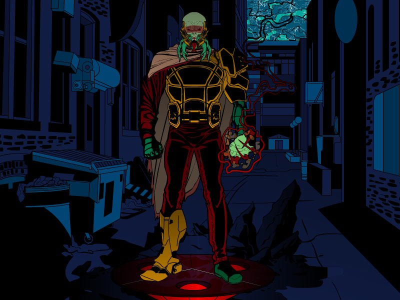
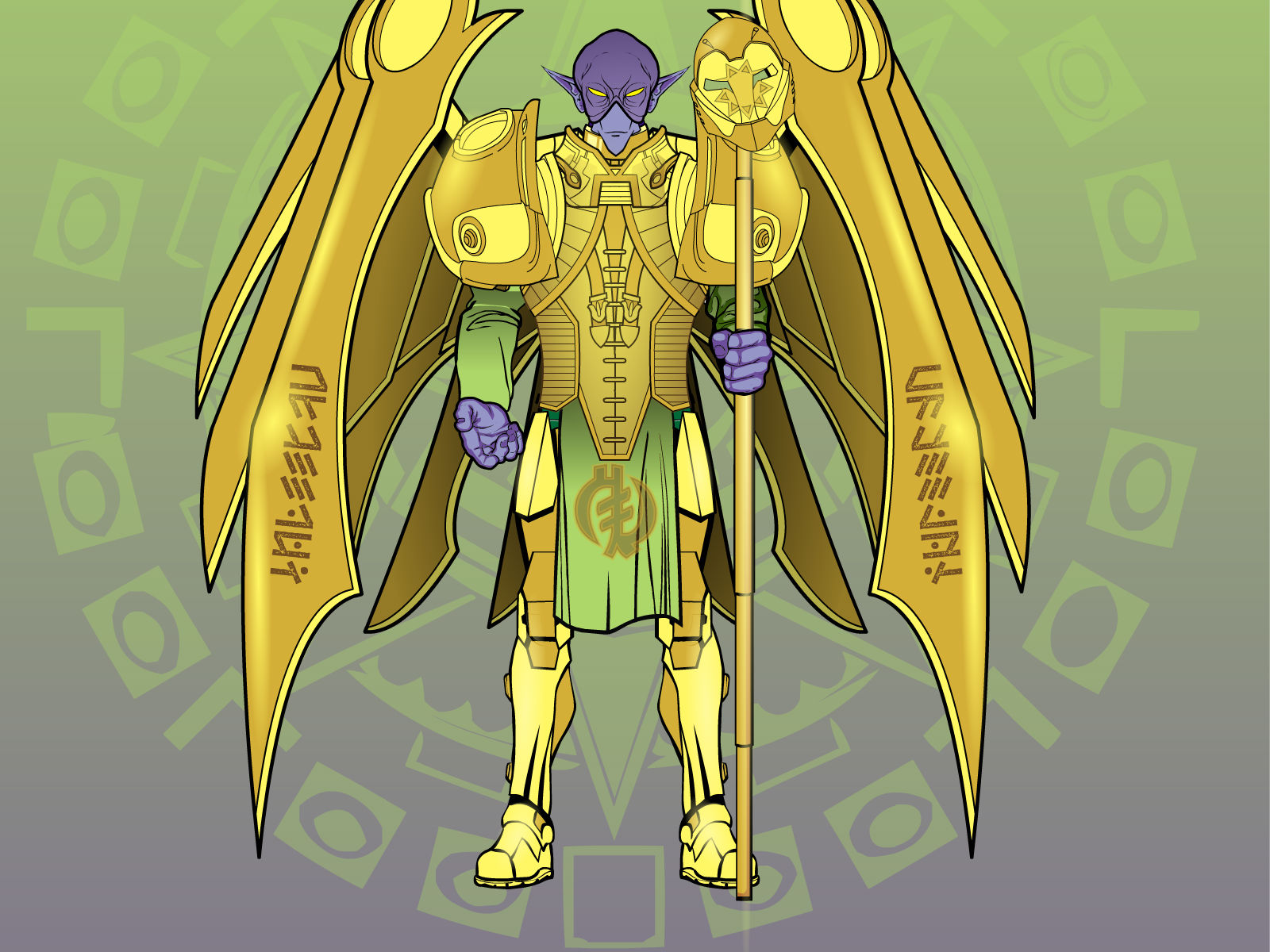
@Harlequin: I think I didn’t modified the size of the face or the head part, it just came that way… not noticing the difference in size you mention though, if you can explain it to me, I’ll be thankful : ) …’bout the lighting… yeah, its too basic, got to work on that a little more.Oh, and here’s a remake on Envoyé… its entirely different, but I wanted to correct it (It was just too plain boring)
Before (so u can compare):

Now:

Yeah, Its more heavenly now, but he’s still just from another planet. I tried to make the armor and accessories give the feel of advanced melee combat technology. Now he may not look evil at first, but, looking closer, his face gives him away. And, yup, I “unfrench’d” his name xD
He was sent to supervise an ancient experiment on mankind that’s been going on for thousands of years now, and its coming to an end…
That’s for now : )
ZerogarthMemberGreat remakes! : D Portal being my favorite so far, yet the last ones are more detailed… good work : )
…oh, and nice new creations too; The Boss, Alias the Dragon and Black Axeman are awesome!
ZerogarthMemberThings I noticed on your Wiki:
On Human’s History, 711 AD, when you wrote about the Moors u didn’t finish the sentence (the name they gave to their new home)… I readed it whole now, with the updates and everything (last time I just readed part of it… yeah I’m lazy -.- )… just a thought; I imagine those “random portals” to be generated on purspose by some higher beings, maybe following a plan or something… I assume you’re ahead of me on this one, but I mention it just in case… seems acordingly to a world like the one u’re creating… this plan may be made by a native race of Kairul’la (I liked the spelling Ximero suggested) or maybe an extrakairulean race…
Another thing, when you talk about “born lupi” u say that they are born from a human mating with a dragon, but u said before that humans and dragons couldn’t mate, that it was done by Kairul’la’s magic (I’m not sure ’bout with this one, maybe it’s just my lack of a better understanding of english… maybe I’m taking the second “mate” the wrong way by giving the same meaning the first one have, idk)Anyway, I like Kairula’s background a lot, it’ll turn out as a real deep plot at the end, I’m sure of it! …I will be following your updates, and try to make a contribution (or none if you don’t want to ,lol) : )
ZerogarthMemberI’m having trouble making original poses, but your’s are great : ) and the horsemen’s pose its the best one I’ve seen so far here on the forums, I mean, that’s the way u actually look when riding a horse (the pose, not the clothes and/or sword, lol) …anyway, maybe his left arm is too big compared to the right one, but that’s a technical detail, and has little to do with the pose.
peace!
-
AuthorPosts


