Forum Replies Created
-
AuthorPosts
-
ZerogarthMemberthanks superfan1, Vampyrist! glad u both liked it ^ ^
oh and Serenity, awesome movie… haven’t seen Firefly yet, but I’ve been told that it was great and somehow got cancelled… there should be more Sci-fi series around, I’m a big fan of the genre and I think we’re lacking good stuff lately (at least audiovisually speaking… haven’t read recent sci-fi books though)
ZerogarthMemberthanks ryan! : ) …looking at your last updates I guess that you figured all the lighting stuff out : P
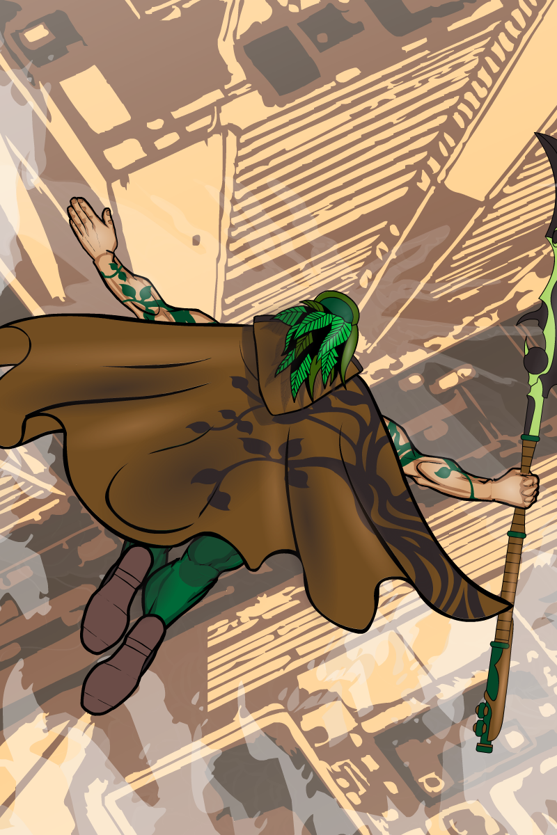
here goes another test, this time on posing and cloud effects…

“Falling Leaf”
…hope you like it : )
peace!
ZerogarthMemberwow… awesome teddy bear appocalypse scene hehe …great stuff : )
ZerogarthMemberBoth are really great, and the restricted city its specially awesome; its atmosphere really suits what you were aiming at, you’re good man!
ZerogarthMemberAwesomeness : P great stuff here, I dig your creations! …welcome back to the forums? guess you were there way before me, but anyway : )
ZerogarthMemberWelcome to the forums! Great characters so far; good composition and cool poses (first two look real nice)… liking your style : )
ZerogarthMemberAwesome style! And I like the characters a lot, specially the green knight and Alban… btw, while the remake of Vegas its more detailed and well done, I like better the atmosphere that brings the first design, its more original… though I should see a full body image of the remake to be sure : P
ZerogarthMemberWelcome! : ) nice characters, promising stuff!
ZerogarthMemberI appreciate your words ^^ …and you should try it indeed… you just have to look for silouettes that match the volume of the thing u want to put the shadow on… anyhow, with the scaling and everything, u can use a lot of things for shadowing the same shape, so its not as time consuming as one could have guessed : P (althought, finding the “perfect” silouette for the shadow does require a lot of time… that’s why I didn’t lookd for it, lol) …thinking about it, I know what could be a great add for the program: a free line tool and a color filler… wonder if that’s possible with the interface it has…
ZerogarthMemberShe’s actually a lot better… I still would put a little more bright on the background, but still, now she’s the main in scene…
hehe try not to overdo it with her, you might as well wait for the inspiration to come while doing new stuff : P
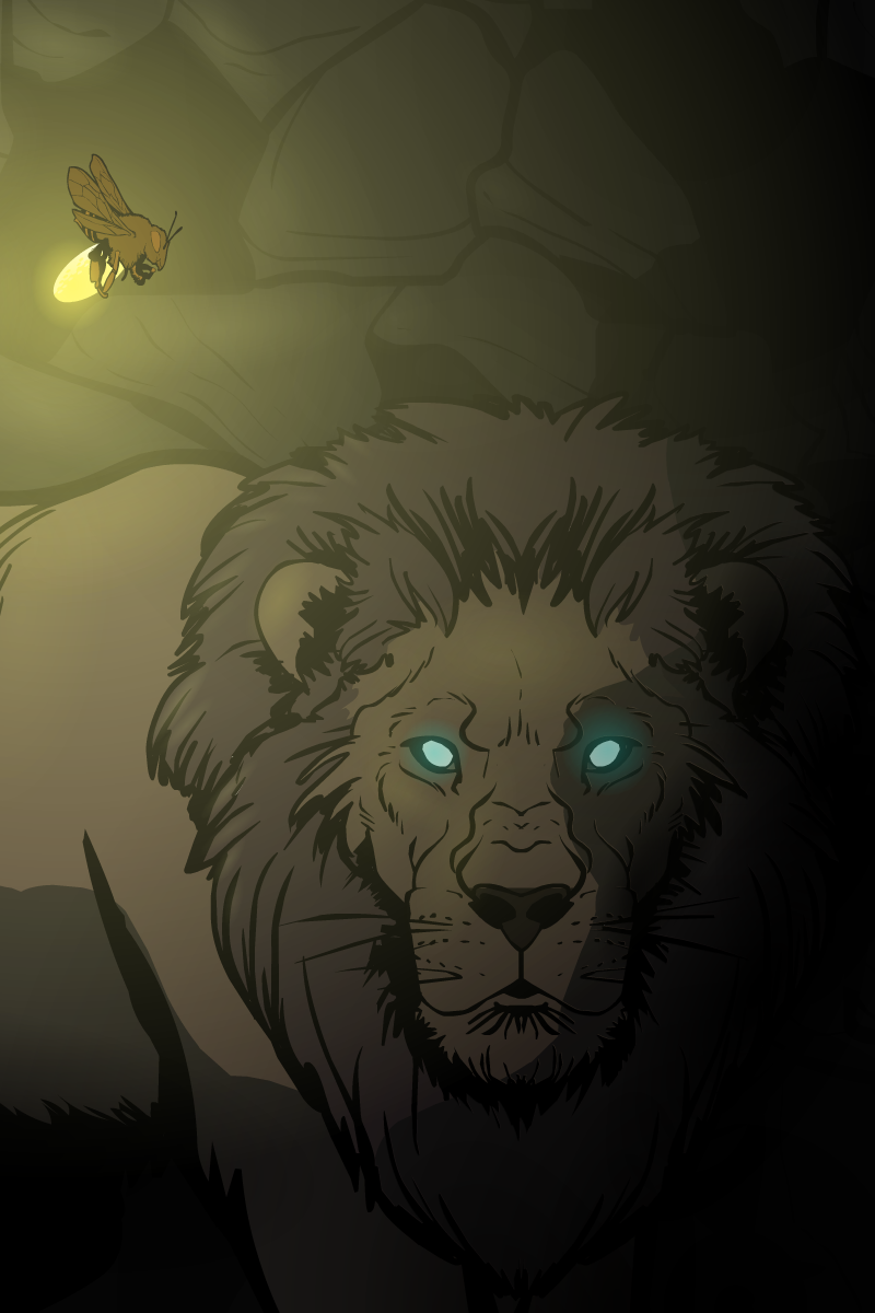
ZerogarthMemberThanks! ^^ …Used the conventional Background/Shapes/[Circle with glowing effect on center] (I suppose that’s what everyone uses for lighting, lol) repeated times… dozens of times, actually xD …and for the sharp shadows, just masked a horse head (entirely of one color, transparent, oversized and turned around, lol) on the lion : ) …I suppose its been done before, but it was a fresh new idea to me, and I think it acomplished its objective fine enough : P
ZerogarthMemberThanks everyone! : ) Looking it again, I really liked the composition on the new Envoy pic too, very simple but effective : D …I would love to do some Sci-Fi background story to go along with him… I guess I’ll do something when I have enough time…
…here goes a test!

I call it “Beneath the surface” (just like a Dream Theater’s song I dig a lot… guess that inspired me a little) …I tried the use of masking to make sharp shadows and practiced a little with the lighting effects… hope you like it! : )
ZerogarthMemberhehe I guess u’re right about the barbarian, I’m just attached to stereotipes when it comes to medieval/fantasy stuff… a bad habit really : P …’bout the knight, the lance its looking better, and so does the foot… but it still gives me the impression of being too close to the left one… maybe if u try moving the right foot further untill it’s between the horse’s two front legs (the separation should be proportional to the belly of the horse in that perspective for the legs to look right)
EDIT: just noticed your first horseman had the right separation! …that’s how it should be on the knight : ) …u should widen the saddle a little so u can give the left leg a wider angle (again, just like on the first horseman)
ZerogarthMemberhehe I knew u were ahead of me on the random portals, and liked the explanation… one can only speculate or try to put the pieces together, I like the mistery, it spices the story : P …the other things I mentiond were just in case u didn’t noticed (though I think I just misunderstood the born lupi thing… I’m working on my english as much as I can so that won’t happen too often xD)
oh, n I’m always willing to make questions, suggestions, to critic and speak my mind, lol. I’ll try to give all the productive feedback I can : P
ZerogarthMemberSoulLess and Mona Lisa are my fav’s, but everything’s awesome! : ) …and very original, nice work!
-
AuthorPosts


