Forum Replies Created
-
AuthorPosts
-
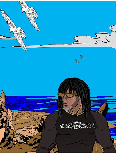
WMDBASSPLAYERParticipantThanks Vampy, but I actually did pose myself in front of my mirror in that position. The hand didn’t feel awkward to me. Anyways, I always respect the feedback. I might redo it with the other hand just to see. Here’s a self portrait I tried. My first from an actual picture of me. I’m in a seaside resort town in Italy, Castigleoncello.


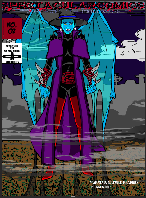
WMDBASSPLAYERParticipantAzura gets a cover. This one is 100% Hero Machine.

WMDBASSPLAYERParticipantThanks Tinker, but I used the correct hand for what I wanted. There are two hands in that position, the palm out that you show and the back of the hand facing out, which is what I used. If anything I could have moved it down a little more into the wrist.
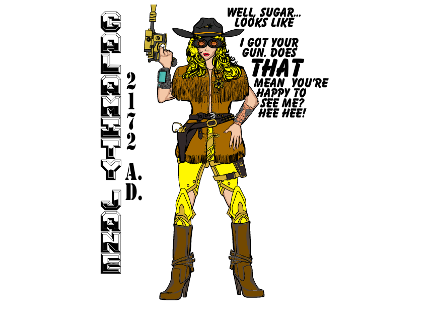
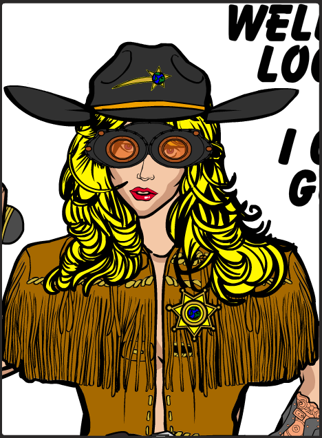
WMDBASSPLAYERParticipantJust something I was toying with. I really like the color of her eys so I had to do one without the goggles, though they help add to the futuristic vibe.


WMDBASSPLAYERParticipantI just noticed in my latest One Armed Bandit, I forgot to put the sword sheath under the shadow; Oops!

WMDBASSPLAYERParticipantLOVE IT, ATOMIC!!! Nice use of the set up “twist”! Totally didn’t think of one of the companions being the focus! Look forward more great stories!
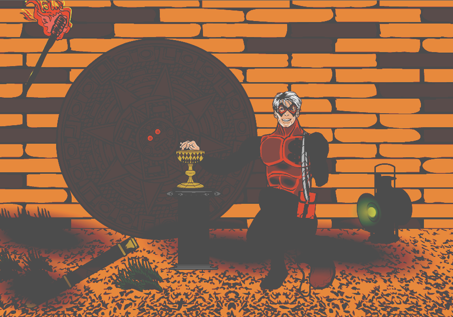
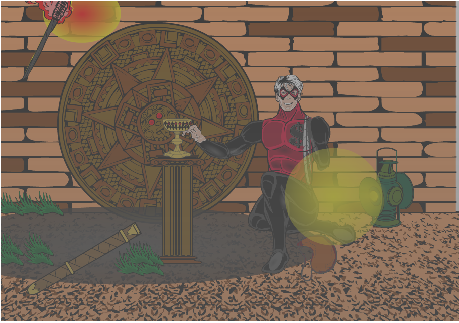
WMDBASSPLAYERParticipantLooking at the One Armed Bandit pic, I’m thinking that even with the shadows it’s still too bright, like he’s outdoors. I touched it up a bit and would like some opinions. The first image is 100% Hero Machine, the second was filtered with a free program, myPhotoedit. I’ve seen great lighting effects done with editors as well as all HM.


WMDBASSPLAYERParticipantGreat! So much with such simplicity! I can see a helluva full length story following this. Here’s another One Armed Bandit for you and after this I’ll try to make some urban scenes with him and Amy.

WMDBASSPLAYERParticipantGreat work! And the story is cool, too!
WMDBASSPLAYERParticipantThanks, you’re too kind. My stuff is pretty hit or miss. You probably didn’t see my earlier efforts when I first discovered HM, lol. My highlighting and shading needs a lot of improvement but right out the box you’re nailing it! Keep it up!
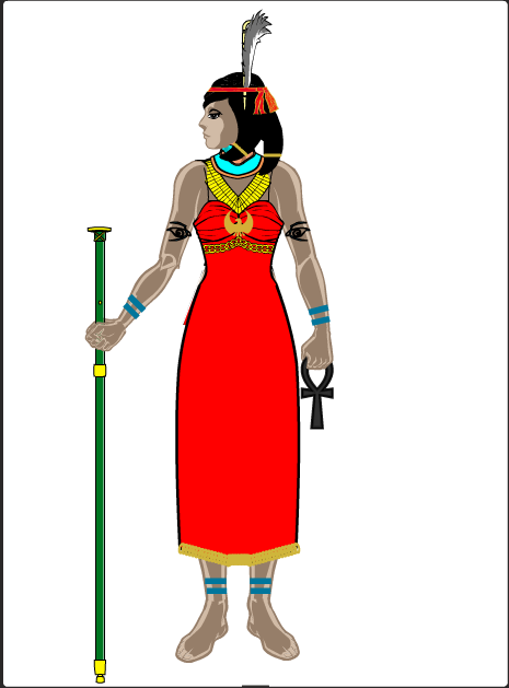
WMDBASSPLAYERParticipantHere’s something I was just messing with. Her name is Ma’at, of the Egyptian pantheon. Here’s a link to the Wiki-page with the image that inspired me as well as background on the deity and principles she represents. http://en.wikipedia.org/wiki/Maat

WMDBASSPLAYERParticipantCool looking character, DC. Really creepy! Can’t wait to see what Atomic does with him!
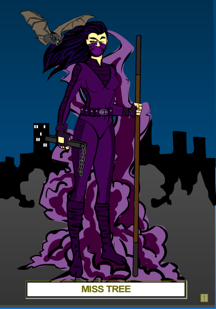
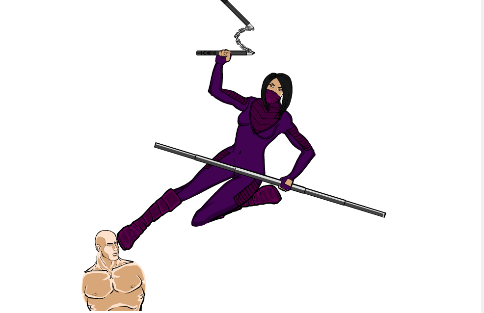
WMDBASSPLAYERParticipantHere’s an HM3 redux of Miss Tree, a play on ‘mystery’. I included the original to compare. Picture is still raw; no shading at all. I was focusing more on getting the position and implied action right.


WMDBASSPLAYERParticipantCool stuff as always, D. Sorry about the job situation. Maybe you can freelance as a graphic artist. I’m sure you might be able to find some musicians in the area looking for CD cover art, local stores that you could do advertising posters for. Whatever you do, I wish you the best.
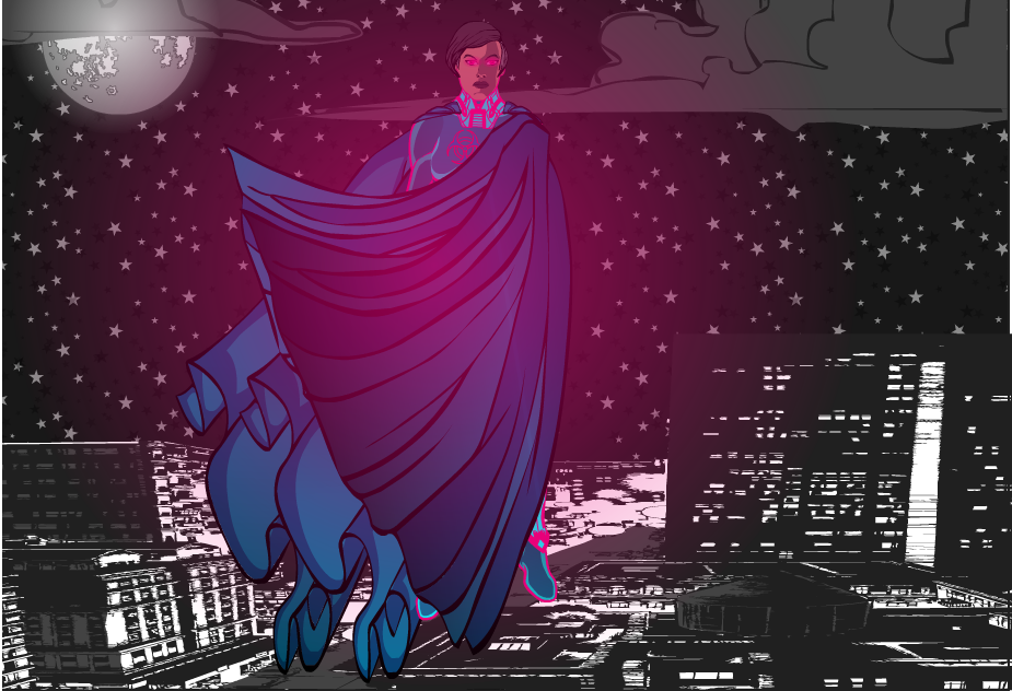
WMDBASSPLAYERParticipantOK, it took some patience and paying close attention, but I see that the parts Livewyre used in his cape pose were cape parts. It’s the way he layered them. Here’s another shot at Arclight in the flowing cape. Still not exactly what Live did, but I like the results, plus I think the background gives the picture a bit of a dramatic element.

-
AuthorPosts


