Forum Replies Created
-
AuthorPosts
-
vespertineParticipantThanks!
I’m definitely feeling better now. That was almost a month back. Yeah, I have noticed a lot of mentions of people going to the hospital on here in the last few months. Weird.
vespertineParticipantNug,
No, I’ve been taking another of my breaks from HM; that and I was in the hospital for a few days (all is well now).
I have to psyche myself up to get started again. lol
Does anyone know how to disable the option where you have to be logged-in to see the attachments? I can’t seem to find it now…
vespertineParticipantWow… Avatar and Linea… speechless!
vespertineParticipantWow. You have a lot of great characters! Old Thunder Blade and Knight are two of my favorites. I like how you shade your pieces. They really stand out from the background.
Keep it up! 🙂
vespertineParticipantOkay… so, I really need some help/suggestions on this one. It started as a sketch, hence all of the crazy lines towards the bottom of the dress. I think I got in over my head a bit, and I’m not sure how to progress. It’s been sitting in this state for several weeks now. The idea was to have the dress appear to be hanging in loops which then feed into the belt. Not sure if the desired effect is starting to show? I started out using ‘belt’ items for the dress, but after I added the male figure, I realized I could probably get a nicer effect using ‘cape’ pieces. Ideas?
I essentially used the same ‘model’ as I did for Rydia. I’m trying to focus more on costumes now, particularly atypical or unusual clothing; and I am developing a fascination for asymmetrical outfits as well. Anyway, I will probably be using the same character as a mannequin of sorts for a while as I focus on playing around with designing outfits. I’m also trying to focus on getting more *detail* into the clothes. Unfortunately, I didn’t really like a lot of the default body parts for females in HM, which started me to make my own figures, which, in turn, led me to making more exact clothing… so, maybe me being picky led me to this. lol.
Feedback (positive or negative) welcome!
Edit: Her left foot/calf is *killing me* Not sure how to fix… Also, the rings through the chest were inspired by one of the characters on Farscape. 😉
Attachments:
You must be logged in to view attached files.
vespertineParticipantLove your style! Zuwa, Darkstar and Cascade are all REALLY great. And Graven reminds me of Orko from the He-Man cartoons. 😉
vespertineParticipantDionysus, Flea, Gloom Oracle, Scalpel… So awesome! I especially like how the head is twisted to the side on Scalpel; it really makes the picture for me. 🙂
vespertineParticipantSo much awesome on this thread… My only gripe is the trend toward mecha stuff in the later posts (just not my cup of tea; though you do it *exceptionally* well). I really like how a lot of the characters of the SAoCE and Mysterious Outsiders gave me that “WTF?!” moment in their design. They’re so unique! They make me think of something I’d find in a good JRPG. 🙂 Either way, looking forward to seeing even more. Truly incredible work here!
Edit: Despite what I just wrote, Mech Suit: Breaker R3D maybe one of the coolest things I’ve seen done in HM. The character just LEAPS off the background.
vespertineParticipantI love Pathfinder (but I’m a sucker for black-and-red color schemes)! I like the little glowing vials at her waist, too.
vespertineParticipantCool stuff, Mad Jack! I really dig the vibe of “The First”; something a bit different for HM.
I also love how you did the side-by-side comparisons on the re-worked characters. You stayed very faithful to the original designs, while adding more detail. Nice work!
vespertineParticipantYour stuff is always inspirational! Love the shading and the patterns on “BLASTER-FINAL”. That has to be one of my favorite HM pieces so far!
vespertineParticipantI really like Replica! There’s great depth-of-field. The glass in the mirror looks tangible; I think the streaks of light on it really make it work. I would agree with Suleman that a mask on the wrist might be called for though.
There’s already a lot of improvement in your skills with HM since your first posts! Keep it up. 😉
vespertineParticipantThe other two versions:
Attachments:
You must be logged in to view attached files.
vespertineParticipantOkay, so it took a while, but I think I may have actually *finished* a heromachine image(s)… I’m way too distractable. 🙂
Here is Rydia, a character I have been working on (yes, I took the name from the old Final Fantasy IV game, which I played endlessly as a child). I included three versions. The one with the full background is the original. Then I tried to make it darker. Finally I decided to do without the background as it was getting too cluttered, IMO (and I still didn’t get it looking half as detailed as I had intended).
A few notes: 1) I imported the weapon as an afterthought from another image I made. Consequently, it refused to rotate properly and I had to drop a few layers that were being especially problematic. 2) The pose was originally intended as a ‘mannequin’ of sorts that I could play dress-up with. lol. So… the pose doesn’t feel as natural as I would like, but, oh well. 3) The style I was going for was more of an anime/manga style, but I’m still horrible with faces IMO, so hope I did okay? 4) In this world that Rydia inhabits, metal is not reliable due to strong magnetic forces; that is why all the buckles, etc, are *white*; they are made of the strongest material available to her culture: bone.
As for the character, she is an assassin. Her typical ‘top’ would be more of a ‘gi’, but the whole image was getting saturated with black, so I took the liberty of giving her a more colorful outfit. The clothing is largely velvet (in fantasy stories, thieves and assassins are always dressed in leather, which is both reflective of light and loud/creaky, which doesn’t make sense to me; velvet absorbs light and is quiet by contrast). Her blade is a hollow glass poniard-style dagger. The hollow design allows it to perforate flesh more easily, while the slimness allows it to fit between armor chinks. The hollowness also speeds exsanguination much the way a hollow needle does. If she strikes a vital artery, her target can bleed out in 30-60 seconds. You can’t see in this version, but in the original design of the blade, there is a score mark about 1/3 of the way from the tip of the blade which allows the blade to be broken off in an opponent, keeping the wound open and leaving shards in them to further then chance of assassination. She can also coat her blades with anti-coagulants to exacerbate the effect and prolong bleeding. The glass blades ‘socket’ into the bone grip (also wound in black velvet), so they can be replaced after each fight. She keeps more wrapped in individual padded sheaths worn at the hip/thigh.
Ummm…. that’s about it, I guess?
Thoughts? Critiques?
Attachments:
You must be logged in to view attached files.
vespertineParticipantAh… very cool.
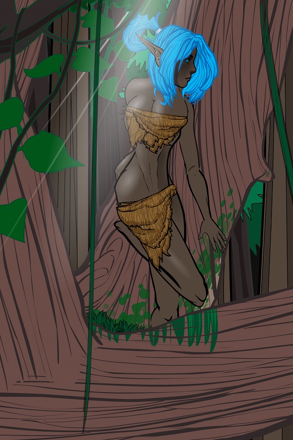
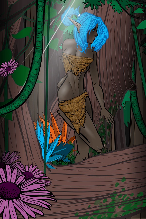
K. Here is my next in the parade of “work in progress” files. I’ve really been focusing on getting more dynamic poses and lighting lately. This is one of the better-looking ones so far. The pose took *forever* to get down. So much trial and error on this one… I want to make the picture a lot darker overall, but have the light cutting through the trees very bright; going for lots of contrast. I’m also hoping I can make the forest look a lot more dense with foliage, lichen, flowers, etc. As always, suggestions welcome!

Edit: I’m wondering about the neck/head placement. I was trying to make it look as if she is peeking around the branch of the tree. Is the neck too thick? Should the entire head/neck be shifted to the right side of the image? I know something is off, but can’t quite put my finger on it…
Edit #2: I adjusted the neck a bit. Tried playing around with some foliage to add some depth of field and color. Not sure I can justify the flowers at the far bottom of the image, but I do think they create some depth of field. I like the bromeliad-looking plants in the split of the tree. I’ve been told they tend to grow in grooves up in trees can catch the rainwater as it falls from the tree branches. I wanted create something exotic-looking. I’ll have to play around with the colors… I also wanted to see what it would look like if I made an umbilicus for the character.

-
AuthorPosts


