Forum Replies Created
-
AuthorPosts
-
ValyndrilParticipantFirst, nice pose, it looks very natural. It’s not over charged either, but the surrounding object make for good balance. There’s 2 things that really caught my eye: she has a very pretty face that has character and wow! the perspective on her higher leg is well done! (although its true that it should have been over the underwear, I know the limitations)
Its true that the community is quieter than I remembered, but then, having left for a year, I’m part of the problem. I’ll try to stay more active, as this community is a very nice, very enjoyable one!
ValyndrilParticipantHi JR! It certainly has been a while! Uni’s going well although it’s very demanding of my time and mind! I think I’ll hang around for some time, art is very helpful to get rid of stress. Lot’s of nice pieces here since my last visit!
Love the make up on Savage.
:
Thanks! I love when makeup artist mix trashy or savage looks with excessive luxury, I find the contrast pleasing.
I’ll try to answer the questions I haven’t seen, even if they’ve been posted for over a year (sorry guys):
May I ask what part(s) you used to make the rain in “I Will Protect You” ?
: I used a spoted floor part if I remember correctly. I put the opacity of the lines and of the floor’s background to 0, keeping only the spots somewhere around 30% opacity.
I absolutely adore the lighting!
: Thanks! I wanted her to have a silvery look, to make it feel as if she’s emitting the moon’s light.
Viper and Nug: Thank you!^-^It’s appreciated!
Thank you all for your nice comments, and I’ll try to finish the hacker and the dryad sometime soon!
Cheers!
ValyndrilParticipantHey all! It’s been a while, I know! University’s keeping me busy. On a stressfull day I came back to HM and got inspired by the contest so, here’s my entry for Savage Beauty! ^-^
Attachments:
You must be logged in to view attached files.
ValyndrilParticipantHi!
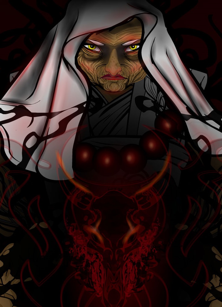
Have been really busy these last months, but I’ve finally been able to finish a picture! She doesn’t have a name, just a title. She is the Prophetess of the Moon. In my original campaign setting, she is one of the two leader of a society based on the worship of the Moon and the Sun. I will eventually do her counterpart, when I’ve thought about the general feeling I want to give to his portrait.
Thank you for your comments! And ams: The hacker will have tattoos 🙂 a lot of them!
Attachments:
You must be logged in to view attached files.
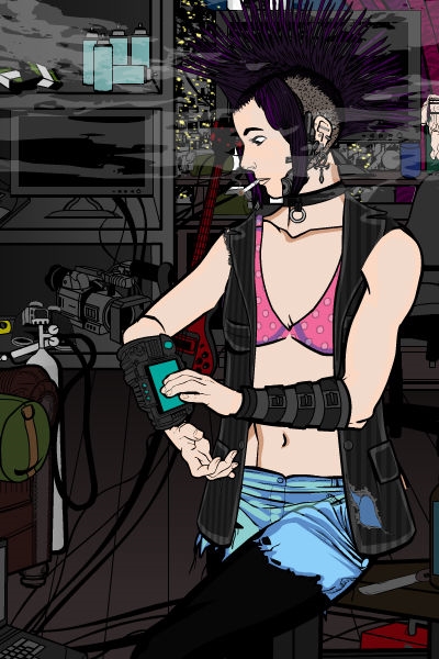
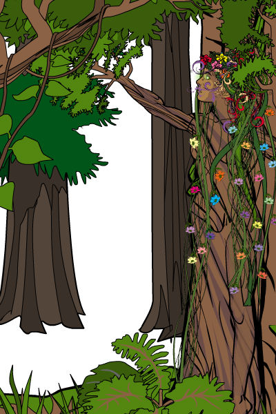
ValyndrilParticipantHello! I wanted to show you what I’m working on right now. Both pictures are not finished yet. I usually do the layout and the basic colors first, then add the shading. I wanted to try CantDraw’s shading process, so the basic colors will probably change for darker ones. If you haven’t seen his tutorial yet, I highly recommend it! http://www.heromachine.com/forum/tips-tricks-how-tos-and-guides/cantdraws-coloring-tutorial-part-1/#p42787
The first one is a OC. She’s a hacker usually living in small apartments or hotel room. Here she is in her temporary room, surrounded by her mess, working on a gadget to relax.

The other one is…well no one in particular I was inspired by a contest some week back that I saw to late to participate but that still interested me. I’ll let you guess what it is


Keep in mind that those 2 are WIP I’ll post them finished as I get around to do it. I’m working too on the thread started by Hammerknight about making oneself as a knight, and I’m very excited to draw myself as one…self portrait is hard to make, I think, but its fun, nonetheless.
I’ll post the link when I’ll be finished with it.Comments? Questions? I always enjoy constructive criticism, it helps me get better!
Cheers!
ValyndrilParticipantWow! It’s amazing! Your characters have such awesome poses, it makes a very dynamic picture. And your shading is fantastic! I’ve read your tutorial, and will try that method! Thank you for taking time to make that! ^-^
Just a little advice (and I may be wrong, take it or leave it :P) : Maybe put less contrast in the faces? For example, in the angel picture (which very nice btw) I would’ve put the highlight of her right cheek a bit darker and more diffused. And maybe more contrast to the hair
As I said, its only my little advice, and I may be wrong.
Anyhow, your art is awesome and inspiring!
ValyndrilParticipantGoth
ValyndrilParticipantVery nice art! Everything is so…clean, the colors, the shading… and I must say I’m impressed by your 3/4 pose which you use perfectly. Might have to use you trick to make boots in 2 different angle, I never thought about it before

keep on the good work ^-^Cheers!
ValyndrilParticipantHello all!
It’s been a while but I’m working on 2 other pieces. Thank you for the comments, I will try to incorporate these in my new pics. Here is my entry for the Indelible contest. It’s about a priestress who tried to remove tainting from a demon. Now, as she was succesful in this endeavour, she is stuck with it for the rest of her life. As always comments are appreciated!Indelible Taint

Thank you,
Cheers!
Valyndril
ValyndrilParticipantHello!
I’m here to claim my prize ^-^

The hand only, not the arm. Would that be ok?
Thanks in advance!
ValyndrilParticipantHiya!
I just saw this section, so here we go:
I’m Valyndril, I’m new to the forum, but I’ve been using heromachine for about 2 years. I know a bit how to draw and at first, heromachine was for me a way of brainstorming on my character’s appearance. Now I enjoy experimenting with HM a lot and I think it became a form of art by itself. I mostly got my tricks by experimenting, but I’ve recently started looking at other’s work, and it brings a lot of inspiration. I play D&D a lot and most of the characters I draw are either my own or npcs from the custom campaign setting my boyfriend and I created. I like trying to give my pictures a mood and a personality to my characters.About me, well, I’m a girl from Quebec, Canada. I’m 28, still at school, not due to lack of skills, but because I keep changing my mind about what I want to do for a living. I have a kid and a boyfriend. I like metal, techno and classical most in music, read a lot fantasy novels, play many videogames but dont watch much tv or movies… I guess that covers it ^-^
It’s nice to meet you all!
Valyndril
ValyndrilParticipantHello!
I want to start by thanking you for character of the week and hall of fame ^-^
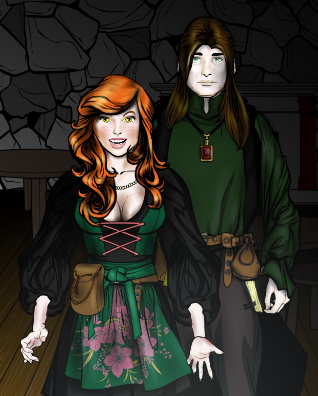
Here is a new picture I recently finished after a long time being forgotten. How to explain it?… in a d&d custom campaign setting I’ve created with my boyfriend, there’s a small city of necromancers that just want to live accepted amongs others, and not needing to be hidden. So the following represent an inn own by one vampire (with explains his paleness) and his sister. Its a moment before the inn is actually open, but make yourself comfortable we’ll be open for business soon!“Welcome!”
Original characters from a custom campaign setting.

As always, comments and questions are appreciated!
(AMS: I actually take it as a compliment, I’ve just saw what Zyp made, its pretty awsome, so thank you!)Cheers,
Valyndril
ValyndrilParticipantI’ve been using HM3 for around 2 years, maybe little more, but the first time I’ve shaded was 1 year ago. I was mistaken though, the first time I shaded was with Sheleigh, but the first time I shaded the hair and skin was with The Forsaken. With The Forsaken I was looking for a challenge: a weird pose and trying to make metal look a little bit more…metallic. By mistake I faded the line art on certain pieces of equipment and realized then that it gave it a shinier look, more reflective-like. So if I could make metal look shinier why not the hair? Because the pose made the character bigger I could give it more detail, and now I mostly always enlarge the characters.
I like to try out new things on every picture, and when it works I use that trick on the next. As for the trees for shading and dirt, I’ve used it the first time with “I will protect you” when I saw the newly added trees. I wanted a gritty look and couldn’t get it with smooth circle. For the rain I tried a floor pattern and it worked.
Apart from the faded circle that gave shading, the other thing that changed my style, was when I realized that lines are lines, meaning that, depending on how you place something it can look completely differently than the original angle. And the fact that my computer can easily handle 500 layers helps a lot too
And no, I’m not Zyp
I’m happy that you like my heromachine-made art and I’ll be happy to answer any other questions!
Valyndril
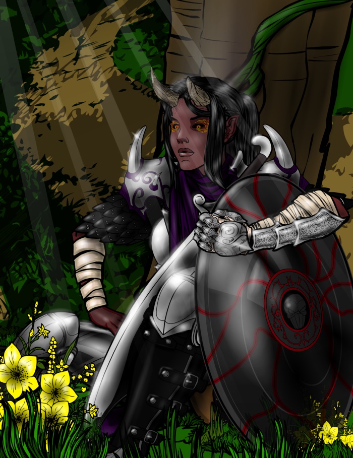
ValyndrilParticipantHello! Thank you all for the nice comments ^-^ Here is a piece I’ve made a while back. It was the first time I used the “fading circle” to make light and shadow. I got the idea to make grass from hair from the picture with the elven girl and the bird on the hero machine banner (sorry dont know who made it :s ) And Stulte, feel free to steal my tricks! :p
The Forsaken
Original character in a custom campaign setting

Don’t hesitate to leave comments or questions!
Good day! (or night)
Valyndril
ValyndrilParticipantVery nice work! I find your landscapes especially appealing.
-
AuthorPosts

