Forum Replies Created
-
AuthorPosts
-
UrbanVanguardParticipantI was hoping to finish my newest character before I went on holiday for a week but unfortunately I didn’t have time. Excited for the trip but can’t wait to get back and do some more heromachin-ing. See y’all soon!
UrbanVanguardParticipantNice! I love the subtle paw emblem on his chest. Something as small as this can make or break the character but it really defines him. Good job
UrbanVanguardParticipantThanks so much JR! I admire your work as well!
UrbanVanguardParticipant…and yes, I realise that in my initial design the colours of the two feet wraps are different. That was changed in the final design
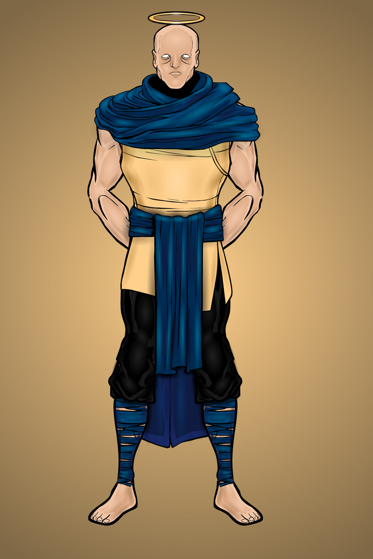
UrbanVanguardParticipantSo my next character is my third Champion out of the eight and he is the Champion of Restoration!

This champion is a master of the art of healing. Not only has he mastered multiple forms of medicine and treatments but he has the amazing ability to heal himself from almost any injury. Although it may look like it, he is not blind… he simply has all-seeing eyes. To be honest though I just thought the eyes looked cool, lol.
The design of this character was originally an angel (hence the halo). However I thought the wings cluttered the design and added a dimension that wasn’t needed. I’ll attach an image of my initial design to show you what he originally looked like. I also removed the pattern from his robe as I liked it better without.
I think the contrast of the navy blue to the pale, sand yellow looks good and gives him a regal look. Perhaps I could have tried a purple colour for his robes but that might not look as good. Something to consider for next time I guess. Anyway, I liked the way he turned out although he isn’t one of my favourites.
Attachments:
You must be logged in to view attached files.
UrbanVanguardParticipantThanks Anarchangel – your work has inspired me alot!
UrbanVanguardParticipant@Vengeance thanks! I love trying to shade flat objects to make them look 3D and the simple design I felt simply fit the character but I really dig it!
@Suleman I agree that while it looks good, a lot of the detail just kind of blends in. Maybe more simple shading is in order… although to be fair, most of those layers are on his trident as I had a highlight and a shadow on every bead of his staff. I’ll also try a different line colour for the fish net. I don’t really ever change the line colour as I like the contrast that the black lines give to the background but then again the fishnet isn’t on the background so I’ll defin try it!I see where you’re coming from with the perspective. I’m not that great at posing so it was kind of a basic attempt. I probably won’t bother fixing it but in future I’ll look at making them seem more accurate, perspective wise. Thanks for the input, I really do appreciate it!
UrbanVanguardParticipantFor this character I decided to take a break from creating my Champions and create something different. So for my next creation, here is Poseidon! Greek god of the Seas and Oceans!

The design for Poseidon consisted of almost 600 layers as I was trying to give his pants a silky-oceany look to them. I also forced myself to shade every little bead on his staff in order to satiate my OCD :p
I felt like his hair and beard turned out alright. This is actually the first character that I have posted with hair and I wasn’t sure if it would look good but the blend of whites and greys makes his hair look more realistic to me.
I was also really happy with how I made his fishnet robe thingy. I used a robe piece from ‘male medieval common’ and then made colour 1 and colour 2 transparent. I then added a pattern to get those lines and I think it really completes the ‘god of the sea’ look. What do you guys think?
Hope you guys like this one. If you have any suggestions on what gods you would like me to make next feel free!
UrbanVanguardParticipantWoah, Dr. Magus is striking! I also really love your subtle shading, it really gives your characters a unique feel to them
UrbanVanguardParticipantThanks gjc6664, before I did any shading I wasn’t sure how the colours would look because they looked kind of bland but after I started shading I really began to like it.
UrbanVanguardParticipantAwesome work! I love all the backstories that you put on every character, I read every one of them and I think they’re all great. I really like the inclusion of a camouflaged Chameleon, it’s a nice touch.
A name for Ember could perhaps be Aidan (Gaelic origin meaning ‘fire’). I like it… what do you think? Not sure of a last name though.
Anyways, awesome work! Can’t wait to see more!
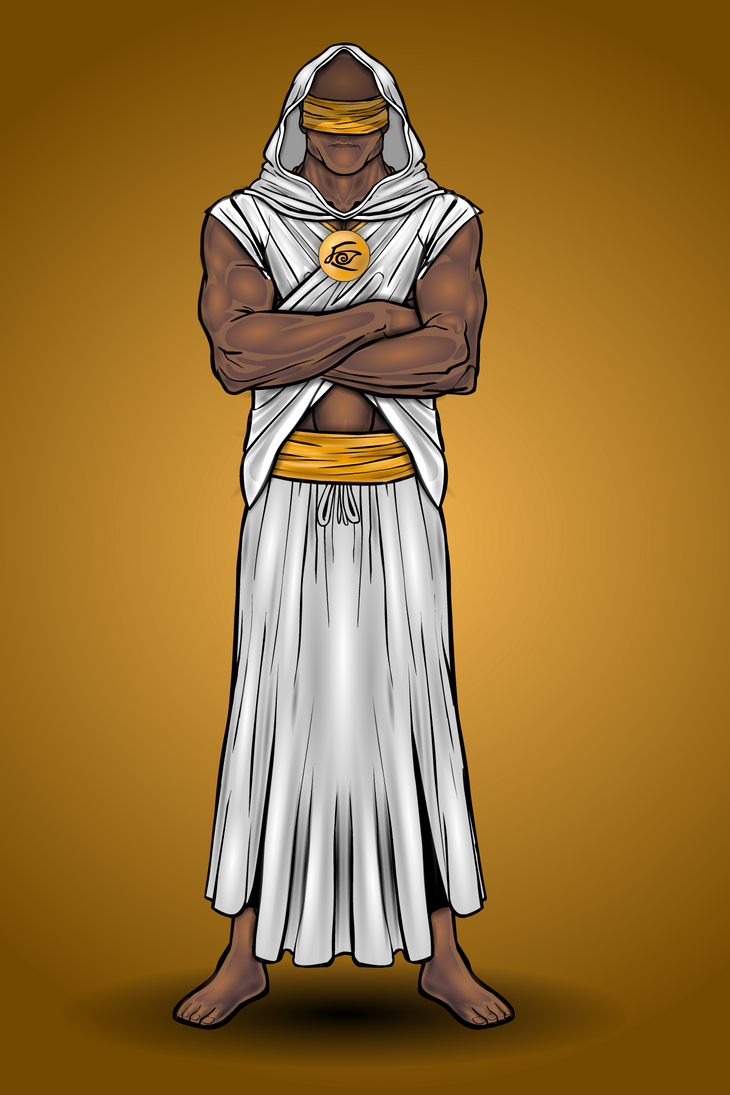
UrbanVanguardParticipantSo here is my second character. Once again, he is one of my universe’s Champions. I give you – The Champion of Insight (Ironic seeing as he is blind)

This character took a while to get right. The robes across his chest required a lot of masking to be able to go both over and under the arms. I believe the design consisted of nearly 300 layers but I could be wrong. The shading on his robes took quite a while but I think it turned out alright. What do you think?
I picture this character to use some sort of telepathy to see into peoples minds and to “feel” what is around him. He is a secluded and secretive guy and is sort of like an old sage character. I hope you like him and stay tuned for more characters to come!
UrbanVanguardParticipantThanks Suleman! I’ve tried using custom colours before but it never really turns out the way I want it to. I probably just need to practice with the hex codes more. I’ll play around with it and see what looks good.
UrbanVanguardParticipantNot sure for this is the best place to ask this but i was wondering if any of you amazing people had any suggestions on the colour of peoples skin. I was partially satisfied with the colour and shading on my previous character but any suggestions. Especially for darker skinned characters as that is what I’ll be attempting next. Thanks!
UrbanVanguardParticipantThanks so much! I’ve taken a lot of inspiration from your amazing art, AMS.
-
AuthorPosts


