Forum Replies Created
-
AuthorPosts
-
HarlekinMemberIntresting pictures here and i like the improvement, but tell the truth you very near the border of the censure.
HarlekinMemberThe idea good, execution is good, overall is good. This is a good picture. Really good.
HarlekinMemberYou ask it, i do it.
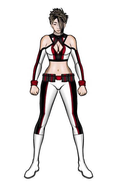
I hope you like it.Lauren Keiler – Harlekin Version.

HarlekinMember@prswirve said:
@Harlekin said:
I like your works, but don’t know why for me your body scale is something not correct. BTW i don’t know why. The last hand draw is nice
Thought i wanna comment, but nevermind ‘coz i might say something BAD. Cheers!
No problem do it, the “masters” are do in the past. I tell the truth no one perfect here, either me. I really like your works, and i think if you give a little bit more time the body scales the pictures looks more dramatically and cool. If you think this is a critique than see for this critique, but not negative more like a building critique.
And the archer is looks so cool. I like de picture dinamic. Nice picture.
HarlekinMemberI like your works, but don’t know why for me your body scale is something not correct. BTW i don’t know why. The last hand draw is nice
HarlekinMemberFor that effect to made liquid metal need to transparence the black and white.
Nice pictures. Nice improvement.
HarlekinMemberhttp://www.melissaevans.com/tutorials/colouring-line-art
Use the force of Jeff young padawan

HarlekinMemberI sacrifice

I made a post in this topic to the attachment resize. If you go back you find it. But this is better because you made the example more clean.Thy Thy great job.
HarlekinMemberCritique.
So the first cover.For me the Lady dress is a little bit plain and too dark to the character a little bit lost in the composition. And need to mask the eyebeam to not goes out for the frame.
The second.
Little dizzy the colouring work. The aura, the cloth and the beam color is the same and the too light font colour made the picture confuse a little.
Advide.
First Cover.
So need to use little item and masking to made the cloth a little more attractive. And if you use dark background use light zypping behind the character or lighter outlines. The eyebeam is cool but masking in a square insignia to not goes out for the cover frame.Second Cover. Play a little with the colors, The same color schemes are confuse the eyes. I first don’t see to what you give the clothes because the “pink” or “purple” is to dominated. The title are also lost in the composition. I think if you change the fonts color, like red or yellow is more effective, and transparent the colors.
I hope this helps you, no one born artist, need to practice and find the borders of what you can do with the program.
HarlekinMemberAtomic Punk i personally enjoyable your stories. I give you my permission if you find any of my illustrations good to give a story than pls do it. I’m not good with the english but i think my illustrations show what i want to tell it.
I personnally want to see what you think for this picture.

Előre is köszönöm, Your stories are greats.
HarlekinMemberI usually use Ms Paint, for cropping. I do fullsize view and printscreen and paste in Ms paint, this is the most easiest method.
HarlekinMemberWelcome to the forum
HarlekinMemberWelcome to the forum.
HarlekinMemberTo tell the truth your whale and bicycle story is the only real original work here. Great comic work. I love the joke comes out for me without any side story. Great and very complex work. The best what i see here.
Csüsz
-
AuthorPosts


