Forum Replies Created
-
AuthorPosts
-
HarlekinMemberIntresting use of the companions. Nice, really nice. My favourite is the Red Reber Army picture.
HarlekinMemberSo not a bad picture. I like the coloring but i think the background gives a little crowded. Too many brighter thing and the character a little missing in the picture. – The clothing is nice work. And in the face – next time try out to made the white zypping a little saturate (30 – 40). BTW very nice character story and you catch the freezing part of the character. Nice keep on going.
HarlekinMemberHello in the forum. Interesting characters. Nice start. Keep on going.
HarlekinMemberSo i have the question.
I use brighter outlines. Sometimes that give the feel the 3D effect. – So i think for two thing try it out and you see wich is perfect for you.
So my first advice try out a brighter outline for the character. (Maybe lighter black or grey).
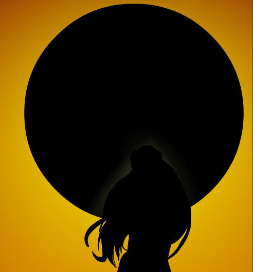
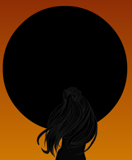
2. give a little zypping (shading for that body part wich in front of the sun) (a little white shade is good maybe the transparency is 30 – 25) –A little tutorial picture how i thinking.
With Shade

With brighter outline

I hope that helps you
HarlekinMemberNp. I glad to you like it.
HarlekinMemberThanks your request. I hope you like the result. I very like it.

HarlekinMemberNice work. Very good color work and the legwear is fantastic. A little advice try out next time to give a little darker zyppin the eye are. Great work i can’t tell more.
HarlekinMemberWowwww. Very wowwww. Nice picture. Very good perspective and complex work. Great idea. I have a very simple problem the sky color is very similar with the golem color. The plan is awesome. Great work Meniukas, great work.
HarlekinMemberNice one, i think you give a little to many more item in the belt area. But the pose is very good. Keep on more.
HarlekinMemberOverally a great picture. For me the face a little bit masculine. And if i made a made little bigger the upper body to shown more the perspective. But i tell overally this is is a very good picture, The background work is very good. Nice work, really nice.
HarlekinMemberI can’t resist, but very good idea M.B. or Genesis, i find my first ever contest entry that is my first honoraly mention. Omg 2 years ago when i first find HM3, long time very long time.
HarlekinMemberWelcome in the forum, nice start, keep on going more.
HarlekinMemberI missing a puppet on a string.
Nice picture. I like his face expression.
HarlekinMemberI think my favourite is the storm wizard. Not an ordinary character. Very unique character concept.
HarlekinMemberFirst welcome in the forum.
Hmmm. Hmmm. Very very nice. Really nice.
1. The Werewolf acocalypse picture is overally is really good picture. I can’t see any mistake maybe only the pose a little.
2. Something with her face is not correct for me, but this is only my opinion.
3. But i think Hilds is awesomly good picture. Very good character picture. I love her face.
(I redhair fanatic, so not problem with that
 )
) -
AuthorPosts


