Forum Replies Created
-
AuthorPosts
-
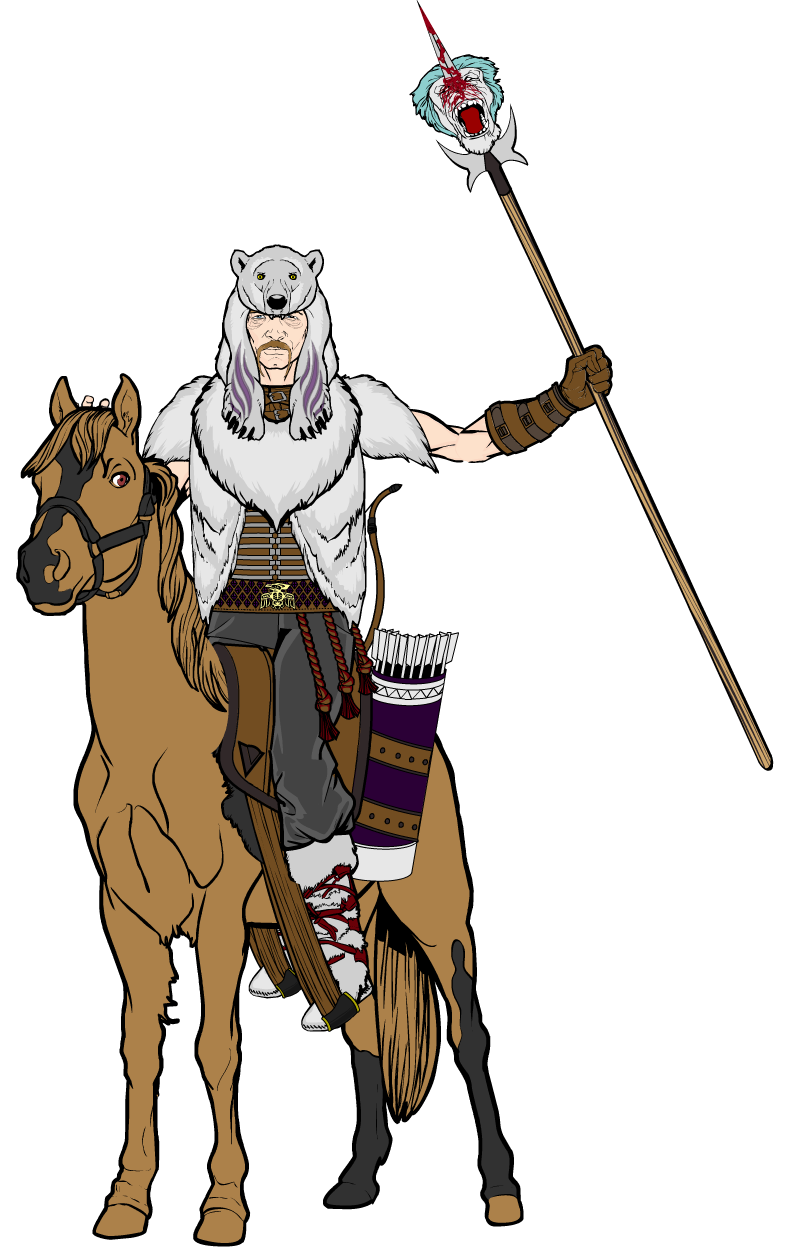
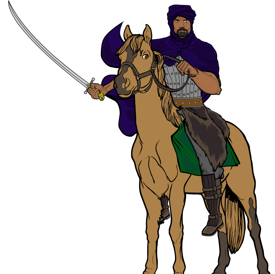
SulemanParticipantThe barbarian is intentionally sort of small. I was going for a mongol vibe, since they were riding nomads. There’s no reason why barbarians would have to be terribly big. Anyway, he might not be Arnold, but he’s tough as old leather and has done nothing but ridin’ and fightin’ since he was born, so he’s very, very good at what he does.
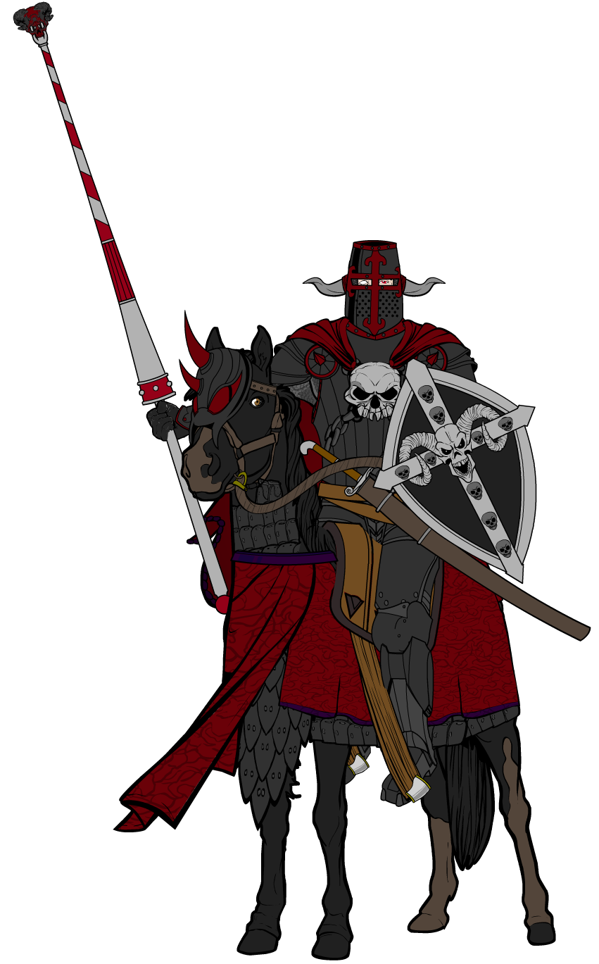
Alright, here’s a tweaked version of the Skull Knight. I moved the right foot a bit further away and I changed the lance somewhat.

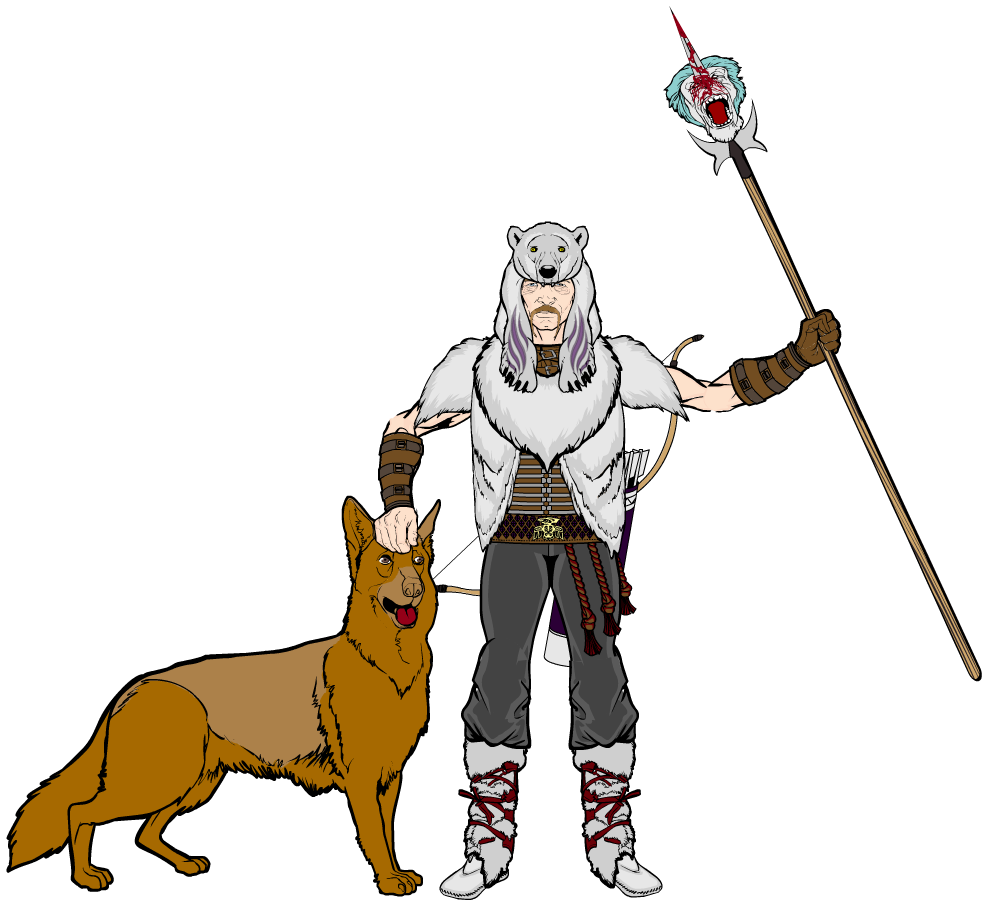
SulemanParticipantWhile I’m at it, have a standing version of the earlier tribe champion character. Also featured: dawg.

Yeah, this was pretty lazy, but I just wanted to see how the character would look unmounted.
SulemanParticipantThanks!
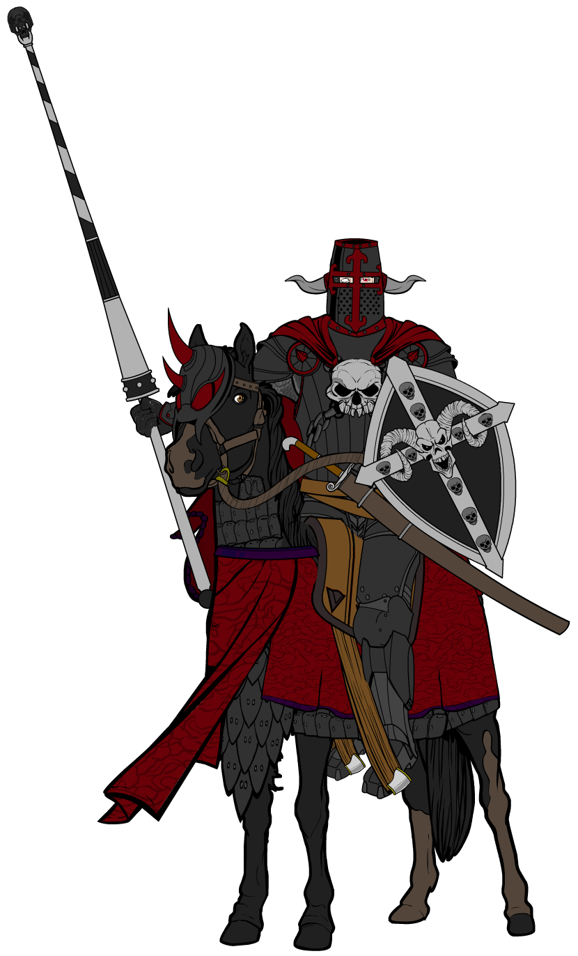
Which parts in the masking do you think need work?Here’s a third horse riding character. This time, it’s the evil Skull Knight, about to joust with the hero of the story or something.
I put a ton of detail work into this one, such as the barding, the reins and a whole lot of other things. Maybe even too much detail, I dunno. I think it turned out alright!
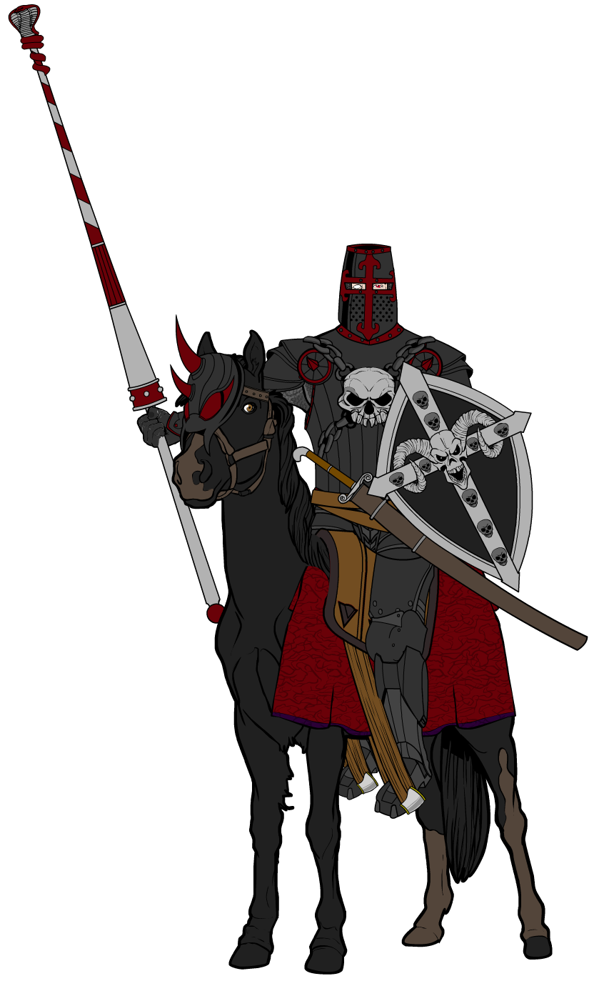
As an added bonus, here’s an alternate, earlier version, with a different kind of lance and far less detail.

SulemanParticipantThese are great! I really like how you use the existing items to create your own things rather than taking them as they are. Even Krieger, possibly the most basic design out of these, still looks unique. The backgrounds are neat, too. Simple, but effective.
SulemanParticipantUsed that as a base to create a new horse riding character. This time, some sort of barbarian champion. Who knows, maybe I’ll try and make some more riders. Like a knight, perhaps? Or a mongol horse archer? We shall see.

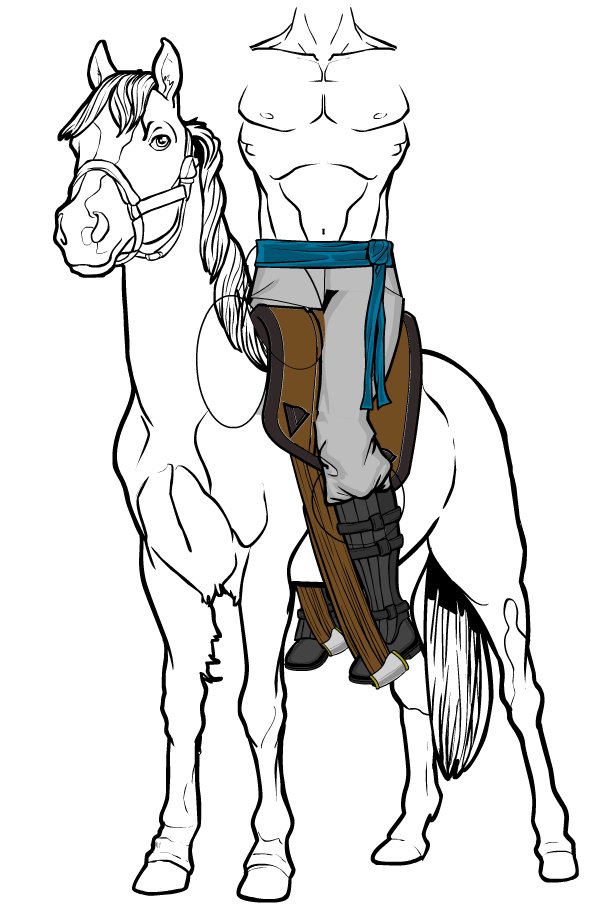
SulemanParticipantI decided to try and make a saddle in Heromachine. Here’s what I’ve got so far.

SulemanParticipantAwesome background, man. It’s pretty obvious that you, unlike me, actually understand something about art, judging by your skill with shading and… let’s say the “big picture”.
What I mean by that is that you not just make things look good close up, but the whole design actually works as a whole, and the colors and pieces mesh together really well.
Keep up the good work!
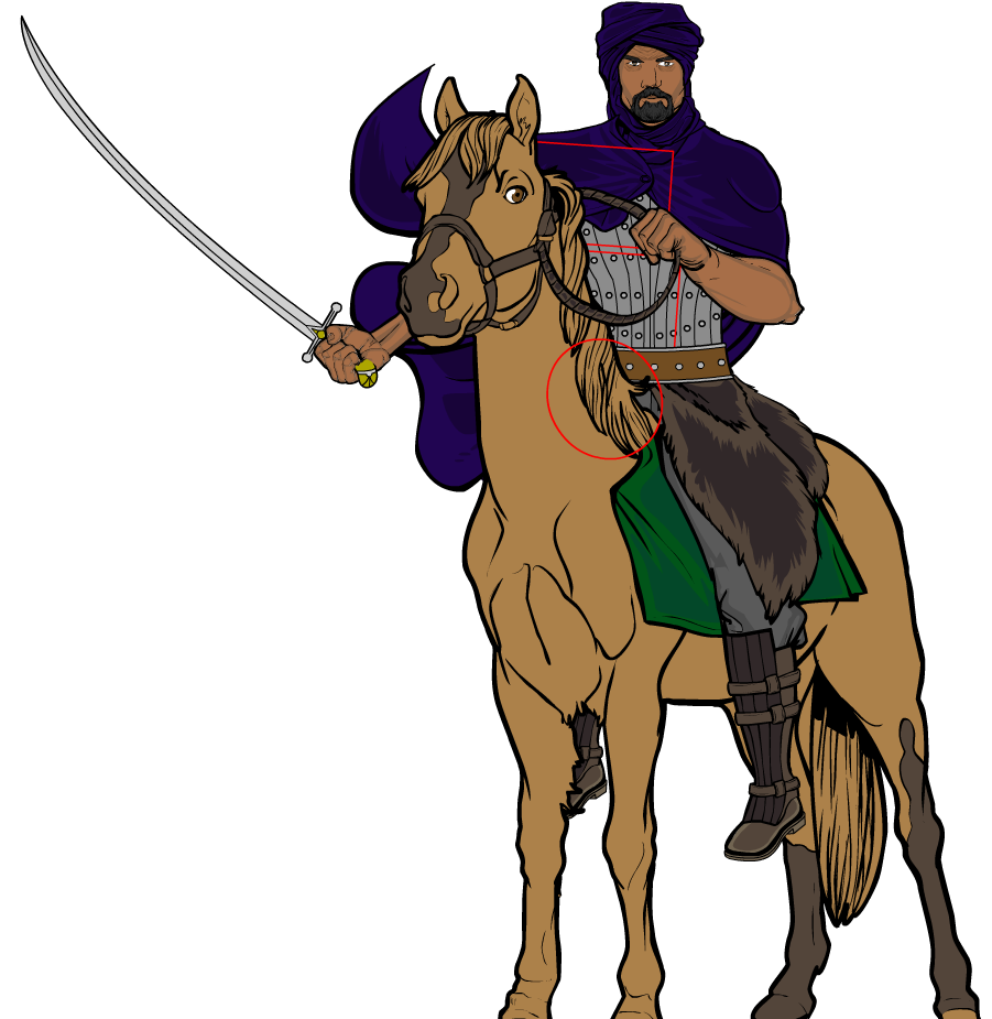
SulemanParticipantThe pants and the… let’s say saddlecloth, for the lack of a better word, seem to disappear because I’ve masked a horse on top of them. I made a copy of the horse with the exact same size, location, etc, and masked it on that red circle you see in the picture.
That way it goes neatly on top of the crotch, the belt and so on, without going above some other elements. It’s very handy in some situations.
The two red rectangles show where I masked two ropes to make the reins. I wasn’t satisfied with any of the available items (belts or such), so I improvised.
SulemanParticipantThanks!
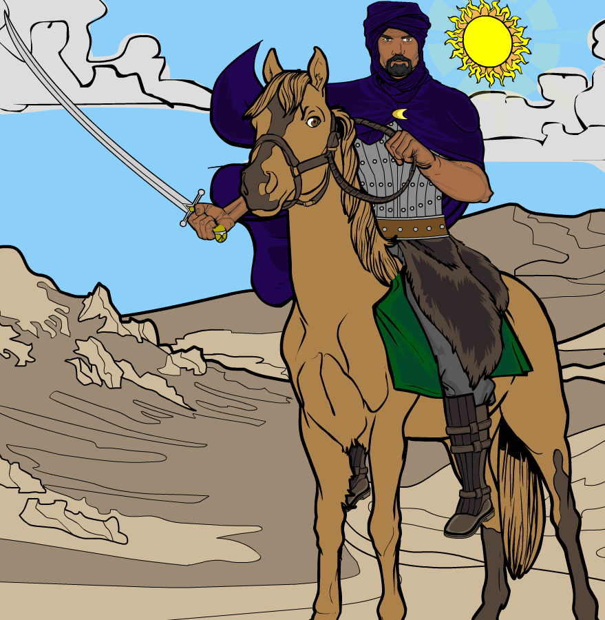
The horseman’s pose is actually pretty simple. It doesn’t actually differ that much from a normal standing pose. The horse I used is far easier than the one in the Companions-Vehicles section. Now if only I could make stirrups and a saddle.As an added bonus, here’s the rider with the masking shown and with a quick background. I made the left arm smaller, and I agree, it was a bit too big before.


SulemanParticipantWanted to try and make a character riding a horse. I’d say it turned out okay.

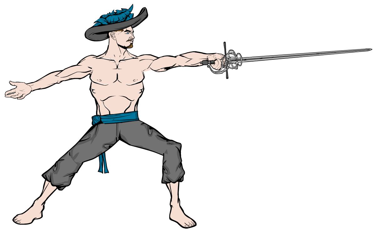
SulemanParticipantThe hat was the only angled hat available, I’m afraid. The others would just look like fedoras or cowboy hats. Let’s just say he’s a really flashy pirate and leave it at that.
SulemanParticipantSecond picture in the rapier posing set.

I’m having some trouble with uploading these, and the edit code seems to be broken when it comes to images. Oh, well. -
AuthorPosts

