Forum Replies Created
-
AuthorPosts
-
SulemanParticipantNice! That’s some creative use Heromachine! The colors are pretty incredible. That really is one of the best HM pieces I’ve seen, as a whole. The mexican theme and the colors remind me of the Black Velvetopia level in Psychonauts (one of my favorite level designs in one of my favorite video games).
Really, if there’s one thing that bothers me about it, it’s the disconnection at the right wrist.Some way to either smooth out the line at the wrist or cover it would make it even more immersive.
SulemanParticipantHmm, alright. Lessee what I can do.

SulemanParticipantHow about this, then? I’m completely new to skin shading, basically, so I have no real idea of what I’m doing.

SulemanParticipantI wanted to try out some skin shading. Looking good? Needs more work?

SulemanParticipantOoh. The asymmetrical symmetry of the tattoos is really great, especially with the careful skin shading. I especially dig Sarah’s physical transformation and Nate’s shirt.
SulemanParticipantCool! I like what you did with the cloak. The combination of the pattern and the transparency is pretty smart.
SulemanParticipantGreat work! I especially like Feres, Fai-Mer and The Aniean.
I really like how you use pastel colors so boldly. It really gives these a unique touch.
SulemanParticipantThat’s a nice, clean design. Lots of fantasy designers tend to go overboard with the little details (e.g. Wayne Reynolds), but this is just about right. I’m also digging the hair!
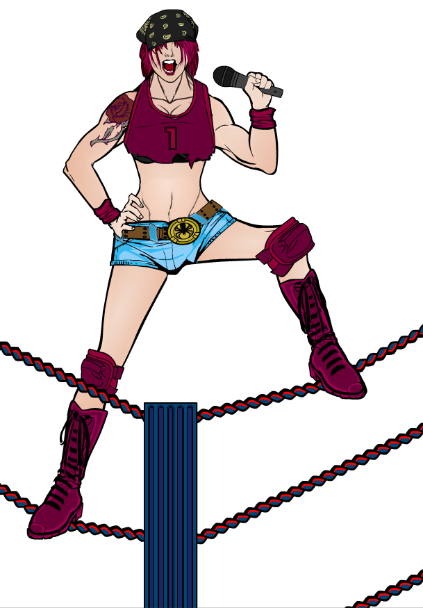
SulemanParticipantOkay, I guess I’ll use that as the definitive version, then. Here is a slightly altered version.

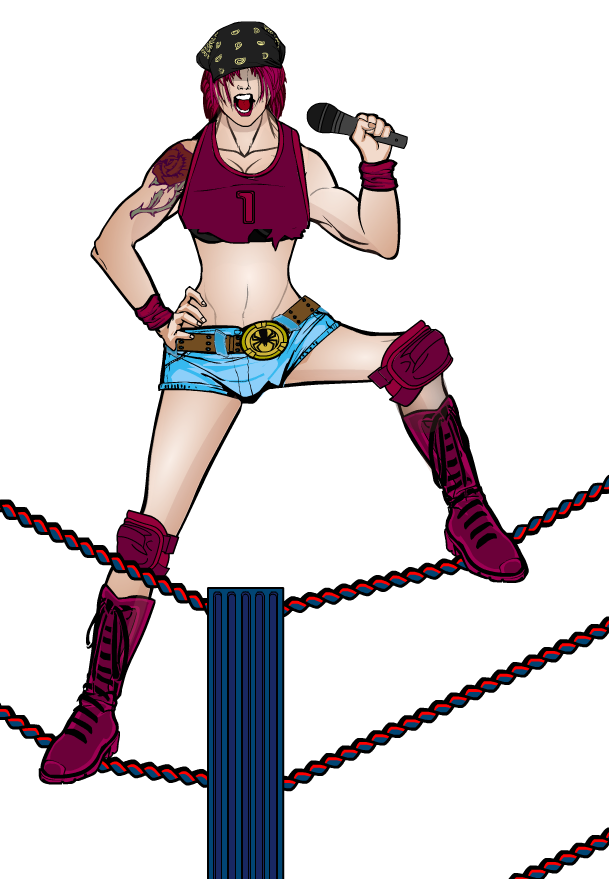
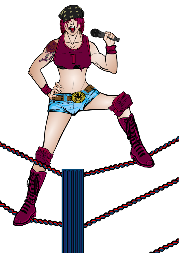
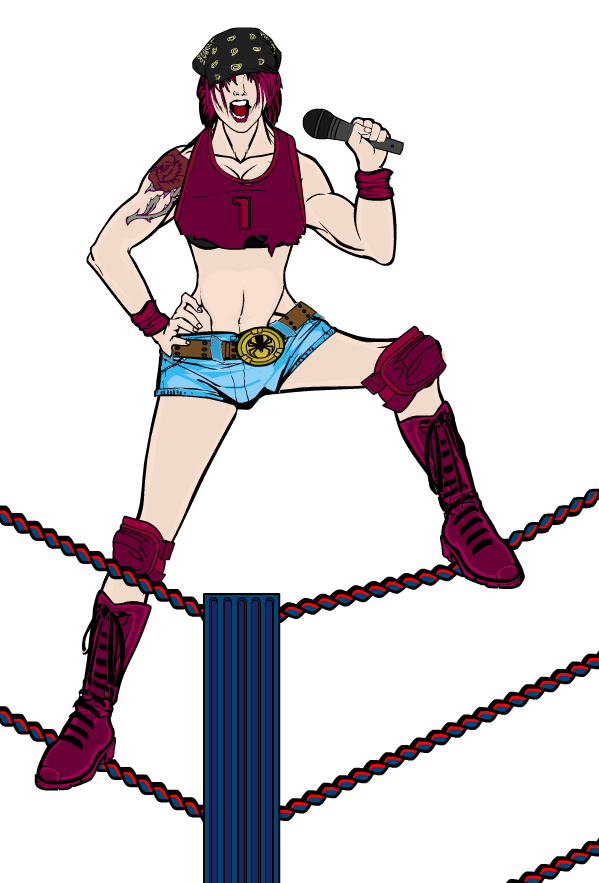
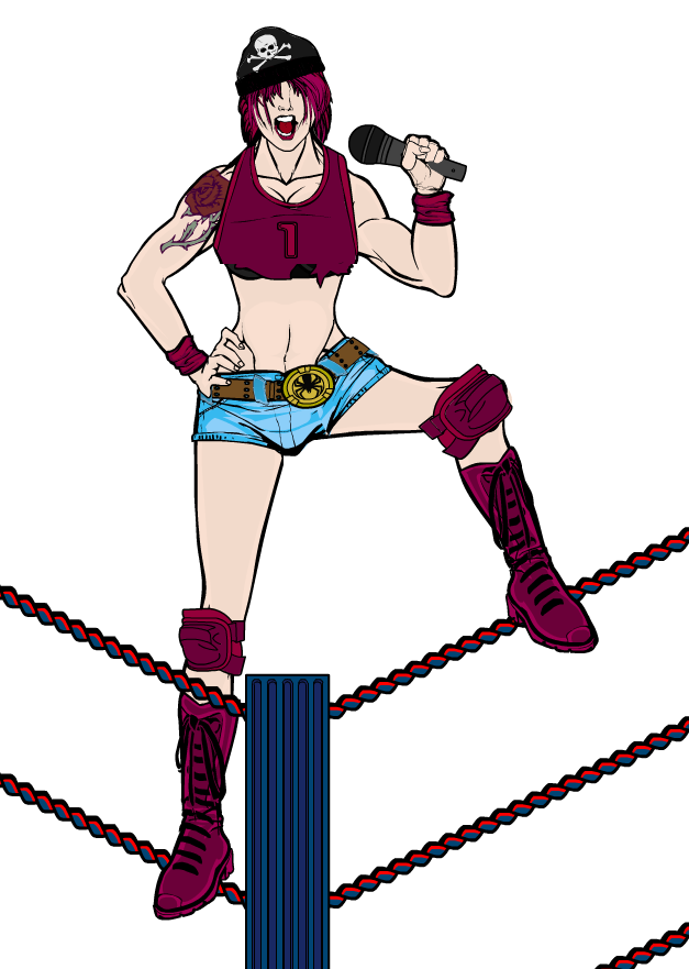
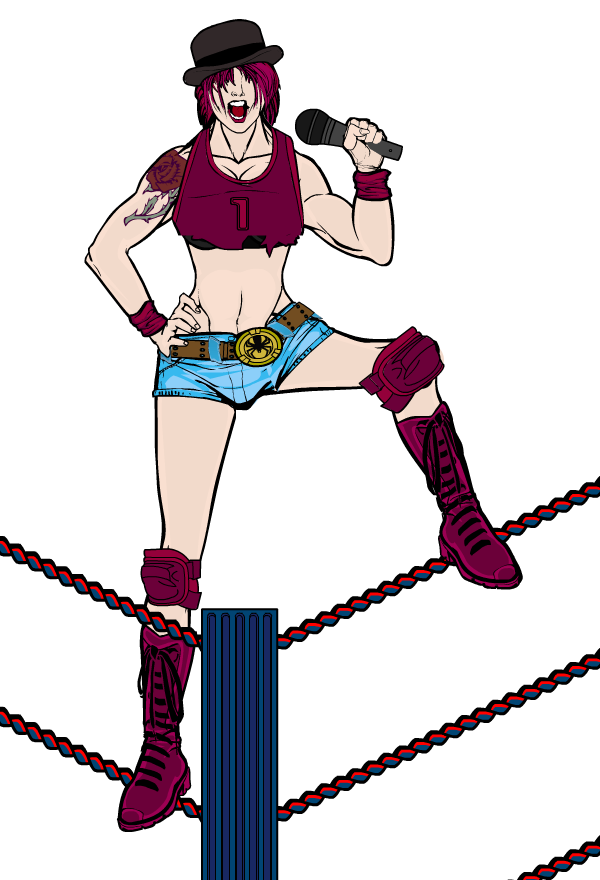
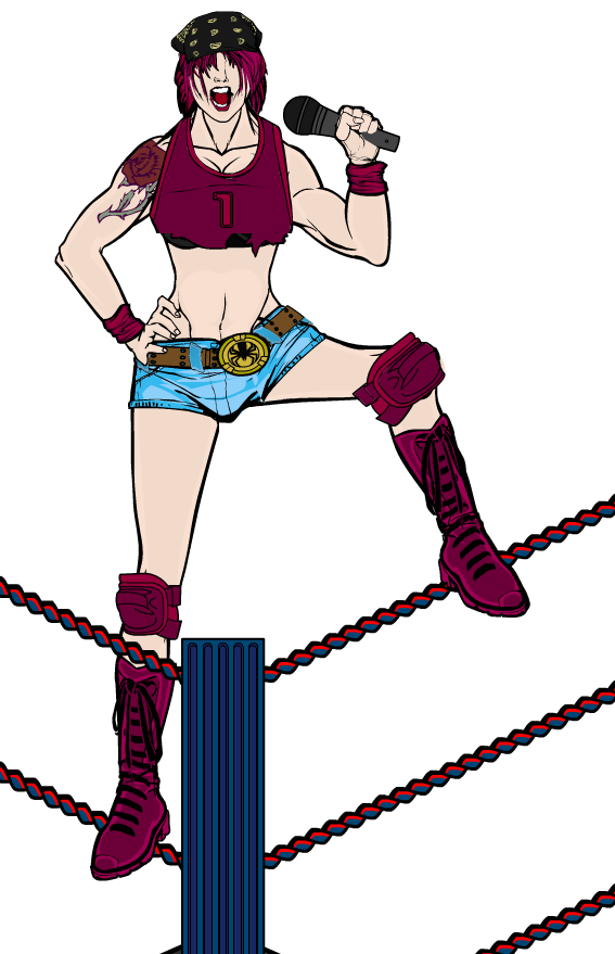
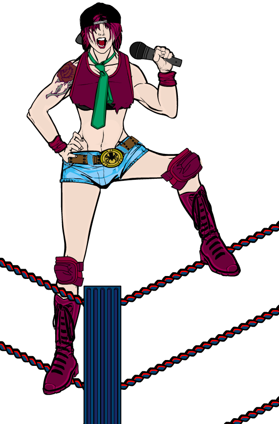
BTW, this character is named “Rockstar” Rose Garner. She’s supposed to be a cocky loudmouth who will take on anyone, anytime, for the stupidest reasons.
SulemanParticipantI couldn’t decide on the accessories, so here’s multiple versions.


SulemanParticipantAlright, I’ll get that done this week. Thanks, man!
What sort of confuses me a bit is the “depth to the heads” that you described. Are you suggesting masking one of the basic insignias (circle?) to each head separately? To what effect?
The seats might not be entirely necessary, as they would mostly be covered by the audience anyway, and they might even be standing.
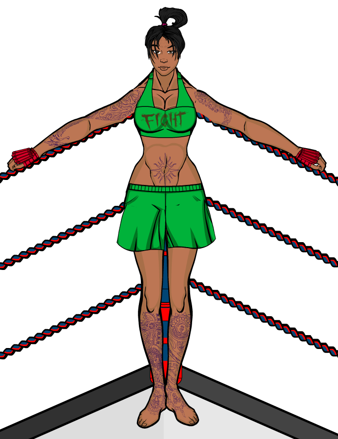
SulemanParticipantHere’s an MMA fighter. You can tell she fights, because it says so on her top.

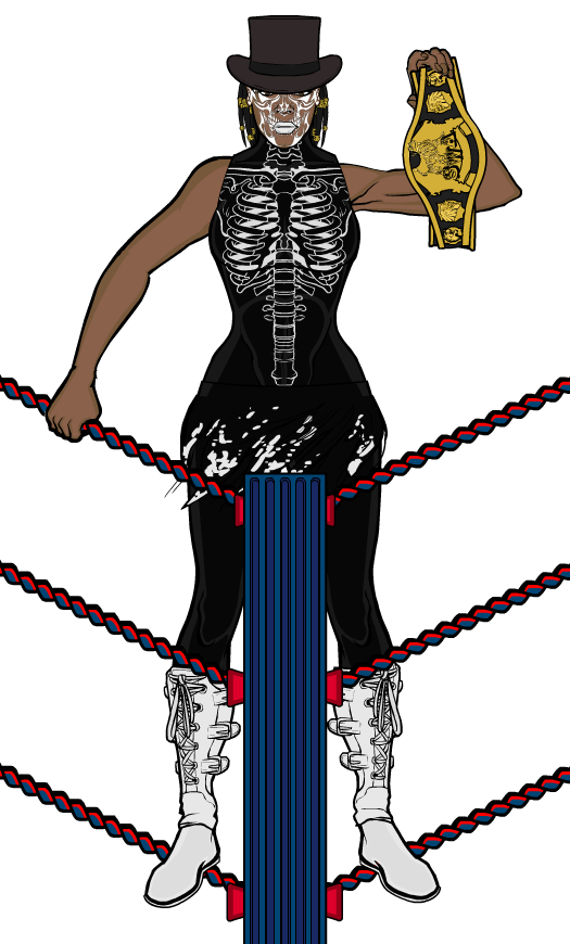
Then there’s Madam Samedi, champion of wrestling. You know, just in general.

SulemanParticipantI’m working on another design as well. We’ll have to see what this leads to.

SulemanParticipantI am really digging that samurai! Great posing, great background, great shading, and good use of those armor and clothing items!
Seriously, every time I look at it, the more cool details and more evidence of your work I see.
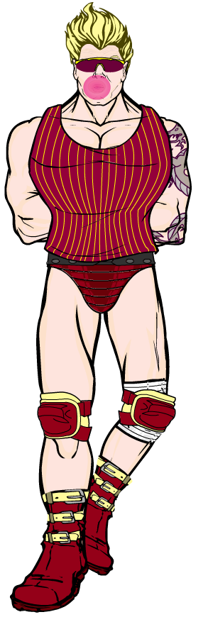
SulemanParticipantI decided to try and make a pro wrestler in Heromachine. Can someone help me pick a color scheme for this guy? I’m not too sure of the red and yellow.


Anything else that you think might need some tweaking?
-
AuthorPosts

