Forum Replies Created
-
AuthorPosts
-
SulemanParticipantHeromachine 3: Design choices, starring Apatite
This is a little piece on how I personally make choices in character design, using my latest Heromachine thing, Apatite, as an example. I’m not a professional and these are only my uneducated opinions, but maybe they can help you as well?
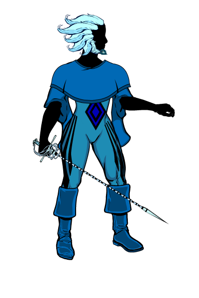
Apatite is a very balanced design. I tried to use many different kinds of elements in her design so she didn’t feel overwhelmingly tied to one character archetype or design style. I will go over the different intended effects of the design and explain my reasoning for using them, as well as point out some examples of them in other character designs. Finally, I will make small adjustments to Apatite’s design to show I could further emphasize that particular effect. Here is Apatite again, with her body in silhouette to emphasize the outfit and such.

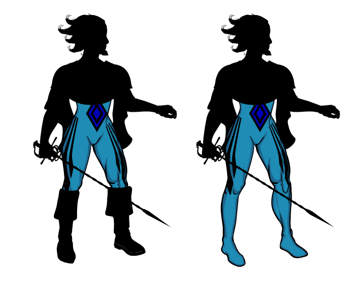
Smooth, skintight elements
Effect: Implies overall mobility. Easier to animate and adjust. Additional elements will add complexity, in both good and bad.
Other examples: Spider-Man, super heroes in general, pro wrestlers, etc
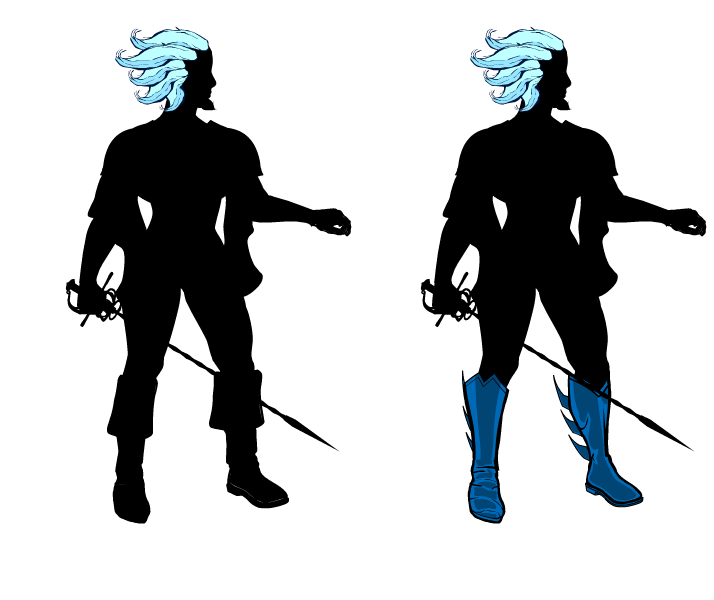
Apatite examples: Her bodysuit shows that she can move when she needs to. If we wanted to further emphasize her mobility, we could simply take off all the other elements (e.g. boots) on top of the suit.

Elements pointing forward
Effect: Implies aggressiveness and stubbornness.
Other examples: Swords and guns, animal horns, some hairstyles (in anime, the delinquent’s pompadour), etc
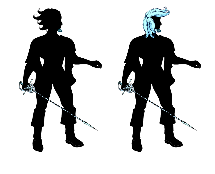
Apatite examples: Her sword and ger gem are pointing forward, giving a slightly threatening impression. We can increase that by giving her an outrageous hairstyle.

Elements pointing backward
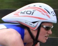
Effect: Implies forward motion, aerodynamics and speed.
Other examples: The Flash’s lightning bolts, Quicksilver’s hair, this bicycle helmet, etc

Apatite examples: Her hair is hella aerodynamic, which should help if she needs to lunge forward with that rapier. Some gratuitous fins on her boots might help the speedy impression even more. Or look ridiculous.

Elements flowing freely and/or hanging off the body
Effect: Implies circular or changing motions and theatricality. Changes direction slightly more slowly than the rest of the body, very useful for emphasizing motion and showing the character’s previous direction.
Other examples: The flowing robes in wuxia and kabuki, Doctor Strange, etc
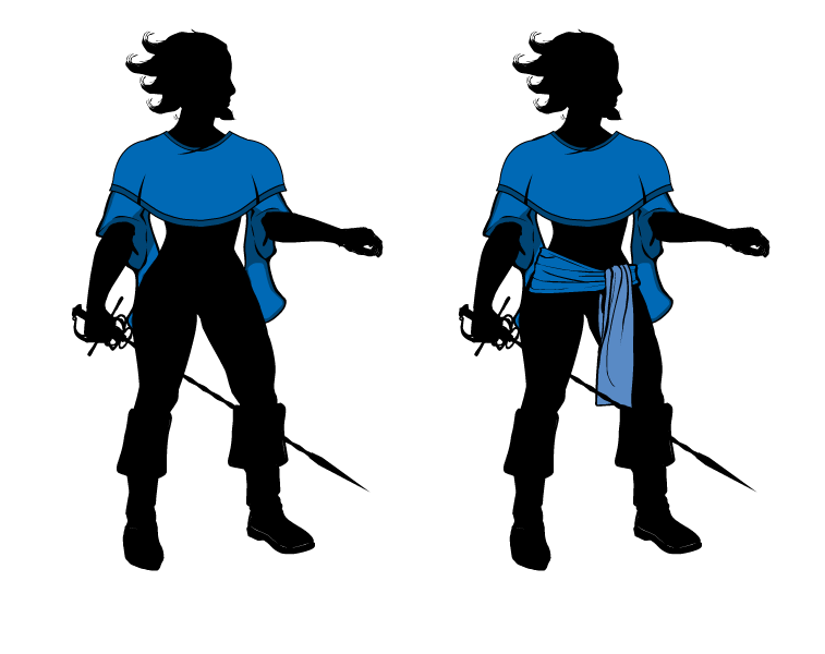
Apatite examples: Her sleeves and poncho flow and look pretty dramatic. We can futher emphasize this effect by giving her a sash.

Elements that increase width
Effect: Implies weight and sturdiness.
Other examples: Most kinds of armor. In superhero comics: Juggernaut, Superman’s cape, etc
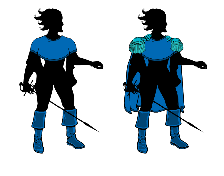
Apatite example: Arguably her beard. Her swashbuckling boots give her legs a little bit of weight, which emphasizes her grounding. Solid grounding is important for a fencer! Her poncho also emphasizes her shoulders, which gives an impression of physical strength. We can just go overboard with that and give her big epaulets and a cape, which also work with the swashbuckling style.

Elements that conceal the character’s body
Effect: Implies mystery, otherworldliness and focus the viewer on what little they see.
Other examples: Batman’s cape, all kinds of robes, wings, etc
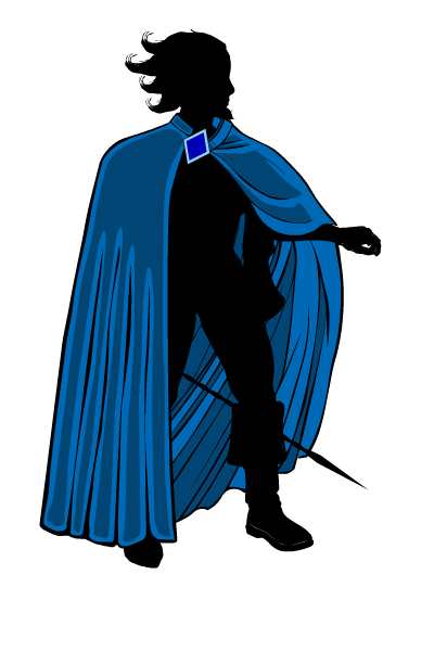
Apatite examples: Maybe her poncho? Honestly, I didn’t use this much when designing her. However, we can introduce a large cloak, which she can throw off dramatically when she reveals herself.

There you have it! I hope this was entertaining and useful to you!
SulemanParticipant@cliff
Anarchangel’s been having some computer trouble, he needs to get a new laptop. He posted about it on DeviantArt on July 28. I’m sure he’ll be returning to us sooner or later, don’t worry.
SulemanParticipantGreat pose! I love how it gives such an impression of motion with the arm and leg placements. I especially like the back arm.
The effects are a neat idea, though they make the whole image a bit busy, there’s so much going on at once. I’m not entirely sure what to do about that. The picture is still very good, though.
SulemanParticipantNice work! I’m looking forward to those advanced posing pictures you mentioned. You’re already using some rather complicated techniques like shading, and the designs are pretty good. Very impressive, especially considering how new you are to this.
Keep it up!
SulemanParticipant
It’s not really my best, the best I can do right now. I’m out of practice and I had to make this left-handed becuase of my tendonitis. Unoptimal.
It’s also a gemsona. That basically means a representation of myself as a Steven Universe character. Goes by the name Apatite. With a beard, because it wouldn’t be me without one. I assume she’s heading to Earth to settle some unfinished business because that seems to be the trend. The tip of her rapier can spin like a drill, allowing it to pierce nearly anything.
SulemanParticipantThese last two monster designs are lovely. I especially like the demon priest’s hat. I’m almost getting Morrowind vibes for some reason. It’s got that same kind of unusual fantasy style.
SulemanParticipantThis is Tide, a merwoman knight. I played her in a tabletop RPG, specifically FATE!
Name: Rising Tide, Tide for short.
Her actual birthname is pretty much unpronouncable.
Physical description:
Tall, strong, sleek, half-fish. Taking her headfin into account, she tops two meters. While pretty fast on land, she is terrifying in the water.
High Concept: She Speaks For The Seas
A young noblewoman and a knight, Tide was sent by her father, the high chancellor of the Deep Kingdom, to represent it in the affairs of Trinity Bay.
Her job is to protect the kingdom’s interests in anyway she can and chooses… She usually chooses trouble. Why was the daughter of the high chancellor sent to this remote town? She doesn’t know, and she is not pleased! And just when she was getting on so well with the crown prince Dagon.
She was going to have dinner with the royal family. Could you have thought of a worse time, father?
Trouble: Imperius Regina
Let’s be honest here, Tide is something of a douche. She is highborn and she knows it, and she doesn’t care much for the surface world. She is quite adept at rousing the ire in others. The Deep Kingdom is almost a caste society. Tide herself comes from the military ruling class. The royal family themselves might or might not be Lovecraftian horrors.
…You Get Paid?
Tide was born and raised for battle. Upon arriving to Trinity Bay, she quickly got interested in the gladiatorial fights.
One day, she noticed Dragonheart being placed in an unfair match and decided to get involved. As a mysterious hooded figure, she has interfered in his matches ever since. She might not have fully realized that the matches are staged.
SulemanParticipantThat leap picture is very inspired. Great concept!
SulemanParticipantOpposing the Empress and her dastardly Lady Knights is the Squire. She’s the hero of the story!
The Squire is a prodigy, a warrior capable of learning any fighting style amazingly quickly. Left orphaned because of the Empress’s wars, she has made it her quest to end them.
Not unlike a certain blue robot, she takes the weapons of her defeated opponents and uses them against their allies. Depicted here are Lady Buffalo’s and Lady Turtle’s equipment (with an updated helm).
SulemanParticipantI realized the ring was not quite tall enough, so I tried to make it a bit bigger and adjust the poses accordingly.

SulemanParticipantWhen good old Granny Carver, general manager of SFWA, finally decided she’d gotten enough of being pushed around by her employees, she called home and got some backup: Nadya Carver and Joanne “Red Jo” Thompson, also known as Granny’s Girls. The question is, can even she control these two?
Nadya Carver is the black sheep of the family. Tall, strong and nearly impervious to pain, a truly unpredictable competitor, who sometimes needs to be reminded to follow the rules.
Red Jo is an amazing athlete, excelling at all aspects of wrestling. She is the brains of the duo, directing Nadya and stepping in when the opportunity presents itself.
Finishing move: Last Rodeo (Nadya lifts the opponent in a wheelbarrow hold, Red Jo jumps over her from the top rope and lands a seated senton on the opponent)
SulemanParticipantDamn. The competition is gonna have to be amazing if that won’t win.
Great job. I love the head and how you used a tail to make the body.
SulemanParticipantWrestling against Pratima Kaur is like playing online against a cheater. She’s even stronger than she looks, and far faster than you’d expect. She excels at suplexes and amateur wrestling techniques.
Despite her intensity and performance in the ring, she has trouble connecting with the audience in San Francisco. Her thick Delhi accent might be a factor. Oh, well, she’s young. She’ll get over it somehow.
Finishing Move: Monsoon Fall (Back suplex lift transitioned into a falling chokeslam)
Note: I really liked the background that JR made, so I stole it. Imitation is the sincerest form of flattery and all that.
SulemanParticipantLooks pretty interesting. What kind of character is he, what does he do?
I’d like to know what the pauldron is attached to, though. It’s not bolted onto his bare shoulder or anything, right? The wind moving his cloak so dramatically isn’t affecting the leaves on his waist at all.
Looking forward to seeing what you do with this!
SulemanParticipantThanks, everybody! I’m very happy that people seem to be liking it, it took a lot of work. I made a small update to the sky color, to vary the blues a little bit. There’s so much blue in the design, they have to be different shades.
I also wrote a guide on what I call Frankensteining, scavenging parts from larger items to use in your designs. Check it out!
-
AuthorPosts

