Forum Replies Created
-
AuthorPosts
-
SiKWiDiTParticipantSweet work on the Goblin King!
SiKWiDiTParticipant@Herr D said:
Hello SiKwIdIt. (harder to type than it looks.)
Feedback: ?’s–did you know the angel of war is traditionally Michael? I don’t know the proper male form of the name Artemis–Artemius? Artemo? Artemer? My declension skills are rusty anyway.Retro is a nice effect and definitely is not overdone on this site. My favorite so far is the chief. You made his shield like a dreamcatcher. A Shield Of Dreams? ‘If you wield it, they will come?’
 Don’t get sik of hm3!
Thanks for the feedback Herr D! Glad that you like them. The Indian was my second or third piece and you can find the shield as you see it in the items right category under shields.
SiKWiDiTParticipantThe mask is wicked…As usual you blend the colors amazingly.
The gladiator is bad a** as well. Good stuff!!
SiKWiDiTParticipantThanks DJuby!
Here is a pic I put together today while I was bored @ work…. I can not name it because of the legal issue thing… but its my personal thoughts on the characters from the past…with a twist of the political present.
SiKWiDiTParticipant@djuby said:
Speedster – Once heralded as the fastest of the B-Class, Rustbuckett, as he was now known, found himself relegated to parades and ribbon cuttings.
The Gladiator is very good and the speedster entry as well. I have to ask how do you get your colors like that? Every picture has an awesome color palette!
SiKWiDiTParticipantOne for the Latest contest… So here is Quick Fire…
SiKWiDiTParticipantNice! The color scheme is very good and a perfect blend of lighting. Good stuff!
SiKWiDiTParticipantThe remake is sweet. I really like the design and the lighting. Nice Job!
SiKWiDiTParticipantOK, I’m addicted. This one was created with the old school in mind.
I call it “Retro’“
SiKWiDiTParticipantAll I can say is WOW! I just read your post about your top 15 favs on page 14 in your thread. WOW…All are very good, but Oblivion, Tech Samurai, Shadowing and Raina are Sik. Oblivion has a ton of hidden features that took me a long time to see but the end result you acheived was BAD A**!! Awesome work.
SiKWiDiTParticipantNice color scheme. The shading and shine are very good.
SiKWiDiTParticipantHere is the latest addition to the Sik family. This is a wandering monk that has higher than normal spiritual powers. He has the ability to summon creatures, both light and dark, through portals from other realms and energy manipulation. I attempted something different this time, using the layers to create the effect of the portal being closer than the monk’s body actually is.
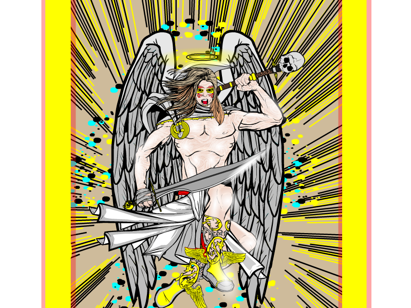
SiKWiDiTParticipantThe latest Angelic Champion is here! Here is Gabriel, the Angel of War! This is my first attempt at making a funky pose. Let me know what you think…

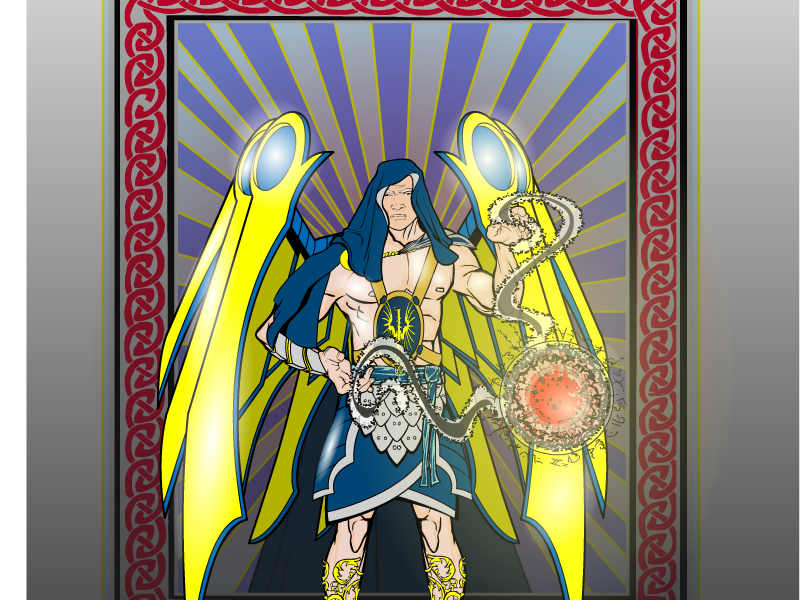
SiKWiDiTParticipantHere is a rendering of a higher powered being. I named him Artemis, a gold laden Sun Champion with energy wielding powers.

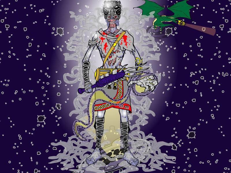
SiKWiDiTParticipantHere is an evil deity for the Small gods contest. I call him “Bandulaar”, a deity over poverty, ugliness and std’s….


 In the background is his pet/sidekick, Gonorrhoea the dragoon. Here to plague the lowly servants with a painful burning.


-
AuthorPosts


