Forum Replies Created
-
AuthorPosts
-
ShiborethMemberNo joke, I think what I appreciate most about the image is the light trailing the fire on her hands, and how you’ve positioned things to try to make the picture more dynamic. It *might* work that if you angled that light to follow the perspective of her body, it could help give the image a bigger sense of movement. I’m not completely sure, though. I’ve been experimenting with that myself, and I’m still trying to figure out what makes for dynamic pictures.
ShiborethMember@MisterDinoMan said:
Actually, I think this would work better as a children’s cartoon.
My god, you’re totally right. I didn’t think about that since I was busy chuckling about the idea of it as a rom-com, but that could make an AWESOME children’s show.
ShiborethMemberI absolutely love that. I wouldn’t have thought to use that new companion that way, but the pose works amazingly.
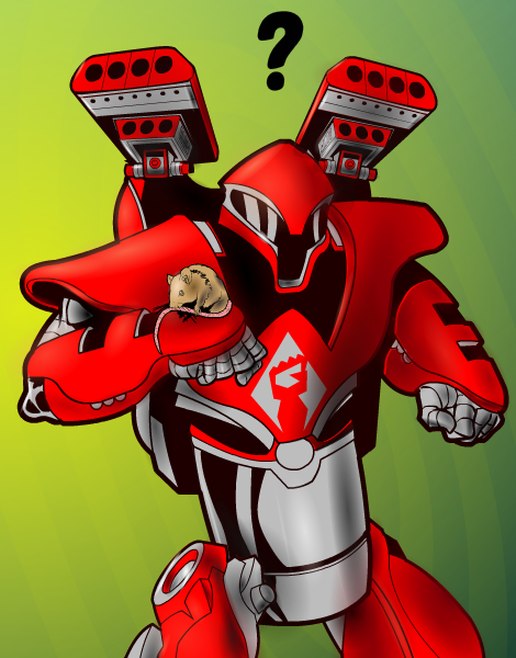
ShiborethMemberWhen I saw the new mech-looking companion, I immediately thought of something like this.
A Chance Meeting:
(The following is to be read in the style of a Rom-Com movie trailer)
Like most abandoned sentient constructions, R0Dee the Rampaging Robot had resigned himself to forever killing all humans. But a chance meeting with a peculiar small furry creature opened his heart to love.

Incidentally, I had the Flight of the Conchords song “The Humans are Dead” running through my head the entire time I was working on this.
ShiborethMemberThese are fantastic. I especially love Rose’s pose. Expertly done, and it fits the design.
ShiborethMemberI don’t know if it’s my “best,” but I felt like doing something new for the 100th contest rather than entering something older. I learn more about how to use this program with every piece I do, so why not try to make something out of the things I’ve picked up?
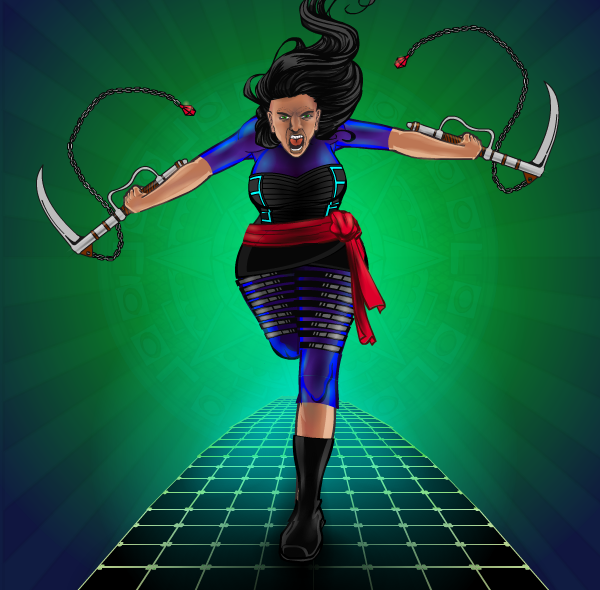
Title: Charge!

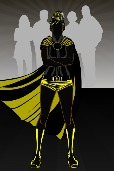
ShiborethMemberPop quiz entry: Sillhouettes

ShiborethMemberI love the design. As well as your sneaky use of head objects!
Just a small thing, his arms look a tad small to me. As far as the right one goes, have you tried using more head objects for some foreshortening shenanigans? I first picked up that trick from the old forums in the poses thread.
ShiborethMemberMakes sense! I guess what might fit as far as the body shape goes might depend on whether you want it to look like the red “skin” is actually skin or if it’s an outfit. What you’re using, in my eyes, gives more “skin” visual signals because of how exactly it fits the breasts. I know that when rendering the female body, comic books and other visual mediums will do things like that as an outfit, but as a woman who is for better or worse somewhat plentiful in the chest area, I can say that wearing a costume THAT skintight would be an experience in misery. Let’s just say, things would be bouncing. A lot. That hurts.
This is my personal opinion, though, and it’s up to you what direction you want to take.
Now that you mention it I also see what you mean about the look of the sash. I’m excited to see what you do with it!
ShiborethMember@Myro said:
I don’t know if that’s what caused it, but I did lose all my saves. Luckilly I haven’t done anything in a while, and everything I had before that was also saved to text, so I didn’t lose anything important.
I had the same issue. That’s also when I discovered I had lacked the foresight to save the majority of my better pieces to text. Oops?
ams, now you should exert your creativity to make the coolest hunched figure yet! And then do one of the opposite gender.
ShiborethMemberI dig Viperess’s design. I especially like the choice of the glowing around her belt.
As for another possible nitpicky tweak, with how big her bust is, the strap going from the shoulderpiece to the hip looks like it’s just “there” to me. It’s probably a combination of it being more or less one tone and the slight give between it and her side. In my personal experience, in order to hold the shoulderpiece to her body, it would fit somewhat to the curves to her body. It doesn’t have to look skintight (in fact it probably shouldn’t, since it’s not spandex!), but if it starts toward the top of the breast, it’s going to curve to the body a bit.
Alternatively, you could bring her bust size down a little bit, and that would probably do the trick too.
ShiborethMemberI really like the look of the fire spirit in Sitembile Ironskin’s picture, with the positioning over the drum. Very cool magical effect.
ShiborethMemberThat’s simply awesome. I love him in all the three things I’ve seen him in, Doctor Who included!
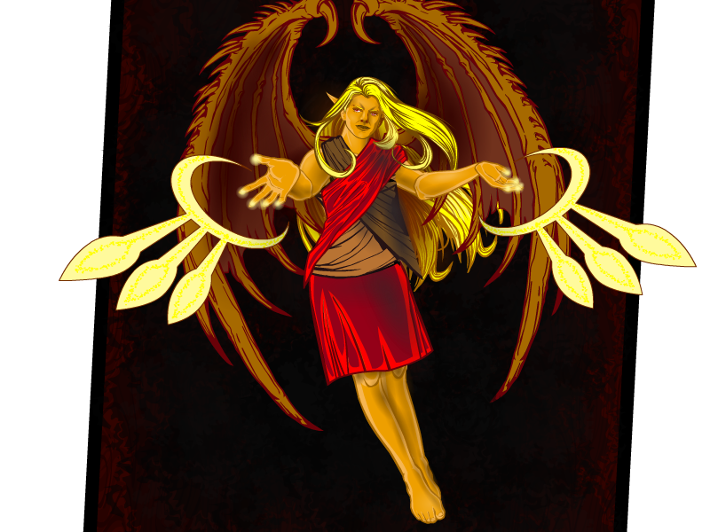
ShiborethMemberI actually managed to finish something again! For the contest:

I tried experimenting with manipulating the lines of the background. It was pretty fun, and hopefully it works.
This creature is from a race called the Asharis, known by their wings, pointy ears, and their affinity for magic. Their society is largely secular, believing magic to simply be a result of the universe functioning as is, but some are more inclined to give magic’s source a divine explanation. This priestess is one such practitioner.
ShiborethMemberAs usual, I am entranced by your color work. Awesome!
-
AuthorPosts


