Forum Replies Created
-
AuthorPosts
-
SabrinaParticipantThanks for the encouraging comments! I owe hawk007 for explaining how to use the pattern objects to shade. Originally I was trying to do repeating circles of different gradients stacked on top of each other to create a similar effect. A single highlight could take up to thirty circles (if I was being lazy that day), so finding out that there was a much better way was appreciated.
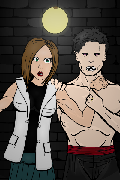
Here’s something inspired by the current contest:
Distraught over the death of her long time boyfriend, Jessica felt herself drawn to her father’s laboratory as a source of comfort and removal from the world. His research involving the creation of life fascinated her. Over time, Jessica found herself wondering what would happen if she tried to return life to a body that had already lost it…
Needless to say, I think Jessica was hoping Derrick would come out of her experiments a little more loving and a little less… bloodthirsty.

What did I learn from this project? I experimented with using shades instead of just highlights and I’ve decided that shadows are harder, but still fun to do. Actually, all the highlights in this image are very subtle and if I didn’t know where they were I might not see them. (Except for a few on the girl’s face that might be too prominent; I’m not sure.)
I didn’t do much beyond using the objects for what they were intended, though, unless you count Jessica’s body actually being a head. But doing the light on the wall was fun. It doesn’t look anywhere near as cool as it did before I put a layer of darkness over everything, but everything in the image just felt too bright. It was a necessary sacrifice.
Thoughts? I’ve love any feedback on improvements you guys recommend. 🙂 As always, this community continues to inspire me.
SabrinaParticipantI like that method of shading much better than what I was trying. Thank you so much! Looking at what everyone else has created is leaving me in awe… you guys are good at this. 🙂
SabrinaParticipantOops, I forgot my questions. *facepalm* Did I forget to mention that I’m absent minded?
My main question is this: Do you guys do all that fancy shading by placing another, similar item in a transparent color on top of the item you wish to shade? That’s how I’m doing it so far… but I’m wondering if there’s a better way.
Second, does anyone else ever try to use just part of an item? Like when you place another item on top of it so you can only see half of it? I’m curious if there are better, more efficient ways to accomplish some of these tricks I’m trying.
-
AuthorPosts


