Forum Replies Created
-
AuthorPosts
-
SabrinaParticipantThank you for the tips! I think I’m going to rework her at some point and post her again, so I appreciate the feedback! College starts in about two weeks though, so I’ve got to make that come first. I really appreciate the pointers you guys give me to help point me in the right direction!
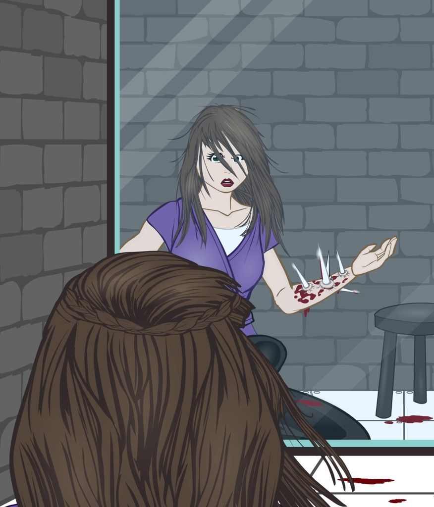
SabrinaParticipantI’m not dead…. yet. I’ve just been really busy, and the only thing I’ve used HeroMachine for in months has been to make printable tokens for a tabletop RPG I’m playing. (None of which were anything about “mass production” quality.) I finished making a token for my character Replica and I suddenly really wanted to do something with HeroMachine again. So for the past two hours, I’ve been working on creating a scene from the opening session of our game’s campaign.
Replica can alter her appearance to imitate any humanoid and control her bone growth, enabling her to use her splintered bones as weapons. In other words, she’s like Mystique and Marrow combined.

Replica was initially imprisoned after first developing her powers.
It’s nothing special and a rather hurried project, but I’m just glad to be Machining again! One of these days I’ll have the time to actually learn how to use the program!
SabrinaParticipantYou’ve got a good eye for costume design! I always have a hard time figuring out where to put the random stripes of color or so forth to make the character look balanced. That’s an excellent skill to have! I can’t wait to see what else you come up with!
Maybe I can learn a trick or two from you. 🙂
SabrinaParticipantI was so focused on trying to prepare for a competition that I never really got around to doing what I had envisioned for Tiger Mask. I decided to submit her anyway to the contest anyway for fun, but I’ll likely go back and see if I can’t do something cooler with her later.
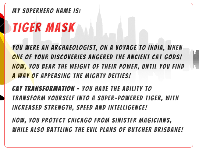
I generated this backstory for her:

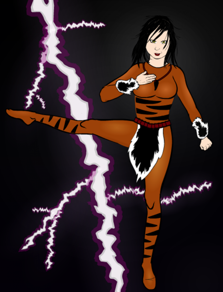
And this is what I tried to do with her:

While I was constructing the body I thought she had more potential, but the background is a rushed job that comes from not having any time to work on her. I had originally envisioned either a) a giant “energy avatar” of a tiger in the background, b) her kicking one of the evil magicians mentioned in her backstory (in which case her body would be twisted more in the direction of the kick and she would be facing her target), or c) have her standing up against a brick wall, and have her shadow be the shadow of a tiger. None of these ended up happening, but I still really want to try that last one. I’ll add it to my ever growing list of things I wish to do but never seem to have time for.
In any case, I had fun learning how to do inner thighs or other areas of the body not covered by Hero Machine. (But then I added the fur and I realized that it covered up all my hard work anyway. Maybe that’s why I should plan ahead…)
This also makes Tiger Mask part of a long line of characters that I’ve tried to make look a little younger. As the Game Master for a superhero game where the PCs are all teenage superheros who wish to battle supervillains of a similar age group, I typically find myself using trying to make characters who are in their late teens or early twenties. I’m not entirely sure if this is working or not… they look age appropriate by themselves but I haven’t made many middle-aged heroes to put them next to and see if you can notice a difference.
SabrinaParticipantAwesome shading! Love what you did with it. 🙂
SabrinaParticipantAdded note: Yes, I am aware that the planet logo on his chest is NOT Mercury. But seeing as the description from the generator said that his home planet was destroyed, I figured that he wasn’t from Mercury anyway. The logo on his chest is a representation of the planet that he’s from.
I imagine he got his name rather like this:
Captain Mercury: This Admiral Beefheart is a dangerous man. Someone’s going to have to stop him! Perhaps that someone is me? *dramatic superhero sigh* But I’ll need a name!
Bystander: How about the Void?
CM: Too obvious. Other heroes, and villains, have taken it.
B: Time-and-Space Man?
CM: Too confusing.
B: The Astonishing Man With Void Powers?
CM: Now you’re just getting ridiculous.
B: Well, how about Captain… something? Lots of good heroes have names that start with Captain.
CM: Ah… I should name myself after my deceased planet! From this moment on, I shall go by the name of Captain Chrocklfishcalevarcoarprelantonogglecriswo…
B: Dude, just stick with Captain Mercury. By the time someone’s done screaming your name they’ll be dead already.
CM: *meekly* That works too… I guess.
SabrinaParticipantThis is my first entry for the current name generator contest. (I’m going to do another one if time permits.)
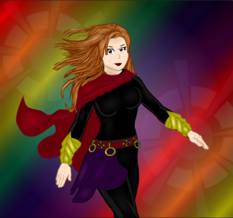
This is the character that the generator rolled up for me:

And this is what I did with it:

I didn’t do anything extremely unique about it; the posing is pretty simple. But I had fun with the background, doing the soft wisps of an aura at the bottom with a few gradient colors spread throughout.
Something I’ve noticed about myself is that I like doing “ambiguous” backgrounds. They don’t distract from the character, but they also don’t bring an added depth that a layed out backdrop can. That’s probably going to be my next challenge for myself- to see if I can do an actual background. I may or may not display the horrific result that will occur.
SabrinaParticipant@JR: Thanks for the kind words of encouragement! Hopefully, when things get a little less crazy in Sabrina-ville, I’ll be able to improve in the areas where I’m lacking. If only the darn neighbors would stop having babies I could stop rushing over to congratulate everyone/ volunteer to watch the other kids. Curse me and my inability to turn away from two year olds with hopeful eyes and moms who look like they’re about to strangle somebody if they don’t get help. I’m soft, I guess. 🙂
@Herr D: The boots for that one were a mess in every way, shape, and form. 😛 I couldn’t get the look I was going for no matter how hard I tried. I think I have some sort of insignias masked over her legs in an attempt to get a bit of the blue-ish tint I was going for, because none of the boots were doing it for me. (I don’t remember why. It’s been awhile… I’ve have to re-open that file and look at it again.) Thank you for the tips! I’ll see if I can mess with them a little more if I find myself tackling something similar.
SabrinaParticipantI tried many different experiments with this character, all of which went horribly wrong. The posing looks somewhat off to me, but I can’t pinpoint the problem. I made the torso using insignias, so I didn’t have much to go off of. The shading on the face looks awful. The coloring is bad. I’m not sure I really like that background.
I’m going to post it anyway because I plan on redesigning her at some point and it would be fun to see her evolution. Any critique is welcome, but I know during the holiday season most everyone is going to be busy and I don’t expect anyone to be checking the forums all that often.

She could be a lot worse, I suppose. She could be like my earlier characters. 🙂
SabrinaParticipant“How do we get better if we don’t push our limits?”
Get BETTER? AHAHAHA!!! You must be joking. You can’t get much better than that!
SabrinaParticipantMost of the characters I create are rather simplistic, because I’m the Game Master in a rather new campaign that needs filling with lots of villains, allies, and those in between. I haven’t had a chance lately to do anything on HeroMachine simply for the sake of playing with HeroMachine.
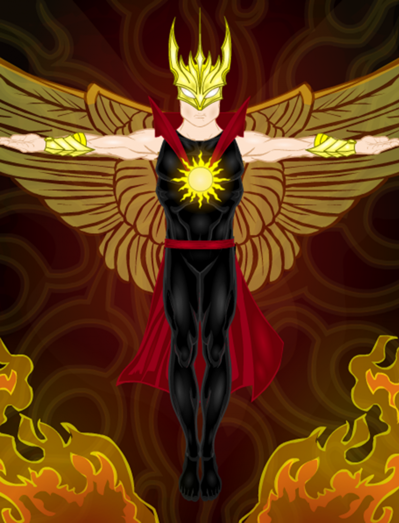
Here’s a villain that my fellow players will run into soon:
(Sorry it’s blurry; export never seems to work for me so I have to do a screen capture. The end result is that my images are always rather blurred.)

His name is Sunstrike and he’s got an axe to grind with one of the PCs. Heatstroke, a character played by a member of our gaming group, has tremendous power. Yet he also struggles with insanity. His family has been plagued with these abilities for several generations, and the powers have been known to consume many of them. Heatstroke’s mother nearly killed all of her children when she started receiving psychic visions of her eldest son, Andrew (or “Sunstrike”), destroying entire worlds in a fit of rage. She went insane because of the horrors she could perceive and set fire to their house. Her husband separated their three children in hopes of protecting them from themselves and each other.
Sunstrike and Heatstroke haven’t seen each other since they were very young and are unaware that they are brothers. But the fact that their powers are remarkably similar will very likely arouse suspicions from both the PCs and the players.
I’m excited to see what they make of him. 🙂
SabrinaParticipantLove what you did with Camilla! 🙂
SabrinaParticipantThanks for the tips! I think I’m getting better… albeit at a snail’s pace. I haven’t done anything lately that was worth posting.
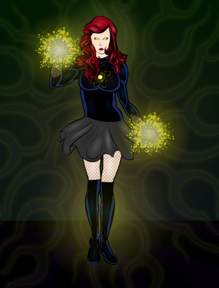
Just for fun, I decided to enter the current contest and redesign Legatus’s character Fusionella.
Here’s the link to his thread (to give full credit where credit is due): http://www.heromachine.com/forums/topic/the-legatus-universe/page/26/
And a direct link his image: http://www.heromachine.com/wp-content/uploads/2014/11/Legatus-Fusionella.png
So I took a stab at it. Originally I had a much more dramatic pose but then I kept having issues making it look right… so I ended up doing a “static” pose. I tried to make it a little more fun with the skirt, but it’s still pretty lame.

At least I was a tiny bit more daring with the shading. (Emphasis on the word “tiny”). I still have this aversion to doing it really dramatically, an aversion which I am completely aware of.
I think I may have rushed this character a bit because I’m heading to California in a few hours and I wanted to get it done before the trip. If anyone has some tips on doing boots on non-standard legs, they would be much appreciated. I wanted to keep the blue tone on them that Legatus had in the original, and masking the boots over the legs doesn’t look quite right. I did it anyway, but I’m wondering if any of you wiser folk have a better idea. 🙂
SabrinaParticipantI understand why everyone hero worships you! That’s amazing!
Any chance you’ve got an official fan club that I could join? 😉
SabrinaParticipantThanks for the tip, JR19759! That’s actually what I attempted to do, but there’s a very good chance that I placed it off center or did something else with it that made the lighting rather awkward. Or it could have been some combination of the lighting underneath that particular pattern that didn’t blend well.
I think you’re right though. The light is set more in the background, so the light should be coming from behind them, versus shining on them from the front. (Unless there’s another light on the opposite end of the hallway that we can’t see… but seeing as that wasn’t intended, using that as a cop out doesn’t feel like a valid excuse.)
If I rework this image I’m thinking I will try having the light come from behind the characters, sor tof like what you see with a silhouette. Again, thanks for the advice!
-
AuthorPosts

