Forum Replies Created
-
AuthorPosts
-
March 15, 2014 at 11:47 am in reply to: RobM’s Museum of Fine (as is good enough, I suppose) Art #38858
RobMParticipant March 15, 2014 at 11:45 am in reply to: RobM’s Museum of Fine (as is good enough, I suppose) Art #38857
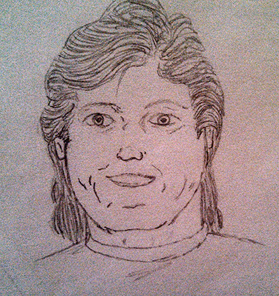
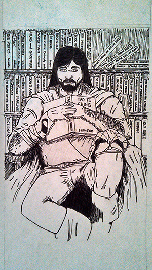
RobMParticipantA self-portrait from my university years – and yes, I had a mullet.
 March 15, 2014 at 11:42 am in reply to: RobM’s Museum of Fine (as is good enough, I suppose) Art #38856
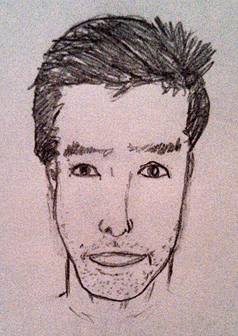
RobMParticipantMy college roommate RobG
 March 15, 2014 at 11:40 am in reply to: RobM’s Museum of Fine (as is good enough, I suppose) Art #38855
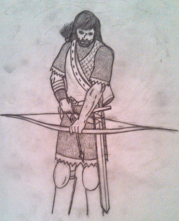
RobMParticipant March 15, 2014 at 11:37 am in reply to: RobM’s Museum of Fine (as is good enough, I suppose) Art #38854
RobMParticipant March 15, 2014 at 11:36 am in reply to: RobM’s Museum of Fine (as is good enough, I suppose) Art #38853
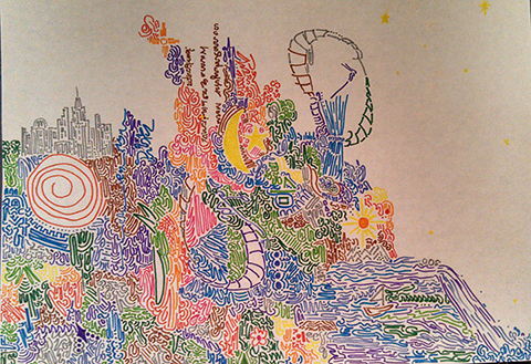
RobMParticipantI’ve posted this before, but this is a much better scan.

RobMParticipant@WMDBASSPLAYER said:
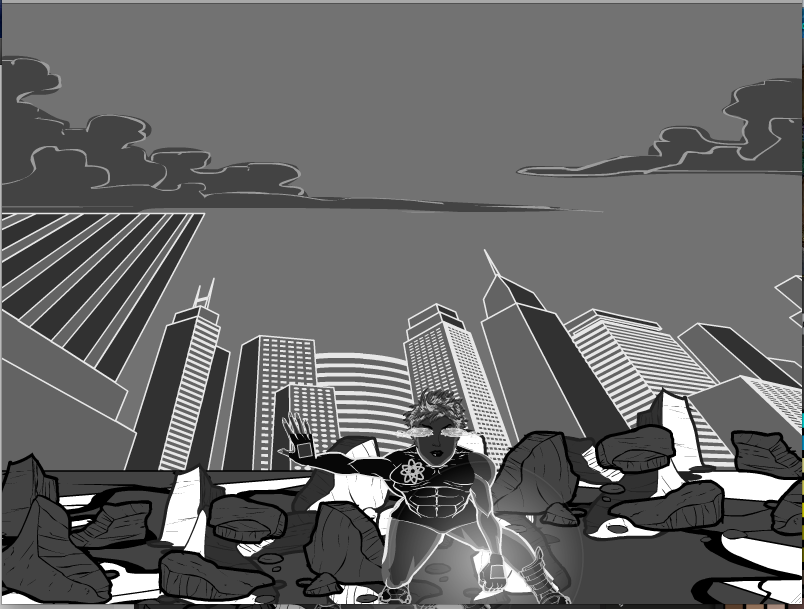
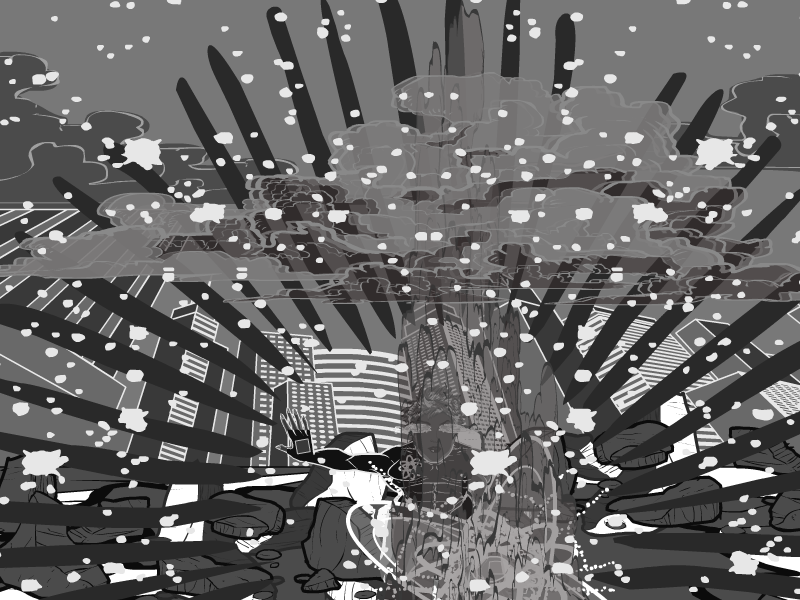
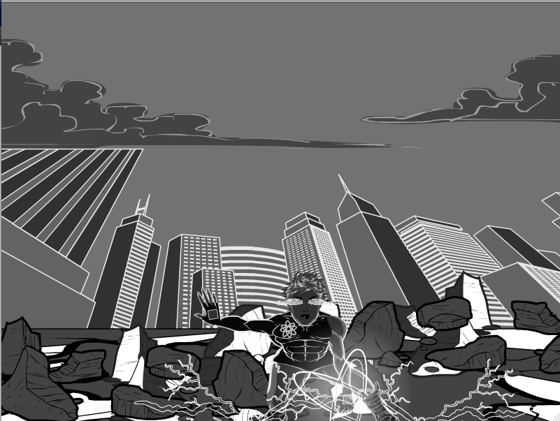
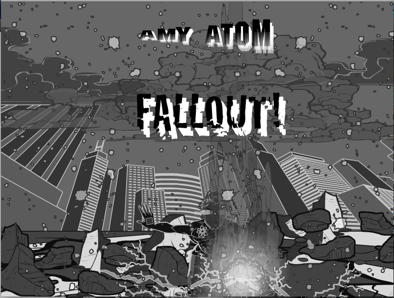
My first monochrome work. Have to play with the transparencies and shades more to not obscure the main figure.


I love that gray wash effect. And you’re right, the hardest part is shade and tone nuance, but you’re definitely on the right track. Nice work. A little trick I’ve adopted is to put a background rectangle between the foreground and background at about 10-15% gray with the alphas at about the same %. It gives the background an out-of-focus effect.
RobMParticipant@Herr D said:
*FNFr5
Undead is a category that I’ve never had enthusiasm for. Hum- um . . . most people I’ve known are trouble enough while they’re alive. I mean really–imagine how much pollution a creature could cause being around for centuries? And the contagion angle? Colds are bad enough. I’m sorry if this bothers anyone, but my personal beliefs are that angels are sent here to work (bad commute,) and nothing else has the right to be here in the category of supernatural. At best demons would be gate-crashers and undeserved by everyone still here, even those malicious enough to invite them on purpose. That’s why I avoid commenting on pictures of demons or other pure-evil creatures and most supernaturals. They get enough press.
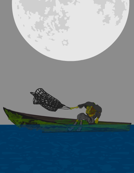
The draugrs do interest me as lore, however. Not as widely known, they strike me as somewhat of a potentially neutral, unpredictable oddity. (Perhaps more artists should focus on them?) Particularly my darkly romantic side is drawn to the idea depicted here.
 Imagine being on a fishing boat, and you see by moonlight a fisherman repeatedly heaving a net and drawing it in. He’s not catching much, but he’s obviously very strong and capable. The clouds clear a bit, and you see that the fisherman has no head, and is floating in half a boat. Most of us have to go through too much of our lives without enough guidance or wisdom or knowing our own minds, trying to stay afloat despite never having everything that we think we need, trying to do our work or our best despite the fact that everything we are ever taught is at best incomplete and at worst absurdly wrong. This sea-draugr is a metaphor for all of us.
Voted for this one on the blog. Evocative and creepy.
RobMParticipant@Kaylin88100 said:
Great start, and welcome! However, the red and black character sort of blends into the red and black background, especially in the top half where there’s less white to break it up. It’s a cool background, but I think it distracts the eye from the equally cool character. Maybe you could tone it down a little, or just post a version with no background?
I agree with toning down the color saturation of the background a bit, but I actually like the three-color concept. It looks very graphic, almost like a propaganda poster or 1960s novel cover. A possible solution is to insert the rectangle gradient from the last page of Backgrounds Shapes between the figures and the background. Increase the size so it covers the whole canvas; use, say, 15% gray for all the colors, and reduce the alphas for all colors to around 10%. Another possibility is to add a white outline around the figures.
Or you could ignore me and enjoy your piece as is, because it’s pretty good.
RobMParticipantThanks, HerrD, and I appreciate the amount of thought you put into deciding this. To answer your questions, the winnings feed is a squashed, upside down clipboard with a black insignia; the sheen on the glass is the jagged spear point on page three of the Polearms.
P.S. the fulcrum of the slot handle is also a hammer head.
Anyhoo, here’s the next three items
 ItemRight Pistols, pentultimate page, bottom row second column
 Neckwear, pentultimate page, bottom row second column
 Hair Standard, pentultimate page, bottom row second column
RobMParticipantThanks!
March 6, 2014 at 1:38 pm in reply to: Science Fiction Backgrounds (Space, Celestial Bodies, Starship Decks / Interiors, etc.) #38595
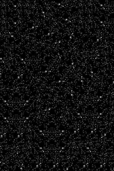
RobMParticipantI enjoy doing an occasional starscape, but I often find the scale of the stars on the existing background item to be distracting at full size. I’ve tried doing a grid of four quarter-scale pieces, but that gives an unnatural, repetitious uniformity. Finally, I put together a pastiche of twenty-something pieces at 40%, rotated and overlaid on each other in random ways. There’s still a discernible pattern, but once I start putting stars, planets, etc. on top, the pattern becomes less obvious. It’s a go-to background for me now; I thought others might like it.

Download DenseStarfieldBackgroundText.doc
RobMParticipant
RobMParticipant
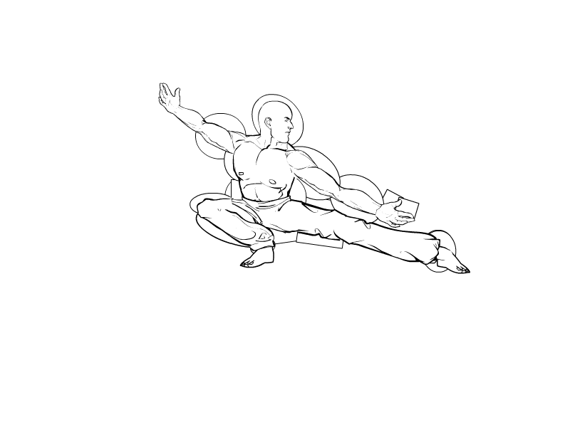
RobMParticipantI posted the colored, zipped version to my gallery (http://www.heromachine.com/forum/the-heromachine-art-gallery/robms-machine-works/) some time ago, but I thought I’d share the text. FYI – I skipped legs and went straight to pants, and some of the insignia are there for masking patterns, but I don’t remember which ones exactly.

Download RobM-KataText.doc -
AuthorPosts


 ItemRight Pistols, pentultimate page, bottom row second column
 Neckwear, pentultimate page, bottom row second column
 Hair Standard, pentultimate page, bottom row second column