Forum Replies Created
-
AuthorPosts
-
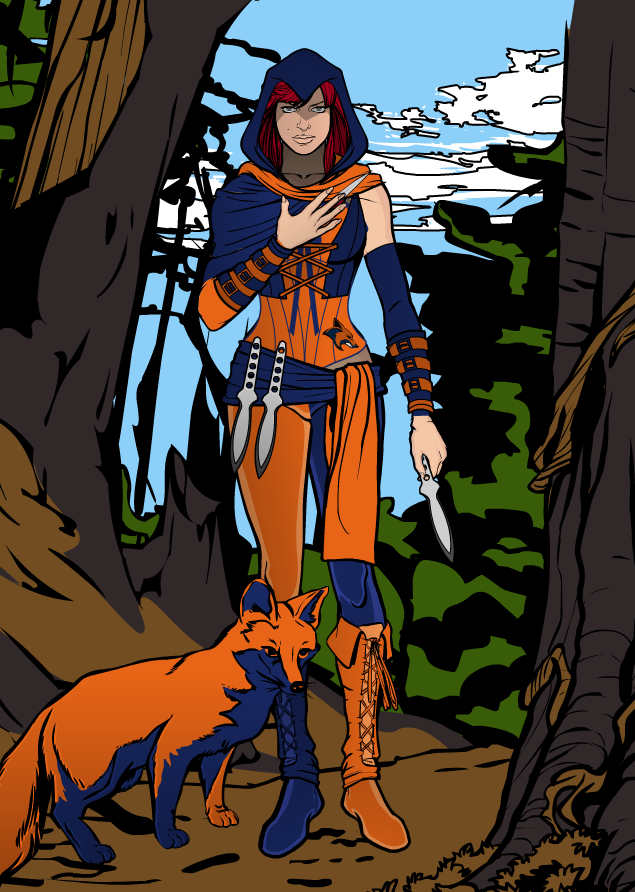
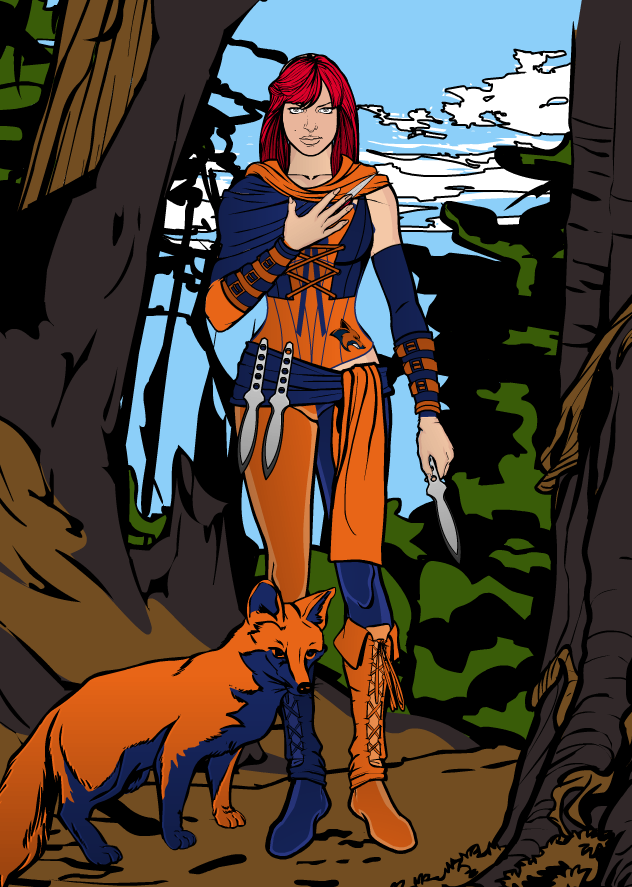
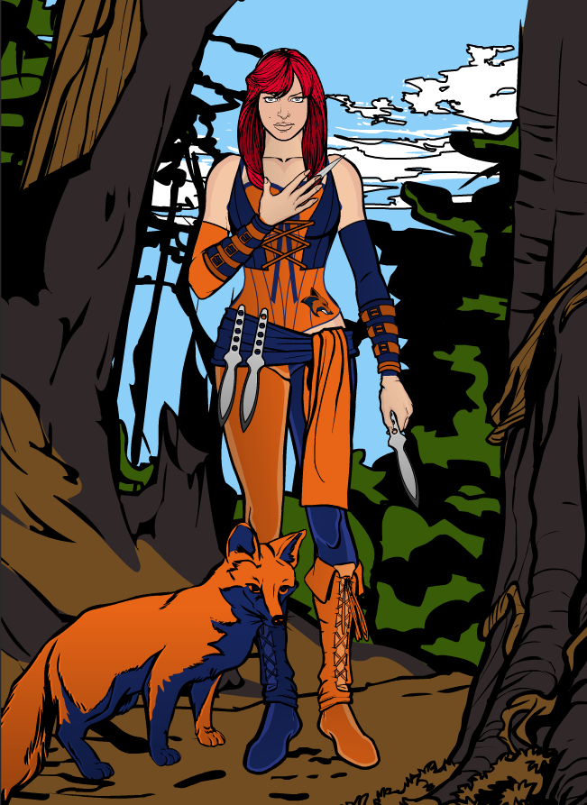
mattisagamerParticipantHello again everybody! I’ve spent a couple hours of my time developing another Superheroine (Still working on Cyan Gale’s story). This one is a bit more basic as I didn’t spend time highlighting it yet, but it’s a work in progress! If you all can give any sort of feedback, that’d be awesome. Thanks!
-Matt
The Foxtress

Shawl Only

No Shawl

mattisagamerParticipantThank you Vampyrist for the welcome! Just starting out!
mattisagamerParticipantYour Pathwalker Knights are awesome man! I like the idea of the hooded knight. Very AC styled with medieval tone. I like it!
mattisagamerParticipant@JR19759 said:
Welcome Matt. Please make sure you read the…… (rereads previous post), damn you beat me too it. Oh well.
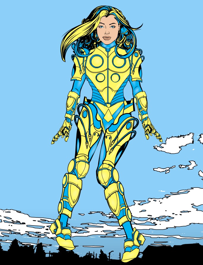
As for your character, good posing, like the use of items (though the gauntlets on the wrist are too big). For future reference, when highlighting, try to use a lighter shade of the colour (in this case yellow or blue) instead of the white for a more natural shine. White tends to only work well when the opacity is turned down very low or when shading grey/ silver. Also, to really make the character pop you could try adding shadows to places on the body you would expect to find them (under the arms, neck, inner thigh, those sorts of places). And unless the hair of your character is covering their ears, try not to forget to add them in, it’s something that does distract and make the character seem odd. But not a bad start either way.
Look forward to seeing more from you.Thank you for the reply and welcome! I resized the gauntlets so they match up to her forearms length and width. I also changed the highlighting of the colors from white to the pastel value of the color as it definitely highlighted the armor and body much better. I added the highlights to the thigh, neck and arms as well, but I was wondering if there was anything I could do to the face. I also added that ear in haha. Thank you for the tips again!
-Matt

-
AuthorPosts


