Forum Replies Created
-
AuthorPosts
-
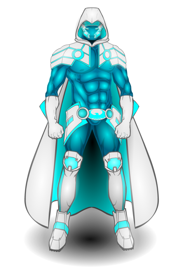
mattisagamerParticipantHaven’t done anything simple in awhile nor anything original, so here’s my latest hero, Artik!
Artik

mattisagamerParticipantAwesome creations! Welcome to the forums!
mattisagamerParticipantHere are some more Versions of other Machiner’s characters!
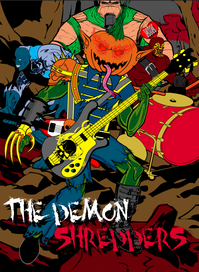
WMDBASSPLAYER’s Punkin’ Head

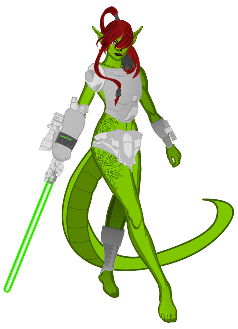
JR19759’s D’Jala

mattisagamerParticipant@mattisagamer said:
@JR19759 said:
@Mattisagamer: Don’t worry about it, that’s happened to me a few times.I still feel like I should do your character justice. Your version is top priority for me at this time.
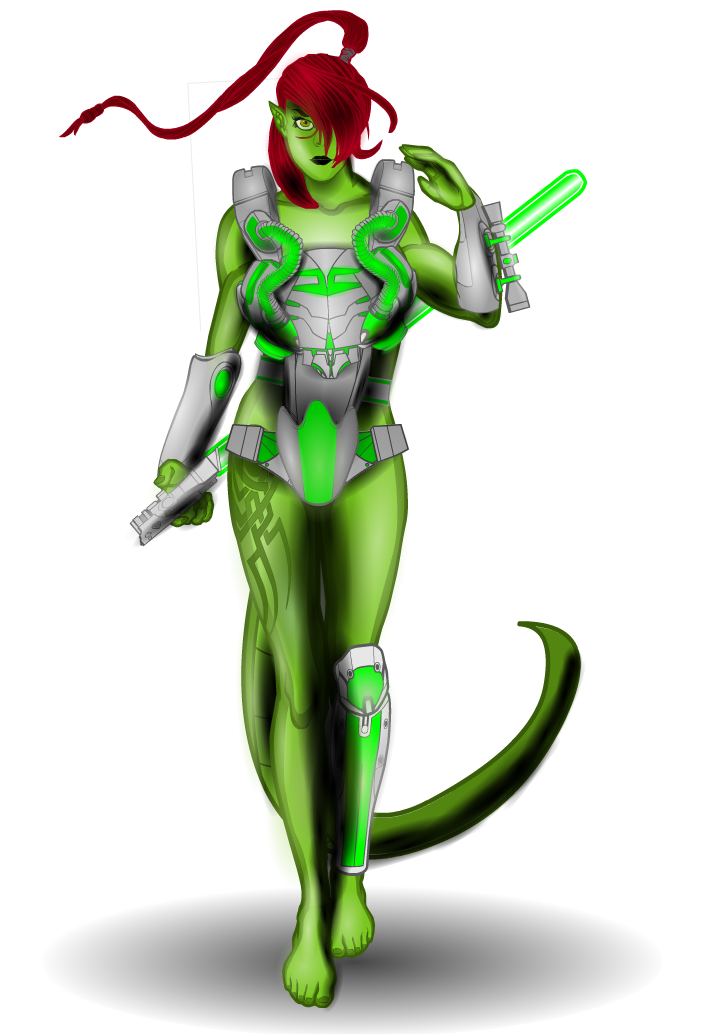
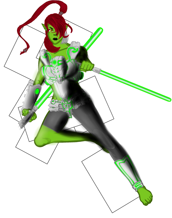
EDIT: Here’s your updated version, JR! Hope you like it. I had a blast with the hair; I loved working with the style and shades of red. Once more I hope it’s up to your standards and please do point anything out that I could improve on. Thanks for letting me do a version of your character!
Who’s next?

JR Re-revamped

mattisagamerParticipant@WMDBASSPLAYER said:
Matt, that is so good I’m almost jealous! And nice touch, making him a bass player and adding a whole band! If you feel up to it and your time allows, try one (or all?), of the female characters in the other pic I posted.
Glad you like it WMD!
mattisagamerParticipant@JR19759 said:
@Mattisagamer: Don’t worry about it, that’s happened to me a few times.I still feel like I should do your character justice. Your version is top priority for me at this time.
EDIT: Here’s your updated version, JR! Hope you like it. I had a blast with the hair; I loved working with the style and shades of red. Once more I hope it’s up to your standards and please do point anything out that I could improve on. Thanks for letting me do a version of your character!
Who’s next?

JR Re-revamped

mattisagamerParticipant@JR19759 said:
Well I’m impressed.
Let’s see what you can do with this ‘un

Hey JR. I have some bad news regarding my version of your character. I ran into a couple of problems. 1) HM became buggy and began to double all the objects I used making it impossible to get different layers of shadowing/shading under the different objects. As seen here:
 I know I didn’t use over 350 objects as I didn’t even use that much in my Pop Quiz #1 creation, of which is much more than this version.
I attempted to clean it up by trying to use different size circles to get the shading, but just became messy in the end. With every object added, it slowed down my computer and became impossible to edit and create. Here’s my attempt to clean it up.

It’s disappointing, I know… Time has been stressing me so I will try my best to remake it. It saddened me because I thought it was going to come out really decent. Then HM just bugged on me and it became frustrating to work on. I will get on to it as soon as I can. I am truly sorry once again and hope you understand.
mattisagamerParticipantWow JR, it is an honor to take on one of your creations! This might take me a couple of days since I will be a bit busy this week, but I will try to get it out within the next day or two!
mattisagamerParticipantAwesome cover! Can’t wait to read the comic!
mattisagamerParticipantArgue
mattisagamerParticipantHere’s your Punkin’ Head, WMD! With a few extra details… Let’s just say he got a little more demon-like! I gave him a 4003 to appeal to your bass playing! (I too am also a bassist!) I also know you’re a fan of simpler HM creations, so I didn’t do any sort of zypping or such. Hope you like it!
Punkin’ Head Revamped

mattisagamerParticipantThanks JR!
mattisagamerParticipantI’d like to take on Punkin’ Head, but how does one exactly find a Pumpkin Head? xD
mattisagamerParticipant@Herr D said:
Your meeting of east and west is good. I’ve had the best luck outlining gold with a combination of gold, copper, and warmer browns?
Thanks Herr! You are the one who suggested to use lifelike outline for my future creations!
mattisagamerParticipant@JR19759 said:
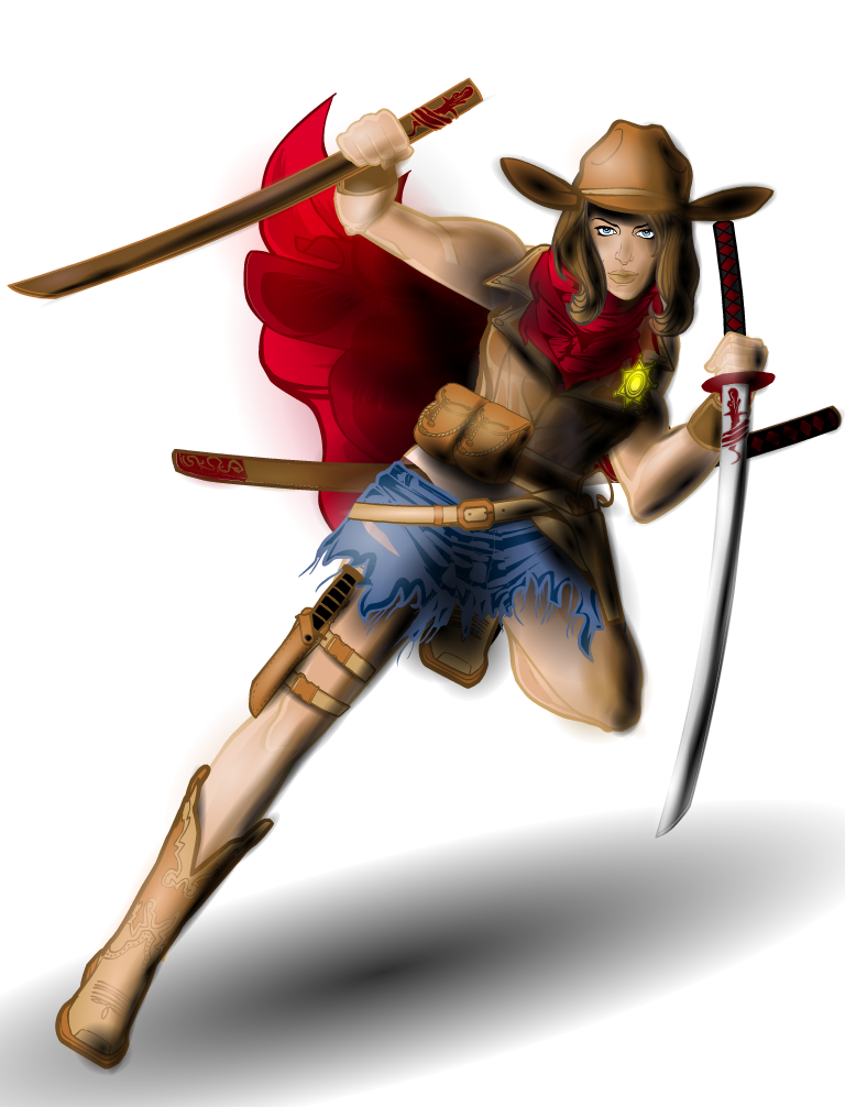
The things that stand out for me that you could do with changing are the black outlines on the badge and the nose and lips. Considering that all the other outlines are colour, these do stand out a bit. The nose and lips just need to be masked to some insignias so you can change the outline colour independently of the eyes and the badge shouldn’t be too much trouble. Also watch your shading over detailing, it can look messy. This I noticed on the sword in her left hand (the highlighting covers the red patterning near the hilt) and the scabbard behind her back (both the brown and red come into conflict with the detailing at the end of the scabbard here). Don’t be afraid to add another layer with the main colour set to transparent, so you can get the detail above the shading, and then add smaller bits of shading so as to match the larger shading you’ve already done. Not all shading has to be done with one massive item.
Apart from those small adjustments, good work.Thank you for the feedback JR! I took them into account and made those small adjustments. I didn’t notice them at first because I was too focused on getting the shadows right, but the little details do make them stand out. I actually changed the color of the nose and mouth by masking another face on top of the face, separating it from the eyes. I wasn’t sure if that’s what you meant, however. I also brought down the white highlight on the left hand sword so the insignia isn’t interfered by it. I also redid the scabbard in the back and added another item on top to bring out the red/brown colors better. I stepped out of my comfort zone with this piece as I typically don’t do such detailed creations, so this was my first attempt at blending shadows together to produce such highlights. Thanks for the tips! Will definitely keep them in mind next time!

-
AuthorPosts

