Forum Replies Created
-
AuthorPosts
-
LullabyOfTheSinParticipantBig thank you to whoever digged out my replies from the graveyard – i assume it was you JR (since i see edit note from you), but just in case keeping it open in case there was someone else helping as well ^^
In the meantime, i have new Sin to share with you all.
Serenity

LullabyOfTheSinParticipantThanks, Michael, I checked your Behemouth, and its a very interesting creature, in a horror-y, creepy kind of way
Meantime it was a rather productive time for me recently
- (Hopefully) managed to get around Spam Protection treating me like public enemy #1
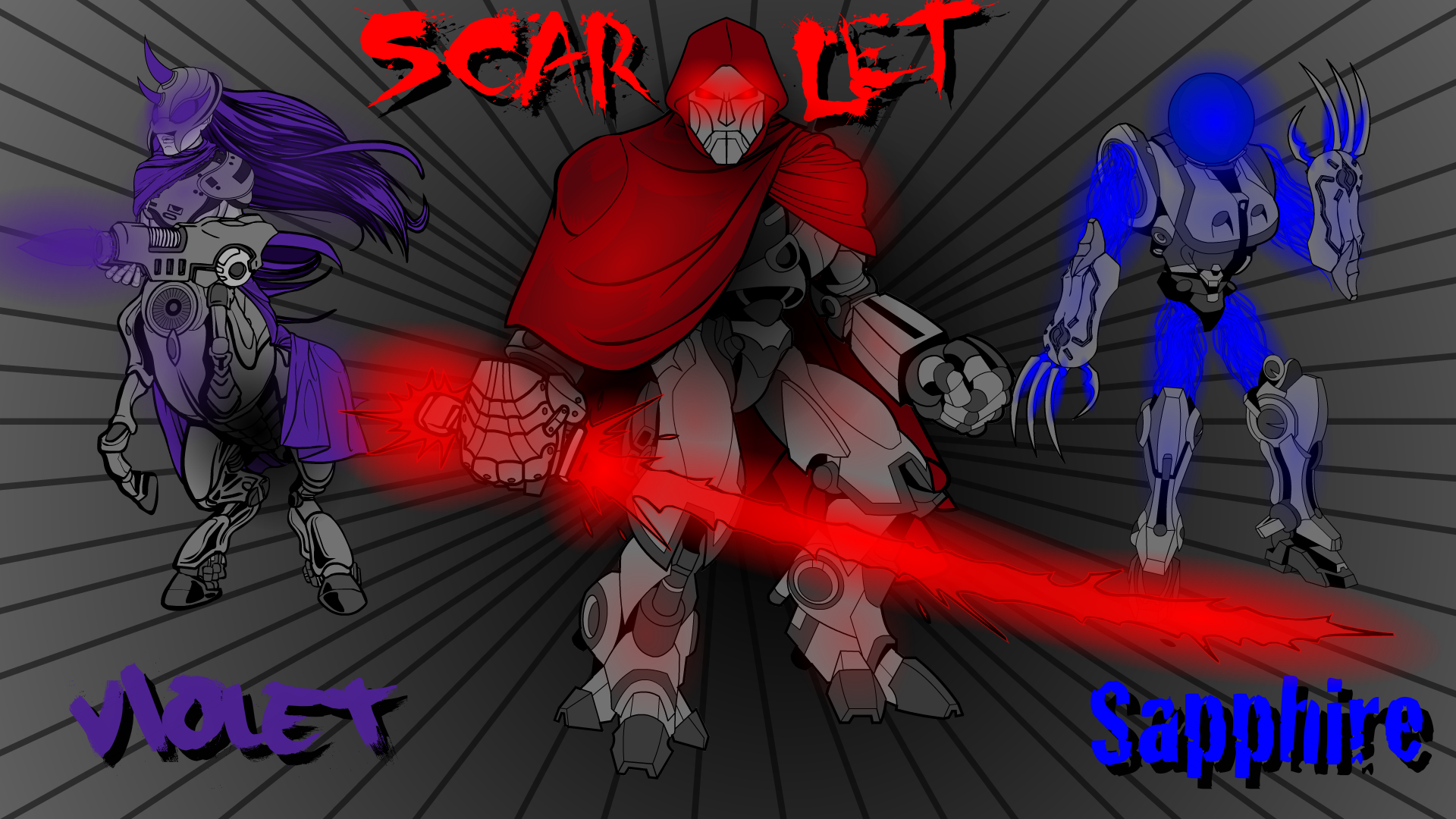
- Made entry for CDC 533:
Stelle Sisters:

Stelle Sisters’ DA Page (BIO in the description)
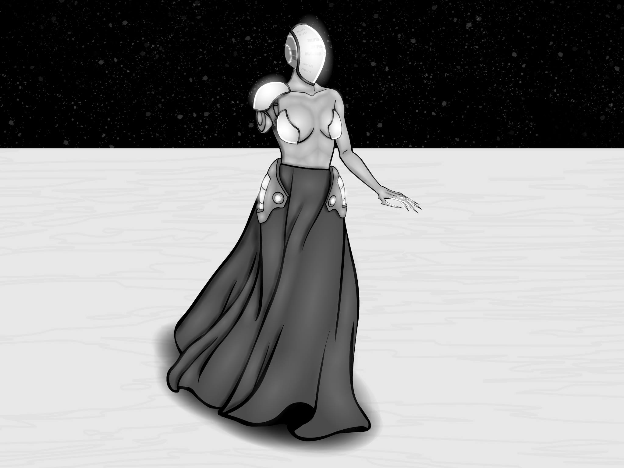
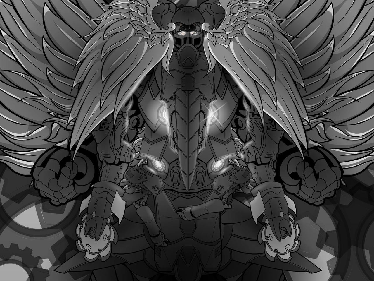
- Managed to find 2 of my old pieces in Facebook profile (as I used them as background at some point in time), and I guess it is not a repost if the originals got deleted from existence:
Lady Of Creation:

Mechanical God:

LullabyOfTheSinParticipantI have heard on one of the science channels that the image-to-image ai generation exists but didn’t know it is already accessible to a wider audience. Regardless, it is nice to see it used for something like this.
Output (image B) is clearly struggling with more unusual parts of the outfit, but it’s still a close enough approximation of the input i guess
I wonder how that AI would work for some of the more detailed pieces of HM art, for example, those in the Hall of Fame?
November 30, 2018 at 3:34 pm in reply to: Lull-carae's works – Place where criticism is welcome #153393
LullabyOfTheSinParticipantWhen in doubt what to do, do a pony.
Direct link to DeviantArt (Better quality): https://www.deviantart.com/vulcarae/art/Infinity-774767071

Some info:
– Shading/highlighting much worse than i want it to be, need more practice after so much failed projects.
August 14, 2017 at 1:10 pm in reply to: Lull-carae's works – Place where criticism is welcome #147193
LullabyOfTheSinParticipantHerr D, Anarchangel, i didn’t replied earlier (so i didn’t bump up my topic without reason), but i saw your words way before, and for them i thank you guys.
Now…
Let’s see if i’m still able to machine out a thing or two.
Direct link to DeviantArt (Better quality): https://vulcarae.deviantart.com/art/Lady-Of-Destruction-698783821
 Some info:
– First character made after very, very long time of not-doing-much in HM3. Tried to get rust off me with this creation.
– Sister of Lady Of Creation
– Idea for Lady Of Destruction came from thinking about Lady Of Creation (my previous character from hm3) story. Long story short – LoC creates, LoD destroys, but they can’t use powers without the other. So for every thing that is created, they have to destroy something of the exact energetic value, and so on.
– That’s what happens when you try to make exact oposite of cyber/tech based character.
– Under her left shoudercape, there is some kind of unspeakable tentacle-eldrich horror. Tried to make it visible at start but… ye, i suck at making tentacles. Sorry!
– Just like LoC, this is rather shading focused image. With some creepy’ish style. Why? Since it’s a me, that’s why.
And that’s it for now. I know i failed at being active at forum. Or at HM blog. Or anywhere. For that im sorry. I really, really am amazed by most of works i see here or DA. And that’s why i will try to get back to commenting here when i will find some free time.
After all, i wouldn’t even try creating again, if not for all of you. Maybe i was silent, but i came here from time to time, or watched my DA notification box. You always manage to inspire me. You always set cogs in my brain in motion. You create my creativity, in a way.
I don’t think i will ever be able to say how much i owe this community and everyone in it. And how much i am sorry for not repaying you properly. Have a nice day/night/pancake and let’s hope i will defeat lazyness when it comes again at me.
February 21, 2017 at 11:46 pm in reply to: Lull-carae's works – Place where criticism is welcome #142683
LullabyOfTheSinParticipantNot-containing art reply to my own topic -> beware and run away!
And being serious, i might… have… ehem… Sliiiiiight delay between commenting here on Heromachine.
Topics and stuff to comment gonna slowly stack, but sadly, i have few things that slow me down.
1) i am lazy.
2) really lazy.
3) extremly lazy.
4) and, not so important, still alive, and that causes few thing to do.Due to first three (and sometimes due to 4’th one) i will comment only once in a while. (i mean, i already comment only once in a while. But now i might comment even less than normal)
Sorry for that!
PS. #ShamelessExposureOfTopic
LullabyOfTheSinParticipantInteresting idea and nice concept. Execution really nice, i like this newspaper style.
All three images on newspaper are in my opinion well done, nothing bad to say about them.
Nice choice of fonts, bot for comments and main text.
Text itsel looks legit, truly newspaper’y text that is.Overall, waiting for the next issue!
LullabyOfTheSinParticipantNot sure what to say, it’s rather hard for me to find words for this in english. Maybe “i feel sorry for you” or “i pray for you to be good from now on”? Not sure what would be appropriate in this situation.
Anyway, as a cheer-up gift, i have something that you will love. A wall-of-text, that’s all about you and your creations! (Yaaaay)
First of all, i cannot admire your very very own way of Heromachine. (that’s what i admire most in almost everyone)
Your creations are original, and often, if not always, very “alive” (not sure hot to say it. And that’s another bracket for you)
Background/Scenery you make for you images are very fitting, and sometimes quite interesting.
For example, your entry for Out Of This World Pop Quiz is simply wonderful.Stuff you make never gets boring, you always create something different, always doing something new in it’s own way, and i like it.
Special “wow!” towards series of satyr characters, they are really nice in my opinion.
I also liked your Geoff and Walnut. Watched some of the Jeffs shows(that how you name those?) some time ago and i laughted hard thanks to him.
Pieces of Heromachine art that you created and that were inspired/based on music are just wonderful.
Also, poses. You are really good at making those look as good as possible.
And that’s it. If you want, i can also give some individual comments on single pieces of Heromachine you did (wasn’t sure where to start, and ended being so unsure that i simply didn’t done it, sorry), just say a word (and wait some time since it takes ages for me to do anything)
Have a nice day!
LullabyOfTheSinParticipantSo… We meet again… Jei-God-zu <prepares for brain meltdown due to what great things he is about to comment on>
Yukito Arashi, just as JR said, is shining with that epic Yu-Gi-Oh hair style.
His hair is worth of it’s own comment section:Highlights and shadows on his hair are just perfect.
How his hair is shaped is like 101% sugoi.
Jei-Hair-zu, teach us, mortals, how to be godly.Okay, back to rest of Yukito.
He is like pulled straight out of Anime. Good job. Your style is just wonderful when it comes to that.
Great costume design. Not to armored for a mage, while chest-piece and cape give him that fantasy/magic style (also nice cape choice, fits wind mage really well)
Color-scheme of his is really interesting and fits him overall.
Part where cape connects with chest-piece also nice.Nakano Gozen truly looks like one of these “goes to school and at the same time saves world and stuff” girls.
I admire way you did her Godly Armor of Female Protection (aka. strong-looking armor covering only ~50% of body with school-girl-skirt). Seriously, it’s really nice. Especialy liking torso-part and her shoes/boots/things on legs
Pose of her is just mindblowing. I have very hard time when it comes to non-standart pose, and you are nailing it like a boss.
Sweet hair. Truly gives image a feel like she is in the air, ready to strike something down with her sword.Ps. (late) congratulations on being a college graduate now. It’s nice that you will be here now more often!
Solar Rainbow Iro Kenshi is so… so…
Okay, okay, i’m back. So, here’s the thing: i don’t know what to say.
First of all, background. It’s amazing. That cliff view of the sea is wonderful. Water and light effects in background are masterpiece in itself, + that climatic rainbow, sweet.Character itself deserve it’s own anime. That determination in the eyes worth of main hero of the epic-story.
What he wears fits well for sword-fighting character. Colors and desing of what is on him are well picked and done.
Also, nice climatic bagde on his chest, rainbow’y
Sword is so, so, so… Sorry. Rainbow overdose almost came into me again.
Nice idea with heavy/durable glove for hand that holds sword.
Rainbow/shine/light effects of sword are flawless and wonderful.Overall, everything you create in that anime’y style of yours in great. Unique, interesting and pleasing for the eye.
I wish you a lot of time to create, your very own section of Hall of Fame and whatever else you want. Just create more, you are godly at this
You inspire me to create with works of yours, and i bet there are more people inspired by looking and what you have done so far.I wish i could have some better way to show you how much i admire your work, but that’s all i can do for now. Have a nice day and create something new quickly!
LullabyOfTheSinParticipantI am rather young when it comes to time on HM forums, so i didn’t meet you before. But anyway, it’s honor to meet someone who started creating long before i did and came back.
Bargain looks interesting. Rather simple, but at the same time it’s nice to think about it. “what Bargain? Does characters on the image want to trade some kind of potion in exchange for big bad dog? Why?”.
It’s always nice to look at these kind of creations that looks like they have story behind them. It get’s me so excited in most cases.
You created also quite unique scenery with this item combination, i like it.
February 1, 2017 at 4:57 pm in reply to: Lull-carae's works – Place where criticism is welcome #141744
LullabyOfTheSinParticipantWell, it’s been some time since i been in that topic.
Thanks, everyone, for nice/cheerful/just words. I know that i might not sound like it matters for me, but actually this is what keep me motivated for quite a lot of time. Really thanks.
Anyway…
Sorry for necro’ing this forsaken by gods place, but i have something new, and that means i have to do this, sadly.
Ps. Gonna try to return to text-flooding of the other topics as soon as possible!
Direct link to DeviantArt (Better quality): http://vulcarae.deviantart.com/art/Lady-of-Creation-660991973

LullabyOfTheSinParticipantHey, here to comment on your creations. But…
To be serious, i am not sure where to start. It looks like somehow i never commented your topic.I am right now checking out every page (going backwards, at page 14 at this moment) and observivng everything you created so far. But i’m not sure if you want to hear comments to your old old old old creations
BUT… If you will want this, just say. Then i’m gonna wall-of-text your topic to the next dimmension and beyond, starting from the very first creations on the very first page to the latest one (or i could start from the page you would find to be not-old enough, your choice)
(Reading Page 10 now) But for now, i will make overall comment about your style, what are you good at, what you make epic, and stuff like that.
(Page 7) in a moment…
(Page 3) almost…
(Page 1) Okay, here we go:
You are great.
I love how diverse you are, at practically everything.
You don’t always do any complex background, but when you do, it’s mind blowing and deep and beautiful
You created so many things in so many styles/themes with so many ideas/characters, each one totally unique with it’s own personality and feel.
Poses ranging from simple but still effective to complicate and stunning.
I love how you create masterpieces that have very varying theme (sci-fi, fantasy, superheroes, anything)
You are so damm creative. Tons, tons, tons of ideas you showcased in that topic. I cannot comprehend it all by myself.
You also have mastered HM it seems, your item usage is great, your way of doing shadows/lights/highlights is also awesome.
And… Not sure what else i could say. You are just one great Heromachinist. I wish you a lot of free (and happy) time and ideas for more creations of yours.
PS. So, just to make sure that it didn’t sinked in the wall of text above – Do you wish for comment on every single creation in your topic, or rather you don’t want me to reach that far? (if you want, i can start from the specific moment in time, so i don’t comment stuff that you find to old)
LullabyOfTheSinParticipantInteresting color scheme on Splitfire.
Nice balance in his costume when it comes to visibly armored and rather flexible parts, i like that kind of thing.
He is for sure one ready-to-fight henchman, that at least i can read from his pose.Deathstalker look really fabulous…deadly, i mean deadly!
her pose and facial expression are both well made and together create perfectly captured in-fight feel in image.
Glow effects give nice touch to her overall design.
well done, really well done.Gustav is interesting approach on brute-force character.
i like his, quite stylish to be honest, outfit. It is to some point elegant in my opinion.
armor-bracelets are always in fashion when it comes to hand-to-hand combat preferring characters, so well done.Koerlungr is really nice knight i must say.
Armor seems solid and well decorated for someone with the title of a “Champion”, and that’s good.
His Inifinity Blade adres me. Nice space/stars/blackness of space effect. Blade truly stands out.You have really cool ideas and way of putting them to life. Don’t stop creating, keep on so i can comment more of yours interesting creations.
LullabyOfTheSinParticipantGremlin would be for sure something i wouldn’t want to meet in dark corner. Or anywhere where is dark. Or at all.
These long nails look creepy on it’s own.
I wonder – are they razor-sharp, or rather for scaring people by suddenly touching them from quite a distance? Or maybe they pierce skin/flesh/bones?
Face is rather disgusting (in a good, horror sense), would probably scare many manly characters that would see him.
Do you think that your gremlin would be rather wild and savage, or maybe cunning and pulling people into deadly traps?
LullabyOfTheSinParticipantWell, and here lies my past hope of commenting on time. Anyway, time to catch up a little.
Or rather, a lot.
The Patriot looks great.
As always, highlighting at master level.
Overall costume design/colors are also well made.Shooting Star is really interesting for me.
Whole energy bow idea is great, and the way you did is is even greater.
Light effects are well done.
Her costume is pleasing for the eyes, good job on that.Major Patriot, when it comes to how good he’s made overall stands on the same level as Patriot.
+ He and Shooting star fit together as a team, at least i think they do.Iron Skull you made look really sweet.
He almost gives super-villian vibes, but thats good, he looks really cool.
You did really nicely the metal head/skin effect, its clean and quite visible (effect, but his head itself is also quite clean. Polished almost)Wrench is really great character.
These heli-drones are nice, adorable, probably deadly, but also well made.
Nice pose/character muscles/costume, everything fits nice.
Also, dirt/not-clean effect really gives him that unique mechanic character.Rose looks very intimidating, sweet.
Things that make up her costume give really interesting effect together. Looks practical, while still giving some defense + not restraining to much movement.
Red/gray color use is great overall.
Highlighting/light effects are perfect in my opinionDr. Wilson a.k.a Doc looks like definition of genius among humans.
Great “i can solve any problem with science” feel is all around him.
I have no idea if that ID he has is something you made or piece from HM, but i never seen it in HM, so i will guess you made it, and if yes, then nice. If no, then nice anyway.Peacekeeper is really nice high-tech superhero.
Loving idea of energy shield + almost-like-lightsaber baton (Lightbaton?)
Great use of light to give metal that reflective look.
also, colors are very nice and fitting, especially energy effects.Your version of Cuahtemoc is really nice.
Overall look is simply great, nothing bad about how you made him look.Sledge interested me a lot.
He looked like brute-force-only guy, until i noticed magic rune/effect on his hammer,
Tattoos on his body give him even more unique feel.
His costume, or rather, his pants, are really well made, good job on that.Whiteout is really someone uncommon in positive way.
loving this white-themed costume/equipment he has, fits his name really good.
He also looks like really nice gentlemen, that’s something i really appreciate.Pink Eraser looks to be one of this characters that never stops smiling.
Sorry to say this, but… I love how you used pink on her costume and weapon ;-;
Her pose is great, perfect i would even say.
Simply fabulous.All Star has color combination that i find quite interesting.
I always liked half armored, half flexible, or to put it simply, balanced costumes. Practical, and looks nice.
once again. look at dat light effects/light reflections/highlights/teach me.Silver Sentry grabbed my attention in few really good ways.
His armor is very not standard, or rather, really unique, in both colors and overall design.
I simply adore that sci-fi/high-tech feel he has.
of course, highlighting on materials of his armor/costume is great (you are just too good at it, i might sound like i repeat myself)Britainnia suprised me nicely, like, whoa, thats something really rare to see.
top-notch quality of her uniform + bonus “sweet!” for mini-trident-thing attached to her gun.
Pose left’s nothing bad to say about it.
Facial expresion of hers fits that captured aiming moment perfectly.Sgt. Steel sounds and loks interesting.
His metal body is so polished and shiny i that i can almost see my own reflection (if i just didn’t had such dirty monitor)
His uniform fits him really nice.Solaris, original and crispy, i like both of these.
These… THESE flames!. i love how they look so good, so… flame-ly!
Seriously, these flames. + this sun/star behind him, also quite beautyful.
Solaris himself with his really good costume and nicely glowing eyes is nice overallKruger looks to be the gold (ba dum tss) member of your vilian collection.
His outfit/custome is well done in every way possible.
His weapon of choice looks and is made really good.
Once again, you showcase on him your masterart of light-usage.Your version of Emma and Bub is just…
well…
It’s in hall of fame. There is no better compliment to anything created in HM than being there. So…
HoF. AKA. So epic that another generations of Heromachiners will know that it’s epic.And that’s it. I hope that this will motivate you to create even more and more. Really looking forward for more stuff to comment.
And with that one done, there’s around 25 more topics to go for me at this moment.
This will take a while.
-
AuthorPosts


 Some info:
