Forum Replies Created
-
AuthorPosts
-
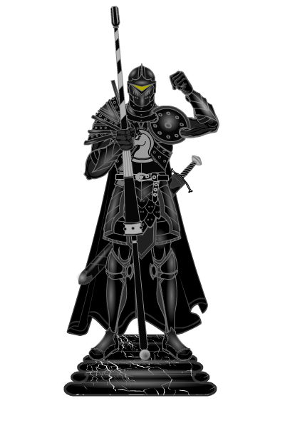
khaalisParticipantHere is my entry for the Black Chess Knight.

khaalisParticipantCongrats djuby!
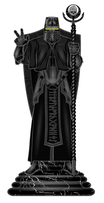
Here is my submission for the Black Bishop.

khaalisParticipantThank you! Thank you! I will try to make this week’s entry but I’m heading out on vacation this week so may not get to. If not, I’ll add a black one when I get back just for the fun of the set. Already have the idea in my head… now I just need the time to make it.
Cheers!
khaalisParticipantThanks Weilyn. Still learning but thanks.
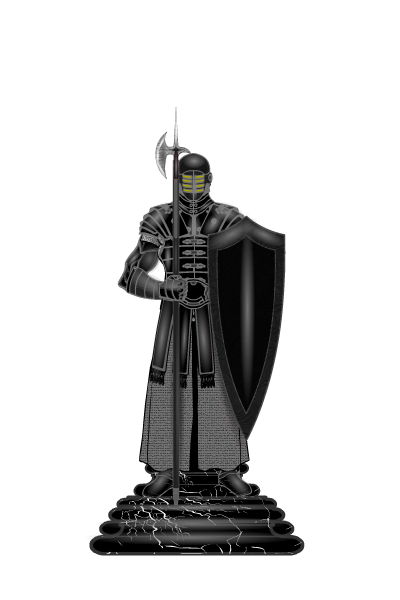
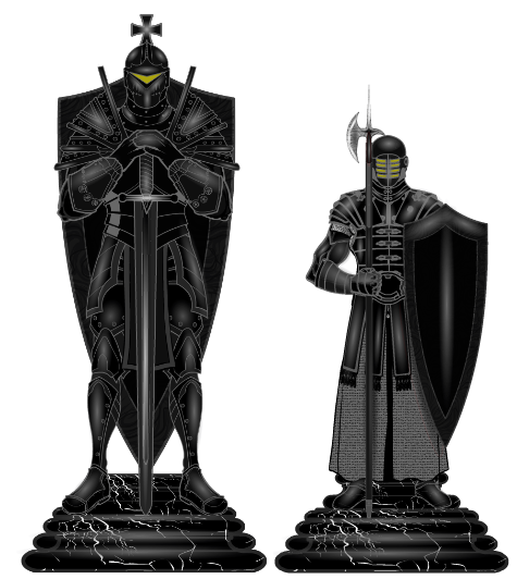
Here is my Pawn entry and a comparison shot of the 2 pieces side by side.


khaalisParticipantOk, since I misinterpretted after seeing the other king, here is my Black Pawn (and the comparison between King and Pawn).


khaalisParticipantHow many entries can we submit?
khaalisParticipantThanks everyone. Here was one I made for the Chess piece entry.
khaalisParticipantHere is my attempt at the Black King.
khaalisParticipantOk, I’m not seeing the poll on the Blog, so can I cast my vote here?
prswirve’s A Long Way Home
I’m not even certain how prswirve managed some of this.
khaalisParticipantDjuby: Thanks for the compliment. What snipping tool do you use?
Kaylin88100: Thanks for the info. Works great for the sides, but it still keeps cutting off the feet.
Just a small annoyance as it means I can’t export a clean transparent version.
khaalisParticipantThank you everyone.
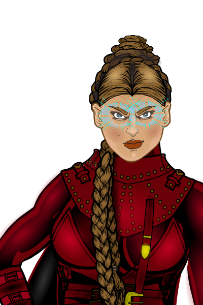
khaalisParticipantHere is what I’ve come up with so far after everyone’s comments. I chose try and keep it a little more subtle.


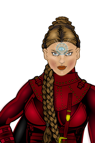
khaalisParticipantSo how is this for a facial redesign?

As to the “power expression”, would a “third eye” centered just above her eyes and done in the same transparent blue of the current expression work better?
khaalisParticipantThanks for all of that. I did mask the legs in 3 parts and it worked great. Still working and thinking about the eyes/power. I agree that it “should” in actuality be invisible, but that’s really hard to pull off in an art piece. I’ll have to see if I can make her look more “concentrating” facially but not sure where to go with that just yet. I may just go with some corner glow to the eyes.
khaalisParticipantThank you one and all.
Hammerknight: The forehead rings might work. That’s a good idea.
Vampyrist: Thats a cool combination of effects, though I get more of a kind of smoky residue after an energy blast kind of feel from it. However, it gives me some ideas for mixing elements.
Kaldath: I’m still very new here so when you say zypping, you mean just the use of a gradiant circle in a “glow-like” color correct? Like the eye on Vampyrist’s sample?
Livewyre: Having scene the face, I take it you are saying its too expression neutral? You’d try to find a way to make the face more expressive, like more in concentration?
Herr D: Ok I’m going to take a chance here since I can’t really find anything that says the style this is based on is copyrighted and there are tons of nockoff costumes in RL out there, so… If a mod needs this taken down just go ahead and do it or let me know and I can take it down.
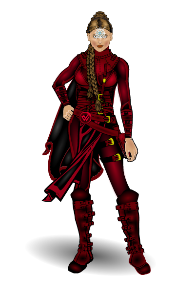
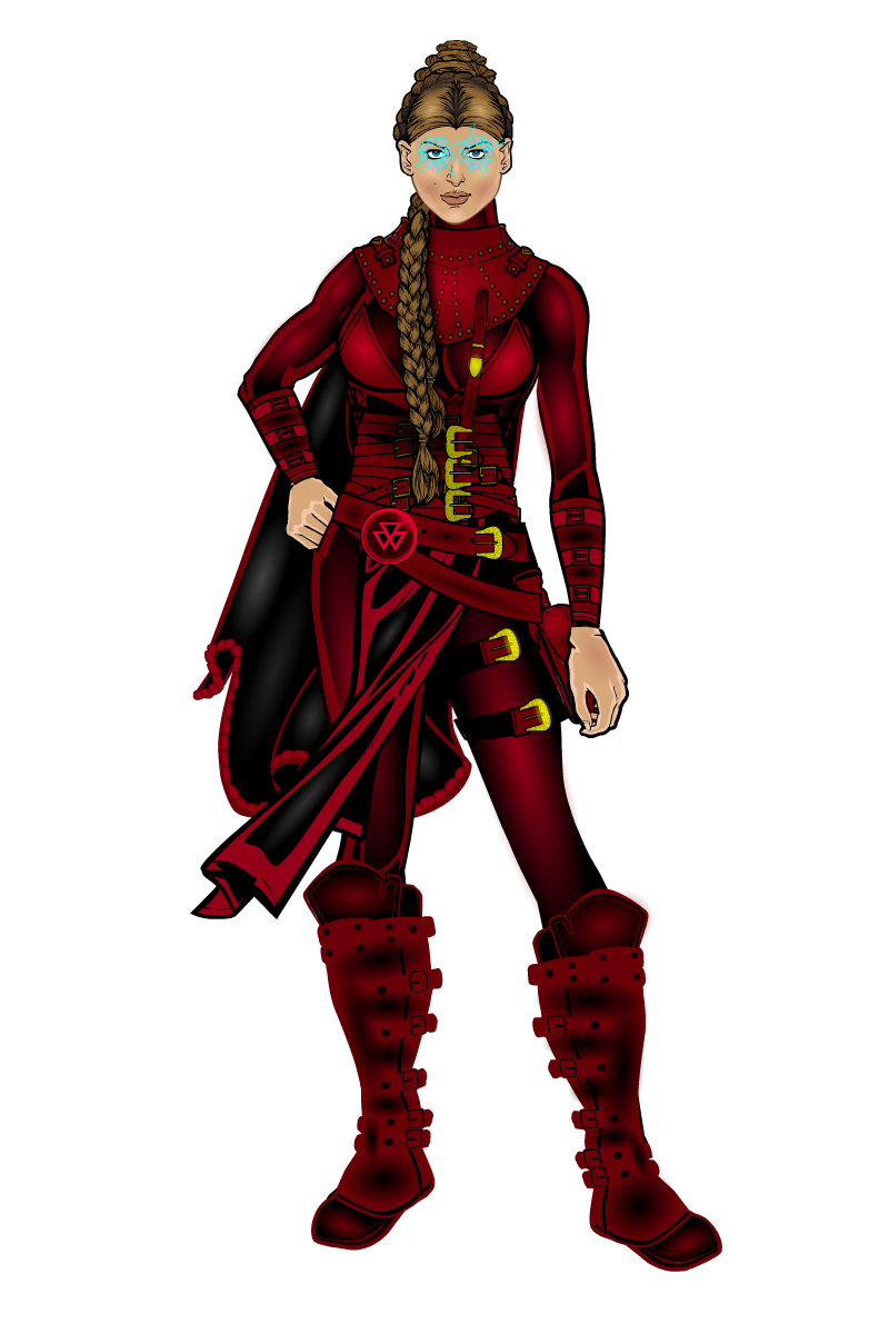
This is the full body shot of what I have so far.

PS: I really need to rework the boots as well since they don’t seem to fit the body even though if I shrink them any more the legs show.
-
AuthorPosts

