Forum Replies Created
-
AuthorPosts
-
Kaylin88100ParticipantI’m intrigued…

Kaylin88100ParticipantHere we go:

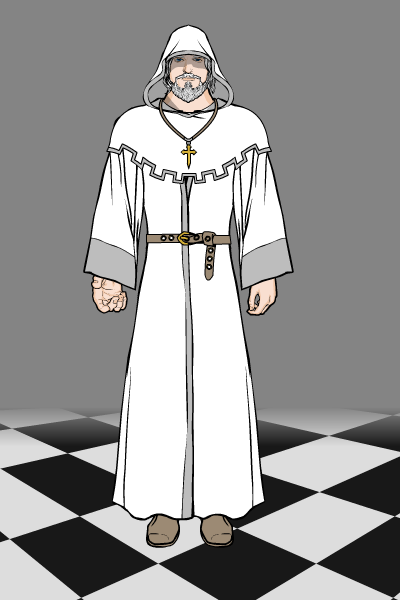
I think he ended up as more of a monk than a bishop, but that’s the Machine’s fault for not having a bishop’s hat, and my school’s fault for giving me an exam tomorrow so I can’t really be bothered to spend 3 hours making one.
Kaylin88100ParticipantI think I’ve seen a similar idea to the last 2 steps somewhere else…nice tutorial.

Kaylin88100Participant@Weilyn said:
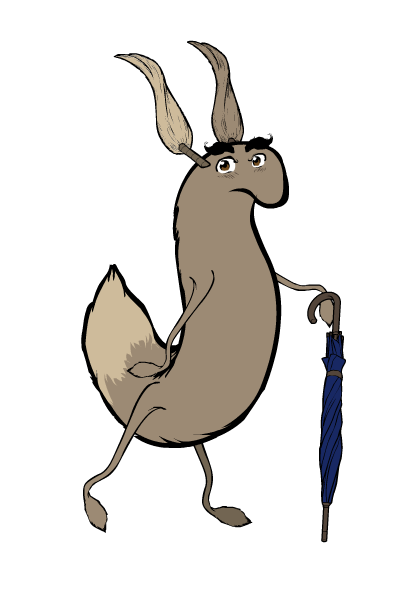
That tail creature is amazing

Thanks! I was just playing around with the items, and it jumped out at me, so I went with it.
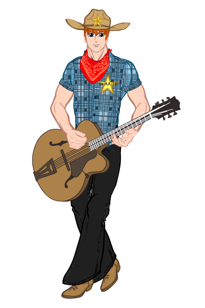
Kaylin88100ParticipantI just realised I haven’t posted anything on here for a while so here’s an entry I made a while back (March) for the One Part, Many Characters contest. I tried some new techniques inspired by Harlequin’s tutorials.

Here’s another one from the same week. This was more of a quick, fun one.

Kaylin88100ParticipantBull
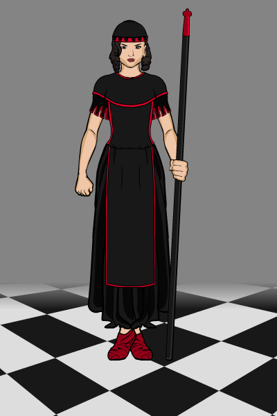
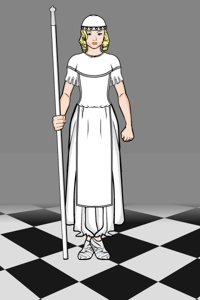
Kaylin88100ParticipantHere’s my contribution for this round.

And here’s the white pawn for comparison, if anyone’s interested in why she looks the way she does.

Kaylin88100ParticipantCompany
Kaylin88100ParticipantVery nice! I’d like to see the original for comparison; I think it’s nice to see how much you’ve improved, and how much the program itself has progressed.
Kaylin88100ParticipantThe way to do a background is to make it separately from the characters and then load it first, with the figures loading on top. It’s probably best if you finish each “layer” of character or background separately, and then don’t do too much tweaking once you’ve put them together. Also, there is a glitch that means if you add a new load on top of an existing character, the bottom layer of the new character is layer 1, and the old character gets pushed into negative numbers, which is mildly annoying as you can’t move anything down a layer below 1. All you can do is move things up, which thankfully seems to work fine.
Kaylin88100ParticipantWhat you need, my friend, is masking. I’m sure I saw a tutorial somewhere…

*wanders off to look for it, or possibly to make one…*
Kaylin88100ParticipantThere is a way to get widescreen pics. On the Export screen, there are options for widescreen formats that you can then crop if they’re too big. Just select one of those.
Kaylin88100ParticipantOooh! You made a mouse!

Kaylin88100ParticipantHere’s my take. This looks like an interesting contest!

Kaylin88100ParticipantEyebrows. It’s all in the eyebrows.
Pull them down low and angle them a bit – you can use insignias to cover up the ones that are attached to the rest of the face, and put in your own so you can mess around with the position. It’s very subtle, but most of facial expression is in the eyes and eyebrows – which is where you’re focusing anyway, so well done.
-
AuthorPosts

