Forum Replies Created
-
AuthorPosts
-
JR19759KeymasterHome
JR19759KeymasterLoving her eyes, the right one is quite creepy. As for the rest of it, refer to any of my other comments (i.e. it’s awesome)
JR19759KeymasterGreat pose you got going on The Invisibles

JR19759KeymasterHappy Birthday Man
JR19759KeymasterWelcome to the forums. Please read the forum rules and have fun posting.
If you want to get better at shading, then I’d suggest that this tutorial by AMS would be a good place to start.
http://www.heromachine.com/forum/tips-tricks-how-tos-and-guides/how-to-highlightshade/
After that just play around and try out new things until you’re happy with the effect.
JR19759KeymasterThat’s awesome.
JR19759KeymasterYour second take on Lilac/ Linea is really good, the shading is brilliant. I assume that the Eeveelution she was inspired by was Eevee it’s self (I can see Vaporeon and Flareon as well, but they haven’t done a flying type yet so not sure about Silver.)
JR19759KeymasterThat is definitely a great costume, even if I’m slightly thrown by the perspective. The sizing of the arms and hands would suggest that his right side is closer than his left, but the body is flat suggesting that his body posture is straight.
JR19759KeymasterHow long have you been doing this exactly, because you’re better than most people on here already.
JR19759KeymasterYou might want to use a head item or two for the body, unless you were going for a slightly inhuman body shape. It doesn’t look bad, per se but he just looks like he could do with a good meal. Also the shoulder is too high. It might work if you just moved the shoulder down and forward a bit and left the rest alone. Great use of items though.
JR19759KeymasterOh wow. That is incredible.
JR19759Keymaster@Nug said:
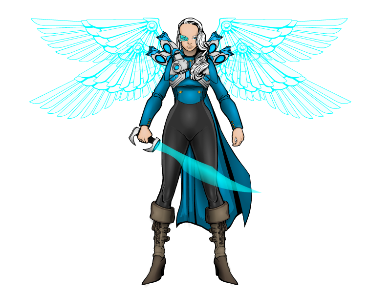
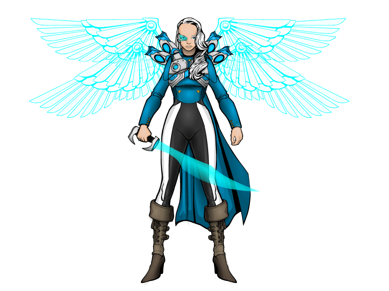
I like your concept here, JR! No offense, and this may be just me, but the stripes on the pants are throwing me off. She has a very well crafted, and old style feel , official type uniform – top. Then when it gets to the pants, it feels to me like it gets a little “circusy” vibe. All in all, it’s a cool piece!

Does this look better?

I just added the stripe because the full black seemed a bit dull.
JR19759KeymasterThanks guys.
Another random one again.

JR19759KeymasterI shall second that Wow
JR19759Keymasterthank you mr. positive, you can be helpful without being rude you know, some people may not have been doing this as long as you and may do things differently/ use a different operating system, lots of different things. Please take that into consideration before being rude.
-
AuthorPosts


