Forum Replies Created
-
AuthorPosts
-
JR19759KeymasterAnyway, a few more things from the Santa Swap.
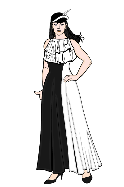
First, a dress to go with a hat for keric (the hat is the one used in the picture.)

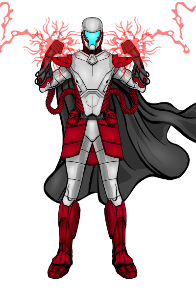
and a coloured version of one of Trekkie’s sci-fi armour super villains, unsurprisingly this one was for Trekkie.

JR19759Keymaster@Trekkie- We do very much approve. That is awesome.
JR19759KeymasterOk, here’s how I do it. Other people may have different ways, but this is the way I find easiest. This tutorial was made because someone asked about colour-blending on clothing, but it works on any item you want as long as you can get the sizing right.
1.Pick out the item you like, then go to backgrounds- shapes and on the last page should be a gradient rectangle (there is also one on the last page of the patterns list). Make the outline of the rectangle invisible and colour to preference

2.Size your first rectangle to cover the amount of the dress you want it to (bearing in mind we will be adding more of these rectangles as we go along, so you may end up coming back and resizing them later). Then bring the rectangle to the front and mask it to the item.

3. Make sure you have multiple selection activated on both items you are using (in this case background and female tops- dresses) and make multiple copies of the item you are masking to. Then using the gradient rectangles create the colour blend. Move each rectangle so they line up with the one below (you will usually have to make the bottom rectangle the top layer so as to make the blend as neat as possible).

4. Repeat step 3 until you have covered the item. You can then make adjustments, such as moving the rectangles or resizing them to make the blend fit better. For this dress I added the collar by adding the separate top of that dress and making the main dress colour transparent.

JR19759KeymasterWelcome Camruth. Good start.
Please make sure you read the forums rules.
JR19759KeymasterGuitar
JR19759KeymasterHere you go Trekkie. I had fun on this one and I must say I was hugely impressed with how you made the costume here, I would never have thought of some of these bits.

Oh, and Herr D, your list is giving me major problems. I started to do a windmill, couldn’t get it right, had an idea, then saw keric had already done one, so now I’m failing to get the Tarzan pose to work and I have no idea what you’re on about with your first present. Sooooo, this could take a while.
JR19759Keymaster@dblade said:
@JR19759 said:
@dblade said:
I just hope the boys in shipping didn’t send out the helmet and star insignia early. That would be embarrassing. Robot Skull votes might surge if that went up early.

Umm, hate to tell you this, but I just checked the insignia-standard section and on the last page is a star that looks pretty much identical to the one you’re talking about. And that helmet seems to be in the headgear-standard set as well. So I’d start drawing that Robot Skull if I were you.
We are all going to pretend that we didn’t read this message. Just to be safe, don’t clear your cache and avoid using HeroMachine for a week. Ignorance is happiness! Knowledge is misery!
Don’t look in my gallery then.
JR19759KeymasterAbsolutely no new items that shouldn’t be in heromachine yet used in this at all, ever, no sir, none at all.

Sorry dblade, I had to.
JR19759KeymasterWelcome Arbiter.
The first thing that I picked up on when I looked at Warrior of the Rose is that the helmet colours don’t match any of the other colours you’ve used elsewhere in the pic (much lighter shade of green, skin tone horns). Whilst this does draw attention to the face (which looks quite good, just having the eyes doesn’t detract here at all, it gives him a lot of expression), it does jar a bit against the rest of the image. My next critique would be the colour layering. If you look at where you’ve placed certain items and how you’ve coloured them, some of them are getting lost by being immediately next to something of exactly the same colour, i.e. the right glove, the cape and background aura. I’d suggest changing the colour of one of these (maybe make the cape red?) or removing one altogether (personally I don’t think the aura adds that much to the overall image). Lastly, I always say this, but don’t use to many different colours, all the best costumes have 4 tops. In this pic you’ve got (excluding the brown body colour), dark grey/ black, silver, two different greens, red, cream/ peach and three different shades of yellow. I think that maybe keeping the armour as it is would be the way to go here, as it looks quite good, change the helmet to match the armour, make the cape red, the right glove green maybe, and keep the under armour dark grey/ black. But that’s up to you, it’s all about experimenting until you find something you’re happy with.
Apart from that, not bad. I’m sure other people will have different ideas to me, so don’t worry if you don’t like my suggestions.
Anyway, as moderator I have to ask you to make sure you read the forum rules, but apart from that, welcome and have fun posting.
JR19759KeymasterSo much for it being a wizard contest when all the top 3 are female characters, but never-the-less, thanks for the nod and congrats Kaldath.
JR19759Keymaster@dblade said:
I just hope the boys in shipping didn’t send out the helmet and star insignia early. That would be embarrassing. Robot Skull votes might surge if that went up early.

Umm, hate to tell you this, but I just checked the insignia-standard section and on the last page is a star that looks pretty much identical to the one you’re talking about. And that helmet seems to be in the headgear-standard set as well. So I’d start drawing that Robot Skull if I were you.
JR19759Keymasterdblade, did I ever mention how much I love having you back?
JR19759Keymasterwelcome MercsRule. I’ve moved this thread from the Art Contests and Challenges section to the Art Gallery Section, as it is a more appropriate place for it. Please take a few minutes to acquaint yourself with the forum rules, and have fun posting.
JR19759KeymasterI’m really trying very hard not to make a bad joke here. Good work. He rocks. damn!

JR19759KeymasterPlug
-
AuthorPosts


