Forum Replies Created
-
AuthorPosts
-
Herr DParticipant@Keric: As the only other contestant this round who entered by the due date, you should know I PM-ed mattisagamer a couple of days ago to remind him to judge. Should we give him till 1/21 before I declare as prior judge that the runner-up start us off afresh?
Herr DParticipantOne of the great advantages of energy blades is that, since the tech for it doesn’t really exist yet, no one can say exactly what shape or size they should be. I haven’t yet seen the obvious plot twists that would come from energy blades altering their shapes by biometrics to ‘twist’ or ‘barb’ inside an enemy and wink out on contact with an ally. Physiognomy can change tactics just as much as technology, after all . . . I’d be tempted not to size them down, but give them a more aggressive angle or shape.

Herr DParticipantOh, and a discussion of splitting pics into separate framed pics might be interesting. There are a surprising number of ways to do that.
Herr DParticipantAs one of the resident amateur xenobiologists, I can tell you that contests for ‘newly designed’ only characters with physiological traits randomly picked by the contest judge could possibly keep the topics fresh and vary the challenge level. I’d be happy to cast a secondary vote based on anatomical logistics to assist in determining tiebreakers in any contest I don’t enter or don’t make finals for.
Example: XC#1, human-sized, meat-muscled, three legs, dancing–twirling should come easy if the legs are roughly equal, All the big toes on the same side of the three feet can make sense if there is only one big toe and not in the center.
For that matter, you might hold a contest for people to make in hm3 entire pictures of single items they’d like to see in the future. That would bring an element of pride–“I made the inspiration for that out of TWO HUNDRED LAYERS so you can have it in one!”
Another idea would be to reuse some of the more challenging pop quiz ideas and encourage using the week. I’m guessing Jeff wouldn’t mind?
Herr DParticipant@Pathwalker said:
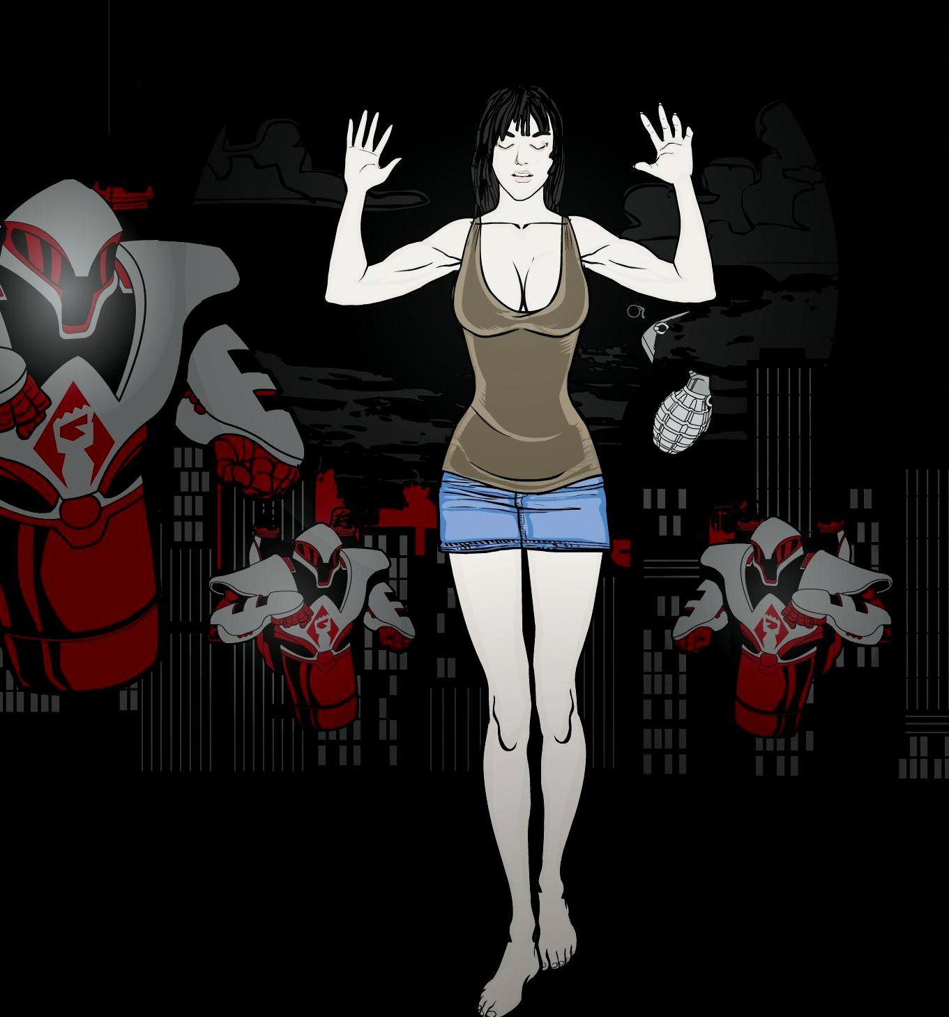
I hate school, Haven’t had much time to play around with heromachine lately but I did get this done.
She’s an experiment in tone. I know the grenade’s not quite right but I don’t know how to fix it.
Move the ring pin so that it’s around a finger? Color the grenade olive green and gray?
Herr DParticipantSunni D guessed again.
Karl Urban?
Herr DParticipant@Lime said:
He is older — by a whopping 6 years. I think they make him look older for his role. Wonder if there’s any way I can make the eyebrows more … I dunno, “feathery,” I guess. That would be more accurate to the guy I have in mind.Layers of translucent? When I did a portrait of Rod Serling, I had to do that a lot. Feathery can be gotten with small Hair, mostly translucent showing only one of 3 colors, the same treatment of the crackling or fire Energy items in ItemRight.
Good luck. Human faces are HARD. But then, I should stick to what I understand, right?
Herr DParticipantUh–I’ve used the Export function, but I don’t normally. Another way is to do a screen capture. If you have Paint or some other graphics program that allows it, you can boot it and minimize it, get the pic like you want it in the lab, hold down ‘ctrl’ and [fn] keys, tap [prt sc] (print screen), maximize Paint, hold down ‘ctrl’ and tap ‘V.’ Most of the contests here allow saving and cropping by other programs, anyway. Lots of us save pics on our threads here and other places as well. I use Photobucket, and I’ve seen a lot of people using DeviantArt.
Herr DParticipantI’m horrible with faces, Sunni D guessed this.
David Giuntoli? as Nick in Grimm.
Herr DParticipantmmm. I think maybe the next thing is to make a translucent rabbit/dove leaping from his hands to scratch out the viewer’s eyes. Maybe it’s a pterodactyl and banks to our right first with translucent force lines showing it’s path. That would also ‘explain’ why we can’t really see the arms. Nice one.
Herr DParticipant@Saje3d said:
Not sure what you mean about “favoring pen names,” sorry. I have only recently started playing with the backgrounds. There are SO many options I’m just starting to play with right now.
And, yeah, I checked out the rules before I posted anything. I’m not likely to violate any of them.
I mean, when you publish your books.
Herr DParticipantAs a pessimist, I should tell you, “your thread’s half empty.” As a viewer, I am formally advising you to overcorrect that.

Herr DParticipanthello! Do you favor pen names? You’ve a good focus for visual backgrounds.

Herr DParticipantMmmm–Foxtress’ knife in her hand should be between her fingers. In that pose you might not need to mask if it’s positioned perfectly? Good matching arcs from glove to boots on Dynafox. You might match it even closer by masking part of a second black curve to the appropriate place on each glove cuff.
Herr DParticipantClarissa was SURE she could work magic. So when she developed a crush on Matt, a local janitor, she took up concrete sculpture in her first attempt to make him fall madly in love with her.
http://i1067.photobucket.com/albums/u438/jamais5/2014hm/FirstAttempt_zps247e34d2.png
Unfortunately, Matt was in a hurry to finish up that night, and moved a little too fast . . . Clarissa is now convinced her magic doesn’t work, and she has been unable to remove these mysterious plastic shards from her wardrobe no matter what she tries.*opmc
-
AuthorPosts


