Forum Replies Created
-
AuthorPosts
-
hawk007ParticipantGreat shading! Looks very smooth.
hawk007ParticipantYou can’t mask more than one thing to an item. Don’t know why, but you can’t. But there is a way you can make it look like more than one thing is masked.
Say you want two tattoos on a head. You mask one tattoo to the head. Then, you make a second head, totally identical in size and place, and mask the other tattoo to that. Then, you make the second head totally transparent, and you can bring it down to the bottom layer, if you want.
Also, if I understand it right, you can’t do the second one, either. Just make make multiple of the tattoo, exactly the same in shape, place, and color, and mask each one to a different body part, but in the exact same place, so it looks continuous.
I hope this helped a little.
hawk007ParticipantThose two last characters are already two of my favorite on here. The costume, posing, shading. Everything’s amazing!
hawk007ParticipantVery awesome stuff! You seem to have shading down, and the costumes are great!
Keep it up!
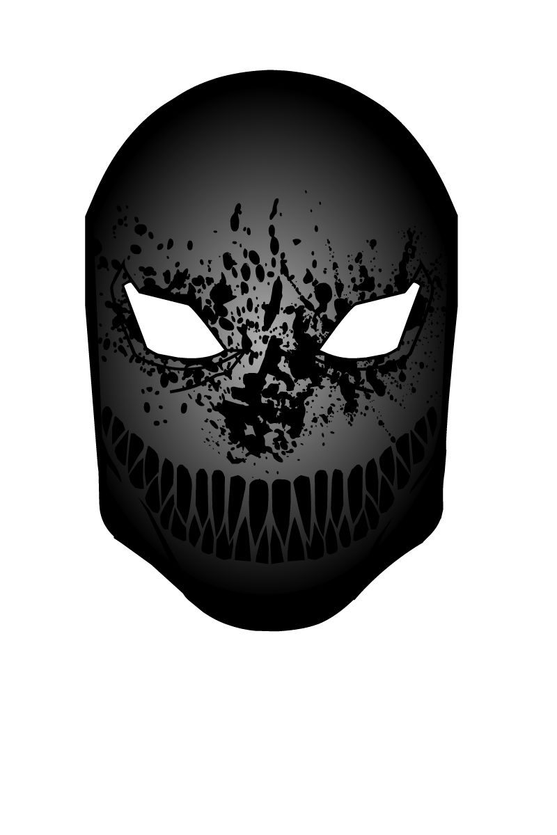
hawk007ParticipantMy entry for the mask pop quiz. The Death Ink Mask.

Attachments:
You must be logged in to view attached files.
hawk007ParticipantI’d suggest some, but you seem to have your plate full. Since I don’t have anything specific, I’ll hold off for now.
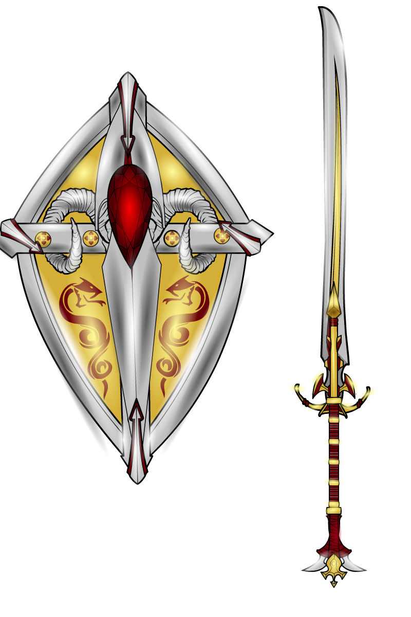
hawk007ParticipantMy entry for the “Devil is in the Details” pop quiz. The Dragon Cleaver set. Only the strongest, most powerful warrior can wield this dragon-destroying blade.

Attachments:
You must be logged in to view attached files.
hawk007ParticipantI have a question. I know that you can’t make copyrighted characters, but is it against the rules to make an interpretation of a character from a book that hasn’t been made into a movie? Because the look (like movie or video game characters) hasn’t been made and copyrighted yet.
hawk007ParticipantCool. I like his pose. Good job!
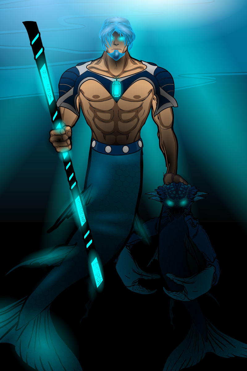
hawk007ParticipantThanks, Geno!
My entry for the contest Water, Triton Landslayer! He’s the son of the god Neptune, and champion of the great Sea-Earth war.

Attachments:
You must be logged in to view attached files.
hawk007ParticipantAs usual, it’s all amazing!
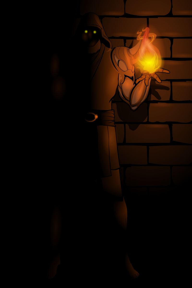
hawk007ParticipantMy entry for the Fire contest (and in my opinion, one of my best) Pyromancer.

Attachments:
You must be logged in to view attached files.
hawk007ParticipantI like the designs of all the characters! I’d say that the third one, the design’s kind of all over the place. It’s good to have change in the character, otherwise it just looks too “monotone”, but I’d say have a little bit of a theme. Like, he looks like a warrior (or something like that), so maybe have all his armor a couple colors, then all the cloths a couple of colors. Maybe have his undershirt brown and white like the things on his lower legs.
Sorry, if this is a lot, it’s just some advice. Love the characters, though! Keep on making ’em!
hawk007ParticipantBlood Oath?
Razor Voice?
Wall Blade?
Just kind of spitting off ideas, here
hawk007ParticipantDude, just…wow. You are probably my favorite machiner on here.
-
AuthorPosts


