Forum Replies Created
-
AuthorPosts
-
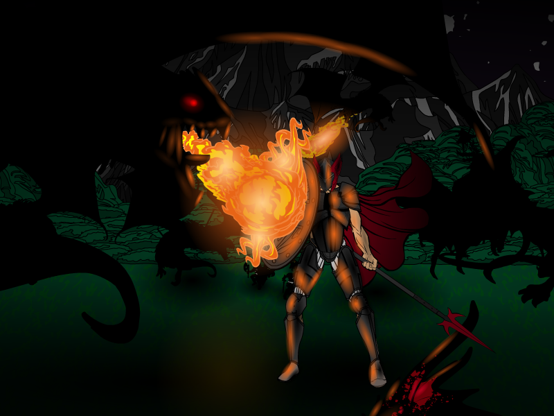
hawk007ParticipantMy entry for “The World is Mine” contest. Dragon Hunter.

Attachments:
You must be logged in to view attached files.
hawk007ParticipantThanks Madjack!
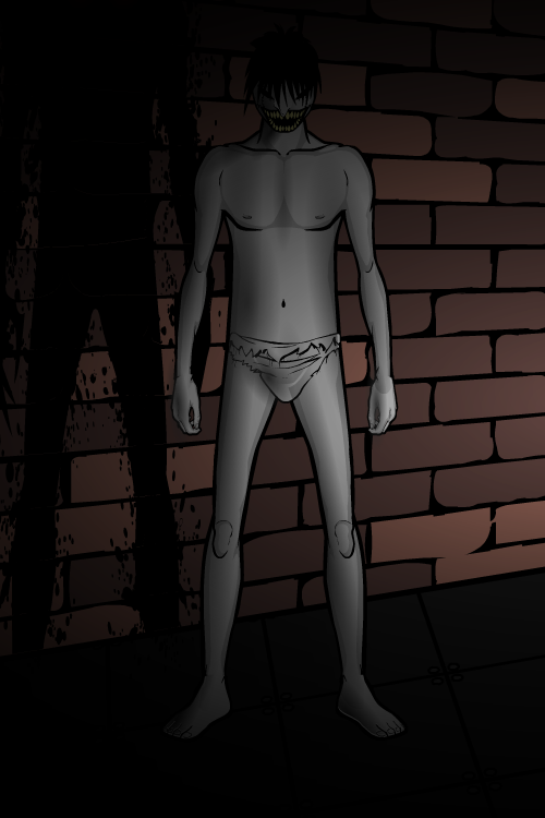
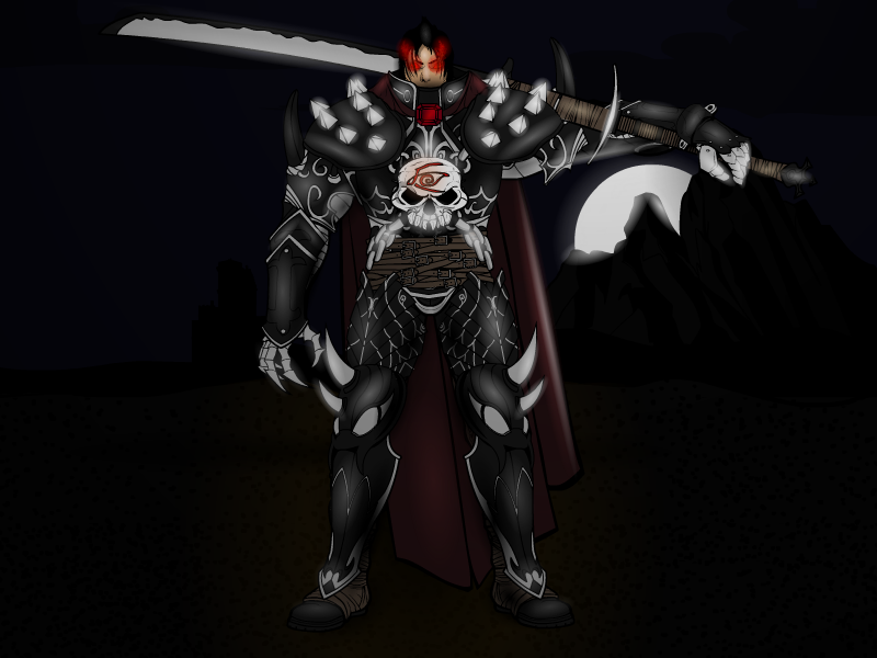
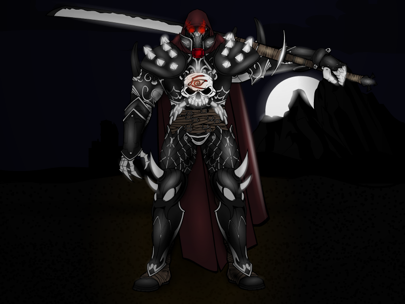
My entry for the Spooky, Scary character contest: Wanna Play?

Attachments:
You must be logged in to view attached files.
hawk007ParticipantLike vector man said, great turn around poses. Very nice character designs.
Yeah, to what you said, male character backs are kind of hard to do. If you’re doing skin or something skin tight, it’s probably best to look at a picture of a back, and use shading to replicate it as best as possible.
hawk007ParticipantDid they ever do a Power User Profile on you? I know they aren’t really anymore, but they definitely should have. You’re probably one of the best on here. Amazing characters! As always, the shading, posing, and costumes are all on point!
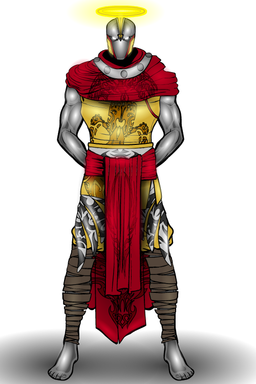
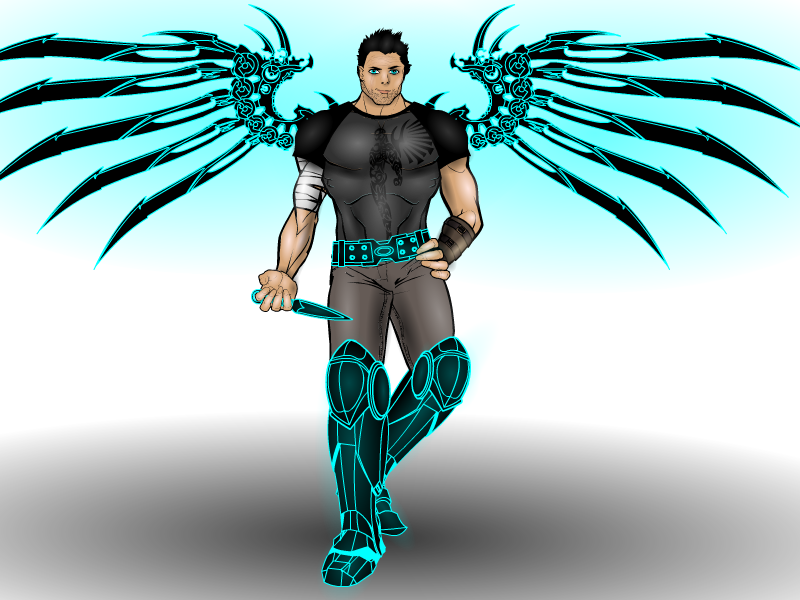
hawk007ParticipantMy entry for the costume contest. Aguar: The Steel Angel.

Attachments:
You must be logged in to view attached files.
hawk007ParticipantThe helmet on him looks great! Good job! Though I have to admit, he looks kinda funny with just a pocket knife.
hawk007ParticipantThanks! I’ve been on spring break this week, and decided to mess around with posing and lighting and stuff.
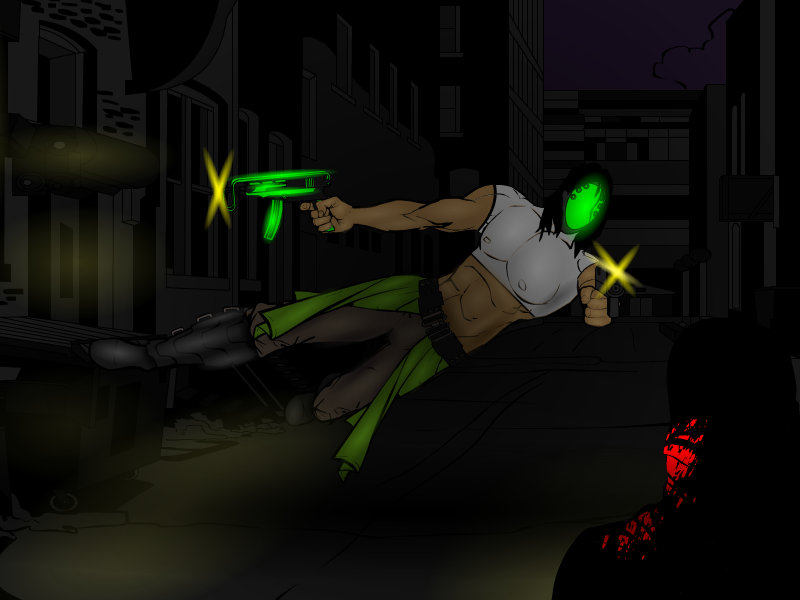
hawk007ParticipantHere’s Warren. Some guy…who fights crime…probably at night…

Attachments:
You must be logged in to view attached files.
hawk007ParticipantThanks, Vectorman!
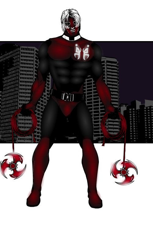
Here’s a remake of an old character. The dagger-throwing, half-demon, anti-hero Dark Angel.

Attachments:
You must be logged in to view attached files.
hawk007ParticipantThanks, JR.
Ok, so here’s the finished Prince Bjurrsif. I think it’s probably one of my favorites I’ve done. There’s one with a helm, and one without. They’re gonna be a little small in the post, so right click and click view picture to see it right.


Attachments:
You must be logged in to view attached files.
hawk007ParticipantWelcome!
I really like the character you’ve made so far. They kind of look like they’d be fighters in something like Mortal Kombat. The posing looks pretty good, too. The only thing I’d say is, besides the last one, they all kind of have the same pose. If you were trying to go for that as a style to just display the characters, then that’s good. I’d just recommend going and trying different poses, and experimenting with different items. Also, I’d say, on Frozen Master, maybe put something from “Item Right->Energy” into his hands, and maybe try a glow effect with it, though that may be a little advanced for someone new to this.
Well, yeah, welcome! You have some great stuff to start out, and I hope to see more!
hawk007ParticipantThanks, guys! By the way, does anyone have a technique for shading areas out of screen in a widescreen mode? I have something that may work, but I want to know if anyone else has done anything that has worked in the past.
hawk007Participant
hawk007ParticipantThanks, Vengeance!
Here’s The Artist, a vigilante who fights crime at night.
That’s about it.

Attachments:
You must be logged in to view attached files.
hawk007ParticipantThanks!
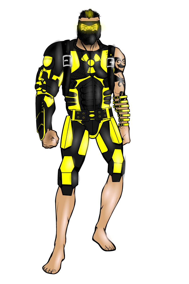
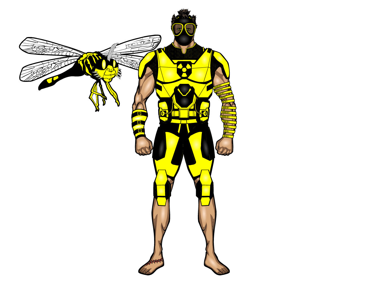
So, for the contest, I redid my old character Reactor. Some of you may notice that a little while ago, I posted a character under this name that’s pretty much just a black background with some lighting. That was originally starting out as a remake, but kind of went off track. Here’s the actual remake.


Attachments:
You must be logged in to view attached files. -
AuthorPosts

