Forum Replies Created
-
AuthorPosts
-
hawk007ParticipantI like it. All the pieces fit together really well, and the shading’s pretty detailed.
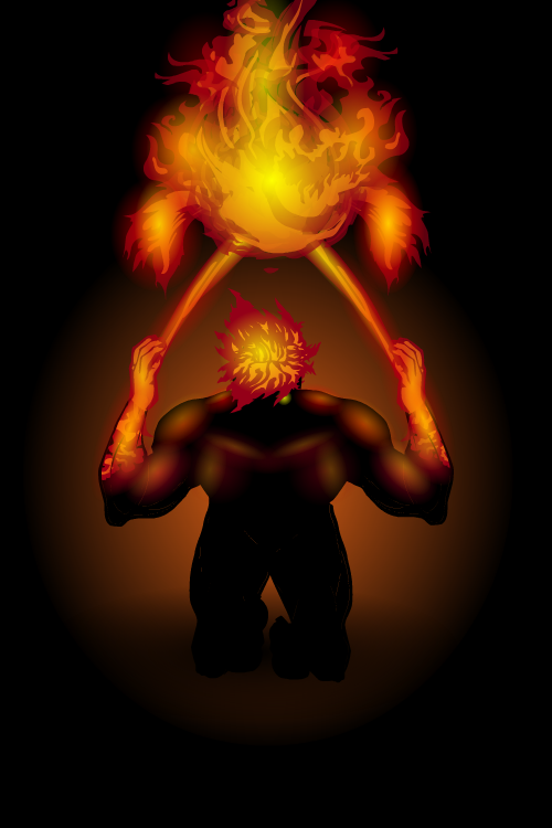
hawk007ParticipantNo problem! Speaking of fire, here’s Burning Veins, a piece I did for the Elemental character design challenge.
(P.S. Sorry there’s two files. I forgot to name it correctly.)

Attachments:
You must be logged in to view attached files.
hawk007ParticipantVery nice!
Really quick critique. You’re shading is on point, very good. But I feel like your posing is lacking just a little. It’s not bad by any means, but I think that your shading skills are enough ahead of your posing that you should maybe focus a little more on poses.
Still though. I would by no means consider these bad. Great job!
hawk007ParticipantThanks! The fire actually isn’t that hard. The key is to just use color and shading it make it darker on the outside and lighter on the inside. For instance, with that fire, and did the outside color red, the inside color orange, and put a yellow gradient (for shading) over it. Also, don’t forget to make the actual color piece semi-transparent and glowing.
hawk007ParticipantReally cool character! Obviously can’t tell from a single character, but it looks like you have a unique style.
Any way, really nice, and I’m looking forward to seeing more!
hawk007ParticipantOk, I get it now. Thanks, I’ll try that.
I’m actually still in highschool, so I’m in my second to last year before I go to college (or university, depending on where you live). But I am going to a career center, for graphic design if that’s at all surprising.
hawk007ParticipantThanks! What exactly do you mean, though, with the shadow and light?
hawk007ParticipantMan, if you’ve been looking around for a few years, you’re just gonna hit the ground running, aren’t ya?
Great work!
hawk007ParticipantThanks!
@Vampyrist Yeah, I just kinda mixed a bunch of different helmets together.
hawk007ParticipantYou’re characters are all just so…clean. You don’t try to use a lot of shading or tons of masking and items. But all of the characters are good, consistent, and professional. There’s rarely a time when I can look at you characters and find anything wrong with it. And they’re all so unique!
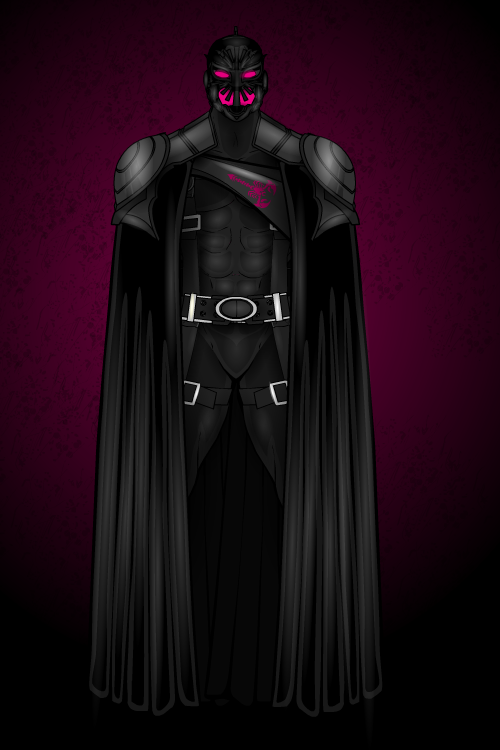
hawk007ParticipantThis costume/pose was originally created for a batman remake. But, because of the copyright rules, I can’t post it here. But you can still see the batman remake on my Deviantart page (cbhawk007).
Anyway, here’s Night Stinger.

Attachments:
You must be logged in to view attached files.
hawk007ParticipantYour’s is good. You’re style just isn’t as flashy. Thanks, though!
hawk007ParticipantThanks man!
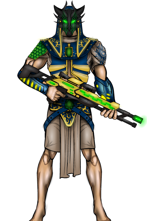
Here’s my entry to the Egyptian god contest: Anubis, the god of the dead, made into a super villain.

Attachments:
You must be logged in to view attached files.
hawk007ParticipantThe meaning is: Outdoors is MANLY!
Seriously, though, that’s awesome. Usually when is see abstract stuff like that, you can seespecific, recognizable parts from heromachine, but this is very well done.
hawk007ParticipantGreat characters! They’re all so unique. They really feel like comic book heroes.
-
AuthorPosts


