Forum Replies Created
-
AuthorPosts
-
fuzztoneMemberI like that a lot. You may have altered my perception of leprechauns….

Top notch colouring and shading, but the pose and the outfit is what sells the image. Excellent work. You should write us a tutorial….
fuzztoneMemberAh, that’s brilliant stuff. Midnight Magician is very clever, and Coup De Grace is just wonderful – a proper comic frame and a great piece, from the pose to the colouring and the custom items (that face is ingenious).
More please (whenever you’ve got the time)…

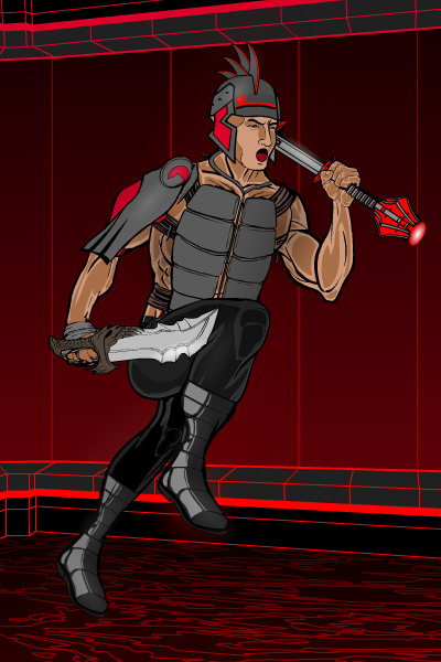
fuzztoneMemberQuick try out for this week’s Pop Quiz… have been meaning to do this sort of character. A kind of cyber-gladiator with a “Tron” kind of feel…

fuzztoneMemberIt’s like, how much more black could it be?
Excellent as always and good to see you back, dblade.
fuzztoneMemberQuick WIP character for the current contest. Had some creative input from my daughter on this one…

Pix, the Pinkest Pixie….
http://i1269.photobucket.com/albums/jj596/largebluecat/PIXFinal1200_zpsf768038d.png
fuzztoneMemberI’ve not looked at this thread before. I’ve been missing out. Cracking work.
Split would make a brilliant video game protagonist, and the fire breather is superb. Looking forwards to seeing more!
fuzztoneMemberIt’s not how many layers you use… it’s how you use them. There’s not a wasted one in post #12 – that’s a really impressive piece.
As the owner of an old computer – give up on the drag and drop. After a while it’s easier just to use the Rotate and Move controls under “Transform”…. they work no matter how many layers you’ve got going.
fuzztoneMemberThanks all. I keep coming back to look at the new characters on the forums and get really inspired by the new things I see people doing – this time round it’s the metal/plastic shading effects. And the big insignias are great fun – definitely an HM eureka moment, when you realise you can make things up to 999% of their normal size.
fuzztoneMemberFancied doing a weather related hero. So here’s Cirrus.

fuzztoneMemberI love that sketch. Not that it stops me making characters in that vein, of course. (aesthetics..
 ) And, in some ways, not enough armour is more realistic than too much – how many times in RPG world have we seen characters going about permanently encased in plate armour? In reality they’d have had trouble walking up a hill without exhausting themselves.
fuzztoneMemberI really like the Sable Bat. You’d think all the Bat-possibilities had been used up, but that’s an elegant design with the right number of twists.
fuzztoneMemberCheers Weilyn. I think she must have an entourage (which gives me an idea for a new character or two) – someone’s got to carry that sword around, because she’s not going to. Plus someone with a few protection spells… and possibly a change of wardrobe… and…
fuzztoneMemberHave you ever noticed, when you’re playing an ARPG, that characters start off sensibly armoured, and the more high-level they get, the more their armour becomes little more than battle jewellery? This one represents the final evolution of one of my ARPG characters – it’s a full set of Valkyrie armour, aka the classic Chainmail Bikini.
Ladies and gentlemen, Ia The Valkyrie. Go figure.
http://i1269.photobucket.com/albums/jj596/largebluecat/IaValkyrie800_zpsd590e9f5.png
fuzztoneMemberOh, that’s interesting. I’ve seen people do metallic effects before, but never plastic. Good job!
fuzztoneMemberProper comic book image, that. Well done.
signed, a giraffe
-
AuthorPosts


