Forum Replies Created
-
AuthorPosts
-
Count DorkuMember@Gargantua said:
I do not want to be mean but to me looks like a girl manga style
I believe the term you’re looking for is “bishonen”.
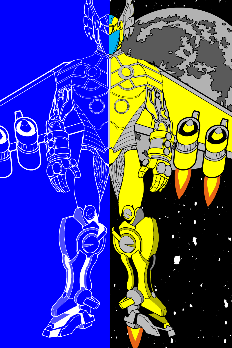
Count DorkuMemberAnd now: superhero stuff.

My basic idea here was inspired by Iron Man’s sentient armour, with the blueprint stuff inspired by the A.R.I.E.S. 11 featured character thumbnail. Basically, the idea was that the last bearer of the Peregrine armour, his family’s superhero legacy, had been rendered paraplegic in a crash landing. As a result, being a techno-whiz, he converted the armour into an independently sentient machine, then tasked it to carry on his duties.
@Alexander of Limbo said:
There is an object in patterns which allows you to do what you did without all the insignias. All you have to do is make the first colour completely transparent, and the second one will fade. Yours looks good but if you want less work the pattern should help.
I’ll try and remember that in future. Thanks!
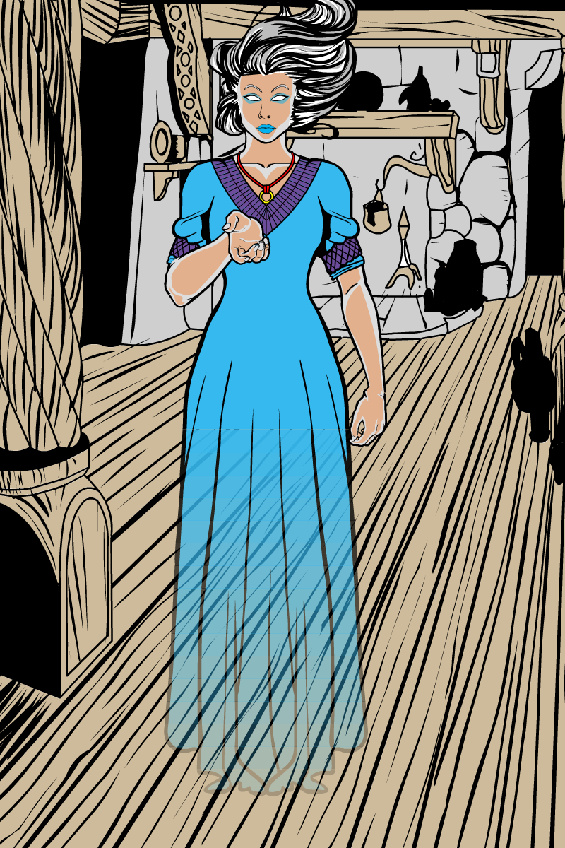
Count DorkuMemberAnd just one more.

The masking I had to do for this one is what we might call a “horrific nightmare”. (Fairly appropriate, given that we’re talking about a ghost.) It uses somewhere in the neighbourhood of eighteen square insignias, reshaped into very flat rectangles, with individual dresses masked to them. Then the alpha of the colours of each individual dress goes down by 5% each time. (They were originally larger blocks and going down 10%, but it just wasn’t smooth enough.)
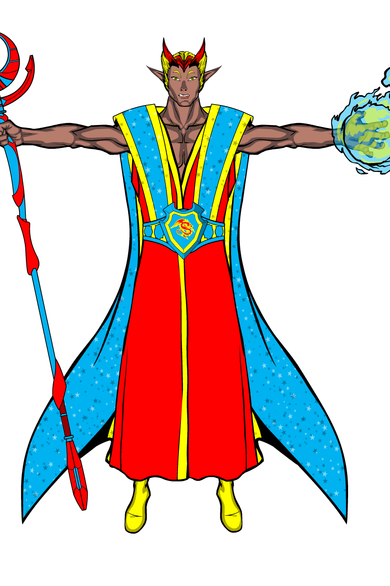
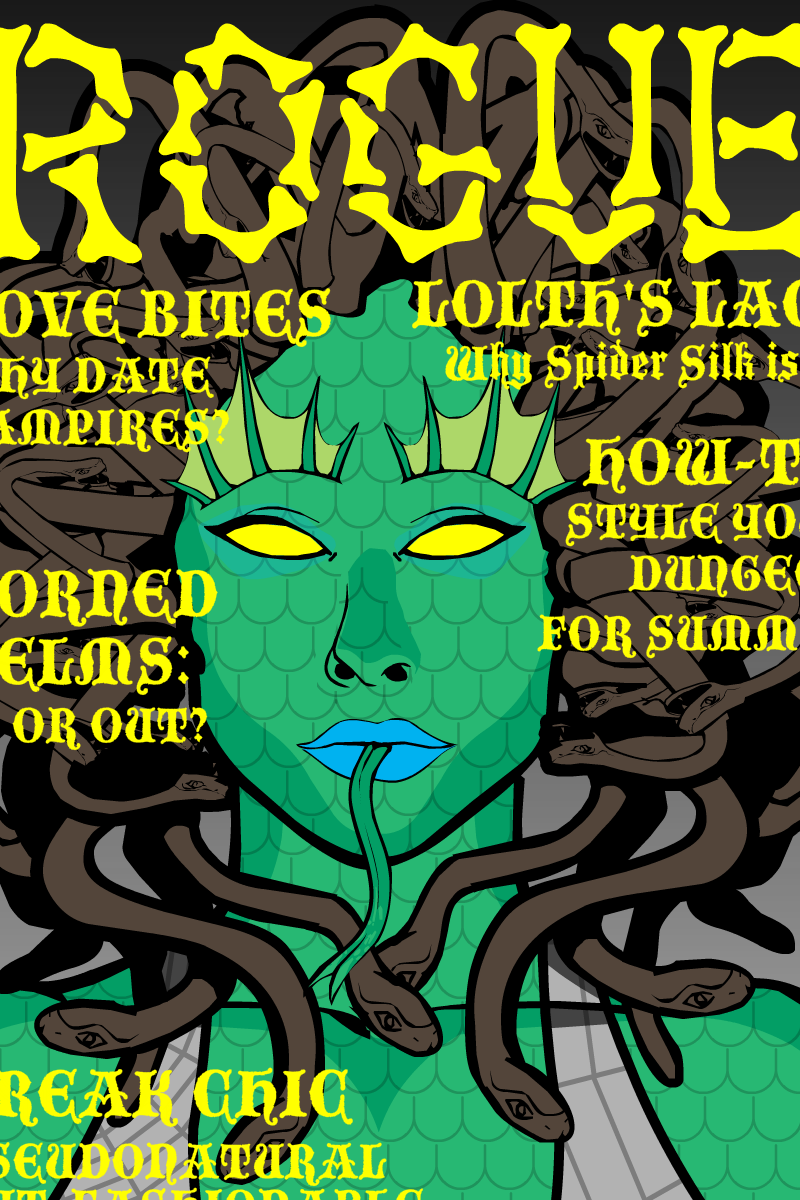
Count DorkuMemberSome new stuff: an elf mage and…well, something weird.

I went for a vaguely Indian skin tone because I think having multiple Elven skin colours is a bit less dumb than the “all the black elves are evil – unless they’re player characters” thing D&D usually slips into.

I don’t even know where this came from. I just find the idea of D&D monsters having their own style magazine to be hilarious. It’d also make an interesting game: a cross between Wandering Monster High School (courtesy link), and Just Shoot Me.
Nor do I know why saving the image has cut off the edges. Eh. Too early in the morning for me to care.
In case you’re having difficulty reading them with the inconvenient cropping and the pseudo-medieval font, the articles are “LOLTH’S LACE: Why Spider Silk Is In”, “Horned Helms: In or Out?”, “HOW-TO: Style your Dungeon for Summer”, “LOVE BITES: Why date vampires?” and “FREAK CHIC: Pseudonatural but Fashionable”.
Count DorkuMember
Count DorkuMemberBlah, forum ate my post. Let’s try this again.
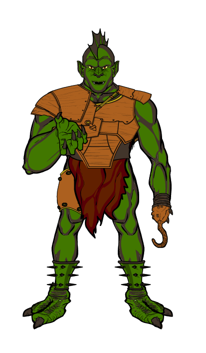
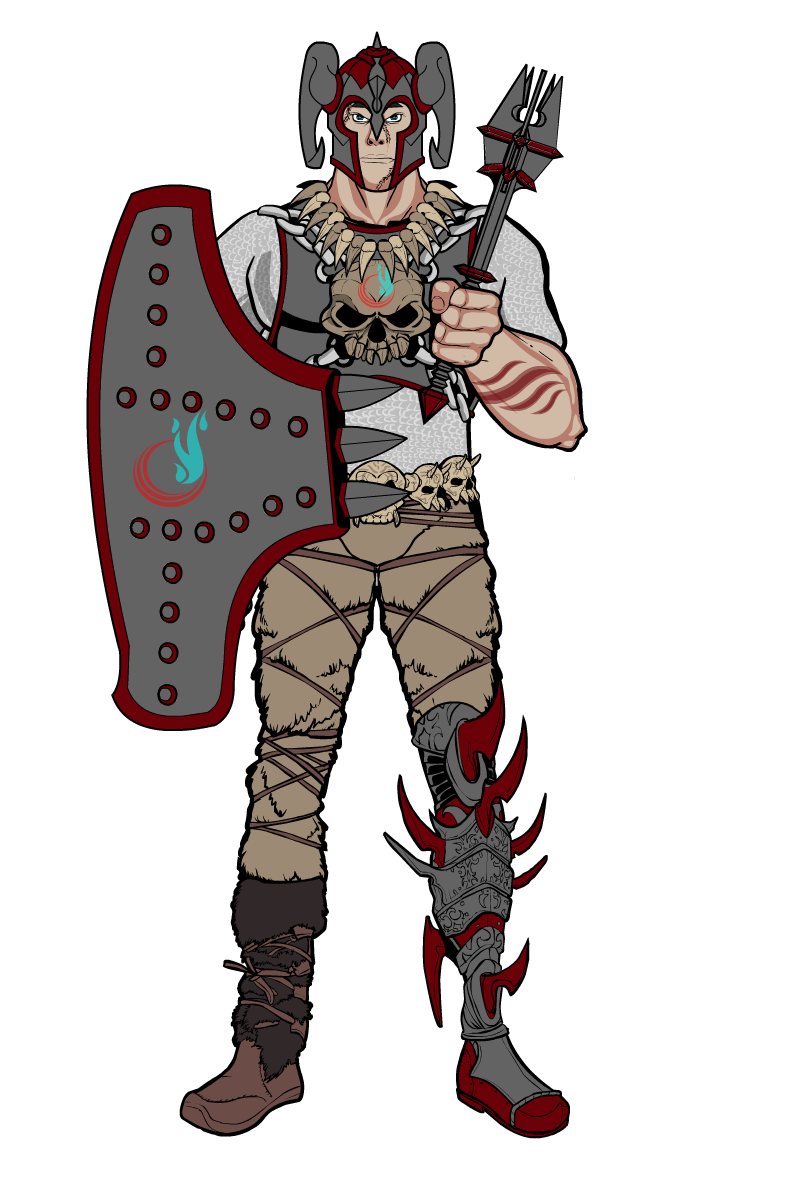
Some semi-random D&D-isms: a goblin whose feet are too big but who required waaaay too much tinkering with sizes to redo, and a paladin from the Demon Wastes of Eberron.

Presumably, his hand is out because someone owes him money. And that is not the face of a guy who accepts “I’ll have it by next Wednesday” or “the cheque’s in the mail”.


In the Eberron setting, the Ghaash’Kala tribes of the Demon Wastes are a blend of orcs and humans (mainly orcs) who battle against the evil found in the depths of their blighted homeland. They tend to look very much like barbarians, but their paladins are as courageous and honourable as any knight of the Silver Flame. And, y’know, it’s awesome to have paladins who don’t look like they burgled King Arthur’s wardrobe.
Count DorkuMemberThat is very cool.
(I’m also digging your sig. As the saying goes: “Waits for audience applause, not a sausage as usual.”)
Count DorkuMember@Herr D said:
With that power description, I might suggest “Finesse” or “Grace” or “Sidestep” because she should be able to be that way around danger.
Sidestep is great, I’ve renamed the images to that.
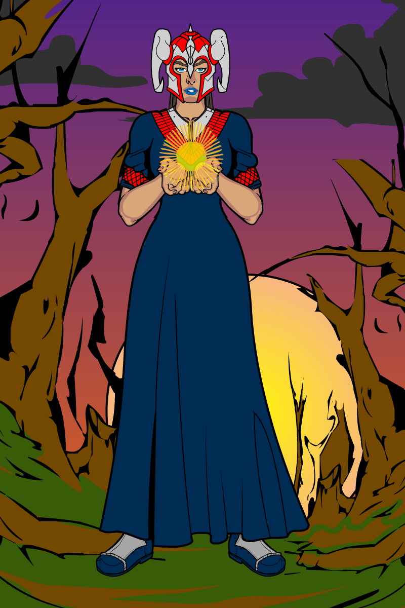
Today’s stuff: a sunset scene, and playing around with masking effects again.

I am very much indebted to the Sunset Recipe, which pretty much is the background. I was going to put in multiple moons to reinforce that it was fantasy, but it started to look a little busy, so I just went with clouds instead.
As for the girl, I basically envisioned her as a D&D-style cleric of a sun deity. If you look carefully she’s wearing armour under her gown.

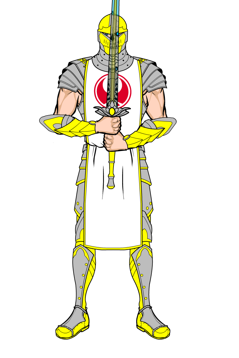
As for this, the basic idea was for a glass sword that, when you looked through it, let you see through illusions. The guy with the tabard is not what he seems…
Count DorkuMemberThanks guys.
The time heroine’s powerset is largely based around a limited form of precognition – basically danger sense and occasional “something really bad is about to go down” hints. She also has temporary time acceleration/deceleration stuff, not enough to freeze the world or reverse history but enough to dodge a punch or hold someone in place for a moment.
I am tempted by Paradox, because that is a very cool name even if it doesn’t quite fit the powers.
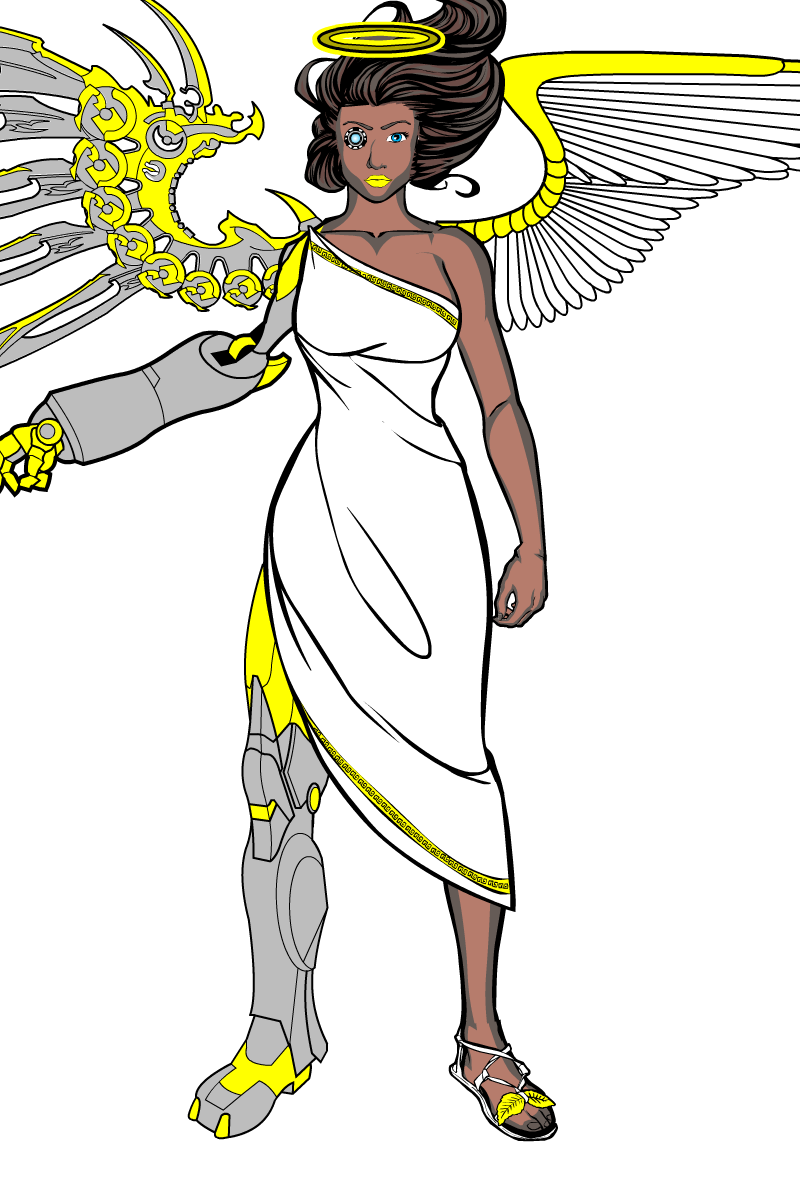
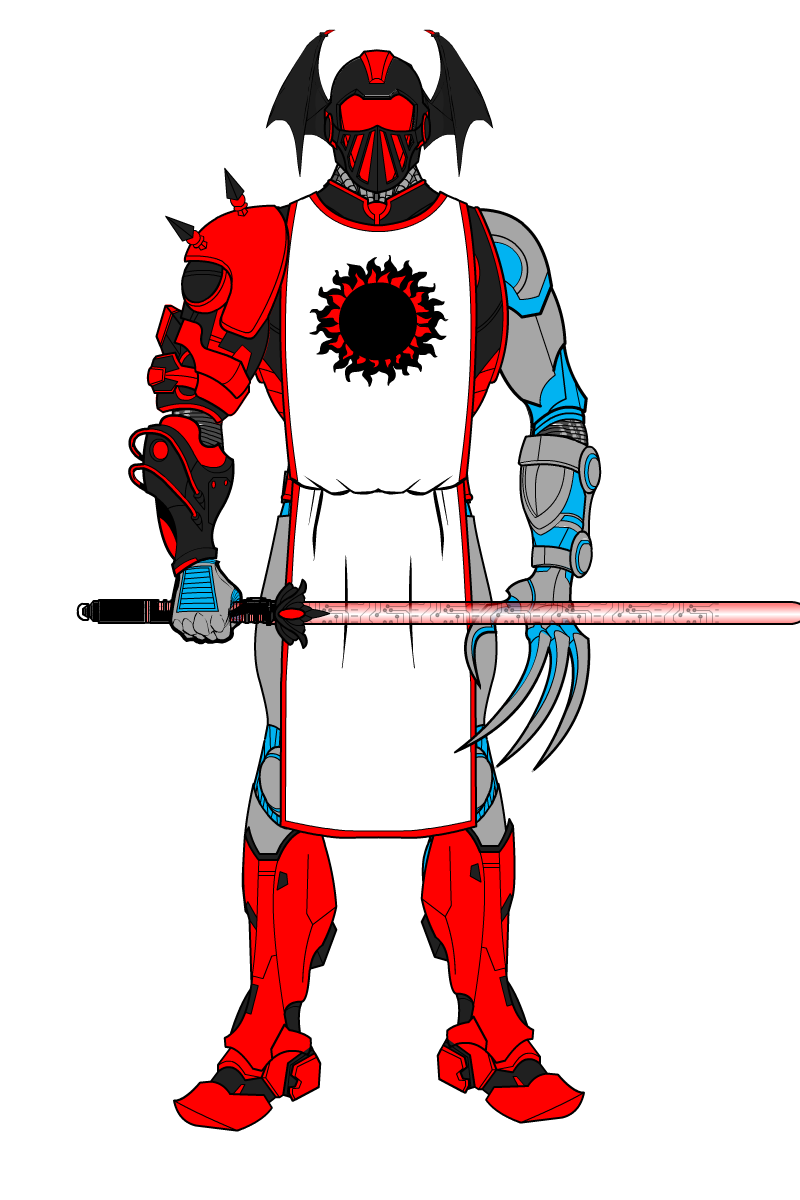
Another couple of projects: a cyborg angel and an Abyssal OC from the Exalted sci-fi variant Heaven’s Reach.

Mazal is a Hebrew name meaning “good fortune”. The cybernetic eye doesn’t really come out well at this distance, and I’m not sure about the yellow lipstick.

The idea here was to have two layers of armour – the grey/blue one at the base and the black/red plating over the top. It could probably have turned out better. Still, as space deathknights go, he doesn’t look too bad.
The tabard is mainly because I find tabards to be cool.
-
AuthorPosts

