Forum Replies Created
-
AuthorPosts
-
Calvary_RedParticipantThanks Jeimuzu. That’s pretty much what i was going for.
Calvary_RedParticipant
Calvary_RedParticipantYou’re like some kind of genius.
Calvary_RedParticipantShe does seem simpler than some of your older designs, but it really suits her, like a kind of natural feel. So whether that’s the intent or being “rusty” i wouldn’t know. i really like how the background suggests a natural setting without distracting from the character.
Calvary_RedParticipantNever entered her in a contest. But “It’s a Kind of Magic” is right up her alley. ^_^

Calvary_RedParticipantThe awesomeness continues.
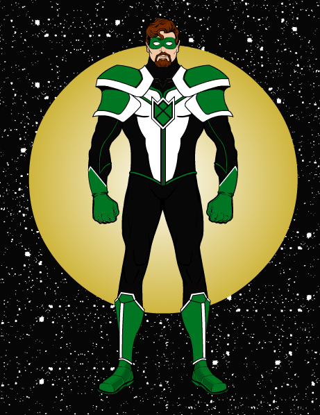
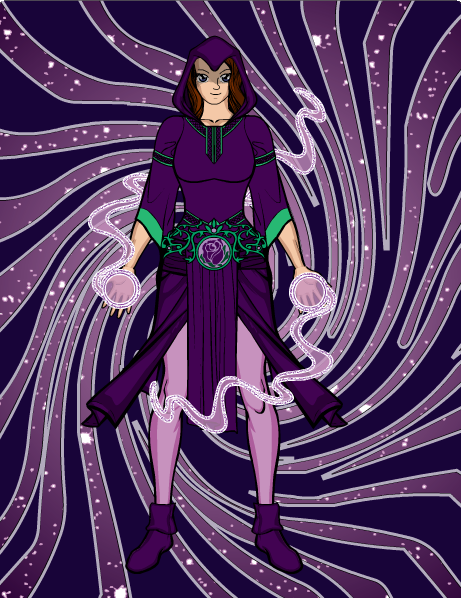
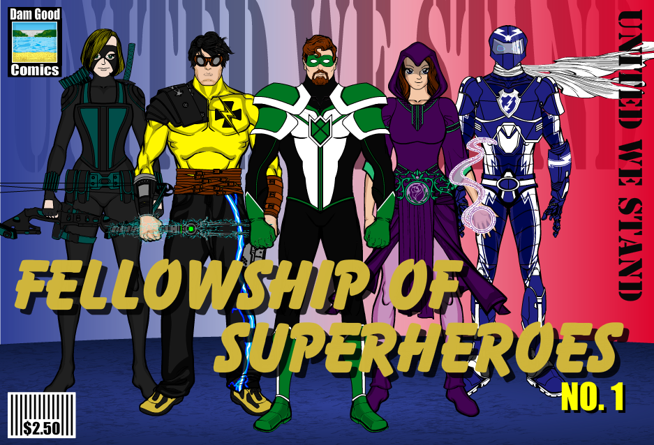
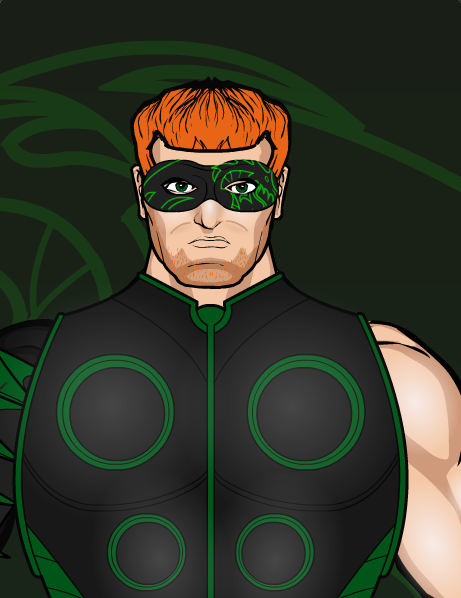
Calvary_RedParticipantThanks AP. The wizard’s (Amethyst Rose) face was made using techniques from Harlekin’s tutorial, so there’s a reason she looks so good. Co-Bolt and Blitzkrieg (the blue and yellow heroes) were created by friends of mine with a little advise from me, and i’ve got another friend i’d like to help me update the archer at some point. The center hero (Green Shield) is a revamp of a character i entered in a contest, though there is a major superhero who uses the green-black-white color scheme (it’s a good color scheme that’s not widely used).
Calvary_RedParticipantThis update uses Co-Bolt’s finalized design. The scarf is a hologram, so while it may serve no practical purpose, it’s not in the way either. Co-Bolt was designed by Cobalt/Lexbraig.

Calvary_RedParticipantThat makes sense. i see you’ve also made good use of purple and pink. i really do like your color schemes. And do i even need to say the creative use of items is brilliant?
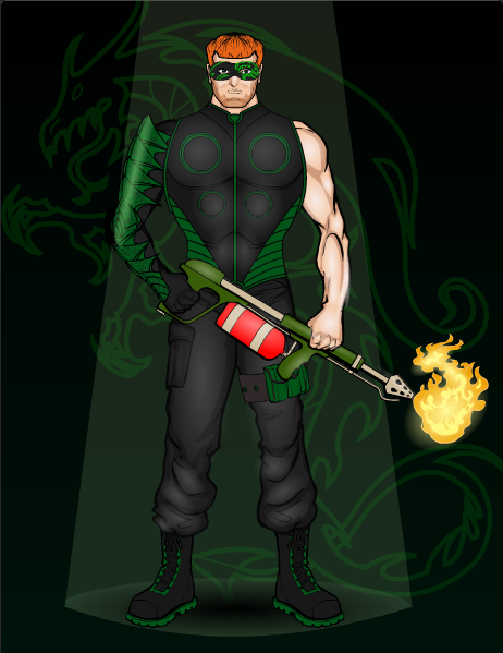
Calvary_RedParticipantA couple weeks ago, Sgt. George Howe had never heard of Alias the Dragon. That changed after Baron Frost attacked the base Howe was stationed at. While the other soldiers occupied themselves with evacuating civilians, George reasoned (correctly) that a flamethrower would adequately subdue the ice powered super villain. News reports covering his subsequent capture of Frost likened George to the now obscure hero of the ’40s. Realizing America had numerous enemies already on our soil, Sgt. Howe took up the flamethrower to fight the good fight as Alias: The Dragon.
The original: http://pdsh.wikia.com/wiki/Alias_the_Dragon

Detail on his mask:

Calvary_RedParticipantWow. Nice designs. So far Herculean is my favorite.
Calvary_RedParticipantWell i’m impressed. Just wondering, do you like green? You’ve certainly made very good use of it (and red). ^_^
Glad to have you here.
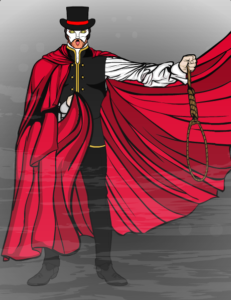
Calvary_RedParticipantThe public domain literature challenge seemed like an invitation to try again. This time i’m sure i got it right (no copyright violations).
And he looks cooler, too.
Calvary_RedParticipant
Calvary_RedParticipantNever heard of a Kapre before, but i love them already. The look on the girl’s face is great too (actually both their faces are [actually every face you’ve ever made is, but i’m on a tangent]).
And The Weatherman, all the power of Storm, yet he looks like he’d be right at home in Gotham. Brilliant design. And if i ever got weather powers i’d have to do that storm-in-the-hand things.
-
AuthorPosts

