Forum Replies Created
-
AuthorPosts
-
asubtledagger28ParticipantThinking of going back and touching up a few of my characters. Comments/suggestions always welcome. Here is the original Otsu and the revised version:


asubtledagger28ParticipantHaven’t spent a lot of time machining lately, but have been trying to work on this guy a few minutes here and there. The pose was from agatharights. He goes by the name Zathruk.

asubtledagger28ParticipantNice work. I thing Genovefa looks pretty sweet.
asubtledagger28ParticipantLike the finished product, great work! Shading and highlights look good. You should be pretty satisfied with how he turned out, looks like you put a lot of work into this.
asubtledagger28ParticipantGood work. Cool characters.
asubtledagger28ParticipantNice work! Great variety of characters. My fave is Graviatorn.
asubtledagger28ParticipantI have been working on this guy for a while but can’t come up with anything that i am happy with. He can live here for a while so I can come back to him later. Gonna take a break and move onto something else.

Here’s a revision with more highlights and shadows not sure if I like it any better or not:

asubtledagger28ParticipantA few things if I may…
Thanks GuyGenesis, I appreciate you taking the time to share some fixes for the hand and arm and some tips/tricks for giving the appearance of transparency.
asubtledagger28ParticipantNice job on Night Spectre. The highlights look great.
asubtledagger28ParticipantReally nice character, but that hand is bothering me… in real life it doesn’t turn that way and it would be equally nice if it was with the other arm (the one that is turned around) and with the hand upside down.
Thanks Trussos. I totally agree with you about the hand. I forgot how gnarly it looked… I should’ve put a bit more effort in on that one.
asubtledagger28ParticipantReally cool. Nice work, patience and perseverance!
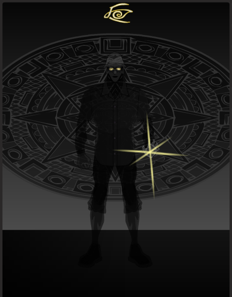
asubtledagger28ParticipantGoing to post this just ’cause I spent some time on it. I’m not happy with it but it was good practice. It was my entry to the random names contest, which was the first contest I tried to enter and I labelled my entry incorrectly. Anyways I have been spending the last few nights looking through people’s galleries and not machining much. There is so much creativity here, it is very absorbing and inspiring. Anyways…
Dazzle Shadow

You were an archaeologist, investigating ancient Egyptian ruins, when you angered the Sun God, Ra! Now, you bear the weight of his power, until you find a way of appeasing the mighty deity!
Your powers mean you can manipulate and control light, using it to create illusions or blind your opponents! and… You can manipulate and control shadows, using them to hid yourself or even as a mode of transportation (traveling from one shadow to another)!
asubtledagger28ParticipantThanks Mad Jack, you read my mind.
asubtledagger28ParticipantHere is another attempt at adding the highlights on just a straightforward pose. I need some more practice with posing, so stuck with straight on for this one. I did it a while ago somewhere in between the 2 guys above. No shadows, but will go back in and try now that i have looked at some other people’s works and think I am beginning to see where they would make sense.

Had time tonight, so I went back and added some shadows; still need lots of practice (and patience).
ASH

asubtledagger28ParticipantI have tried to incorporate some of the suggestions form JR19759 and added a few shadows, changed the colour of the main costume to white and tried to add some glow from the energy, but still need to work on that element. Oh yeah and tried to straighten out the right foot. Thanks again JR I think this looks a little better. I’m going to come back to it and work on it some more but wanted to post this just to give an update. I can see that adding the dark shadows really aids in making characters more 3 dimensional.

..and shortened the cape.
-
AuthorPosts


