Forum Replies Created
-
AuthorPosts
-
AnarchangelParticipant@Jeimuzu said:
Oh my, that’s awesome. That is a killer costume, love the color choices.
Meh. I think I could have done better to be honest (but I’m my own worst critic).
I’ll probably redo this character at some point.
AnarchangelParticipantWhile we’re talking about bodies, I would love to have the Male Military body at a three quarter view. Is that possible? I mean I know we already have a three quarter body but I find it too muscular for certain heroes. I’d like to be able to use that kind of stance for smaller, more athletic characters.
AnarchangelParticipantVery much interested in those items. I have a cyborg character I’ve been thinking about doing and they would come in very handy.

AnarchangelParticipantHello and welcome to the forums.
Can I just make a suggestion? When using hoods, if you place a circular insignia behind it and colour it a slightly darker shade than the hood itself, it makes it look more natural.
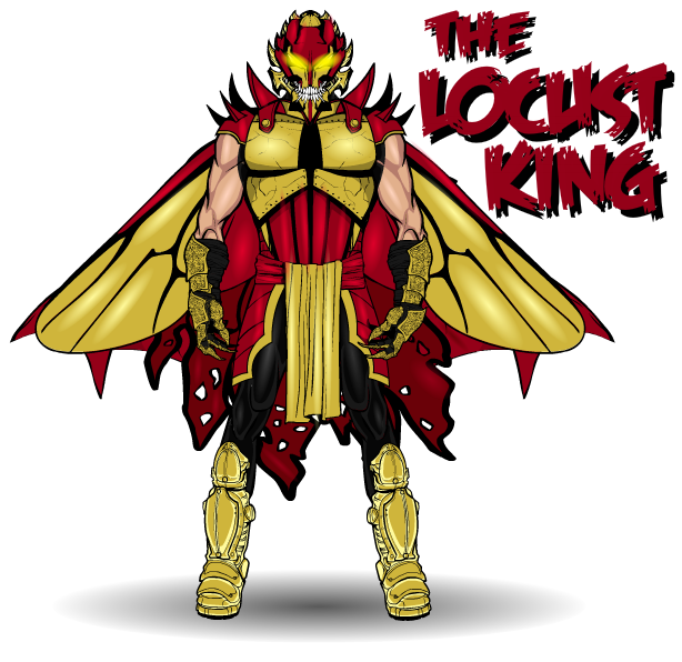
AnarchangelParticipantIn the meantime, here’s a new character.
I actually made this guy a short while back but didn’t really think he was good enough to post here. But then I thought about some of the other rubbish I’ve posted here over the years and I decided I may as well.
I think I may have chucked this guy together in like five minutes so I know he’s not my best work.
…………………..
The Locust King is the number one reason the developing insectoid human population is so feared and hated by general society. He and his army of drones have become a plague on all of humanity and are responsible for all manner of vile acts. The self appointed king has attempted to take control of a number of areas across the world. His most daring and devastating plan to date was when he and his army invaded Freedom City and almost succeeded in ousting the entire resident meta-human population of the city. Given the large number of meta-humans who live within and around Freedom city, this was a real testament to the power and of the Locust King and the threat he poses. It was only the stealthy actions of Dragonfly and Vespa, who the Locust King had initially overlooked, that managed to save the day and oust the invading army.
The Locust King both loves and hates the Ant Queen. He began with love, believing that their very similar powers are a sign that they were supposed to rule the world together. But the Ant Queen found her would be suitor to be rather disturbing and almost psychotic. She spurned his advances and his love twisted until he was unable to tell if he loved or hated the woman.
His mixed feelings for the leader of the colony are what led the king to develop his horrifying current persona. The Ant Queen, often the target of the spurned Locust King’s mad schemes, felt guilty for her albeit unintentional part in creating this psychotic menace and tried her best to foil his plans whenever she could. This only made the Locust King hate her even more. But still, his underlying love prevented him from eliminating her for good. Unfortunately, this love doesn’t transfer to others who get in his way and the Locust King has been responsible for the deaths of a number of young heroes who attempted to put a stop to his plans.
Dragonfly has become a particularly hated enemy of the King, not only because the hero was responsible for ruining his invasion of Freedom city but also because he appears to be the Ant Queens favourite agent. Dragonfly, while confident in his own skill, recognizes that the Locust King is one of the greatest threats anyone could ever face. On one occasion Dragonfly and the young heroine Salamander encountered the Locust King. Salamander, not really knowing who the king was, wanted to fight the villain but Dragonfly ordered her to retreat immediately. He knew that the Locust King wouldn’t hesitate to kill the young girl if she got in his way.
The Locust King is a dangerous and psychotic individual who seems seems to lack any kind of morals. He continually threatens the safety of the world and truly believes that he should rule over everyone else.

AnarchangelParticipant@ams said:
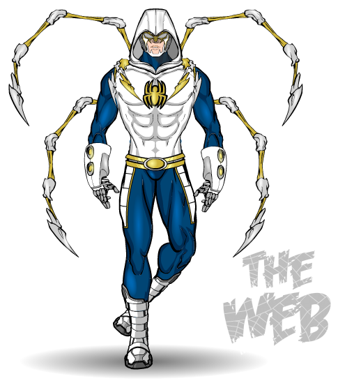
Like The Web. Switch your colors for the torso and the hood and highlight white. That will bring out some depth. For the gloves and boots, try designing something similar to the spider legs in the background. Spiders have 8 legs, try to make them all uniform. The right boot does not go with the legs you have chosen, unless he is battle scarred or something. Go to a more natural. straight forward stance. Maybe spread the legs out a bit, to simulate the spider legs?
I know what you mean about the glove. It’s a unique item.
Cheers!
I actually already tried making the torso a light grey and shading white, per your suggestion for Ricochet, but I’ve learned that one of the areas where I really lack skill is shading black and white. I can never get it looking natural. I’ll have to practice quite a bit more before I’m confident enough that it looks right.
I had originally envisioned him having four spider legs behind him and four wrapped around his torso to better break up the white. I pictured there being some kind of metallic spider thorax etc designed on his back. He does have four on his body but two of them were supposed to be lower down, around his waist almost. I just couldn’t get them to fit there so they ended up higher, near his shoulders. Unfortunately with the way I coloured them, they ended up kind of blending in with the torso.
I do really like your idea of making the gloves and boots resemble the spider legs. I’ll definitely have to try that next time around.
Anyway, I did say this was just a first draft and I do plan on going back and fixing a lot of things so I really do appreciate all the tips guys.

AnarchangelParticipant@Camruth said:
Aw man, I just finished going through your thread from page 1 and I have seen so many ideas that I have already posted by you & much better than I could do….. Not just characters though, Ideas too; e.g. I too have a school for ‘gifted youngsters’ that I had named the Claremont Academy but as you have already used that I have renamed it the Wolfman Academy (kudos to anyone who can correctly identify the reference).
Your work is amazing and I bow before my superior.HA! Thank you but I still consider myself an amateur at this.

AnarchangelParticipant@Herr D said:
@JR19759 said:
I see what you mean. Maybe add some sort of blue detailing to the chest/ stomach area, just to give the gold a little more help breaking up that sea of white. Also, his left foot seems to be horribly broken to have twisted so far in that direction.
You now have treads if you want a side view of that boot sticking out. If it were me, I’d add something like masking the web background in blue to a transparent odd shape, maybe one of the spiky ears for something asymmetrical. Lay some shapes out over it to see what you like.
Maybe I’m just having a stupid moment but I’m not entirely sure what you’re suggesting here. Are you suggesting I include the web background on the character himself somewhere or just in the background?
Good tip for the boots but I think when I get back into fixing him I may change the lower half of his body to eliminate that weird way he’s standing. I just couldn’t figure out the physics of how to fit the boot to that leg shape first time around.
AnarchangelParticipant@CantDraw said:
In answer to JR, I would call it comic book…er, I mean, quantum mechanics.

And duct tape

AnarchangelParticipantOh man, I am so jealous of your skill right now.
I love that one (and Fly Guy)
AnarchangelParticipantVery cool. Also, very nice work on Azmael.
AnarchangelParticipant@JR19759 said:
I see what you mean. Maybe add some sort of blue detailing to the chest/ stomach area, just to give the gold a little more help breaking up that sea of white. Also, his left foot seems to be horribly broken to have twisted so far in that direction.
Oh man, it is such a pain trying to fit boots to those legs. To be honest, I don’t know why I even used them. I think I just didn’t want to use my standard pose.
AnarchangelParticipantBeautiful.
AnarchangelParticipantAh Pokemon. I understand being distracted.
The group shot looks great and happy new year to you too.

AnarchangelParticipantThis is a first draft costume experiment for a character I’ve been meaning to do for months now. I could never find the right pose for him but eventually just decided to forget about the pose and work on the costume….I like it but something still seems missing.
Also, I’m totally overusing those gloves and boots.Teenage hero Oliver Easton is essentially Spider-Man with added technopath powers. So of course he’s The Web.

…..I’ll show myself out.

-
AuthorPosts


