Home › Forums › The HeroMachine Art Gallery › Zerogarth’s characters so far…
- This topic has 40 replies, 15 voices, and was last updated 12 years, 9 months ago by
Scatman.
-
AuthorPosts
-
June 14, 2012 at 9:38 pm #6457
ZerogarthMemberHere goes another…

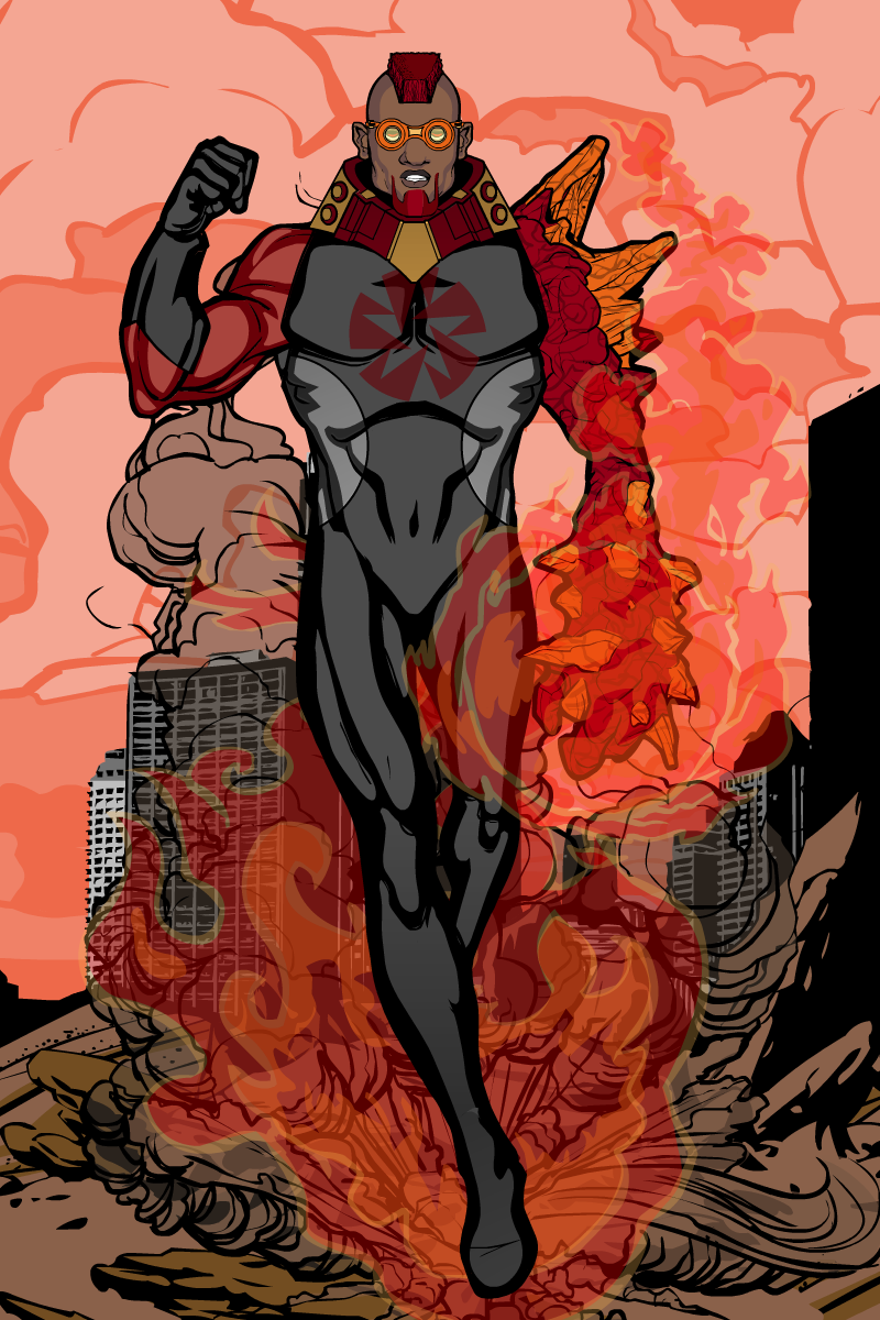
Meteor, Superhero at Horadran City. His capacity to turn his skin into burning meteorite, and his flying skills, makes him an opponent to be feared; combining both habilites he is capable of resisting high temperature and pressure, and his impacts have the power of a small meteor crash.
…more to come!
June 15, 2012 at 10:24 am #6474
ZerogarthMemberFelt inspired, lol… This is my first use of masking and lighting …yup, read no tutorial so far u.u but’ve been learning from everyone’s work : )
…hope you like it

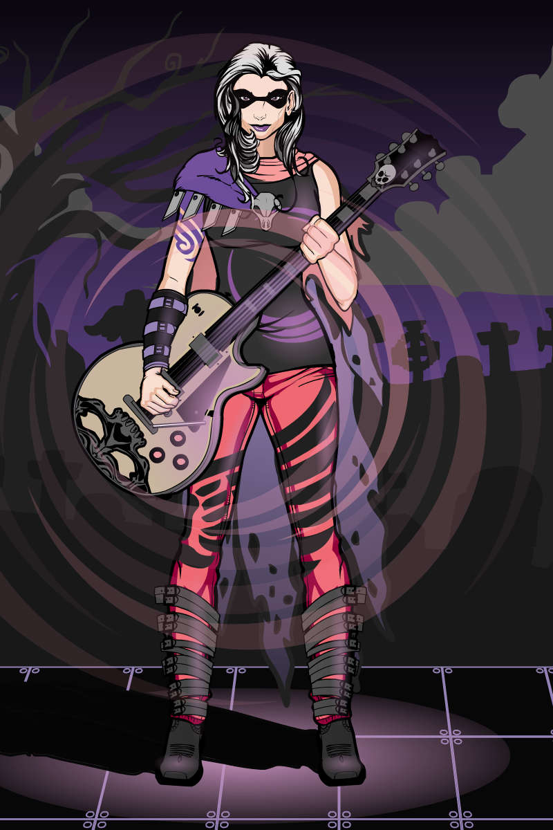
Death’s String, Villain at Horadran City. She controls sickness and death through her music, being able to weaken her enemies and raise the dead back from their graves in the form of mindless zombies (though she has the potential to even kill her opponents with her music, and give life back to the dead, keeping their full capabilities while under her control, its almost impossible for her to reach such mastery)
June 15, 2012 at 11:19 am #6479
FRMParticipantcool!
(que twilight zone music)June 15, 2012 at 12:36 pm #6480
HarlekinMemberInfidel – Tremolo in a Gibson Les Paul.
Not bad, but the face part is bigger than the head. And the light work is not perfect. Btw not bad for first try.June 15, 2012 at 12:41 pm #6481
amsParticipantGreat pic! Awesome character. Cheers!
June 16, 2012 at 7:05 am #6515
Kaylin88100ParticipantBrilliant! That’s a really effective use of both lighting and masking, especially for a first try. It took me ages to get that good!
 June 21, 2012 at 3:33 pm #6688
ZerogarthMemberThanks everyone, I appreciate the feedback, and I’m glad u liked Death’s String …she went out nice ^ ^
@Harlequin: I think I didn’t modified the size of the face or the head part, it just came that way… not noticing the difference in size you mention though, if you can explain it to me, I’ll be thankful : ) …’bout the lighting… yeah, its too basic, got to work on that a little more.Oh, and here’s a remake on Envoyé… its entirely different, but I wanted to correct it (It was just too plain boring)
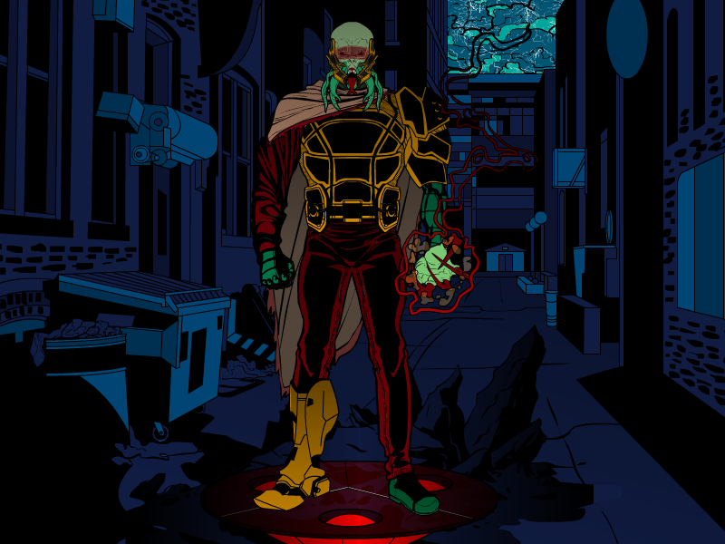
Before (so u can compare):

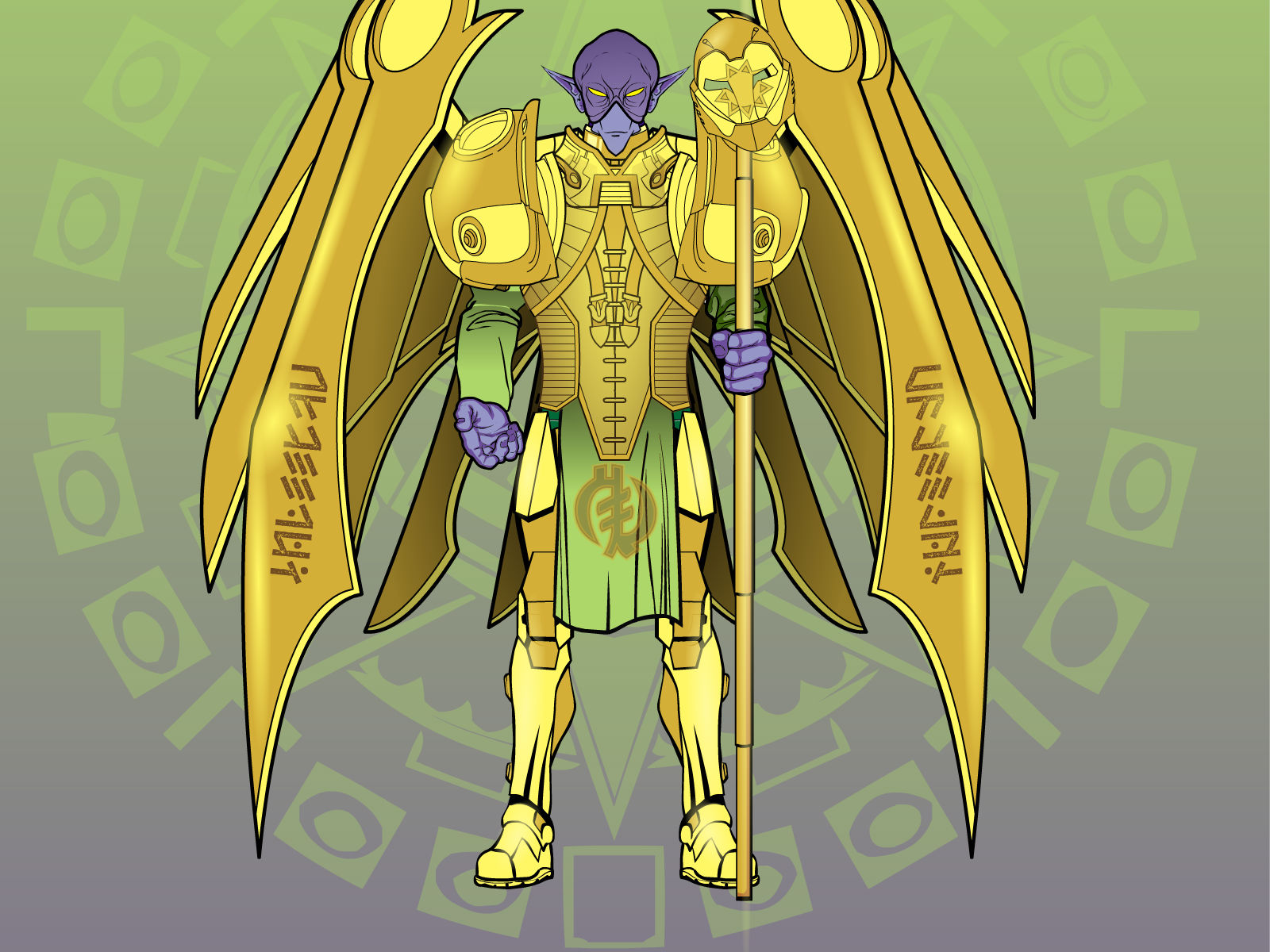
Now:

Yeah, Its more heavenly now, but he’s still just from another planet. I tried to make the armor and accessories give the feel of advanced melee combat technology. Now he may not look evil at first, but, looking closer, his face gives him away. And, yup, I “unfrench’d” his name xD
He was sent to supervise an ancient experiment on mankind that’s been going on for thousands of years now, and its coming to an end…
That’s for now : )
June 21, 2012 at 5:18 pm #6697
SulemanParticipantAwesome background, man. It’s pretty obvious that you, unlike me, actually understand something about art, judging by your skill with shading and… let’s say the “big picture”.
What I mean by that is that you not just make things look good close up, but the whole design actually works as a whole, and the colors and pieces mesh together really well.
Keep up the good work!
June 21, 2012 at 7:24 pm #6705
ZerogarthMemberThanks man! : ) …I really try to do it that way, I’m studying Industrial Design and there is a lot of composition on every thing we do… so its kinda an habit, I guess… that’s why I take so long on posting new stuff, I keep changing things in the last minute ’cause they don’t seem right enough >.< its a pain actually, lol... u're done with 80% of the work on 20% of the time u take to finish it, the rest of the time is used to complete the 20% left of work... Pareto's principle I think...
June 22, 2012 at 12:37 pm #6728
ScatmanMemberHey man.just passin’ by and man,I dig your backround style.Inspired to work with that a little more.I really dig the creations here!
June 23, 2012 at 3:38 am #6758
MisterDinoManMemberI usually don’t bother with backgrounds myself. But if done right, like you have, it really adds to the atmosphere and the overall character design.
June 24, 2012 at 1:24 pm #6814
Kaylin88100ParticipantThe new version of Envoy is much better!
 I love your use of shading, it makes him look really good.June 25, 2012 at 5:11 pm #6859
ZerogarthMemberThanks everyone! : ) Looking it again, I really liked the composition on the new Envoy pic too, very simple but effective : D …I would love to do some Sci-Fi background story to go along with him… I guess I’ll do something when I have enough time…
…here goes a test!

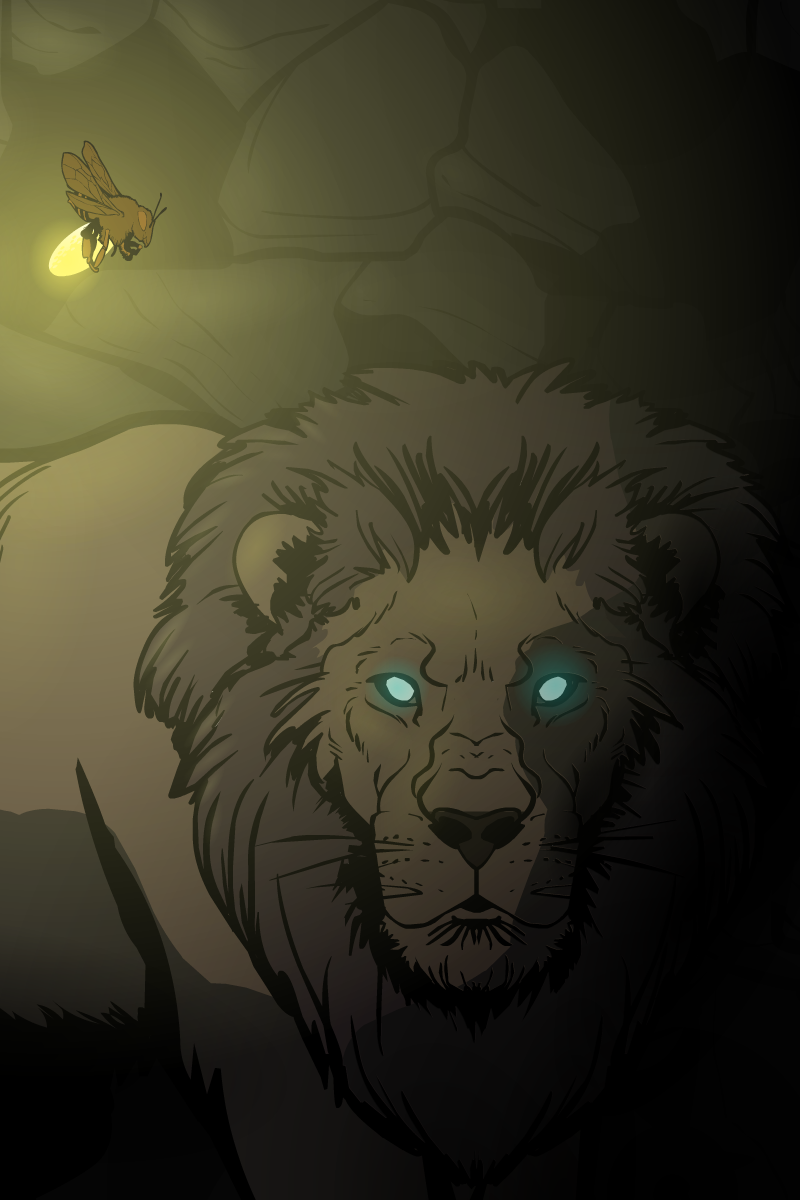
I call it “Beneath the surface” (just like a Dream Theater’s song I dig a lot… guess that inspired me a little) …I tried the use of masking to make sharp shadows and practiced a little with the lighting effects… hope you like it! : )
June 25, 2012 at 5:14 pm #6860
ShiborethMemberI love your shading/lighting work. It looks absolutely fantastic. How did you do the lighting on the lion?
June 25, 2012 at 5:40 pm #6862
ZerogarthMemberThanks! ^^ …Used the conventional Background/Shapes/[Circle with glowing effect on center] (I suppose that’s what everyone uses for lighting, lol) repeated times… dozens of times, actually xD …and for the sharp shadows, just masked a horse head (entirely of one color, transparent, oversized and turned around, lol) on the lion : ) …I suppose its been done before, but it was a fresh new idea to me, and I think it acomplished its objective fine enough : P
-
AuthorPosts
You must be logged in to reply to this topic.

