Home › Forums › The HeroMachine Art Gallery › Trekkie’s World
- This topic has 435 replies, 57 voices, and was last updated 8 years, 1 month ago by
Herr D.
-
AuthorPosts
-
July 11, 2012 at 3:48 pm #7410
HarlekinMemberNice picture. Very complex image. I like it overally. Maybe few advice. Next time give a little circle insignia in the stomach and i think her right eyes is not vell positioned. But this is only critique. For first seen i see something for this picture. Nice work. I really really like it.
July 11, 2012 at 5:03 pm #7411
FRMParticipanti love that outfit! it looks so natural! like it was pre-made! it’s so much better than the Britain outfit i’m working on.
July 12, 2012 at 12:00 am #7421
TrekkieParticipantThanks Harlequin and FRM!
Harlequin, I see what you mean about the right eye- it does look a little too far away from the nose. Still, I’m glad you like it.July 12, 2012 at 1:54 am #7424
VengeanceParticipantLiz is a way cool design
July 12, 2012 at 9:21 am #7435
TrekkieParticipantThanks Vengeance!
July 24, 2012 at 9:03 am #8036
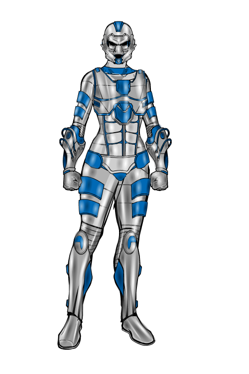
TrekkieParticipantA new creation at last!
I wanted to do something using similar techniques I used for Steel Bug a few pages back, so here’s a sci-fi suit of armour made with a few hundred layers (mostly gradient circles).At last! A bio!
They knew they were taking a risk with this. They’d spent years working on it: imagining, sketching, designing, building, developing. And it all came down to this- the first test. If it worked, they could show the world their creation and advance technology by miles. If it failed, there was a good chance that the wearer could be injured or killed.
Fortunately, the test went well. Everything worked perfectly- the weapons and defence systems; the communications; the enhanced speed and strength. There was only one problem: it took forever put on and take off. Ah well, back to the drawing board.:

I did give her the Iron Spidey-style back claw-things, but then I decided that they cluttered the design up a bit.
Edit: Looking again, I just realised I forgot to put gradients on the neck bit. I’ll do that sometime later if I can be bothered.)
July 24, 2012 at 9:12 am #8040
LegatusParticipantWow! Breathtaking!
July 24, 2012 at 9:15 am #8044
TrekkieParticipantThanks Legatus!
July 24, 2012 at 9:17 am #8045
MisterDinoManMemberawesome!
July 24, 2012 at 9:17 am #8046
HarlekinMemberNice really nice. But i have a little bittle problem. I made the eyes gloving red. But the coloring is very good. Really steel looking.
July 24, 2012 at 9:21 am #8049
TrekkieParticipantThanks MDM and Harlequin!
July 24, 2012 at 3:36 pm #8071
FRMParticipantNICE!!
July 24, 2012 at 3:46 pm #8074
KaldathKeymaster@Trekkie said:
A new creation at last!
I wanted to do something using similar techniques I used for Steel Bug a few pages back, so here’s a sci-fi suit of armour made with a few hundred layers (mostly gradient circles):

I did give her the Iron Spidey-style back claw-things, but then I decided that they cluttered the design up a bit.
Edit: Looking again, I just realised I forgot to put gradients on the neck bit. I’ll do that sometime later if I can be bothered.)
VERY NICE!!!!
July 24, 2012 at 4:46 pm #8080
headlessgeneralMemberWOW! Very nice.
July 24, 2012 at 6:20 pm #8089
The Atomic PunkParticipantThat is an incredible amount of patience. Very convincing suit of armor. Excellent design!
-
AuthorPosts
You must be logged in to reply to this topic.


