Home › Forums › The HeroMachine Art Gallery › The Pathwalker’s Gallery of Broken People
- This topic has 28 replies, 8 voices, and was last updated 10 years, 10 months ago by
Pathwalker.
-
AuthorPosts
-
December 22, 2013 at 5:40 pm #35103
PathwalkerParticipantI hate trying to size pictures properly. Probably because I’m bad at it.
December 23, 2013 at 5:45 pm #35162
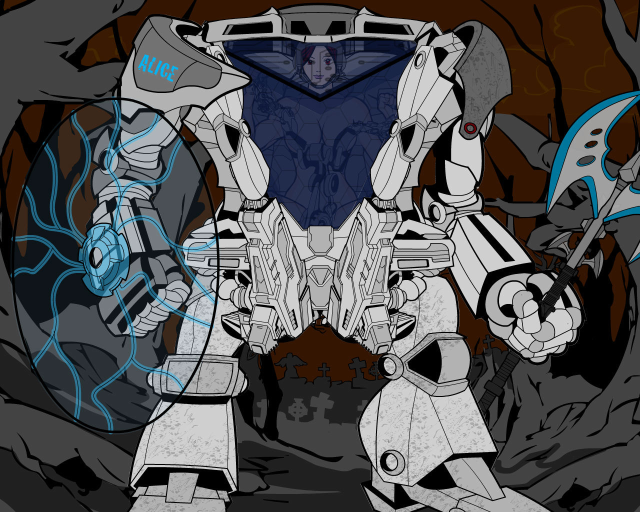
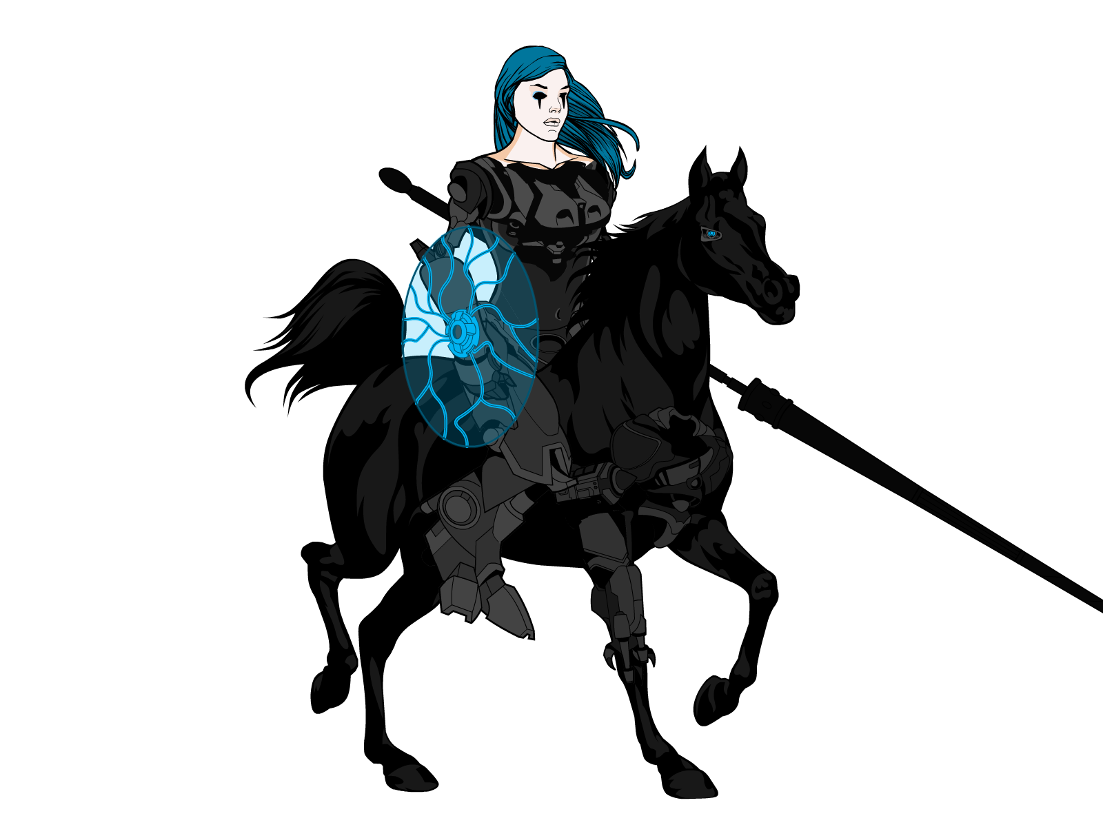
PathwalkerParticipantI tried to make a mech
I think she turned out rather well for a first attempt, don’t you?
 December 23, 2013 at 6:12 pm #35167
headlessgeneralMemberI like her.
December 27, 2013 at 10:57 am #35276
mattisagamerParticipantYour Pathwalker Knights are awesome man! I like the idea of the hooded knight. Very AC styled with medieval tone. I like it!
January 1, 2014 at 4:25 pm #35578
PathwalkerParticipantThanks for the comments y’all!
January 15, 2014 at 6:46 pm #36178
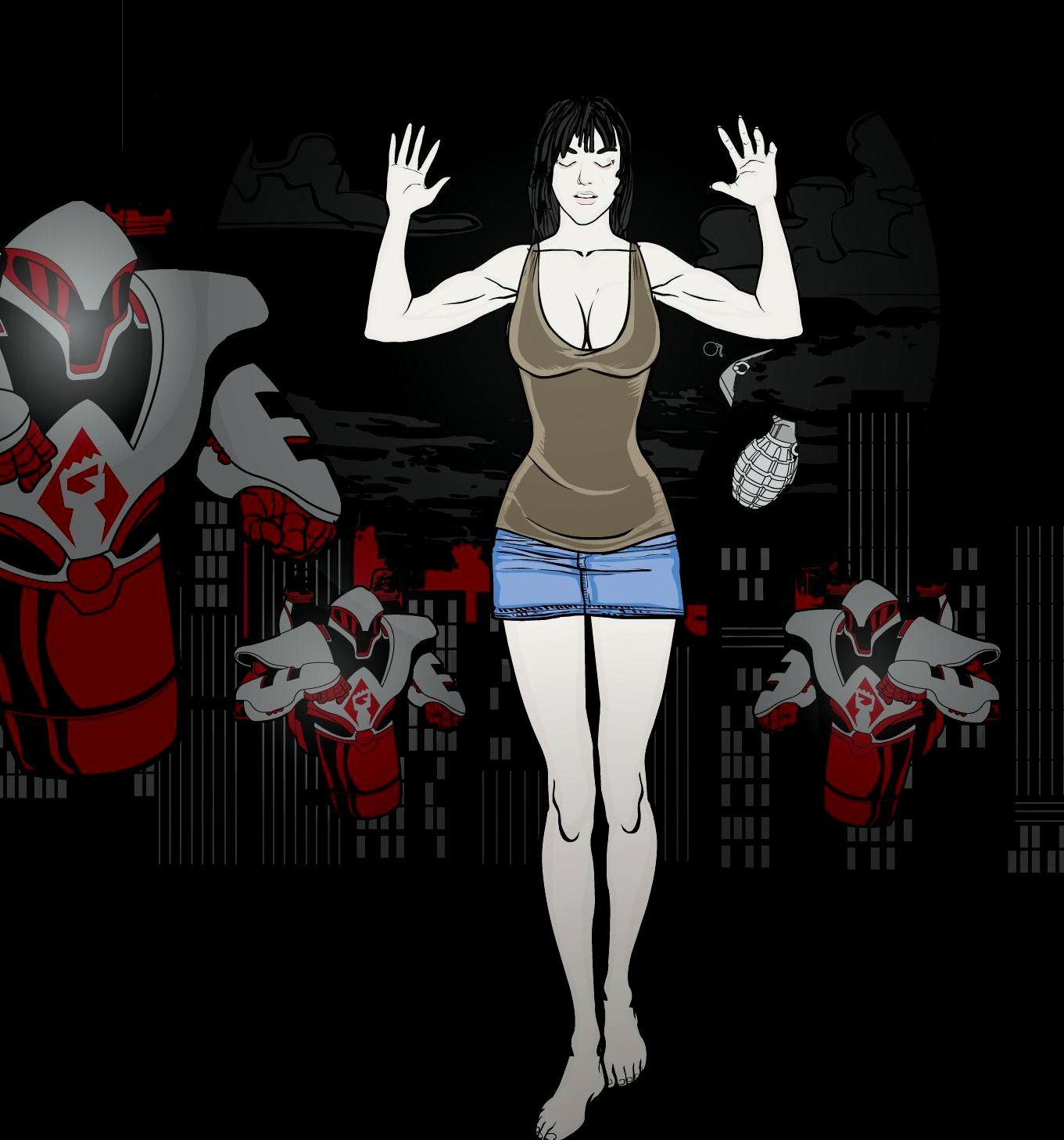
PathwalkerParticipantI hate school, Haven’t had much time to play around with heromachine lately but I did get this done.
She’s an experiment in tone. I know the grenade’s not quite right but I don’t know how to fix it. January 15, 2014 at 6:47 pm #36179
PathwalkerParticipant January 15, 2014 at 7:45 pm #35579
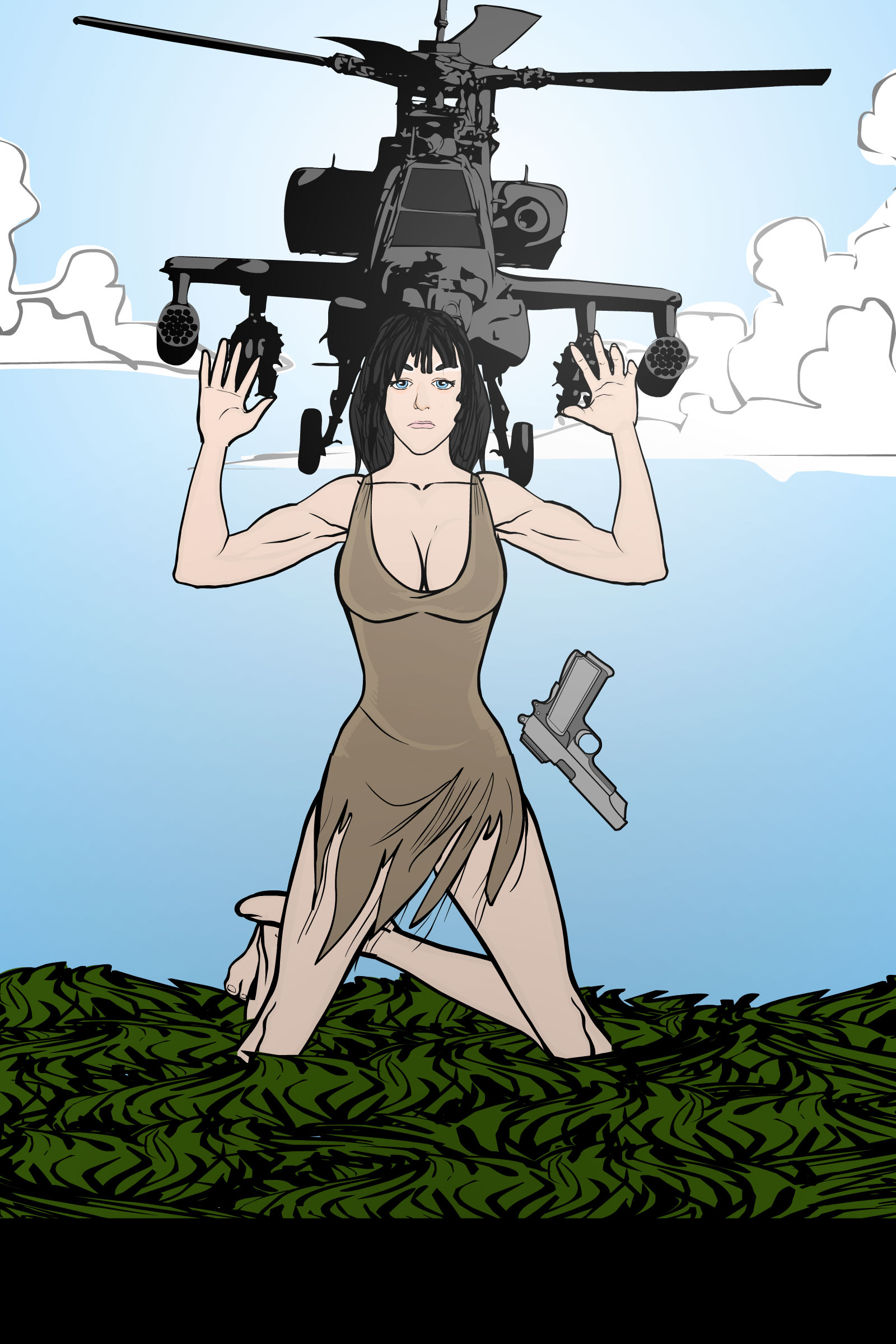
PathwalkerParticipantI expect I’ll come to a similar end someday, gunned down by a chopper as a pistol drops from my numb hands
 January 15, 2014 at 9:07 pm #36183
Herr DParticipant@Pathwalker said:
I hate school, Haven’t had much time to play around with heromachine lately but I did get this done.
She’s an experiment in tone. I know the grenade’s not quite right but I don’t know how to fix it.
Move the ring pin so that it’s around a finger? Color the grenade olive green and gray?
January 18, 2014 at 6:04 pm #36354
PathwalkerParticipant@Herr D said:
@Pathwalker said:
I hate school, Haven’t had much time to play around with heromachine lately but I did get this done.
She’s an experiment in tone. I know the grenade’s not quite right but I don’t know how to fix it.Move the ring pin so that it’s around a finger? Color the grenade olive green and gray?
Yeah, I’ll probably give the robots actual weapons too. Thanks!
January 20, 2014 at 6:29 pm #36450
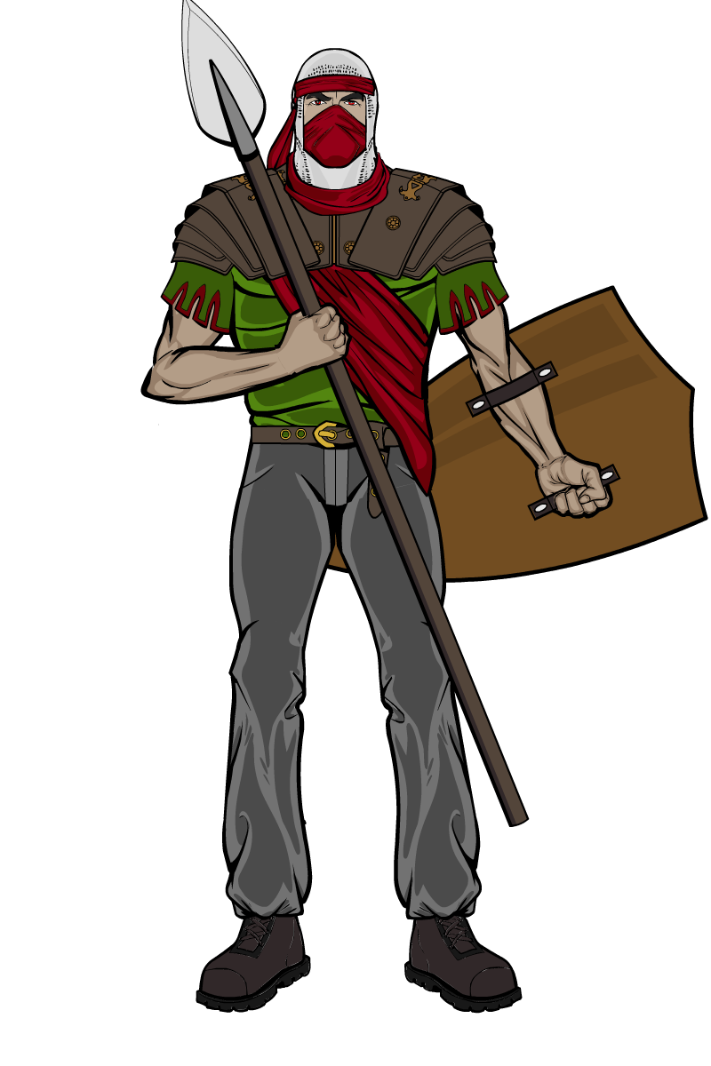
PathwalkerParticipantColor schemes. I need to figure them out.
 January 21, 2014 at 2:03 am #36468
JR19759KeymasterA tip on colour schemes is to try and keep to using 3 or 4 colours max and not to crowd an area with too much of one colour, especially if two items have the same colour (spear shaft and armour would be a good example here). This rule generally only applies for costume, so don’t worry about weapons or skin and stuff like that, but I’d keep the shield’s colour the same colour as the armour, and keep all the armour the same general colour to give consistency. Think about what colours work well together, what makes what stand out, for example you’ve used red against green here in the torso area. Having a green background makes the red foreground stand out because they are contrasting colours, but it wouldn’t work the other way round because red is a much stronger colour than green. And don’t be afraid of using different shades of the same colour to add variety.
Hope this helps.January 25, 2014 at 7:21 pm #36759
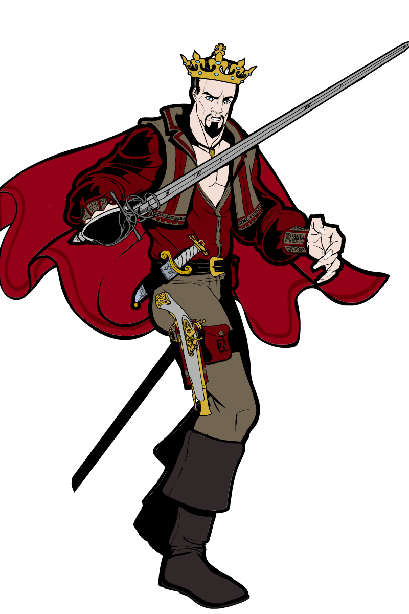
PathwalkerParticipantMy creativity is like nonexistent right now. Just messing around with
 June 2, 2014 at 10:02 pm #40587
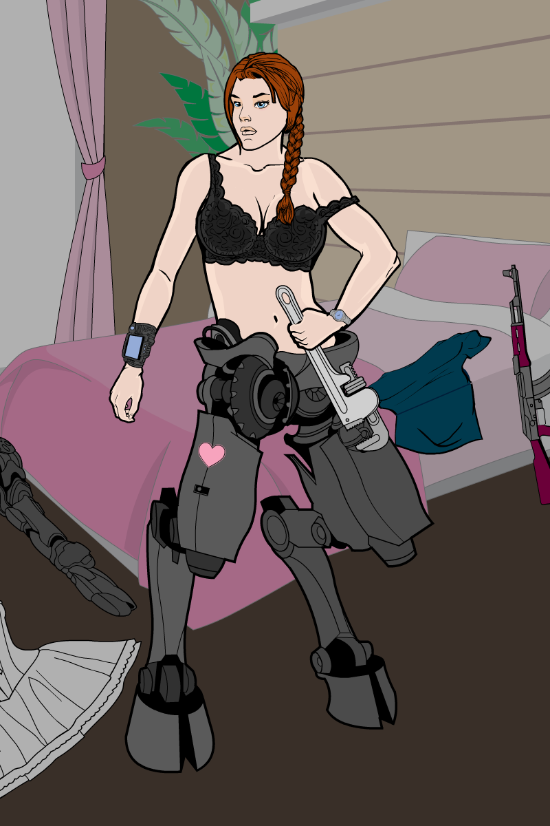
PathwalkerParticipantHaven’t been on in 4 months because my computer crashed and I lost ALL of my heromachine stuff and gave up on life for a while. I’m back! And here’s my entry for the sci-fi/other genre contest

-
AuthorPosts
You must be logged in to reply to this topic.

