Home › Forums › The HeroMachine Art Gallery › The Imp’s Gallery
- This topic has 70 replies, 17 voices, and was last updated 12 years, 7 months ago by
Hammerknight.
-
AuthorPosts
-
July 17, 2012 at 9:40 am #7623
FRMParticipantdo you mind if i fool around with your Golden Fleece design? i feel inspired.
July 27, 2012 at 6:53 pm #8258
The ImpMember@FRM said:
do you mind if i fool around with your Golden Fleece design? i feel inspired.
Sure. (Sorry for the late reply!)
July 27, 2012 at 7:26 pm #8261
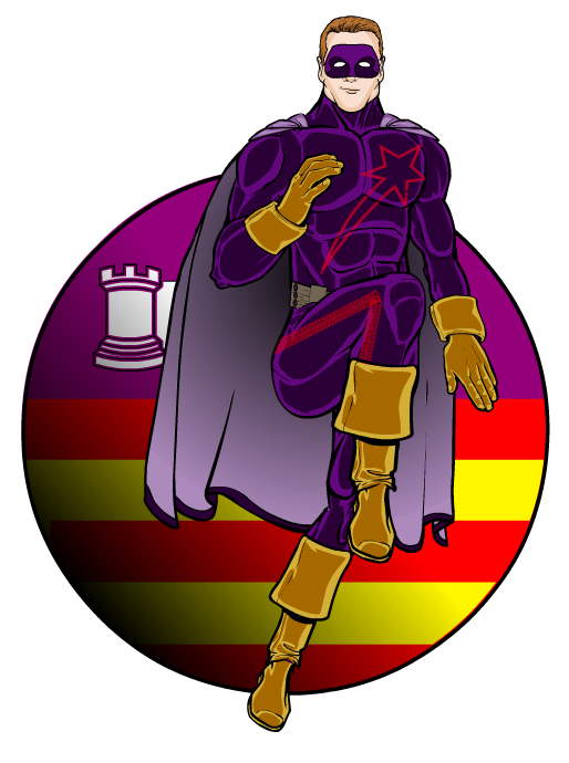
The ImpMemberI had so much fun with the international superhero thing I decided to make some more. Here’s the first, Shooting Star, a Spanish hero, based out of the Balearic Isles (hence the flag…)
 July 27, 2012 at 8:59 pm #8265
amsParticipant@The Imp said:
I had so much fun with the international superhero thing I decided to make some more. Here’s the first, Shooting Star, a Spanish hero, based out of the Balearic Isles (hence the flag…)
I know how you feel. That’s probably why I made 24 flag characters. Can’t wait to see more! Cheers!
July 28, 2012 at 2:19 am #8269
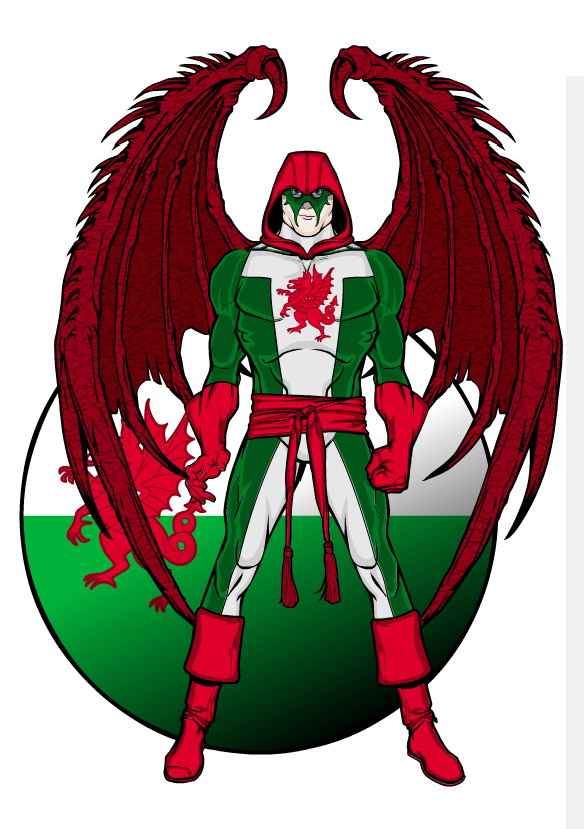
The ImpMemberThanks, ams. Yours were a definite inspiration! Here’s the Welsh national hero, The Dragon:
 July 28, 2012 at 3:01 am #8270
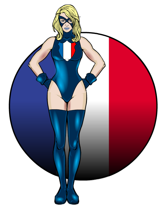
The ImpMemberAnd La Tricolore, from France (obviously
 ):
): July 28, 2012 at 5:59 pm #8311
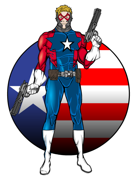
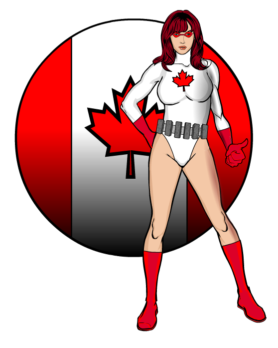
The ImpMemberFinally got around to doing the US (Superpatriot) and Canada (Aurora):

 July 28, 2012 at 6:39 pm #8312
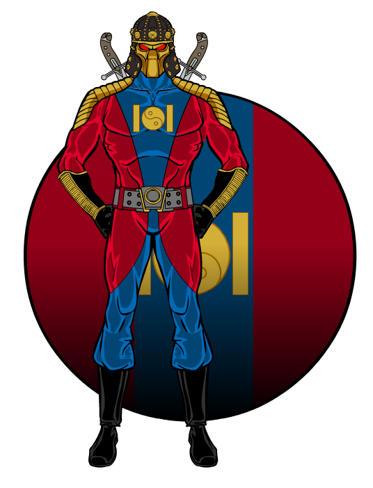
The ImpMemberThis one is Whirlwind, from Mongolia:
 July 28, 2012 at 7:23 pm #8313
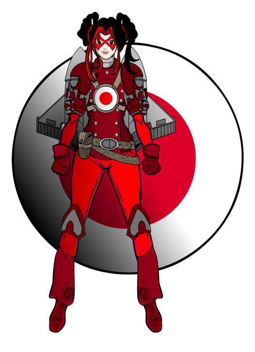
The ImpMemberRed Rocket, from Japan:
 July 29, 2012 at 2:20 am #8324
MisterDinoManMemberWow, you’ve been busy. I really like Red Rocket, Whirlwind and La Tricolore.
July 29, 2012 at 2:42 am #8325
taylorthecreatorMemberHey, Imp would you mind explaining how your doing the lighting on your characters or items? It would be greatly appreciated, I really admire your creations.
July 29, 2012 at 2:28 pm #8344
FRMParticipantta-dah! here is Golden Fleece, my way:
hope you like it!
 July 30, 2012 at 10:44 pm #8406
The ImpMember@taylorthecreator said:
Hey, Imp would you mind explaining how your doing the lighting on your characters or items? It would be greatly appreciated, I really admire your creations.
Not too complicated, just time consuming. I just use the multi-color/gradient circles in Patterns. The outer color’s transparency is set at 0 (as is the outer line), and the inner color is anywhere from 100% opaque on down, depending on the look I want. Then it’s just a matter of sizing and placement. Any sort of tutorial I could give on that would be way too long for this forum. The best advice I can give you is to look at the way light is reflected off of real-world items and try to replicate it. For the human form, I go with the ‘bulgy’ bits – the parts of the anatomy that stand out and so would reflect light more prominently – thighs, biceps, chest, etc. Think about which direction the light source is coming from and layout the highlights accordingly. Hope that helps!
July 30, 2012 at 10:45 pm #8407
The ImpMember@FRM said:
ta-dah! here is Golden Fleece, my way:
hope you like it!That is AWESOME! Nice work!
July 31, 2012 at 12:20 am #8408
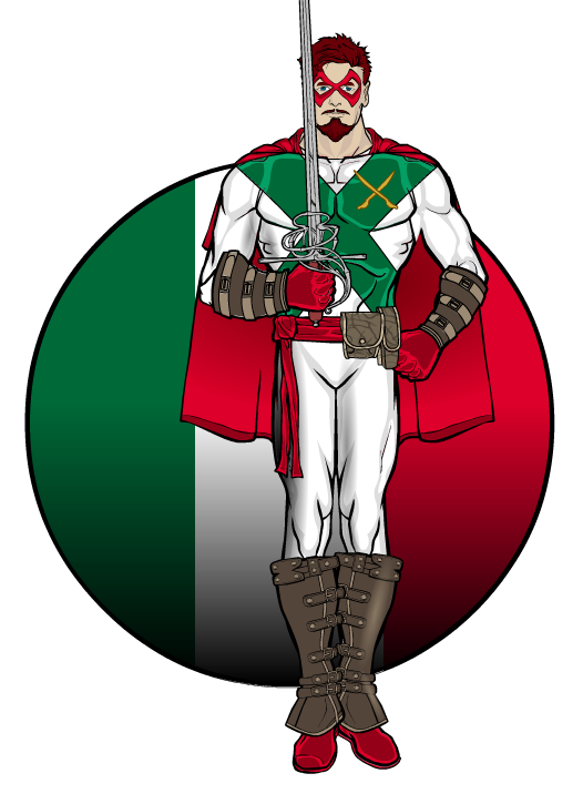
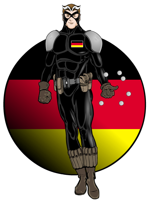
The ImpMemberTwo more national heroes, Condottiero from Italy, and Cannonball from Germany. (A note on Cannonball’s powers, since it’s not obvious from the picture: he’s a telekinetic, and can levitate objects and hurl them with immense force and speed – those are supposed to be large ball bearings orbiting his hand.)


-
AuthorPosts
You must be logged in to reply to this topic.

