Home › Forums › The HeroMachine Art Gallery › Suleman's creations
- This topic has 387 replies, 49 voices, and was last updated 3 years ago by
Suleman.
-
AuthorPosts
-
February 1, 2014 at 2:45 pm #37201
SulemanParticipantThanks!
Yeah, I figured he was pretty brash because of his sumo star status and stepped on some toes when he joined the gang. That’ll get your fingers cut in a jiffy.February 15, 2014 at 5:36 pm #23464
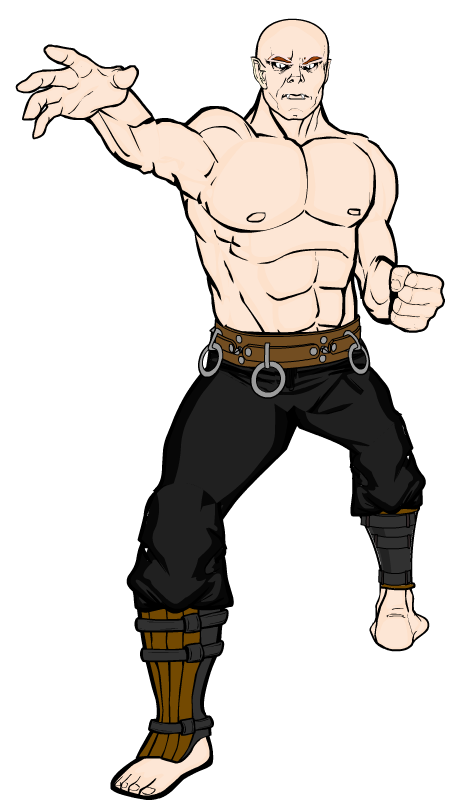
SulemanParticipantHere’s a posing sketch I made. The character is supposed to be a vampire monk, Dungeons And Dragons style, but don’t let that distract you.

It’s still pretty early in development, but do you have any ideas on how to make the pose better? Is the perspective looking alright? How about that back foot? It’s sort of bothering me.February 16, 2014 at 3:42 am #37866
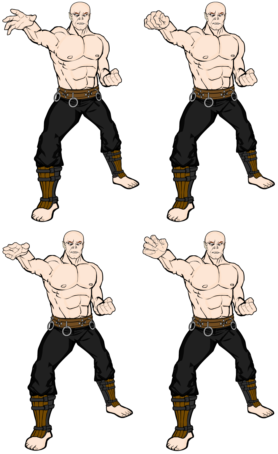
SulemanParticipantI altered the pose a bit and tried out some different hands. Now I guess I just need to figure out what a he would wear.
Any vampire monks in the audience? February 16, 2014 at 3:46 am #37867
StulteParticipantI’m no fighter, but it seems to me that most fighting stances would have the back foot turned at a 90 degree angle from the other, rather than having both feet facing opposite directions.
Here are som pictures I found for reference.

Also, the back leg seems a smidge too small to me. Could be wrong, though.
Apart from that the pose is pretty freaking epic. Mind sharing the text when you’re staisfied with it?
February 16, 2014 at 3:49 am #37868
StulteParticipantAw, too slow again.
The pose looks great now! The original hand fits best, in my opinion.As for what he could be wearing?
…
The blood of his enemies, perhaps?February 16, 2014 at 4:10 am #37870
SulemanParticipantCool! I’ll start working on the details soon. Shading, battle damage, tattoos, whatever.
 February 16, 2014 at 11:00 am #37878
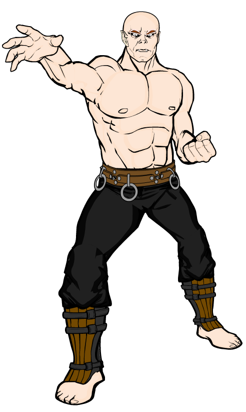
SulemanParticipantI couldn’t think of anything else in particular to add, so he will remain bald and shirtless for the rest of his days.
Here’s the final version with some shading:

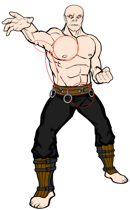
Here is a picture that demonstrates where I used masking to make the pose work:

And, finally, here is the code for the character.
Download monk_final.txtFebruary 16, 2014 at 2:18 pm #37884
StulteParticipantGreat end result! I think he really cool bald and shirtless. Sometimes less is more, which also goes for you subtle use of shading. Nice work!
February 16, 2014 at 6:08 pm #37896
KericParticipant@Stulte said:
Great end result! I think he really cool bald and shirtless. Sometimes less is more, which also goes for you subtle use of shading. Nice work!
I do agree he’s really cool bald and shirtless, but IF you want to put him in a shirt, I’d go with a Sholin (sp) style one sleeve cross body shirt in another color than orange.
February 17, 2014 at 11:00 am #37908
CantDrawParticipantExcellent pose!
February 17, 2014 at 12:46 pm #37915
SulemanParticipantThanks, dudes!
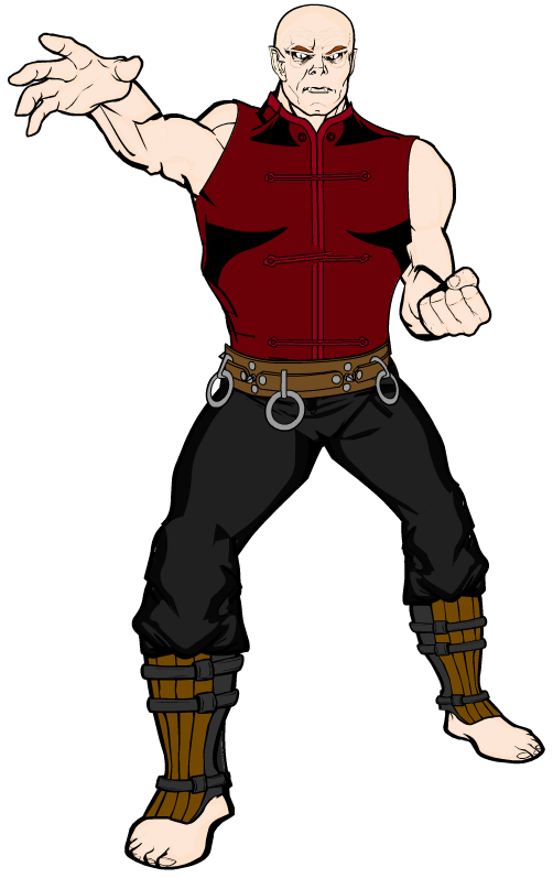
I tried giving him a shirt, and, well, it was hard enough to make the pose with just the body parts. As usual, the clothes are even harder. They’re just all intended for the basic torso, not the angled one.
 February 19, 2014 at 9:10 am #37951
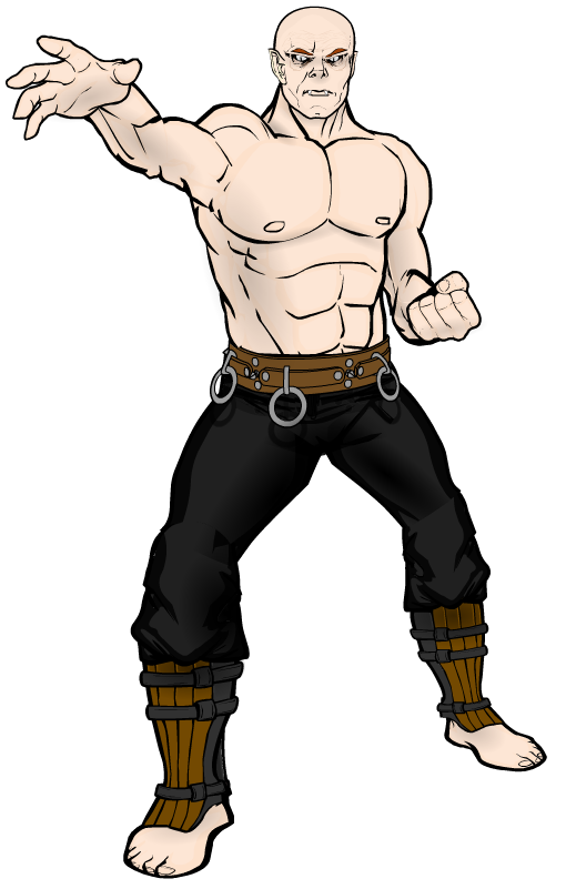
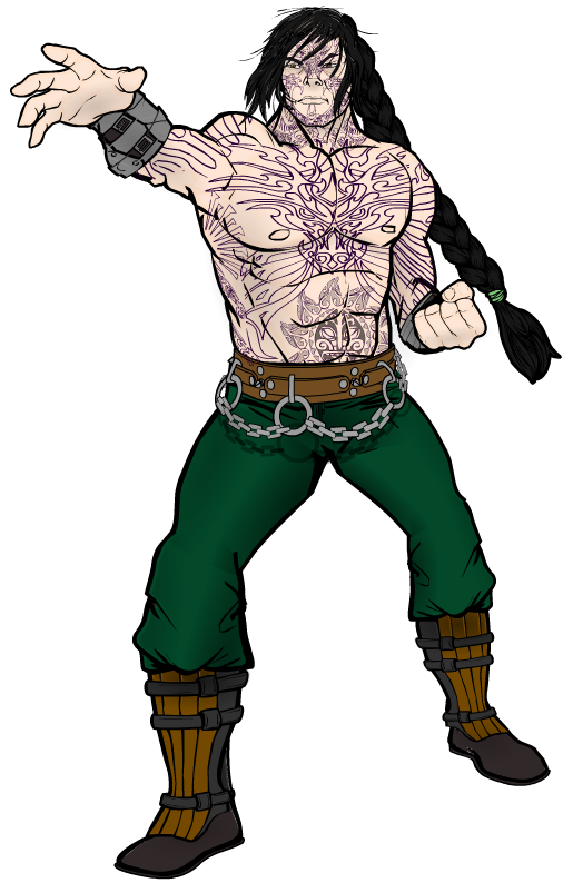
SulemanParticipantI realized I actually had a character I could use this pose for. So I did!

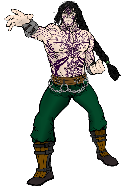
Shin, of the Shen brothers. A devastating warrior, who is feared for his martial prowess and strength even in a world where magic is commonplace. Unfortunately, he is arrogant, short-tempered and easy to fool.I also made a version with slightly different colors for the tattoos. I’m having trouble deciding between them.
 February 19, 2014 at 9:43 am #37952
StulteParticipantThat is really freaking cool! Interesting how the change in expression does so much for the character’s overall appearence.
Personally I think the second version looks better, but I can’t really explain why…
February 19, 2014 at 10:03 am #37956
SulemanParticipantThanks, man. The head area is actually mirrored horizontally compared to the original pose, so the entire character is now facing towards the front hand. That, interestinly enough, also forced me to change the front foot, as it no longer looked like it could support the pose. Just goes to show how changing even one part can affect the entire body and the design.
I’ll stick with the thicker tattoos if I ever feel like tweaking this design.
February 20, 2014 at 4:12 am #37987
WMDBASSPLAYERParticipantGreat work on the yakuza/sumo and Shin Shen is badass!
-
AuthorPosts
You must be logged in to reply to this topic.

