Home › Forums › The HeroMachine Art Gallery › Suleman's creations
- This topic has 387 replies, 49 voices, and was last updated 3 years ago by
Suleman.
-
AuthorPosts
-
May 8, 2016 at 1:58 pm #135575
SulemanParticipantOpposing the Empress and her dastardly Lady Knights is the Squire. She’s the hero of the story!
The Squire is a prodigy, a warrior capable of learning any fighting style amazingly quickly. Left orphaned because of the Empress’s wars, she has made it her quest to end them.
Not unlike a certain blue robot, she takes the weapons of her defeated opponents and uses them against their allies. Depicted here are Lady Buffalo’s and Lady Turtle’s equipment (with an updated helm).
June 6, 2016 at 11:41 am #136096
SulemanParticipantThis is Tide, a merwoman knight. I played her in a tabletop RPG, specifically FATE!
Name: Rising Tide, Tide for short.
Her actual birthname is pretty much unpronouncable.
Physical description:
Tall, strong, sleek, half-fish. Taking her headfin into account, she tops two meters. While pretty fast on land, she is terrifying in the water.
High Concept: She Speaks For The Seas
A young noblewoman and a knight, Tide was sent by her father, the high chancellor of the Deep Kingdom, to represent it in the affairs of Trinity Bay.
Her job is to protect the kingdom’s interests in anyway she can and chooses… She usually chooses trouble. Why was the daughter of the high chancellor sent to this remote town? She doesn’t know, and she is not pleased! And just when she was getting on so well with the crown prince Dagon.
She was going to have dinner with the royal family. Could you have thought of a worse time, father?
Trouble: Imperius Regina
Let’s be honest here, Tide is something of a douche. She is highborn and she knows it, and she doesn’t care much for the surface world. She is quite adept at rousing the ire in others. The Deep Kingdom is almost a caste society. Tide herself comes from the military ruling class. The royal family themselves might or might not be Lovecraftian horrors.
…You Get Paid?
Tide was born and raised for battle. Upon arriving to Trinity Bay, she quickly got interested in the gladiatorial fights.
One day, she noticed Dragonheart being placed in an unfair match and decided to get involved. As a mysterious hooded figure, she has interfered in his matches ever since. She might not have fully realized that the matches are staged.
September 3, 2016 at 12:49 pm #137995
SulemanParticipant
It’s not really my best, the best I can do right now. I’m out of practice and I had to make this left-handed becuase of my tendonitis. Unoptimal.
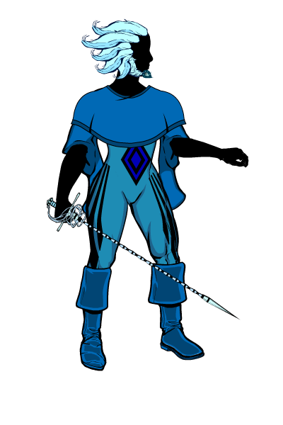
It’s also a gemsona. That basically means a representation of myself as a Steven Universe character. Goes by the name Apatite. With a beard, because it wouldn’t be me without one. I assume she’s heading to Earth to settle some unfinished business because that seems to be the trend. The tip of her rapier can spin like a drill, allowing it to pierce nearly anything.
September 3, 2016 at 6:01 pm #138002
TiberiusMemberEven left-handed your art is very nice. Neat idea on the floating technology with Earth in the scanner. Well done!
September 5, 2016 at 5:52 am #138046
SulemanParticipantHeromachine 3: Design choices, starring Apatite
This is a little piece on how I personally make choices in character design, using my latest Heromachine thing, Apatite, as an example. I’m not a professional and these are only my uneducated opinions, but maybe they can help you as well?
Apatite is a very balanced design. I tried to use many different kinds of elements in her design so she didn’t feel overwhelmingly tied to one character archetype or design style. I will go over the different intended effects of the design and explain my reasoning for using them, as well as point out some examples of them in other character designs. Finally, I will make small adjustments to Apatite’s design to show I could further emphasize that particular effect. Here is Apatite again, with her body in silhouette to emphasize the outfit and such.

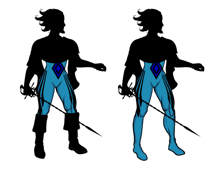
Smooth, skintight elements
Effect: Implies overall mobility. Easier to animate and adjust. Additional elements will add complexity, in both good and bad.
Other examples: Spider-Man, super heroes in general, pro wrestlers, etc
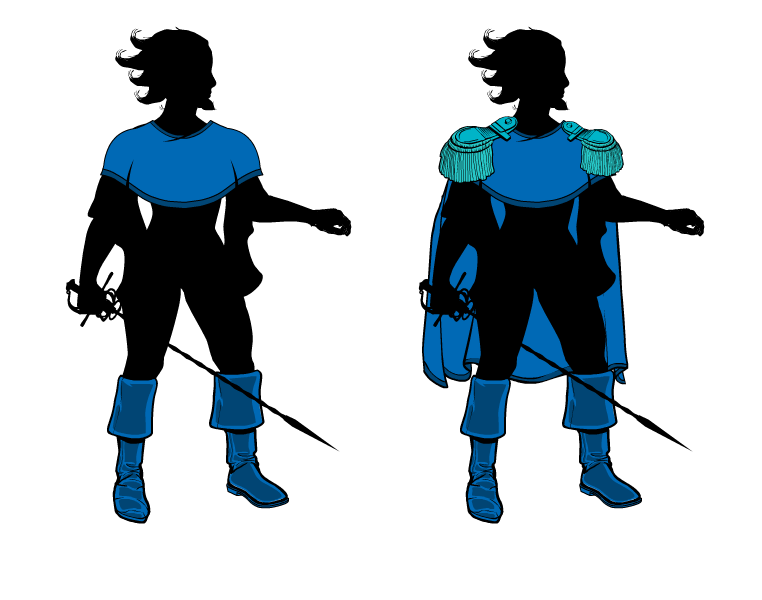
Apatite examples: Her bodysuit shows that she can move when she needs to. If we wanted to further emphasize her mobility, we could simply take off all the other elements (e.g. boots) on top of the suit.

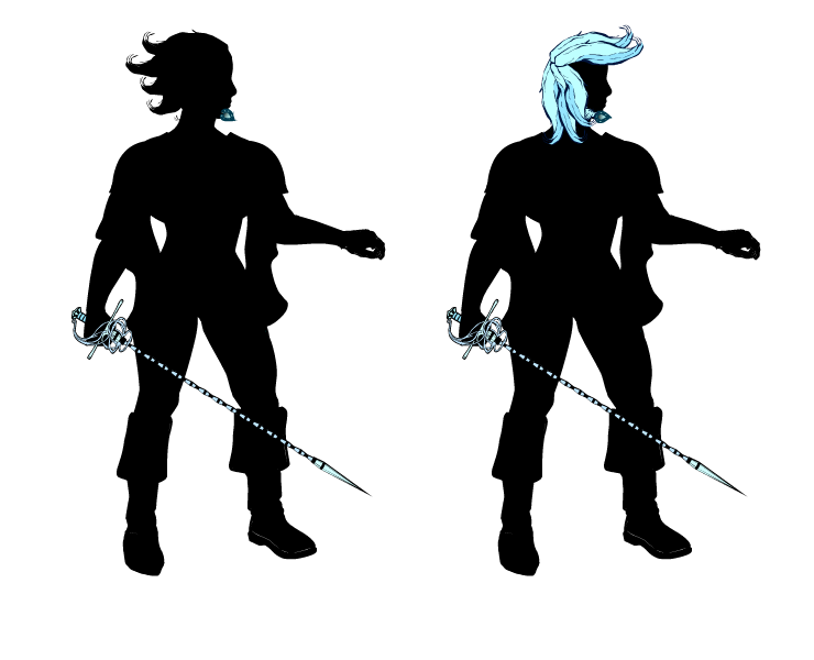
Elements pointing forward
Effect: Implies aggressiveness and stubbornness.
Other examples: Swords and guns, animal horns, some hairstyles (in anime, the delinquent’s pompadour), etc
Apatite examples: Her sword and ger gem are pointing forward, giving a slightly threatening impression. We can increase that by giving her an outrageous hairstyle.

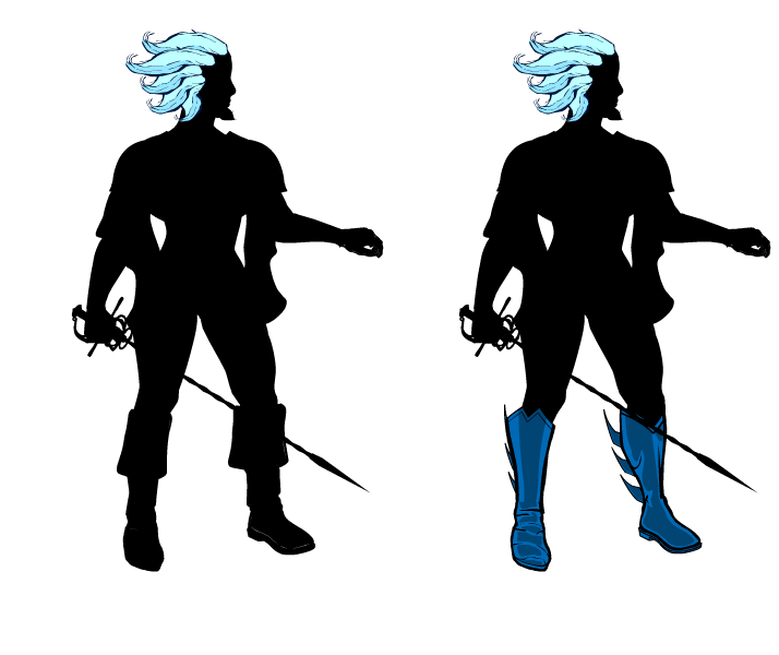
Elements pointing backward
Effect: Implies forward motion, aerodynamics and speed.
Other examples: The Flash’s lightning bolts, Quicksilver’s hair, this bicycle helmet, etc

Apatite examples: Her hair is hella aerodynamic, which should help if she needs to lunge forward with that rapier. Some gratuitous fins on her boots might help the speedy impression even more. Or look ridiculous.

Elements flowing freely and/or hanging off the body
Effect: Implies circular or changing motions and theatricality. Changes direction slightly more slowly than the rest of the body, very useful for emphasizing motion and showing the character’s previous direction.
Other examples: The flowing robes in wuxia and kabuki, Doctor Strange, etc
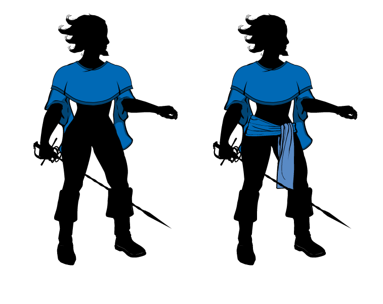
Apatite examples: Her sleeves and poncho flow and look pretty dramatic. We can futher emphasize this effect by giving her a sash.

Elements that increase width
Effect: Implies weight and sturdiness.
Other examples: Most kinds of armor. In superhero comics: Juggernaut, Superman’s cape, etc
Apatite example: Arguably her beard. Her swashbuckling boots give her legs a little bit of weight, which emphasizes her grounding. Solid grounding is important for a fencer! Her poncho also emphasizes her shoulders, which gives an impression of physical strength. We can just go overboard with that and give her big epaulets and a cape, which also work with the swashbuckling style.

Elements that conceal the character’s body
Effect: Implies mystery, otherworldliness and focus the viewer on what little they see.
Other examples: Batman’s cape, all kinds of robes, wings, etc
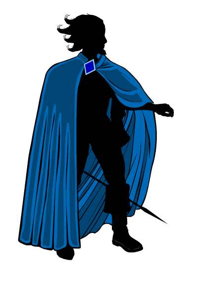
Apatite examples: Maybe her poncho? Honestly, I didn’t use this much when designing her. However, we can introduce a large cloak, which she can throw off dramatically when she reveals herself.

There you have it! I hope this was entertaining and useful to you!
September 5, 2016 at 8:08 am #138048
TiberiusMemberThis is a really nice design guide, thank you Suleman! I’m glad to see I do some things right (even if I don’t know the exact reasons, haha).
September 5, 2016 at 8:14 am #138049
SulemanParticipant“Right” is relative, dog. We all have our own ways of thinking, that’s how art works. I just happened to introduce mine here.
September 8, 2016 at 1:57 pm #138124
Magnus MaximusParticipantTide and her people are awesome! They look like something I could easily see showing up in an Aquaman comic or something.
September 8, 2016 at 2:14 pm #138125
SulemanParticipant@Magnus Maximus: Haha, thanks! My initial pitch of my character to the gamemaster went something along these lines: “I know you’re running a fantasy game here, but would you mind if I just straight up played Namor?”
He let me, and the rest is history. The game didn’t last too long, but it was fun. Would have loved to explore her people more.
September 8, 2016 at 8:27 pm #138141
VengeanceParticipantVery good to see you around these parts again, good art work as usual
September 9, 2016 at 5:42 pm #138231
cliffParticipantTide is awesome, and so well put together, No surprise there though.
love the fin mohawk.Sorry aout the tendonitis, at least you can still be wonderfully ceative.
Apatite. Very interesting character and name.
kewl use of eyebrows as hair.
Is it me or is the veiw got a Stitch vibe going on? Look ate Apatite and let the veiwer sneak into your peripharil. Looks like Stich to me. heh heh
and kewl concept and execution of the drill sword.Great Design Choices guide, as yours always tends to be.
I found myself doing some of those without thinking about it.September 10, 2016 at 7:40 am #138293
LullabyOfTheSinParticipant+1,5 for characters before Apatite, wonderfull
+2 for Apatite (i am gigantic/huge fan of Steven Universe!)
+2 for guide
Simply, great everything!
September 10, 2016 at 10:20 am #138309
SulemanParticipantThanks, everybody. Glad to see you like what I do!
@cliff: Since the gem characters in Steven Universe are all named after their gemstone, Apatite’s name comes naturally. I’m not entirely sure what you mean by Stitch here. Could be my second-language English or my lack of experience in visual design. Is that a reference to this? https://en.wikipedia.org/wiki/Image_stitchingMy guides are mostly a way for me to analyze my own methods to understand what I’m doing and possibly make some improvements. If any of y’all have got some ideas or comments about them, I’d be interested in reading and discussing them. For example, I’m still not entirely sure what kind of effect upward pointing elements have in a design, or if these methods of mine actually work.
September 30, 2016 at 6:12 am #139020
SulemanParticipantThis is actually from years ago. I hadn’t even started using shading yet. I’d like to think that I’ve gotten better since then.
Anyway, this was for a Pathfinder game I was in. Starring a human Inquisitor, a half-elf Ranger and a halfling Gunslinger. Not a big fan of the system, but it was a fun game.
October 2, 2016 at 4:52 am #139075
Herr DParticipant‘Stitch’ of ‘Lilo & Stitch’ the Disney film. I highly recommend it.
-
AuthorPosts
You must be logged in to reply to this topic.


