Home › Forums › The HeroMachine Art Gallery › Scatmans loft’ the gallery
- This topic has 653 replies, 57 voices, and was last updated 10 years, 11 months ago by
Wolf Master.
-
AuthorPosts
-
May 28, 2012 at 12:08 pm #287
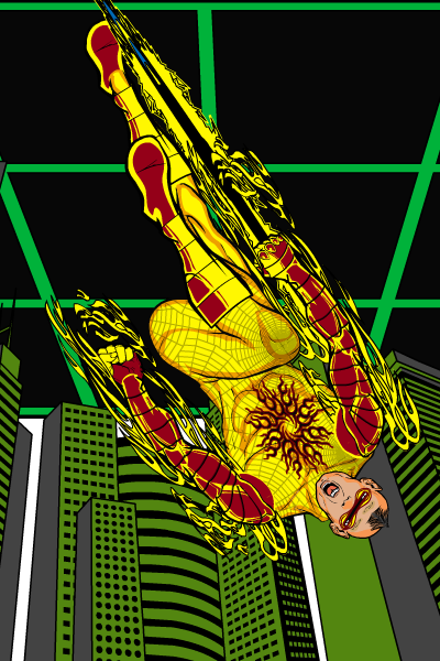
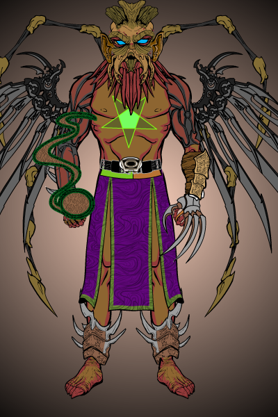
ScatmanMemberThanx I really appreciate the critizism.I felt that the detail was alittle much too.I have been at it for a few weeks and am learning alot just by looking at some the great stuff you and some others have created with this thing!I definitly tryed to keep it more on the character with some of the newer ones.Thank you so much it means alot to hear your thoughts and ideas!I think this one might be more about the character.
May 28, 2012 at 8:48 pm #5979
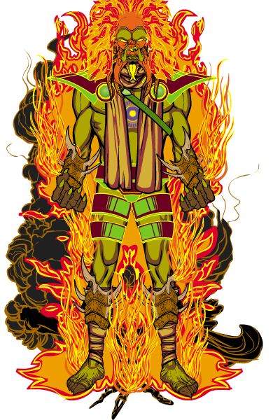
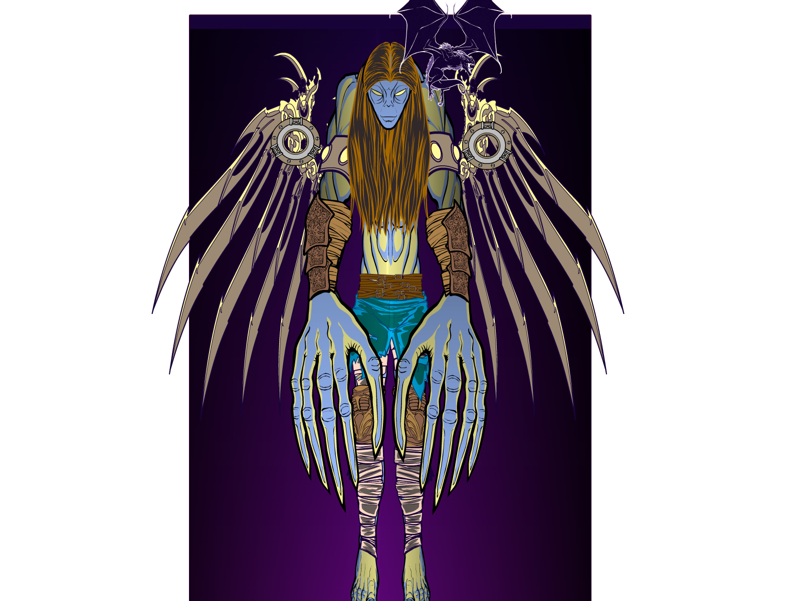
The Atomic PunkParticipantWillkommen, Scatman. I agree with Kaylin88100, but I am a minimalist myself. I like Hangman. Without a backstory, the wyvern seems tacked on to the picture.
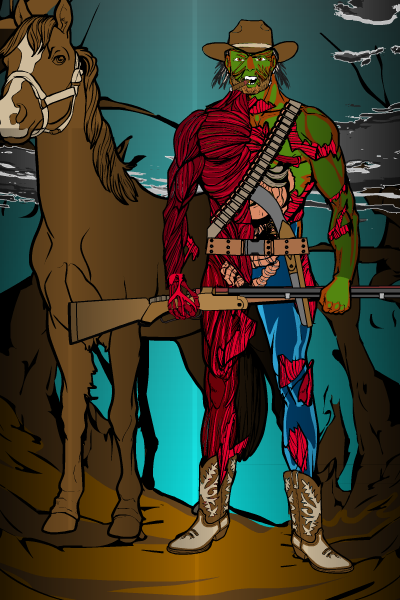
Having said that, a closer look at the detail. Hangman’s hands are on the outside of his sleeves / above the gauntlets. They are tacked on to the character. Might want to tweak that.
May 29, 2012 at 8:03 am #5991
ScatmanMemberHey AP i am near sighted so sometimes while creating i don’t see things.You sure are right with the little pet and the hands.I wonder if you could help me.I have a problem tweekin’ my stuff because for some reason the machine loses my saves after returning to the page a few times.thats why I rush to download it as fast as a can to save what I can quickly.It sucks for going back and correcting things.It’s probably my dinosuar of a pc.Wait UPDATE I just realized my saves were still there!cool I only became a member yesterday so maybe It will save my stuff now,crossin’ my fingers!anyway made some adjustments.It’s holing some water now thanx to you!thanx again.
May 29, 2012 at 9:00 am #5995
KaldathKeymaster@Scatman said:
Hey AP i am near sighted so sometimes while creating i don’t see things.You sure are right with the little pet and the hands.I wonder if you could help me.I have a problem tweekin’ my stuff because for some reason the machine loses my saves after returning to the page a few times.thats why I rush to download it as fast as a can to save what I can quickly.It sucks for going back and correcting things.It’s probably my dinosuar of a pc.
I would suggest saving your creations text strings as a text file on your computer that way you do not have to worry about your compuiter purging the .sol files ( the files heromachine uses to save the characters ) To get the text string click on the save button, then the text tab and copy the text that appears in the box and paste it into your favorite text programs be it MS word, notepad, google docs, what have you.
May 29, 2012 at 12:59 pm #6011June 1, 2012 at 11:27 am #6098
ShiborethMemberI love the levels of creativity that pour into your images. Really impressive!
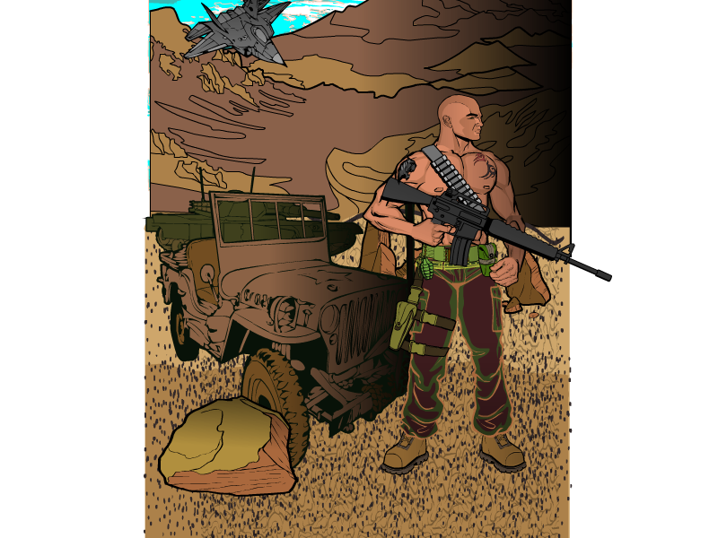
I think for some of your more complex backgrounds, if you put some more contrast into the pieces, it might really help the details come together as a more complete image. In terms of settings, depending on the effect you want, you might make things that are further away lighter (or darker) than things further away.
If you haven’t done something like this, (and if you have the ability to!), take some time out and find a place where you can look out across a very wide stretch of land, such as from on top a massive hill. Our eyes/brain have learned to read the cues to know what piece of the landscape is further away and which is closer. Try to figure out what these cues are (e.x. perspective, intensity of colors, hues, etc.) When we’re drawing something, we’re trying to create the illusion of depth (or some sort of 3Dness) on a 2D image. With HM, in some ways creating that illusion is easier than if we did it by hand, but in other ways it is harder. However, a lot of the principles are the same: how do we create the illusion of depth in a 2D image?
Sorry if I said anything you already know. In any case I hope it makes sense, and is helpful.
June 1, 2012 at 11:47 am #6085
ScatmanMemberThank you so much for your perspective(no pun intended)you know I really am tryin’ hard to work with this 2D platform,and finding it kinda challenging using light from left light from right light from up down,you know what iI’m tryin’ to say anyway,I look at some others and think how did they make that shine spot or how did they get that depth.So really thank you for the advise i just started with this thing and find it very addictive.I need all the non-objective critisizmIcan get and what you said brings light to alot of things(no pun intended)Thanx
June 1, 2012 at 11:54 am #6086
ShiborethMember@Scatman said:
Thank you so much for your perspective(no pun intended)you know I really am tryin’ hard to work with this 2D platform,and finding it kinda challenging using light from left light from right light from up down,you know what iI’m tryin’ to say anyway,I look at some others and think how did they make that shine spot or how did they get that depth.So really thank you for the advise i just started with this thing and find it very addictive.I need all the non-objective critisizmIcan get and what you said brings light to alot of things(no pun intended)Thanx
No problem! I’ve been trying to figure it out myself, having rediscovered HM about a month-ish ago. AMS posted a guide on highlighting/shading under the “Tips” subsection of the art gallery. I don’t know if you’ve seen it, or if it’s an art style choice you’d want to take, but it was hugely helpful to me.
June 1, 2012 at 12:07 pm #6088
HarlekinMemberHmmm very unusual pictures. Great start. And a few advice first time do what you want to do, after if you need to improve yourself try out new things.
June 1, 2012 at 9:44 pm #6113
HammerknightParticipantDon’t worry about lighting and shadowing and all that major art stuff, the point of HM is for you to have fun and enjoy making characters. They are your characters, it only matters that you like them, people may say stuff and make suggestions but in the end your happiness is what counts. I’m old school comics and HM lays it out old school if you ask me. Spending hours trying to make everything perfect takes the fun away from making the characters in the first place.
June 2, 2012 at 9:34 am #6120
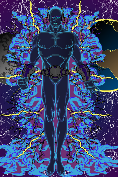
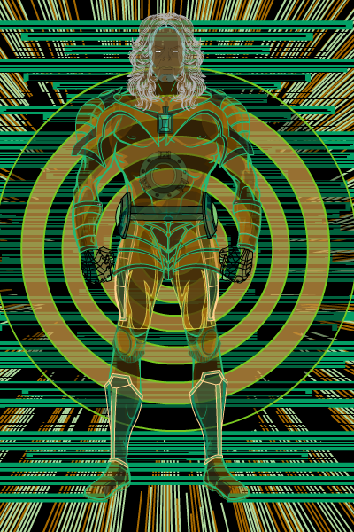
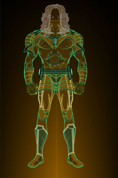
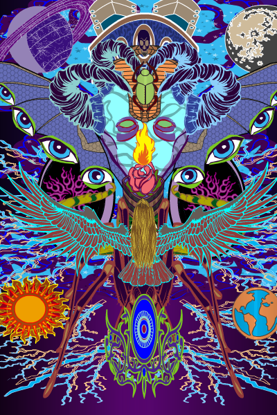
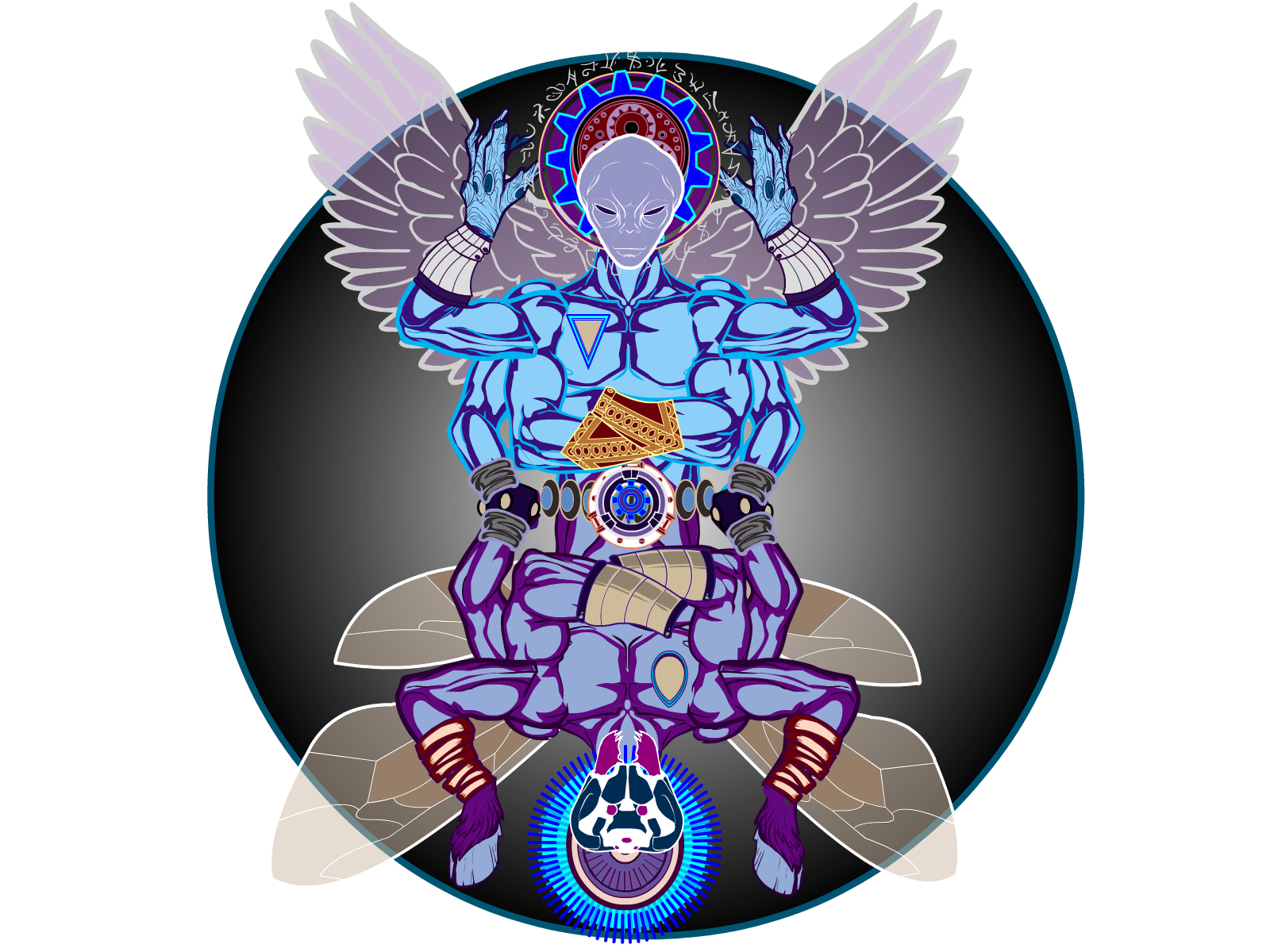
ScatmanMemberDON’T START PROJECTS LATE AT NIGHT ,IT MADE ME THROW THINGS TOGETHER WITHOUT EVEN THINKING BOUT’ THEM.WITH SOME NEW MORNING THOUGHTS AND FRESH CREATIVE JUICES I TWEEKED THE NOVA PIC.IT’S NOW DOORWAY TO EVENT HORIZON.I REALLY LIKE IT NOW ,EVEN THOUGH IT’S UNCONVENTIONAL AND AGAINST THE NORM.
http://img816.imageshack.us/img816/4475/scatmanthedoorwaytoeven.png
June 2, 2012 at 9:54 am #6106
VampyristParticipantThat is awesome
June 2, 2012 at 8:39 pm #1084
ScatmanMember


 June 2, 2012 at 10:31 pm #6128
ScatmanMemberthis the one that made me realize the potentiall of HM3
http://imageshack.us/photo/my-images/816/scatmanthedoorwaytoeven.png/
June 3, 2012 at 11:12 am #6141
ScatmanMemberhttp://img42.imageshack.us/img42/2108/scatmanthemorphimal.png
Alright here is the final on MORPHIMAL !
-
AuthorPosts
You must be logged in to reply to this topic.

