Home › Forums › The HeroMachine Art Gallery › Posters, Covers, & Cards › RobM’s Sentinels’ Comic Covers
- This topic has 127 replies, 19 voices, and was last updated 7 years ago by
JR19759.
-
AuthorPosts
-
October 23, 2013 at 2:28 pm #32878
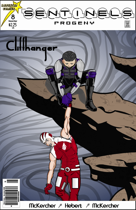
RobMParticipantI thought this idea would be more fun with the next generation.
 October 23, 2013 at 4:59 pm #32994
headlessgeneralMemberVery nice!
October 24, 2013 at 5:29 am #33003
The Atomic PunkParticipantIncredibly original! The shadow adds drama as well as dimension.
October 24, 2013 at 1:04 pm #33016
RobMParticipantThanks, guys.
I’m satisfied with the overall design and posing, but the finished product feels a little flat to me. Any thoughts?October 24, 2013 at 2:16 pm #33020
Herr DParticipantI would suggest ‘deforming’ the wrist band, making it out of a cape or something. It doesn’t look like it’s helping hold the weight of a guy. Maybe dulling the background a bit would make the foreground stand out more?
October 25, 2013 at 12:32 pm #33043
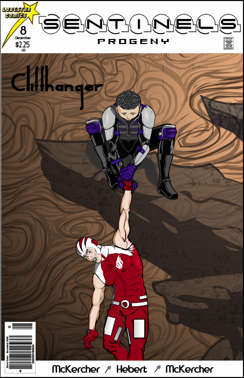
RobMParticipantThanks, Herr D. Sometimes I’m too close to the work to see some of these things. I didn’t intend to imply that the dangler was being supported by his wristband, but after you mentioned it, it was pretty obvious that’s what the illustration was saying. So, I changed the hands to suggest that he’s slipping through Midnight Arrow’s hands. I think it adds a layer of tension. Also, as you can see, I changed the background color and proportions. I think it adds some depth. What say you?
 November 2, 2013 at 5:49 am #33282
WMDBASSPLAYERParticipantRobM, awesome! And like you with “high five,” I hate using the word “awesome” but that is exactly what your work is! That last cover is great, both versions, but I think the black shadows made it more dramatic, though this version is more natural looking with the earth tones.
November 4, 2013 at 11:41 am #33346
RobMParticipant@WMDBASSPLAYER said:
RobM, awesome! And like you with “high five,” I hate using the word “awesome” but that is exactly what your work is! That last cover is great, both versions, but I think the black shadows made it more dramatic, though this version is more natural looking with the earth tones.
Much thanks.
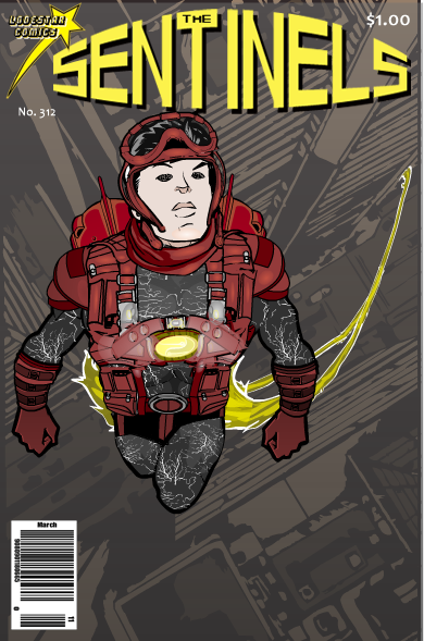
December 23, 2013 at 2:33 pm #35140
RobMParticipant December 23, 2013 at 5:47 pm #35163
headlessgeneralMemberAnother excellent cover. I think I might just try to make one of my own soon.
December 30, 2013 at 10:37 am #35427
RobMParticipantThanks! And thanks for the Hall of Fame nominations on the blog.
December 30, 2013 at 11:30 am #35429
AnarchangelParticipantRob, I wish I had half the talent you have for creating covers. I want to make a Dragonfly cover but I suck at that kind of thing.
Anyway, all of yours are fantastic, keep it up.December 30, 2013 at 4:20 pm #35453
RobMParticipantHere’s an idea to get you started.

Download DragonflyCoverSketch.pdfApril 26, 2014 at 8:39 am #39734
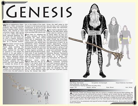
RobMParticipantI’ve been thinking about this for awhile – Who’s Who style pages for the Sentinels universe. The drawings are HeroMachine; the typesetting and page layout were done in Adobe InDesign. I started with Lodestar Comics’ core character, Genesis. Here is his entry from the Lodestar Universe Compendium.

This is a much reduced copy because the original was too large to upload. To read the text you can go here http://www.robertmckercher.com/CompendiumGenesis3.pdfApril 26, 2014 at 9:11 am #39736
FRMParticipantlove it!
-
AuthorPosts
You must be logged in to reply to this topic.

