Home › Forums › The HeroMachine Art Gallery › RobM’s Machine Works
- This topic has 415 replies, 46 voices, and was last updated 5 years, 2 months ago by
RobM.
-
AuthorPosts
-
November 5, 2014 at 2:20 pm #114408November 14, 2014 at 1:32 pm #115004
RobMParticipantFor Character Design Contest 98 Starting at the Beginning
Attachments:
You must be logged in to view attached files.November 14, 2014 at 1:43 pm #115006
RobMParticipantFor Character Design Contest 98 Starting at the Beginning Entry 2
Attachments:
You must be logged in to view attached files.November 14, 2014 at 1:52 pm #115008
RobMParticipantFor Character Design Contest 98 Starting at the Beginning Entry 3
Attachments:
You must be logged in to view attached files.December 10, 2014 at 10:35 am #116361
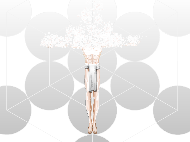
RobMParticipantI have been working on this for a while, and I think I have something I’m satisfied with. Even then, I couldn’t decide which background color I like better. Oh well, here’s both versions.


Attachments:
You must be logged in to view attached files.December 10, 2014 at 10:47 am #116366
JR19759KeymasterBoth are awesome, but I like the first version better.
I really hate the fact that so many people are doing so much good stuff at the moment. I really makes COTW difficult for me to decide. *shakes head in mock despair*
December 12, 2014 at 2:25 pm #116439
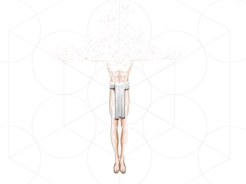
RobMParticipantProcess pic for Sublimation
Attachments:
You must be logged in to view attached files.December 13, 2014 at 9:05 am #116460
Wolf MasterParticipantWell deserved COTW. Thats absolutely mind bogglingly amazing. Love how how you can still see bits of the arms and the shadow from the loin cloth.
December 13, 2014 at 2:51 pm #116474
SkoulParticipantHi RobM, I’m just stopping by to say – love your work! And I’m nominating your Sublimation Silver for the HOF.
December 15, 2014 at 2:15 pm #116551
RobMParticipantJanuary 12, 2015 at 4:42 pm #117418
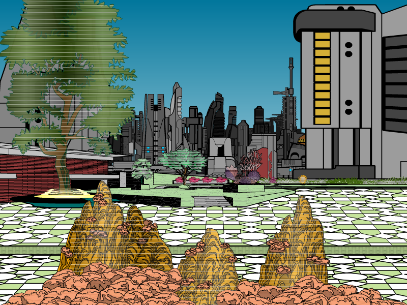
RobMParticipantI feel there’s probably more I could (should?) do with this, but I’m fine with it for now.

Attachments:
You must be logged in to view attached files.January 13, 2015 at 1:12 am #117445
JR19759KeymasterWell……..
*dies of awesome overload*
January 13, 2015 at 10:51 am #117460
RobMParticipantThanks, JR. I feel like I should add lighting depth, but I suspect it would be a big undertaking to do it to my liking – and half-way would not be good. I suppose the upside is that holograms don’t cast shadows, do they?
January 14, 2015 at 5:04 pm #118748
RobMParticipantCharacter Design Contest ♯104- RANDOMNESS ABOUND!
I ignored the name generator’s suggested backstory.Attachments:
You must be logged in to view attached files.January 14, 2015 at 6:05 pm #118762
NugParticipantOh cool Rob! I love your future-scape there. Some shading would be awesome, but we’ll see you some time next year if you go all out. Its still pretty cool the way it is. Any plans for it?
-
AuthorPosts
You must be logged in to reply to this topic.


