Home › Forums › The HeroMachine Art Gallery › PLANET AMS
- This topic has 1,903 replies, 115 voices, and was last updated 2 years, 1 month ago by
ams.
-
AuthorPosts
-
January 29, 2017 at 4:18 am #141697
LullabyOfTheSinParticipantWell, and here lies my past hope of commenting on time. Anyway, time to catch up a little.
Or rather, a lot.
The Patriot looks great.
As always, highlighting at master level.
Overall costume design/colors are also well made.Shooting Star is really interesting for me.
Whole energy bow idea is great, and the way you did is is even greater.
Light effects are well done.
Her costume is pleasing for the eyes, good job on that.Major Patriot, when it comes to how good he’s made overall stands on the same level as Patriot.
+ He and Shooting star fit together as a team, at least i think they do.Iron Skull you made look really sweet.
He almost gives super-villian vibes, but thats good, he looks really cool.
You did really nicely the metal head/skin effect, its clean and quite visible (effect, but his head itself is also quite clean. Polished almost)Wrench is really great character.
These heli-drones are nice, adorable, probably deadly, but also well made.
Nice pose/character muscles/costume, everything fits nice.
Also, dirt/not-clean effect really gives him that unique mechanic character.Rose looks very intimidating, sweet.
Things that make up her costume give really interesting effect together. Looks practical, while still giving some defense + not restraining to much movement.
Red/gray color use is great overall.
Highlighting/light effects are perfect in my opinionDr. Wilson a.k.a Doc looks like definition of genius among humans.
Great “i can solve any problem with science” feel is all around him.
I have no idea if that ID he has is something you made or piece from HM, but i never seen it in HM, so i will guess you made it, and if yes, then nice. If no, then nice anyway.Peacekeeper is really nice high-tech superhero.
Loving idea of energy shield + almost-like-lightsaber baton (Lightbaton?)
Great use of light to give metal that reflective look.
also, colors are very nice and fitting, especially energy effects.Your version of Cuahtemoc is really nice.
Overall look is simply great, nothing bad about how you made him look.Sledge interested me a lot.
He looked like brute-force-only guy, until i noticed magic rune/effect on his hammer,
Tattoos on his body give him even more unique feel.
His costume, or rather, his pants, are really well made, good job on that.Whiteout is really someone uncommon in positive way.
loving this white-themed costume/equipment he has, fits his name really good.
He also looks like really nice gentlemen, that’s something i really appreciate.Pink Eraser looks to be one of this characters that never stops smiling.
Sorry to say this, but… I love how you used pink on her costume and weapon ;-;
Her pose is great, perfect i would even say.
Simply fabulous.All Star has color combination that i find quite interesting.
I always liked half armored, half flexible, or to put it simply, balanced costumes. Practical, and looks nice.
once again. look at dat light effects/light reflections/highlights/teach me.Silver Sentry grabbed my attention in few really good ways.
His armor is very not standard, or rather, really unique, in both colors and overall design.
I simply adore that sci-fi/high-tech feel he has.
of course, highlighting on materials of his armor/costume is great (you are just too good at it, i might sound like i repeat myself)Britainnia suprised me nicely, like, whoa, thats something really rare to see.
top-notch quality of her uniform + bonus “sweet!” for mini-trident-thing attached to her gun.
Pose left’s nothing bad to say about it.
Facial expresion of hers fits that captured aiming moment perfectly.Sgt. Steel sounds and loks interesting.
His metal body is so polished and shiny i that i can almost see my own reflection (if i just didn’t had such dirty monitor)
His uniform fits him really nice.Solaris, original and crispy, i like both of these.
These… THESE flames!. i love how they look so good, so… flame-ly!
Seriously, these flames. + this sun/star behind him, also quite beautyful.
Solaris himself with his really good costume and nicely glowing eyes is nice overallKruger looks to be the gold (ba dum tss) member of your vilian collection.
His outfit/custome is well done in every way possible.
His weapon of choice looks and is made really good.
Once again, you showcase on him your masterart of light-usage.Your version of Emma and Bub is just…
well…
It’s in hall of fame. There is no better compliment to anything created in HM than being there. So…
HoF. AKA. So epic that another generations of Heromachiners will know that it’s epic.And that’s it. I hope that this will motivate you to create even more and more. Really looking forward for more stuff to comment.
And with that one done, there’s around 25 more topics to go for me at this moment.
This will take a while.
February 1, 2017 at 7:52 pm #141751
amsParticipantMany thanks, Lull-carae! Such great positive critiques does make me want to create more.
Cheers!
February 1, 2017 at 7:56 pm #141752
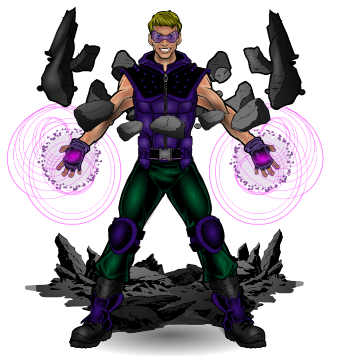
amsParticipantNEW CHARACTER!!
Created with my son who was home sick from school. We had a blast making this together. I even printed in Black and White for him to color on his own and put on the fridge. Lots of fun!
GRANITE can manipulate rock and stone to cement justice for all!
Cheers!

Attachments:
You must be logged in to view attached files.February 3, 2017 at 10:47 pm #141804
livewyre1014ParticipantLove to pose, the design, the idea…however, the color scheme seems…off? everything about Granite is great except the purple…again, just one man’s opinion…but a warmer color i.e. orange, yellow, red…something in that spectrum I think would be more earthy and give the design more…POP. Just a thought…amazing work as always…your posing and face work is still so amazing I just stare at these designs haha!
February 3, 2017 at 11:28 pm #141805
livewyre1014ParticipantMaybe even silver,gold, or copper…to go with the whole rock, ore theme…that could work too!!! sorry, just spitballing over here.
February 5, 2017 at 5:18 am #141814
Herr DParticipantI personally would only alter the skin color–somehow the sunburned color looks wrong? And go for less symmetry in the rocks. Cool though.
February 5, 2017 at 10:11 am #141824
amsParticipant@ Livewyre – Agreed on the color choice, but this was a collaboration with my son and these are the colors that he chose. He chose the powers of the character and has a small rock collection that he values. His fave is a amethyst sample that is colored purple and his favorite color for clothes is green. I even tried to base the face off of his but making it more mature/adult. He is very happy with the final product and I couldn’t bear to change it not wanting to hurt his feelings. But I do agree that I probably wouldn’t have selected the present colors….:)
@ HerrD – All my “white characters” use the same skin tone colors. I did have some difficulty highlighting the arm items. Are those the ones that stick out?
February 6, 2017 at 3:08 pm #141844
JeimuzuParticipantI may be in the minority here, but I actually like the color scheme. I like that these are not the typical colors you would associate with a character with this ability. I think the unique color scheme acts to set Granite apart from other characters with similar themes.
February 9, 2017 at 8:05 am #141935
amsParticipantCheers, Jeimuzu!
February 9, 2017 at 8:12 am #141937
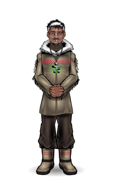
amsParticipantMy entries for the Character Contest #304 for the next member of the ILJ (International Legion for Justice). Hell, it was a Canadian character and I had to represent….
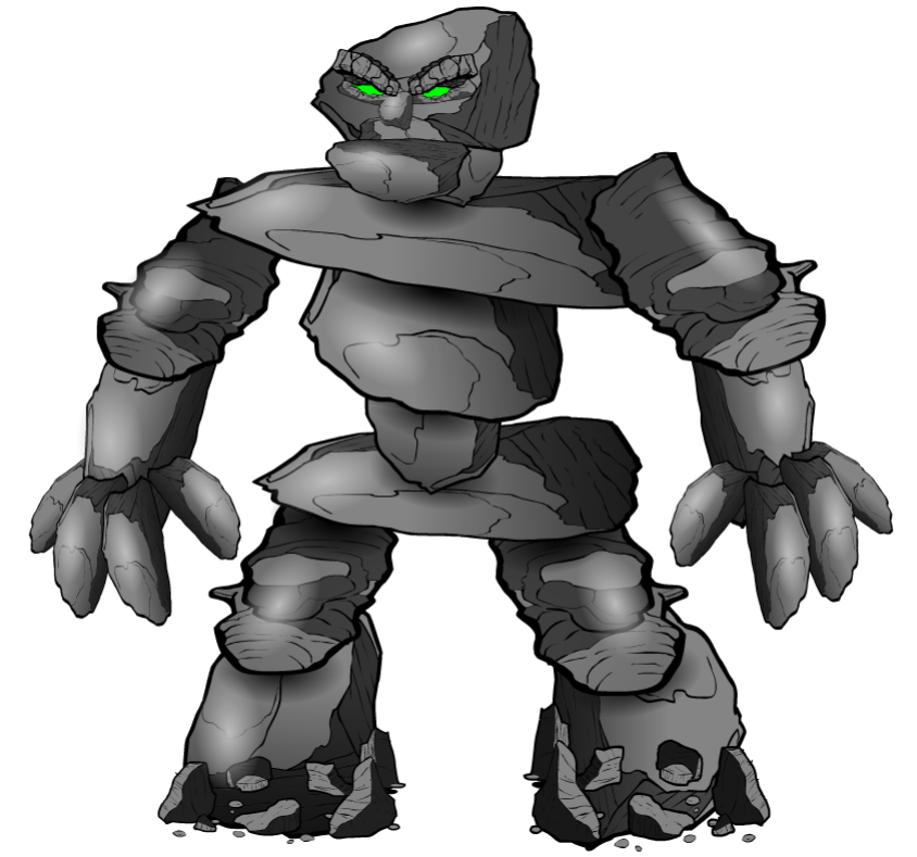
“ATUQTUAQ KUMAGLAK was born in January of 1940 in the remote Qikiqtaaluk area of Canada’s high arctic. While his quiet almost spiritual demeanor made him an unlikely hero, it was his ability to physically transform that brought him to the attention of the ILJ.”

“When ATU senses a threat or sees others in distress, he transforms into Inukshuk, a solid stone creature sworn to protect all those in peril. He joined the ILJ in 1961.”

Attachments:
You must be logged in to view attached files.February 9, 2017 at 7:42 pm #141949
VengeanceParticipantGRANITE the purple and green looks good to me, color of skin is good , the only thing that looks strange is the shoulder and upper arm area
February 28, 2017 at 6:22 pm #142967
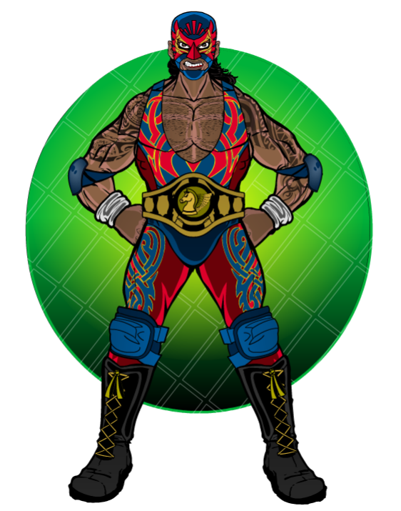
amsParticipantDAISY for the latest character contest.
Attachments:
You must be logged in to view attached files.March 1, 2017 at 3:43 am #142989
TrekkieParticipantNice!
March 1, 2017 at 2:30 pm #143019
amsParticipantJust got some awesome pics of my characters done by 12FOR12. Check out his awesome pics!
http://12for12.deviantart.com/
March 29, 2017 at 8:41 pm #144654 -
AuthorPosts
You must be logged in to reply to this topic.


