Home › Forums › Art Contests & Challenges › ONE PART, MANY CHARACTERS contest……
- This topic has 828 replies, 42 voices, and was last updated 5 years ago by
Funkmachine7.
-
AuthorPosts
-
October 27, 2013 at 10:31 am #33104
KericParticipantMaaz~ congrats, yours was so well done, that I would have even voted for it!
October 29, 2013 at 4:37 am #33150
MaazParticipantOuch, sorry for the long wait.
Thanks, Herr D and Keric. Glad ya liked my mercenary-spider-alien-thingy.
So, brace yourself for the demonic chaos and randomness of my strange mind:
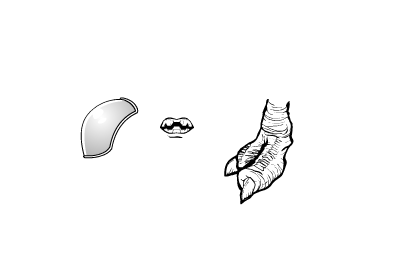
Left to right, these are situated in:
ShoulderRight , Tech
Mouth , Standard
FootRight , MaleStandard November 3, 2013 at 11:33 am #33316
Herr DParticipantSome questions turn out to be somewhat unnecessary if you notice the right details.
http://i1067.photobucket.com/albums/u438/jamais5/HerrD-UnsuccessfulMask_zps0f53aad3.png
Hope you all had a happy Halloween.
November 5, 2013 at 3:46 am #33366
MaazParticipantAaaaand… Only one entry. Really? I actually managed to outsmart you folk with my confusing choices?
Still got to say, that one, single entry by Herr made me laugh. That darned wierd expression of surprise on an equally darned wierd face was enough to make me laugh before I could make sense of anything else. Stupendously creepy-ish funny face aside, the use of the items was quite, quite unique. Never would I have thought to construct a mask out of mouth items, but now… hm. That could prove useful.
So Herr D, excellent piece, really late happy halloween, and you are now allowed to throw the most fiendishly tricky combinations of mismatching items right at my smug face (Please try to miss). Congrats!November 5, 2013 at 8:13 am #33371
Herr DParticipant[takes careful aim] “Don’t worry–it’s padded at the tips.” [throws–and it goes to slow m-

-oti-
on . . .]
November 6, 2013 at 4:31 am #33385
MaazParticipantPhew. Nearly had me there.
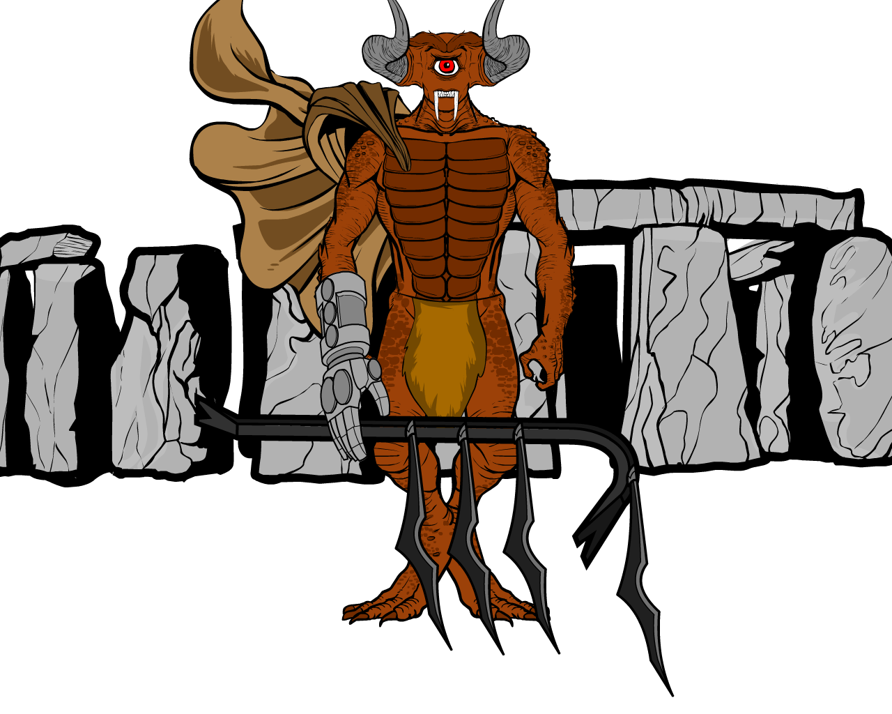
After nearly half an hour of fruitless experimentation, I finally found a way to use those items in a totally different way. And so I smugly present:
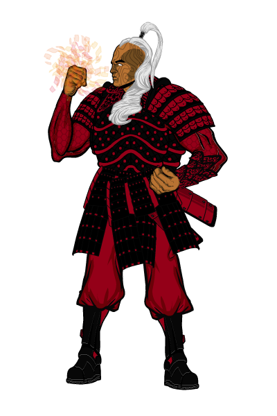
The Warrior of Sixteen Souls, Zu’Valun. A warrior created when sixteen warriors sacrificed themselves to the Elder Dragon in order to create the ultimate guardian of the Empire of Floating Roses, and the ultimate enemy of the Sta’Ra Dynasty. November 6, 2013 at 3:26 pm #33410
KericParticipantNovember 10, 2013 at 6:48 pm #33498
Herr DParticipantThis one takes a bit. If you’re in a hurry, scroll to the end.
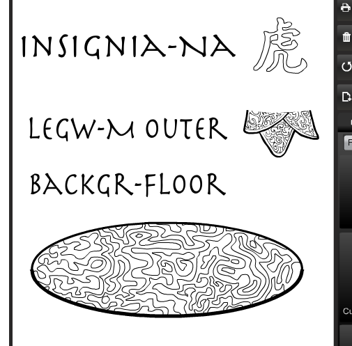
Item use went Floor: K-pattern plus insignia ‘factor‘, M- tattoo plus energy ‘factor’-even. Legwear: K-hairbow halves (!!) , M-buckler and neck piece (!)-switching armor location was good, but less ingenious, goes to K. Insignia: K- insignia (striping it !), M- repeated striped energy (!!) -M. Tie.
Backgrounds: no backgrounds–tie.
Backstory: M has one–M.
Name: tie. The apostrophe thing is cool, but so is the name scrunch.
Posing: Both are out of doll stance, which is, like, the first hundred points. M’s got the look of a warrior who just cocked his sixteen-soul shooter and can’t help but look at it’s power, giving his opponents the chance for a fruitless head start. The custom armor was obviously a lot of work. K went for the simple look, and I only know from experience that it was more work than it looks like at first. She looks like she is ready for anything and will outrun me. Tie.
Mystique: M’s energy vs. K’s Insignia drape. Tie.
Asymmetrical Flair: M’s warrior only needs a buckler on one arm, hinting by exclusion that the energy wielded is primarily offensive. Interesting. K’s created a diagonal look that I personally love down to the artfully mismatched shoes. K wins for flair.
Simple cool points: supernatural alien shogun vs. feline femme fatale–tie.
Nat-picking: Excellent hair choices for both. K’s mismatching the eye color and ear placement goes a long way toward hinting that Tigirl has mutant powers. M did a lot of patterning and resizing work to get that armor on the shoulders to look like an upper-body twist. Tie. NICE TOUCHES, GUYS.
Nit-picking: –K? I don’t see how the knife stays on her belt. Is that a ‘hip bone’ at the right side of her belt along with some upper leotard or is her scabbard happy to see me? Maybe that belt should have been two pieces joining under the loincloth? –M? I have to ask–would his eyes have been white if the background wasn’t? It can be a good design choice, but here it’s just too ambiguous for me. How did you do all that wonderful work around the breastplate and leave it alone? Even ‘masking off’ its right edge and tipping it a few degrees counter-clockwise would have been such a major improvement. Seriously, go look at sheering off his breastplate’s lower right edge with the inner edge of a massive crescent like Insignia Tech at 185 degrees rotation. You’ll be glad you did. —Tie.Guys? I think this is the longest comparison critique I’ve written for this contest. I want both of you competing here regularly. You bring enough apples and oranges to the table for a week-long fruit salad!
Looking back through it, I have to value backstory over minor flair, since the three items were used less toward the flair, and more toward the general awesomeness that the backstory made.Maaz? Congratulations. Pick three!
November 11, 2013 at 3:36 am #33502
MaazParticipantThanks!
Ah, yes. The white eyes. Certainly, I did consider adding some pupils. But the blank eyes seemed… appropriate. The lack of eyes, I felt, added to the emotionless aura I was trying to establish. Oh, and about the breast-plate? I was simply trying to stay sitting by the time I got down to it, what with a sore back and the irritation that comes from lack of coffee. I admit to my lazyness.
I’ll be honest, I was pretty happy when I posted him up, but one look at Keric’s Tigirl had me think, “Damn, I lost”. Awesome work on posing and creative use on items, mate!
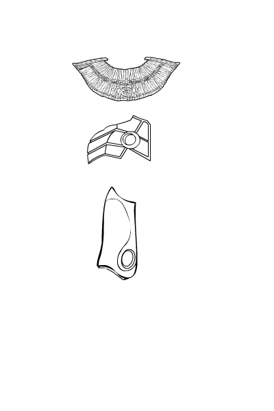
So, before I digress further, here are the items.
Top to bottom:
Neckwear, Standard
Shoulder Right, Tech
Foot Right, Male Tech November 11, 2013 at 4:30 am #33503
KericParticipantNovember 12, 2013 at 8:18 pm #33551
Herr DParticipantThis is a shot from round 27 of a local dance-off. Zobey makes a twisting thirty-foot ‘jetais’ toward the next glowing panel. Zobey is one of a three-armed, three-legged, three-eyed, three-gendered species. They always do well in these competitions–the name doesn’t translate well, but it’s essentially like ‘Dance, Dance, Revolution’ in a free-form, basketball-court-sized stadium.
http://i1067.photobucket.com/albums/u438/jamais5/Round27_zps5ac74f47.pngThe light bill per round could run a city block for a day.
@Keric: Interesting that I haven’t seen many surfers here–? You may be filling a void.
@Maaz: pain and caffeine deprivation? That translates to most carbon-based species . . . laziness translates to EVERYBODY.November 13, 2013 at 2:42 am #33558
KericParticipantYeah, Herr, I’d expect to see more like either of these 2~!
(I never saw a limit on entries so I’m limiting myself to 3!)
November 18, 2013 at 8:16 am #33680
MaazParticipantAnd it’s JUDGIN’ TIME! (I’m going to assume that all entries posted are separate entities, and judge them accordingly)
For STORY, BIG KAHUNA=0/1 , GABRIEL=0/1 , YOUNG HEXEN= 0/1 , ZOBEY=1/1
For POSE, BIG KAHUNA=1/5 , GABRIEL=3/5 , YOUNG HEXEN= 5/5 , ZOBEY=5/5
For ITEMS, BIG KAHUNA=2/5 , GABRIEL=4/5 , YOUNG HEXEN= 5/5 , ZOBEY=4/5
TOTAL : BIG KAHUNA=3/11 , GABRIEL=7/11 , YOUNG HEXEN= 10/11 , ZOBEY=10/11And it’s a tie breaker! Young (Hot) Hexen VS. Zobey the strange alien-creature-thingy.
So, let’s see.
THE GOOD:
Neckwear item used as spots on the Hexen’s top. Keric displayed a very sneaky and creative side here, and I positively spent a day trying to figure out where that item was. Well done.
Shoulder item dance floor. Gotta hand it to ya, mate, that was well done. Using them as disco platforms; classic.
Foot item as skirt. Seriously. A skirt. Keric, that was a really nice touch.THE BAD:
The left leg (From viewer’s perspective) of the Hexen, was a little strange. Actually, it was downright awkward, and the only reason I didn’t consider this in pose, was because it doesn’t actually change the body language of the character, or warp the essence of the picture.
The furthest right hand of Zobey (Again from viewer’s perspective), seems incredibly awkward. I mean, I understand that you may be trying to communicate their vast flexibility, but the effect is just… strange.From these points, I see that Keric is one good point ahead. Close battle, guys, but Keric wins this time! Throw your best at us, mate!
November 18, 2013 at 9:33 am #33681
KericParticipantthree items enter… one picture leaves!
 November 18, 2013 at 7:05 pm #33701
Fanfer_64Participant
-
AuthorPosts
You must be logged in to reply to this topic.

