Home › Forums › The HeroMachine Art Gallery › Mattisagamer Characters
- This topic has 78 replies, 16 voices, and was last updated 11 years, 1 month ago by
mattisagamer.
-
AuthorPosts
-
February 26, 2014 at 6:58 pm #38331
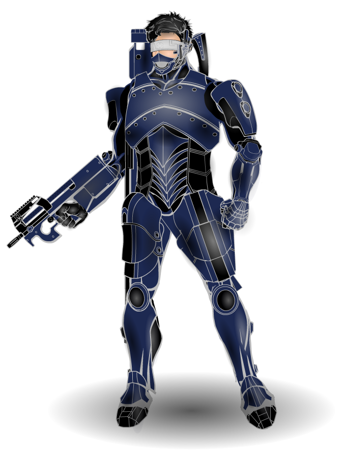
mattisagamerParticipantThe question comes to mind, “Who do we get our inspiration from when we create HM creations?” If I were to answer that question, I would definitely say AMS is a huge influence on my HM creations and work. So in homage to AMS, I present a Revamped Captain Mathias Valentyne!
Captain Valentyne Revamped

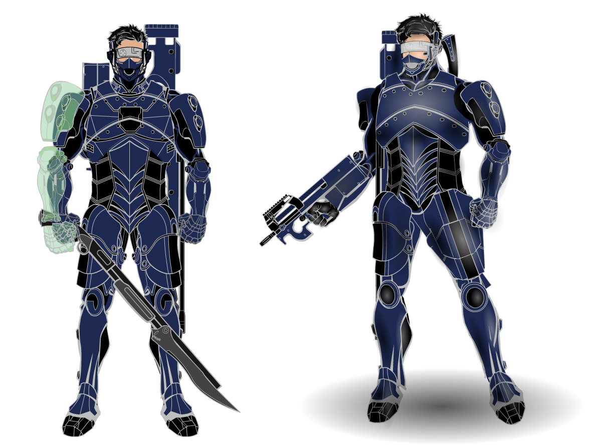
This piece took me roughly 6 hours to complete. My longest project and I do believe it’s my best! There are parts of the character that I need to fix again, such as the torso piece and pelvic area. It had it’s flaws, but I think I did alright my first time around with this type of technique! This is my first time attempting the techniques used to highlight and shade like AMS, so I hope you all enjoy this piece! As always, criticism and feedback is always appreciated! Thanks!

Also just a side by side comparison to show progress!
 February 27, 2014 at 12:00 pm #38358
amsParticipantWow! That’s pretty cool of you to say! Thanks for the great words. You made my day!
Cheers!
March 1, 2014 at 12:59 pm #38417
mattisagamerParticipant@ams said:
Wow! That’s pretty cool of you to say! Thanks for the great words. You made my day!
Cheers!
You’re welcome AMS!
 Keep up the awesome!March 1, 2014 at 1:07 pm #38418
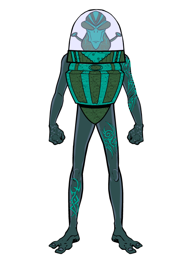
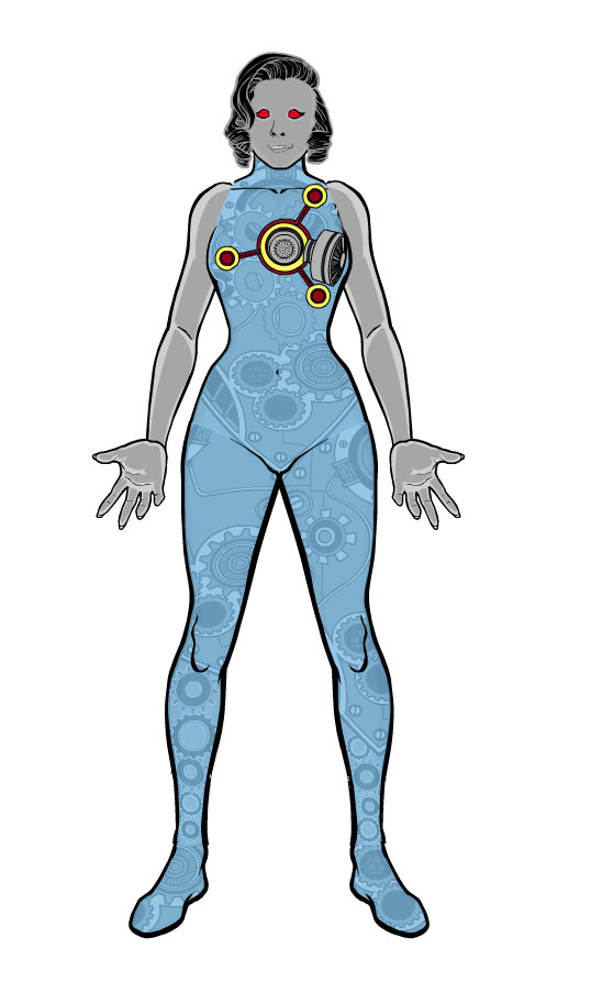
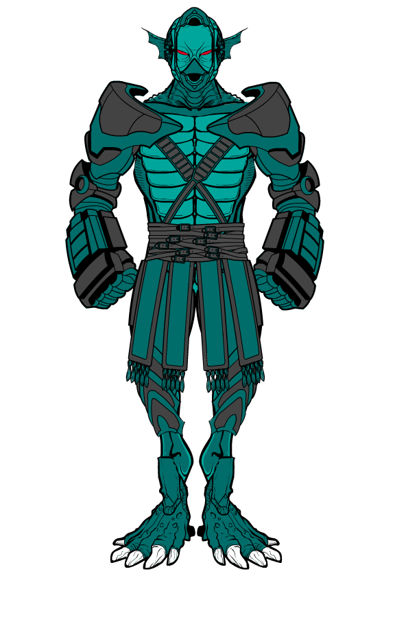
mattisagamerParticipantHere are some Alien concepts I’ve been doing for the past couple of weeks:
Javrians

Gear-I (Pronounced Jeer-y)

The Orbit Battalion

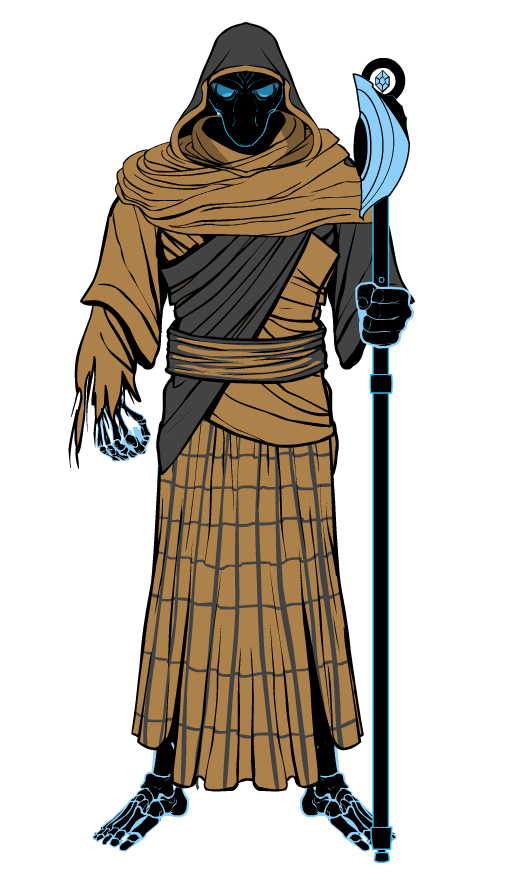
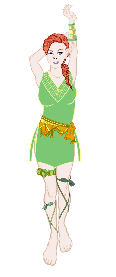
And some Valiant Crew characters I’ve been thinking about working on:
Jove Griefsong

Jilia Xenda (Pronounced Heelia Zenda)
 March 3, 2014 at 1:37 pm #38503
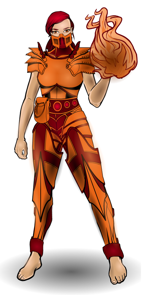
mattisagamerParticipantHere are some of the creation’s by other HM’s I’ve redone in the Versions thread!
hawk007’s Ember

Vectorman316’s Xevo
 March 3, 2014 at 8:55 pm #38519
Delirious ALParticipantXevo just made me poop myself. Believe me, that’s a good thing. Really sweet concepts dude!
 March 4, 2014 at 9:46 pm #38549
mattisagamerParticipant@Delirious AL said:
Xevo just made me poop myself. Believe me, that’s a good thing. Really sweet concepts dude!

Thank you Delerious! That means a lot coming from you
 March 5, 2014 at 5:19 pm #38570
mattisagamerParticipant@mattisagamer said:
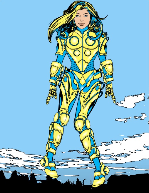
Hey Everybody! I’m new to Heromachine and I’ve only had a chance to play around with it for a few days. I have familiarized myself with the rules, so hopefully I’m posting right! Below is a creation I did roughly in three hours today and I feel that it may be my best work, but I also feel I may have went too heavy with the shading and such. I hope you all can spare a few moments of your time to critique it and offer any advice! Thank you!
EDIT: I can no longer edit this hero because I am unable to load the text doc again. I guess this is the final then!

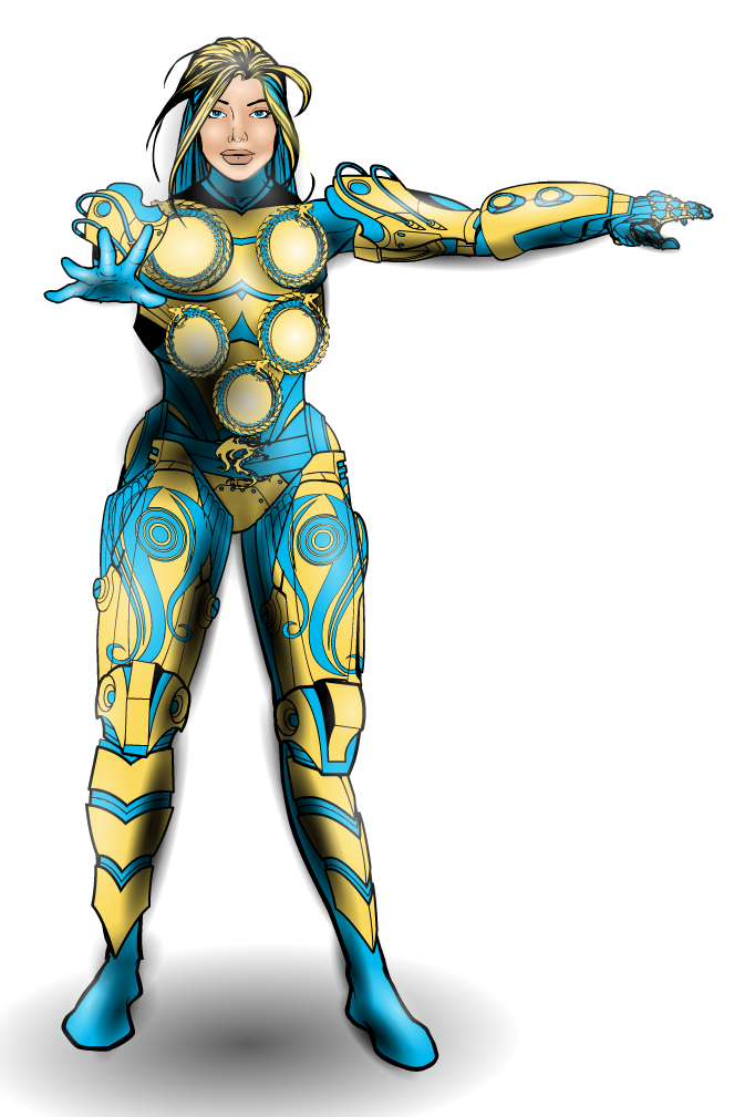
Here’s a revamped version of my first HM creation, Cyan Gale.
 I tried to make the circles a bit like they were lighting up. Most likely will the next time I get a chance! I’ll probably go back and get rid of some unnecessary as well.
Cyan Gale Revamped
 March 6, 2014 at 6:24 pm #38611
Herr DParticipantHer old hair and background I liked better. Everything else is definitely an improvement.
March 6, 2014 at 7:03 pm #38612
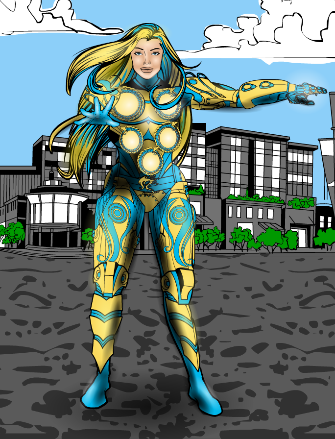
mattisagamerParticipantThanks Herr! I started to play around with the old hair and added a background. It isn’t too detailed, but Cyan Gale is the main center piece!
Cyan Gale Revamped 2
 March 8, 2014 at 10:32 pm #38668
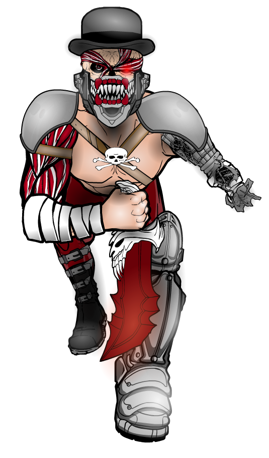
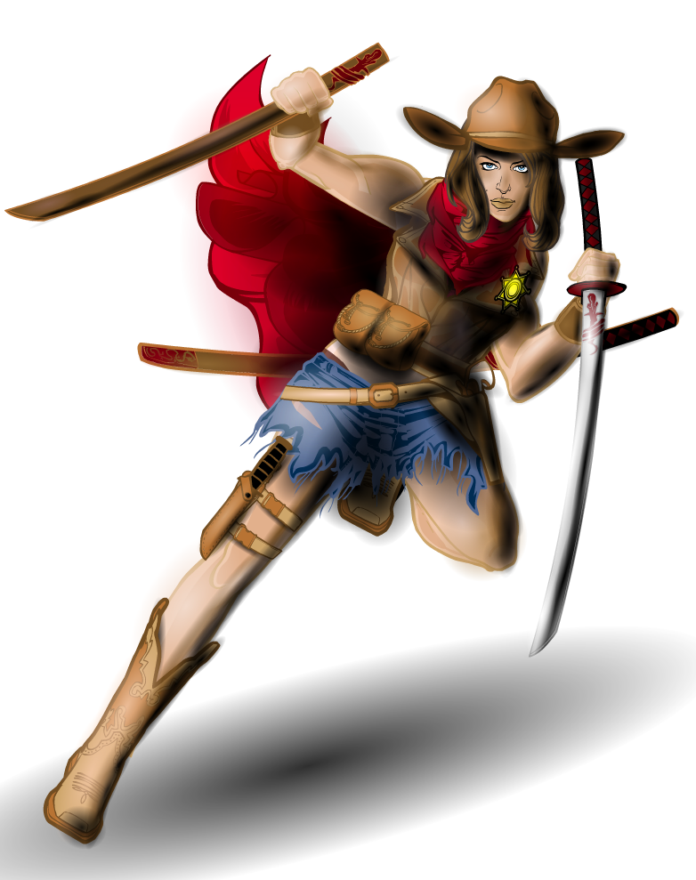
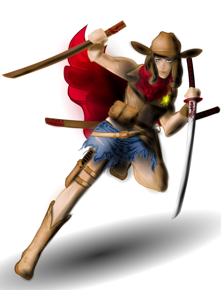
mattisagamerParticipantThis is perhaps my proudest and best HM creation I’ve ever done… I know there’s some areas I need to touch up on, but I’m a bit tired. Areas I’m thinking of is definitely the cape, the sword and the pelvic area. Here’s is my submission for Kaldath’s Pop Quiz #1! Feedback would really, really be great because this is perhaps my most serious HM creation that I’ve put all my focus into and dedication. Thanks!

 March 9, 2014 at 3:49 am #38669
JR19759KeymasterThe things that stand out for me that you could do with changing are the black outlines on the badge and the nose and lips. Considering that all the other outlines are colour, these do stand out a bit. The nose and lips just need to be masked to some insignias so you can change the outline colour independently of the eyes and the badge shouldn’t be too much trouble. Also watch your shading over detailing, it can look messy. This I noticed on the sword in her left hand (the highlighting covers the red patterning near the hilt) and the scabbard behind her back (both the brown and red come into conflict with the detailing at the end of the scabbard here). Don’t be afraid to add another layer with the main colour set to transparent, so you can get the detail above the shading, and then add smaller bits of shading so as to match the larger shading you’ve already done. Not all shading has to be done with one massive item.
Apart from those small adjustments, good work.March 9, 2014 at 9:00 am #38675
Herr DParticipantYour meeting of east and west is good. I’ve had the best luck outlining gold with a combination of gold, copper, and warmer browns?
March 9, 2014 at 10:19 am #38676
mattisagamerParticipant@JR19759 said:
The things that stand out for me that you could do with changing are the black outlines on the badge and the nose and lips. Considering that all the other outlines are colour, these do stand out a bit. The nose and lips just need to be masked to some insignias so you can change the outline colour independently of the eyes and the badge shouldn’t be too much trouble. Also watch your shading over detailing, it can look messy. This I noticed on the sword in her left hand (the highlighting covers the red patterning near the hilt) and the scabbard behind her back (both the brown and red come into conflict with the detailing at the end of the scabbard here). Don’t be afraid to add another layer with the main colour set to transparent, so you can get the detail above the shading, and then add smaller bits of shading so as to match the larger shading you’ve already done. Not all shading has to be done with one massive item.
Apart from those small adjustments, good work.Thank you for the feedback JR! I took them into account and made those small adjustments. I didn’t notice them at first because I was too focused on getting the shadows right, but the little details do make them stand out. I actually changed the color of the nose and mouth by masking another face on top of the face, separating it from the eyes. I wasn’t sure if that’s what you meant, however. I also brought down the white highlight on the left hand sword so the insignia isn’t interfered by it. I also redid the scabbard in the back and added another item on top to bring out the red/brown colors better. I stepped out of my comfort zone with this piece as I typically don’t do such detailed creations, so this was my first attempt at blending shadows together to produce such highlights. Thanks for the tips! Will definitely keep them in mind next time!
 March 9, 2014 at 10:30 am #38677
mattisagamerParticipant@Herr D said:
Your meeting of east and west is good. I’ve had the best luck outlining gold with a combination of gold, copper, and warmer browns?
Thanks Herr! You are the one who suggested to use lifelike outline for my future creations!
-
AuthorPosts
You must be logged in to reply to this topic.

