Home › Forums › The HeroMachine Art Gallery › Mattisagamer Characters
- This topic has 78 replies, 16 voices, and was last updated 11 years, 10 months ago by
mattisagamer.
-
AuthorPosts
-
December 26, 2013 at 9:31 pm #902
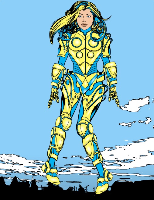
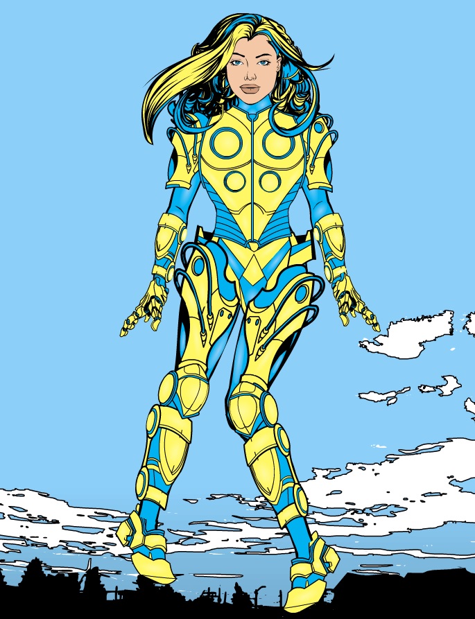
mattisagamerParticipantHey Everybody! I’m new to Heromachine and I’ve only had a chance to play around with it for a few days. I have familiarized myself with the rules, so hopefully I’m posting right! Below is a creation I did roughly in three hours today and I feel that it may be my best work, but I also feel I may have went too heavy with the shading and such. I hope you all can spare a few moments of your time to critique it and offer any advice! Thank you!
EDIT: I can no longer edit this hero because I am unable to load the text doc again. I guess this is the final then!
 December 27, 2013 at 2:58 am #35266
JR19759KeymasterWelcome Matt. Please make sure you read the…… (rereads previous post), damn you beat me too it. Oh well.
As for your character, good posing, like the use of items (though the gauntlets on the wrist are too big). For future reference, when highlighting, try to use a lighter shade of the colour (in this case yellow or blue) instead of the white for a more natural shine. White tends to only work well when the opacity is turned down very low or when shading grey/ silver. Also, to really make the character pop you could try adding shadows to places on the body you would expect to find them (under the arms, neck, inner thigh, those sorts of places). And unless the hair of your character is covering their ears, try not to forget to add them in, it’s something that does distract and make the character seem odd. But not a bad start either way.
Look forward to seeing more from you.December 27, 2013 at 10:35 am #35274
mattisagamerParticipant@JR19759 said:
Welcome Matt. Please make sure you read the…… (rereads previous post), damn you beat me too it. Oh well.
As for your character, good posing, like the use of items (though the gauntlets on the wrist are too big). For future reference, when highlighting, try to use a lighter shade of the colour (in this case yellow or blue) instead of the white for a more natural shine. White tends to only work well when the opacity is turned down very low or when shading grey/ silver. Also, to really make the character pop you could try adding shadows to places on the body you would expect to find them (under the arms, neck, inner thigh, those sorts of places). And unless the hair of your character is covering their ears, try not to forget to add them in, it’s something that does distract and make the character seem odd. But not a bad start either way.
Look forward to seeing more from you.Thank you for the reply and welcome! I resized the gauntlets so they match up to her forearms length and width. I also changed the highlighting of the colors from white to the pastel value of the color as it definitely highlighted the armor and body much better. I added the highlights to the thigh, neck and arms as well, but I was wondering if there was anything I could do to the face. I also added that ear in haha. Thank you for the tips again!
-Matt
 December 27, 2013 at 11:13 am #35277
VampyristParticipantWelcome and she’s very cool.
December 27, 2013 at 11:19 am #35278
mattisagamerParticipantThank you Vampyrist for the welcome! Just starting out!
December 27, 2013 at 5:42 pm #35290
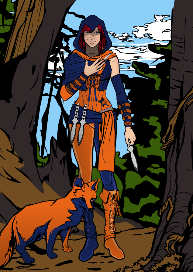
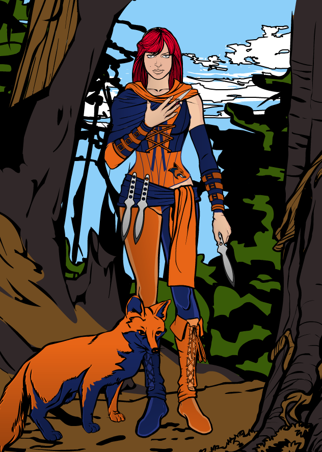
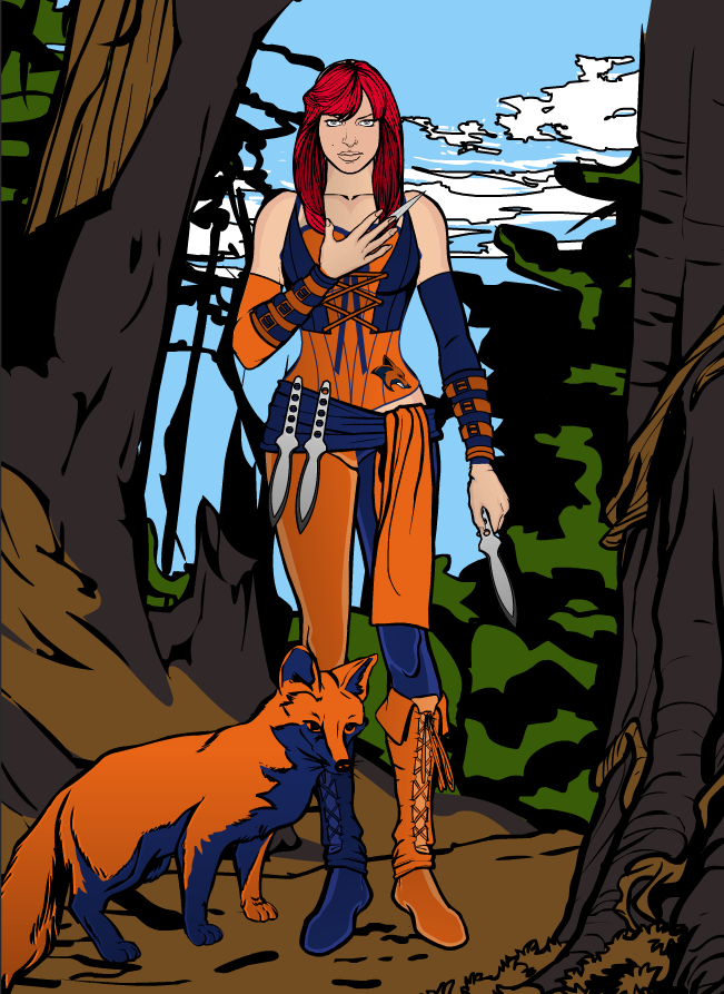
mattisagamerParticipantHello again everybody! I’ve spent a couple hours of my time developing another Superheroine (Still working on Cyan Gale’s story). This one is a bit more basic as I didn’t spend time highlighting it yet, but it’s a work in progress! If you all can give any sort of feedback, that’d be awesome. Thanks!
-Matt
The Foxtress

Shawl Only

No Shawl
 December 27, 2013 at 6:18 pm #35294
AnarchangelParticipantI like it.
The only thing I’d say though is the colours on the fox should maybe be changed. At least to a slightly different shade. Right now it kind of blends into the leg next to it. The blue more than the orange.
December 27, 2013 at 6:26 pm #35296
mattisagamerParticipantThanks Anarchangel! I just realized what you mean about the fox and I can clearly see it now. I think I’ll definitely change around the colors so that it doesn’t blend. I do believe why the fox blends into the leg is because of the shadow I put in the boot, so I’ll definitely change that around. Thanks again!
-Matt
December 28, 2013 at 4:06 am #35310
CamruthParticipantThe Foxtress looks awesome, your first character looks good too but to me, the head seems out of proportion to the rest of the body, it just looks too big. But that is just my first reaction.
Awesome work, looking forward to seeing what else you come up with.December 28, 2013 at 11:40 am #35334
mattisagamerParticipantThank you Camruth! I appreciate the feedback. The head is slightly bigger and out of proportion to the rest of the body. I will definitely fix that and repost it with more changes! I haven’t yet finished the majority of my HM creations as I still need to add the finishing details to it, but I will definitely change the proportion of the head. Thank you for the feedback and kind comment!
-Matt
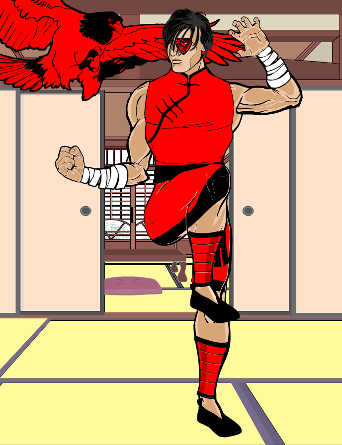
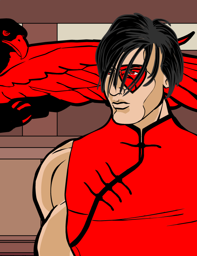
I’ve decided that I wanted to perhaps make a group of heroes like most HM users do. Mostly animal based, like how the Foxtress is with her, well, Fox. I wanted to experiment with the different poses, so I decided to make a Martial Artist Pose and work around that. The arms are slightly out of proportion and I will get to that as soon as possible to fix, but I had to share my idea with you all. Below is my latest hero, Eagle Eye.
Eagle Eye

Eagle Eye Portait

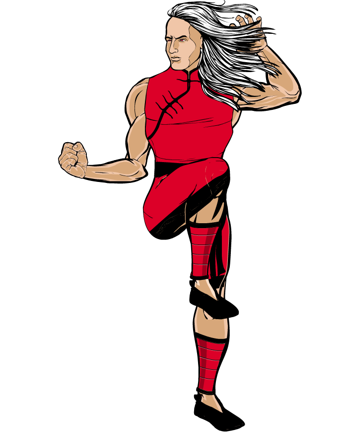
And for laughs, Fabio the Kung Fu Master
 December 28, 2013 at 5:53 pm #35353
Herr DParticipantAs far as Eagle Eye being out of proportion, I would say they’re almost fine, just maybe put some mashed Insignia/Tech circles behind the edges to ‘join’ the elbow and cover some of the “extra” lines that don’t belong near the other shoulder with insignia and such. Sometimes you have to use non-body as Body or to fix the body.
 December 28, 2013 at 6:25 pm #35354
mattisagamerParticipantThanks for the reply Herr! That’s a great idea to fix the pointiness of the elbow haha. I started working around it trying to proportion the arms or elbow and that’s what I ended up with, but it makes a lot of sense to use the lines of the insignia to fix the elbow.
 Thanks for the feedback and advice!
-Matt
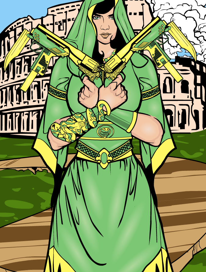
I never thought I’d work out two HM Heroes in one day, but it seems I just had a lot of free time to work today. This is my latest heroine in the group of heroes that I soon plan to come up a story for (Hopefully by this week)! Her name is Princess Serpentina and I will work out the backgrounds and powers of my characters throughout this week as well. I think I’m starting to grasp the idea of highlighting as I feel this is a better example of me attempting highlighting than compared to Cyan Gale, but I have noticed some improvement from there to here. Any feedback and criticism is always appreciated
 Thanks!
Princess Serpentina
 December 29, 2013 at 8:42 am #35369
Vamon"09"MemberPrincess Serpentina looks way cool! And the pose is pretty good!
 December 29, 2013 at 10:39 am #35374
HammerknightParticipantGreat start, welcome to the forums.
December 29, 2013 at 2:19 pm #35391
mattisagamerParticipant@Vamon Thank you! I appreciate the comment! Yeah, I wanted to do something with the arm cross with guns, I even though of using swords but the gun idea just seemed way cooler! Thanks!
@HK Thank you man! If I may call you HK haha. Thanks for the welcome!
-
AuthorPosts
You must be logged in to reply to this topic.

