Home › Forums › The HeroMachine Art Gallery › Linea24’s Astra Universe
- This topic has 405 replies, 44 voices, and was last updated 8 years, 11 months ago by
Linea24.
-
AuthorPosts
-
July 16, 2013 at 1:05 pm #27718
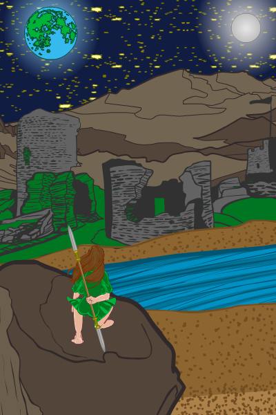
Linea24ParticipantHere’s Harriette overlooking a ruin called Auorme.

By the way, the blue and green planet isn’t Earth, but Antia, which is Felinae’s sister’s planet.
July 16, 2013 at 1:53 pm #27721
HarlekinMemberYeap Herr D have right try out new things that upgrade your imaginery and help for the improvement.
Nice gallery i love the faery theme.July 16, 2013 at 4:57 pm #27728
Linea24ParticipantThanks, Harlekin!
July 19, 2013 at 4:17 pm #28033
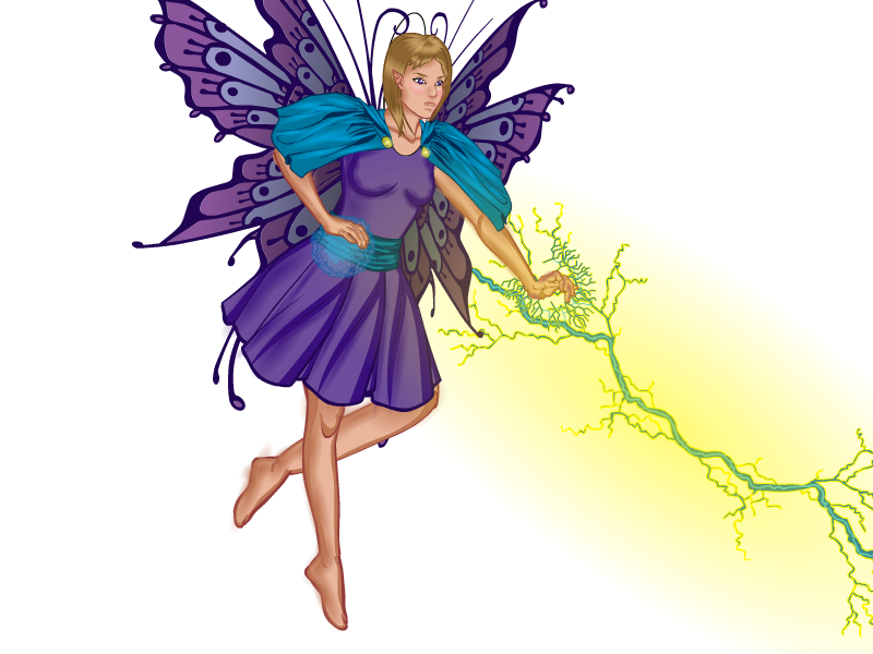
Linea24ParticipantOk, I just finished this one portion of a much bigger picture I want to do. I wanted to try shading my character for once, so I did it on this one. If anyone has any suggestions or critques, I’ll gladly accept them.

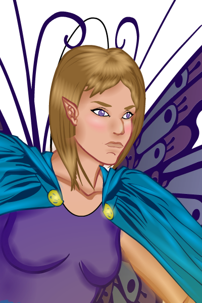
Close-up:
 July 19, 2013 at 11:35 pm #28065
VampyristParticipantThat shading is amazing!
July 19, 2013 at 11:59 pm #28066
TrekkieParticipantAgreed. Fantastic shading- especially on the face!
July 20, 2013 at 1:02 am #28067
TorogParticipantGreat job for your first time shading. Minor critique, there are a few spots where your gradients hang outside of the body’s contour. Just keep on shading your pieces your skills will improve.
July 20, 2013 at 1:42 am #28070
HarlekinMemberNot bad, not bad. I see some cool idea. Nice work Linea. Very stunning piece. Keep on going.
July 20, 2013 at 7:42 am #28081
Linea24ParticipantThanks, all! I just did what I do on my drawings and shaded where I felt there needed to be shading.
@Toroq: Thanks. I’ll try to catch it next time. But the one overlapping the hair- I couldn’t figure out how to hide it.July 20, 2013 at 7:59 am #28082
NugParticipantYou have a great gallery! You can tell you challenge yourself to do bigger, and better things with each piece!
July 20, 2013 at 8:11 am #28084
Linea24ParticipantThanks Nug!
July 20, 2013 at 8:20 am #28087
AnarchangelParticipantThat fairy is really cool. I love the colours……..That sentence wasn’t very manly, was it?
 July 20, 2013 at 8:53 am #28091
Linea24Participant@Anarchangel: Thanks! And your secret not-so-manly sentence is safe with me…as far as the internet goes.
July 21, 2013 at 6:18 pm #28225
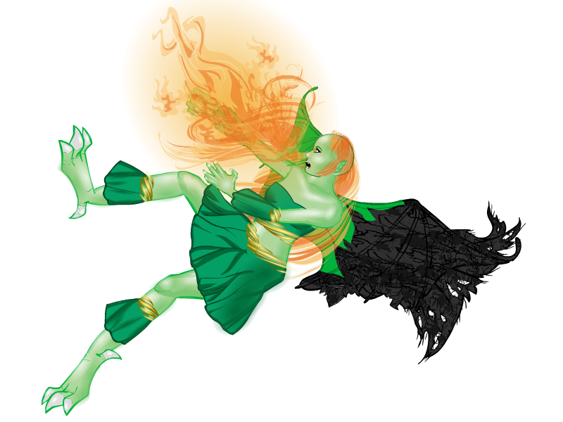
Linea24ParticipantHere’s the second portion of the larger picture that’s also going to include the fairy I posted yesterday. Again, I greatly appreciate any critiques.

I know in the first part it says dragon, but I couldn’t really figure out how to do anything but the tail. Instead of a dragon though, I made the other character a drakan, which is essentially a combination of a fairy and a dragon.
Also, the charred wing is where the fairy hit the drakan, and is the reason why she is falling.July 21, 2013 at 6:42 pm #28229
AnarchangelParticipantI really like it. The only concern I have is the fact that her hair and the fire are the same colour. I realize that this may be on purpose but personally I would try and change one of them so they don’t look so similar. I actually thought I might all be hair at first glance.
-
AuthorPosts
You must be logged in to reply to this topic.


