Home › Forums › The HeroMachine Art Gallery › Lightningsword’s Superhero HQ
- This topic has 324 replies, 32 voices, and was last updated 4 years, 5 months ago by
JR19759.
-
AuthorPosts
-
September 13, 2013 at 12:48 pm #14076
prswirveParticipantGreat work. So heavily ams inspired, especially the boots. I can see a great machinist in the making here. The great ams now has a successor.
 September 13, 2013 at 9:39 pm #31555
LightningswordParticipantI think Jei has the whole AMS successor thing. Maybe your successor instead,I’d be happy to carry the Philippine flag in HM.
September 14, 2013 at 9:46 am #31578
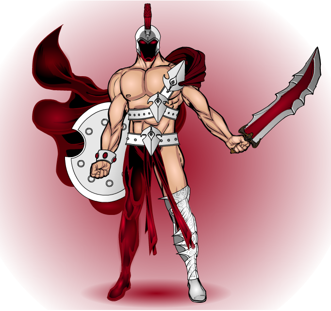
LightningswordParticipantHere’s another one:
Arius Titus, The Warrior
 September 15, 2013 at 1:46 am #31631
JR19759KeymasterSomeone has been looking round djuby’s gallery I see. Looks great, keep it up.
September 15, 2013 at 2:49 am #31635
LightningswordParticipantThanks JR! Djuby’s work is very inspiring!
September 20, 2013 at 8:47 am #31901
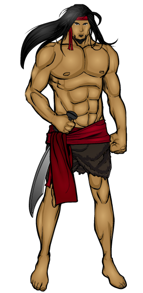
LightningswordParticipantAnother one:
Datu Kurin!
 September 20, 2013 at 8:49 am #31902
LightningswordParticipantAnd no, I don’t know why he kinda looks like prswirve.
September 22, 2013 at 7:20 am #32007
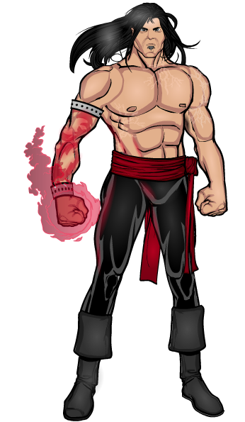
LightningswordParticipantNow, the guy with the glowing tattoo:
Rune!
 September 27, 2013 at 1:03 am #32206
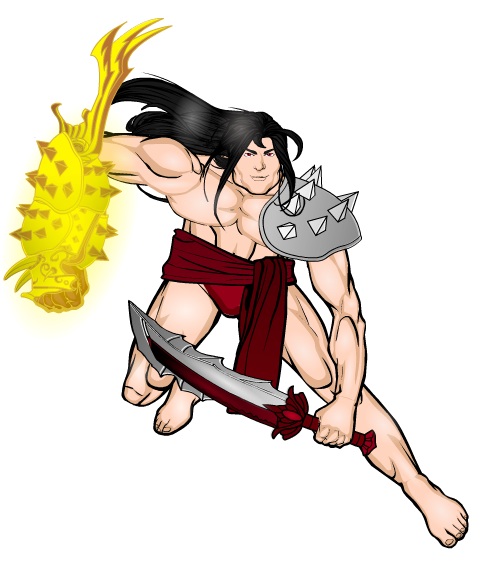
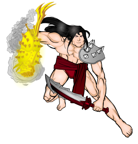
LightningswordParticipantHere we have the so-called “Son of Apollo”:
Alexander!

Does the gauntlet work? feedback please!September 27, 2013 at 1:09 am #32207
JR19759KeymasterHe looks like he’d have one hell of a right hook. The guantlet works for me, but I might suggest that if you are going to have such a shine coming off of it, maybe show some evidence of that on the adjacent body (abdomen, belt and thigh), just a small reflection of the glow on each could really look good. Also it doesn’t look like you’ve finished shading it, the belt looks completely untouched and I can see no shadowing anywhere, so maybe address those issues. Good work though, I do like the guantlet. (Apologise for the long critique I’m still in OCD mode)
September 27, 2013 at 1:21 am #32210
LightningswordParticipant@JR19759 said:
He looks like he’d have one hell of a right hook. The guantlet works for me, but I might suggest that if you are going to have such a shine coming off of it, maybe show some evidence of that on the adjacent body (abdomen, belt and thigh), just a small reflection of the glow on each could really look good. Also it doesn’t look like you’ve finished shading it, the belt looks completely untouched and I can see no shadowing anywhere, so maybe address those issues. Good work though, I do like the guantlet. (Apologise for the long critique I’m still in OCD mode)
Alright, here we go, edited Alexander!
Alexander has been called the Son of Apollo ever since he found the Gauntlet of Apollo. More people are looking for the left one, the Gauntlet of Ares, and the Cape of Hades.
 September 27, 2013 at 8:12 am #32221
Herr DParticipantIf you’re up for continuing improvements, the right foot looks wrong somehow. Shrink it? Definitely take a head or something and show a tiny bit of calf/shin from the side. For the foot to be where it is, the calf can’t be lined up under the thigh . . .
You might also want some charcoal and smoke coming off the gauntlet? Interesting shape, I like it.
September 27, 2013 at 9:18 am #32224
LightningswordParticipant@Herr D said:
If you’re up for continuing improvements, the right foot looks wrong somehow. Shrink it? Definitely take a head or something and show a tiny bit of calf/shin from the side. For the foot to be where it is, the calf can’t be lined up under the thigh . . .
You might also want some charcoal and smoke coming off the gauntlet? Interesting shape, I like it.
There is a head behind the thigh, although it was covered by the sword. And the smoke was a nice suggestion. I’ll do that when I get my hands on my computer.
September 29, 2013 at 7:18 am #32306
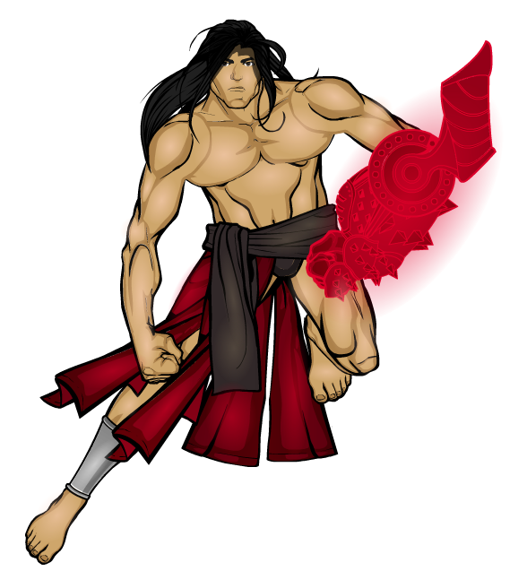
LightningswordParticipantAlexander’s brother who discovered the Gauntlet of Ares:
Orion!

Where do I put the zypping for the glow from the gauntlet? Criticisms, anyone?September 29, 2013 at 7:26 am #32307
The Atomic PunkParticipantMaybe zyp the individual circles around the “elbow joint.” Definitely zyp the center circle. The slits in the kneepad that make the forearm. Like there is energy within the gauntlet. Use a different red for the spiked shoulder pads. As it is, the gauntlet is somewhat muddled without a sharper break in the color.
-
AuthorPosts
You must be logged in to reply to this topic.

