Home › Forums › The HeroMachine Art Gallery › Lightningsword’s Superhero HQ
- This topic has 324 replies, 32 voices, and was last updated 4 years, 5 months ago by
JR19759.
-
AuthorPosts
-
September 10, 2013 at 1:22 am #31424
LegatusParticipantI’ll keep my ears open for your elven tongue from the other side of the world.
 September 10, 2013 at 5:31 am #31429
Mad JackParticipant@Lightningsword said:
Yup… If you heard it and you’re not familiar with it you’d be like, “Are those Elves in disguise?”.I never heard Filipino but I recognize some words here that I also encountered in Bali, Indonesia. I guess theres a relation between Filipino and Indonesian? I found the latter one to be a relatively easy language to learn (but already have forgotten everything I did actually learn) …
 September 10, 2013 at 6:57 am #31433
LightningswordParticipantYes, actually all people from southeast asia come from a single ancestor called Austronesians.(Good thing I lsten to my teachers!)
September 10, 2013 at 9:30 am #31447
prswirveParticipantLol! Are those elves in “Orc’s” clothing?
 September 10, 2013 at 6:49 pm #31472
Herr DParticipantI’m glad you did make the lightning sword. Now I want to see a pic of HQ.
 September 10, 2013 at 7:10 pm #31473
Calvary_RedParticipantVery cool designs. Tron, Wielder of the Lightningsword and his eponymous blade look really awesome.
September 10, 2013 at 11:11 pm #31478
LightningswordParticipant@prswirve: LOL!
@Herr D: Don’t worry, I’ve been working on it.
@Calvary_Red: Thanks! I’m personally a big fan of your thread.September 11, 2013 at 3:40 am #31482
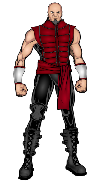
LightningswordParticipantHere’s Red Wolf, Mentor of Tron:


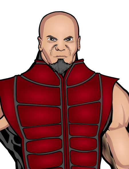
Did I do the face well? Feedback please!September 11, 2013 at 4:10 am #31485
JR19759KeymasterThe face looks good. The lower set of wrinkles could be moved down a bit though (in line with the nostrils ideally).
September 11, 2013 at 4:39 am #31487
LegatusParticipantJust move the wrinkles down a bit. JR is right about that.
But apart from this little detail… he looks grrrrrreat!
September 11, 2013 at 5:03 am #31488
LightningswordParticipantThanks guys!
September 11, 2013 at 5:52 am #31490
The Atomic PunkParticipantMight want to adjust the Alpha of the wrinkles. Instead of the color black, use a darker flesh tone and more translucent.
September 11, 2013 at 7:52 am #31493
LightningswordParticipant@The Atomic Punk said:
Might want to adjust the Alpha of the wrinkles. Instead of the color black, use a darker flesh tone and more translucent.
Thanks AP! Keep that in mind.
September 11, 2013 at 7:55 am #31494
amsParticipantLooks great! Some critiques that I have is with his head. It’s a little low and a tad small. Face looks strong. I agree with Atomic Punk about the line color of the wrinkles. Second, his right arm is a tad smaller than his left. And last, one kneepad? Was that on purpose? If so, disregard. Good job on the right foot. Glad you figured it out. Cheers!
September 11, 2013 at 8:12 am #31495
LightningswordParticipant@ams said:
Looks great! Some critiques that I have is with his head. It’s a little low and a tad small. Face looks strong. I agree with Atomic Punk about the line color of the wrinkles. Second, his right arm is a tad smaller than his left. And last, one kneepad? Was that on purpose? If so, disregard. Good job on the right foot. Glad you figured it out. Cheers!
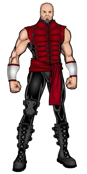
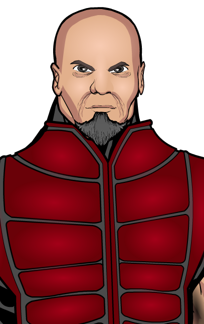
AM I DREAMING? DID AMS POST ON MY THREAD? Only some on my endless list of questions when I saw this. I was able to quote your message, so that means it IS real. Thanks. Having at least one of your posts is such an honor. The kneepad was put there to cover the knee, for the leg was created from separate parts. Here’s the Improved one:
Red Wolf


-
AuthorPosts
You must be logged in to reply to this topic.


