Home › Forums › The HeroMachine Art Gallery › Jadebrain’s Creations
- This topic has 45 replies, 12 voices, and was last updated 9 years, 9 months ago by
HermanSmellville.
-
AuthorPosts
-
March 30, 2012 at 3:56 pm #184
JadebrainParticipantHello! I was a bit surprised when all of my login info and uploads to the HM forums were gone. Ah, well… Time to start a new thread, I guess.
Here’s an unfinished bit of concept art that I need help with. Specifically, I need help deciding on where to put folds. Any input is appreciated.
 March 31, 2012 at 9:35 pm #3906
The Atomic PunkParticipantA very neat character. The double thumb is something that I have never seen. She have a backstory?
April 1, 2012 at 7:33 am #3909
JadebrainParticipant@The Atomic Punk said:
A very neat character. The double thumb is something that I have never seen. She have a backstory?
Not much of one. This is basically a drawing of a character I’m using to playtest the game I’ve been working on for a while now; she’s little more than a set of mechanics, and her personality is kind of generic for a mage (enthusiastic learner, basically).
May 4, 2012 at 11:13 am #5183
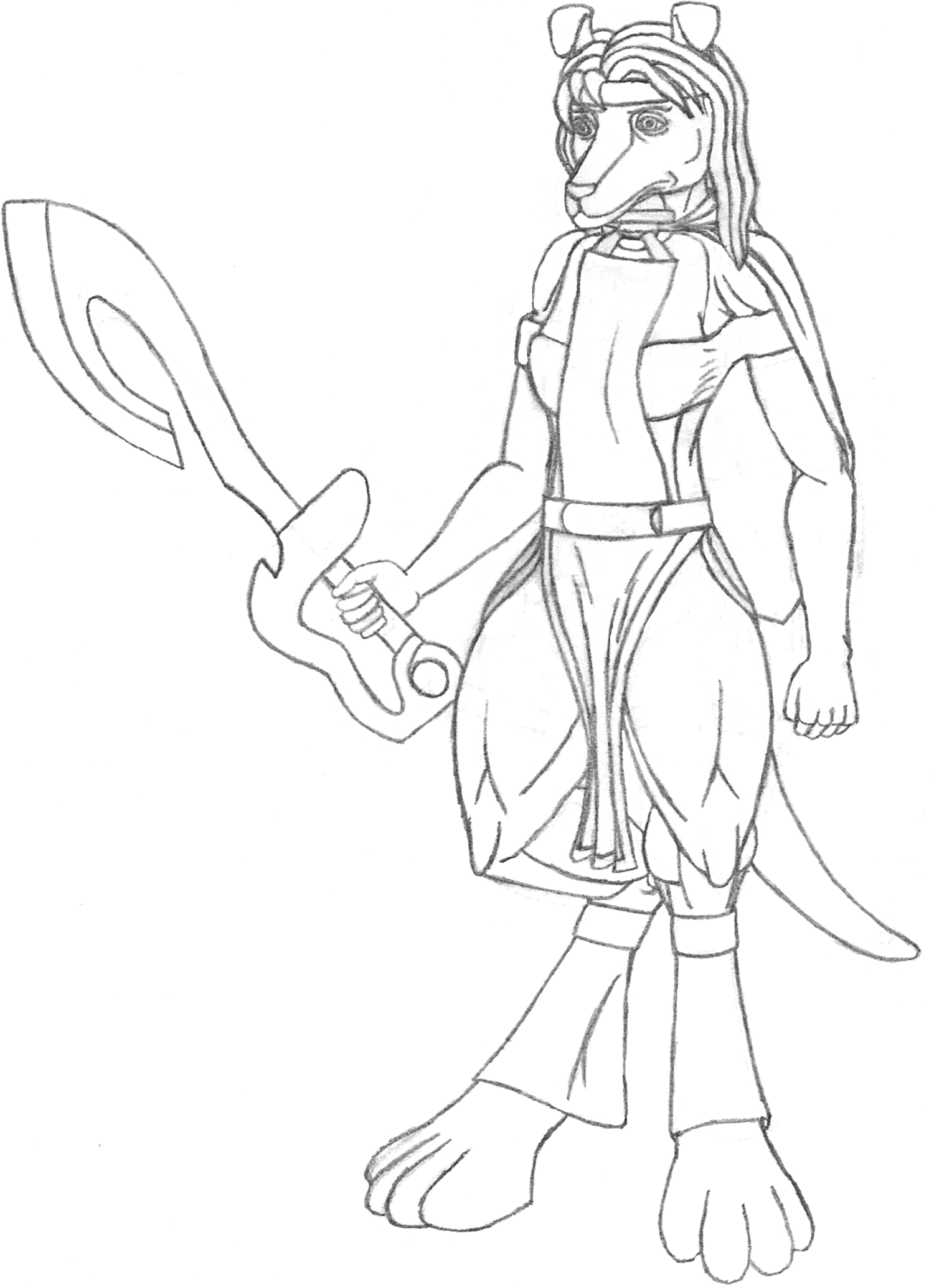
JadebrainParticipantHere’s some more unfinished concept art. I know that some of the parts of the picture are a bit off, especially her right eye. I will be fixing that in the final drawing. Right now, though, what I think I need help with the most is the clothing and accessories. The race she belongs to is a race which typically obsesses over beauty, majesty, and similar whatnot. As a person who has never really had a clear or consistent definition of “beauty,” depicting this in my art is rather hard. Everything from the clothes she wears to the sword she wields, in my mind, fails to convey her love of beauty and majesty. Any ideas?
 May 4, 2012 at 11:25 am #5184
TrekkieParticipantI like it- it’s a good design, and very cleanly drawn. As for showing her love of beauty and majesty, perhaps if you added some patterns to some parts of the clothing that looks like the gold leaf sort that royalty often seem to wear? You could also do the same for the sword- you could add something that looks like a pattern carved into the metal, or draw jewels embedded in the hilt. Hope that helps.
June 1, 2012 at 5:24 pm #6104
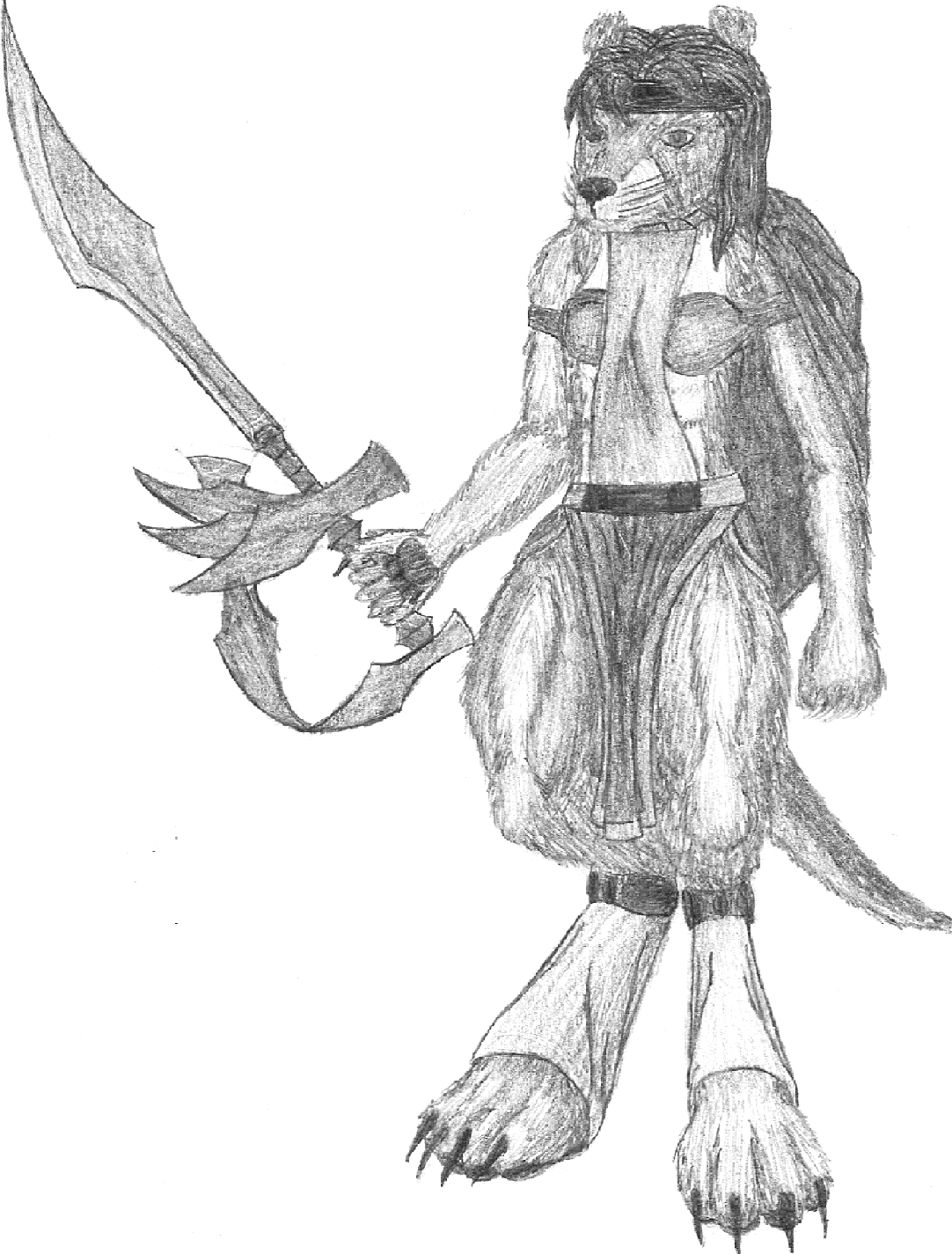
JadebrainParticipantHere’s a finished version of my previous picture, now with a name for the character. You’ll notice I completely redid the sword, in my attempt to add visual majesty to the picture, and I also tried harder to make her face look less like a human’s face with a muzzle tacked on. One thing I’ve had trouble with throughout the making of the picture has been the general area around her right shoulder – I really do need more practice on the female form, especially with how the chest interacts with the shoulders. As for the problems specific to this final rendition, I do believe I’ve gotten sloppy with my ability to shade fur, and my lack of decently-sharpened pencils certainly isn’t helping; for example, you almost can’t tell that her left hand has fingers, even before the scan-induced detail distortion. In addition, the hilt guard looks far too large to be practical; I tried experimenting with using the same general shape repeatedly, which wasn’t such a good idea in retrospect. Any other thoughts?
 June 15, 2012 at 4:03 pm #6488
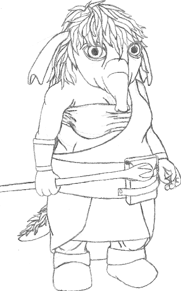
JadebrainParticipantHere’s the second stage of a drawing of the character of one of the players in the group that’s playtesting my game. The character, whose name is Gauley, is a Grendemoth, one of the races in the game I’m making, and it was for this picture that I needed advice on hide armor. As it is the second stage of the drawing, I have not done shading yet, though for this particular picture, I decided to use a zig-zaggish pattern to denote fur for the purposes of Open Critique Day, in addition to editing the picture on my computer to increase contrast. My main concern is whether or not the hide armor looks practical or realistic given its design, but other tips would also be appreciated. Also, if you think the “abs†look weird, it’s because they’re not actually abs… *ahem*
July 13, 2012 at 3:04 pm #7491
JadebrainParticipantHere’s the finished drawing of Gauley, one of the Player Characters in the campaign I’m using to playtest my game. Not much has changed since the outline from four weeks ago… basically, I just added shading and fur patterns and such.
July 13, 2012 at 3:17 pm #7493
FRMParticipantthat is so cool!
July 14, 2012 at 2:29 am #7516
Kaylin88100ParticipantI love your drawings!
 August 3, 2012 at 10:33 am #8529
JadebrainParticipantThanks for the praise! Anyway, I’ve got a little problem with the design of my next character, as described below…
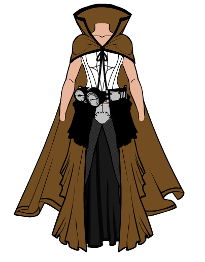
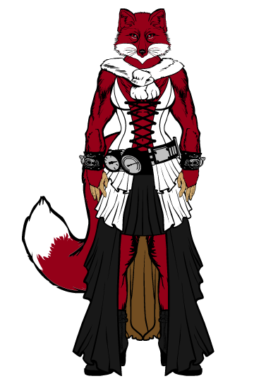
I am currently trying to brainstorm the clothing of an NPC in a new story arc to playtest the game I’m making, and I have little to no idea of how to make the specific design. Basically, the look I’m trying for regarding the clothing is a combination of “skimpy” and “steampunk.” I’ve tried looking online for pictures of clothing which would qualify as both, but what I got was basically too much of one trait and not enough of the other. You know, either “skimpy” or “steampunk,” as opposed to both in equal measure.
So far, this is what I’ve come up with for the clothing, as brainstormed on Heromachine 3.0. One thing I feel must be mentioned, just to give you a better idea of what I have so far: you’ll notice a dark brownish-gray area on the dress; that is not the front of the dress, but rather the interior of the back. Anyway, what I’m basically having trouble with is making it both more revealing and more steampunk-ish, whereas right now it just seems like an inconsistently-revealing dress with some dials and test tubes tacked on.
In case it helps you to get an idea of what I want, the character is basically a rather anime-esque (despite my general lack of enjoyment of anime) depiction of a steampunk tinkerer, who also belongs to a specie that is usually obsessed with beauty (and she is no exception).
August 3, 2012 at 3:46 pm #8540
HammerknightParticipantWould something like this work for you. Bare arms for that time would have been “skimpy” and the stocking showing would of put it over the top.
 August 3, 2012 at 3:48 pm #8541
HammerknightParticipantSorry I forgot to change the color for the back of the dress, but it gives you something to think about.
August 4, 2012 at 2:25 pm #8578
JadebrainParticipant@Hammerknight said:
Would something like this work for you. Bare arms for that time would have been “skimpy” and the stocking showing would of put it over the top.

Eh… I appreciate your attempt at helping me, but there’s not really much I would apply from your suggestions. Granted, that’s because of the fact that I had neglected to describe the character adequately… The character is a Poruqe, the same race as the character depicted in this previously-posted drawing. Given her fur, having any sort of fishnet-type clothing would be pointless at best and problematic at worst. In fact, her race is the reason I only did the clothing in HM3; it’s kind of hard to clothe people with digitigrade legs in an application designed mostly for plantigrade characters, and there’s no good furry-type body for females yet. I’m basically using HM3 to brainstorm what I’m going to draw in pencil, in case you’re wondering.
As for the cape, that’s another thing I forgot to mention: The types of weapons she prefers to use are the heavy kind which require large objects carried on the back (like the petroleum gel tank that goes with flamethrowers), so the cape would also get in the way.
While your suggestion of bare arms is a good one, I’m not sure how to implement it correctly. I suppose I could make the sleeves shorter than they were in the picture I posted, but I wouldn’t remove them entirely, as that would make the vest look incomplete (assuming I keep the vest).
August 4, 2012 at 7:50 pm #8595
HammerknightParticipantWould this be any closer. She is a Manimal (Man+Animal) from one of my worlds.

-
AuthorPosts
You must be logged in to reply to this topic.

