Home › Forums › The HeroMachine Art Gallery › J3loodT4lon's Art Room
- This topic has 38 replies, 10 voices, and was last updated 6 years, 1 month ago by
RobM.
-
AuthorPosts
-
November 21, 2014 at 6:29 pm #115390
Herr DParticipantThe technique Hawk mentioned is one I use commonly. Take any item in your picture; select another one, a few percent different in size, all three colors black and put it behind, protruding. For long shadows, mask that gradient circle to it to show instead and drop the second item to the bottom layer.
As for where? Experience is going to be long coming, but you could sample shadow patterns from other pictures with similar light patterns and objects from the web or IRL.
November 23, 2014 at 2:50 pm #115461
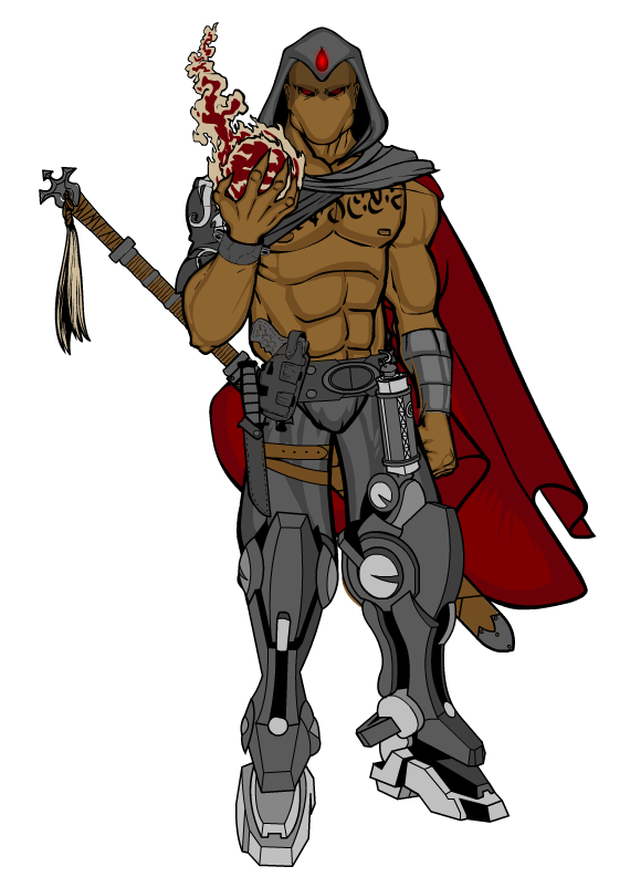
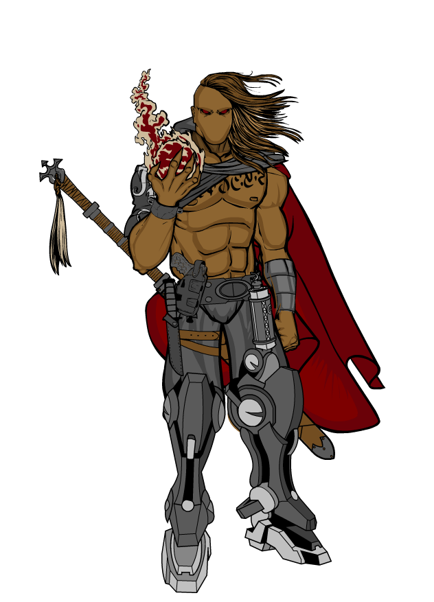
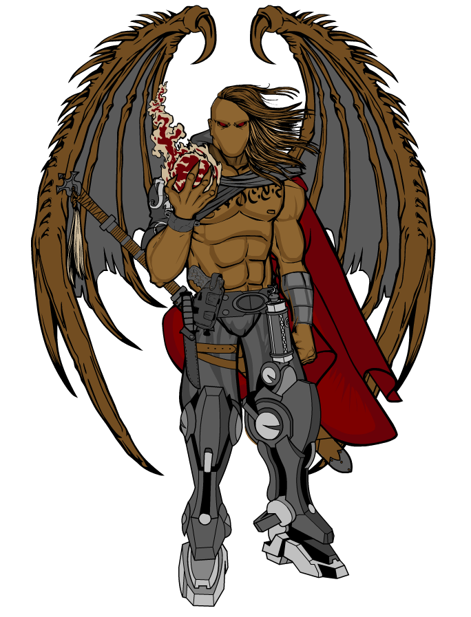
J3loodT4lonParticipantOkay so I was up a long while last night working on another character. I started off with the character Arcaniss and started editing it, changing the skin color and some of the major details that set my characters apart. One thing led to another and I ended up working in the turned male body, which was a bit of a struggle for me as I haven’t really worked with them that much. I personally think he turned out fantastic, but I cannot decide on which version I want to set as his ‘classic’ model, for lack of a better term. So I decided to post them all here and get your guy’s opinions on them. Without further adieu, meet Falcon:

Falcon (Hood)

Falcon – The Sky Terror (Hood)

Falcon

Falcon – The Sky Terror
And for shits and giggles I decided to see what he would look like with a face. Now I refuse to alter the eyes at all, as they are kinda a signature in my opinion for my characters. So with keeping that in mind, I was limited to certain noses and mouths, as they would need to match well with the eyes, and this is what I came up with:

 November 23, 2014 at 2:58 pm #115462
JR19759KeymasterI’d say, personally, I think the third one is the best. Having wings behind a cape doesn’t really work (as naturally they’d need to be in front of the cape and the cape would just get in the way during flight). I like the fact that the cape and the hair together give a sense of atmosphere to the picture even though there’s no background. Their movement suggests that there’s some sort of wind blowing on the character, which always says badass, because when ever you see a badass character with long hair they’re having it blown in wind, right?
November 23, 2014 at 3:10 pm #115463
J3loodT4lonParticipantI’d say, personally, I think the third one is the best. Having wings behind a cape doesn’t really work (as naturally they’d need to be in front of the cape and the cape would just get in the way during flight). I like the fact that the cape and the hair together give a sense of atmosphere to the picture even though there’s no background. Their movement suggests that there’s some sort of wind blowing on the character, which always says badass, because when ever you see a badass character with long hair they’re having it blown in wind, right?
I agree, I feel the hair gives that “I’m a badass” feel to it that the hood doesn’t. However, in terms of the cape, it is actually only over the one shoulder:

Going off how that cape is placed, I personally don’t see it interfering with the wings at all.
November 24, 2014 at 3:26 pm #115511
hawk007ParticipantLove the sword on Ignastus. That’s obviously not the only thing, but It’s a cool sword.
November 24, 2014 at 3:51 pm #115515
J3loodT4lonParticipantLove the sword on Ignastus. That’s obviously not the only thing, but It’s a cool sword.
Thanks Hawk 🙂
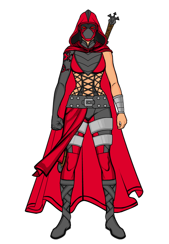
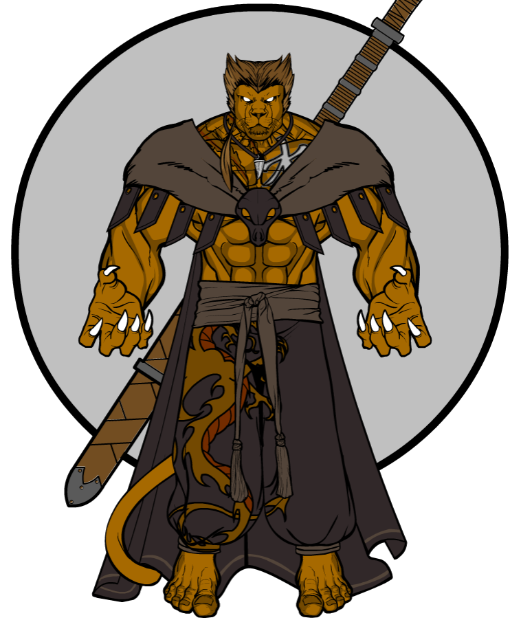
If you look though, Drakon, Ignastus, Arcaniss, and Falcon all have multiple details in common:
- Eyes, whether they be blue, green, purple, red.. They are all the same style.
- No other facial features other than eyes. (Ignoring the shits-and-giggles face portraits I did of Falcon.. Consider those ‘non-canon’)
- They all have some form of cloak.
- All have the same dragon tattoo and runic tattoo.
- They all posses the same sword, whether it be drawn or in its scabbard.
- They all have a hood attached to their cloaks, though in Falcon’s case he may or may not have his pulled back. (Haven’t decided on which model to use)
November 24, 2014 at 4:33 pm #115521
J3loodT4lonParticipantHere are a couple more characters I created last night/this morning. Enjoy and please leave comments!

Tamali

Leon
Updating the original post to include these new characters.
November 24, 2014 at 6:42 pm #115527
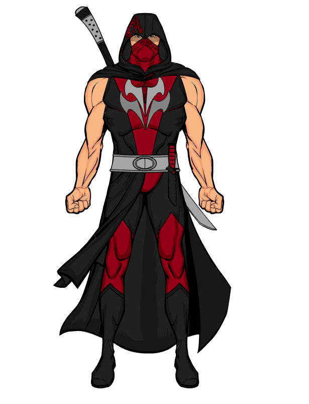
J3loodT4lonParticipantJust finished up a new character model. Let me know what you guys think.

Hexblade
November 25, 2014 at 11:56 am #115541
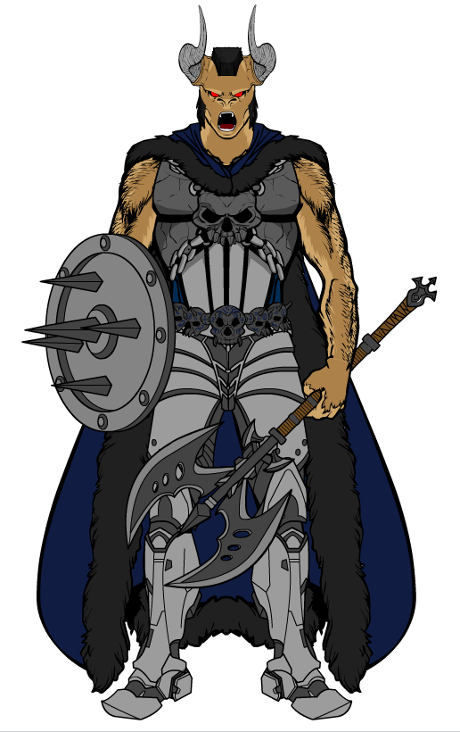
J3loodT4lonParticipantFinished another character last night, a Minotaur named Kathos.

Kathos
I am also working on fleshing out my universe, and have a little teaser for you guys: The world map.
 November 25, 2014 at 9:00 pm #115554
VampyristParticipantKathos is really cool!
March 31, 2015 at 10:58 pm #122361
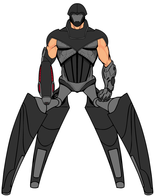
J3loodT4lonParticipantSo I have been gone for a while dealing with IRL stuff and a lack of creativity. But I have returned.. kinda. Did some playing around a bit ago and threw this guy together. Let me know what you think!

Robot-Centaur?
March 31, 2015 at 11:56 pm #122362
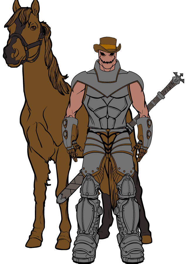
J3loodT4lonParticipantHere is another one I just put together.
 April 1, 2015 at 12:30 am #122363
JR19759KeymasterNot bad. On the second one you might want to either change the brown on the costume or the colour of the horse, because they merge with one another on the overlap. But other than that everything looks good.
Good to have you back with us.
April 1, 2015 at 7:05 am #122370
hawk007ParticipantHey, I was just looking, and would you mind if I tried remaking Hexblade? Obviously, just for fun. I just think he’s a cool character, and would like to see what I could do with him.
April 1, 2015 at 6:50 pm #122394
J3loodT4lonParticipantGo right ahead, Hawk 🙂
-
AuthorPosts
You must be logged in to reply to this topic.

